




Logo Design Considerations for a Tomahawk Business
According to LOGO.com data, the five most popular colors among logos with camping in their names created on LOGO.com over the past 12 months were white at 26%, green at 18%, black at 16%, grey at 13%, and blue at 9%. White led the sample and green followed, pairing a clear base with a natural cue for a tomahawk brand rooted in trail work. For a tomahawk logo that needs to feel at home on gear, packaging, and social profiles, start with white or black and use green or blue as a focused accent.
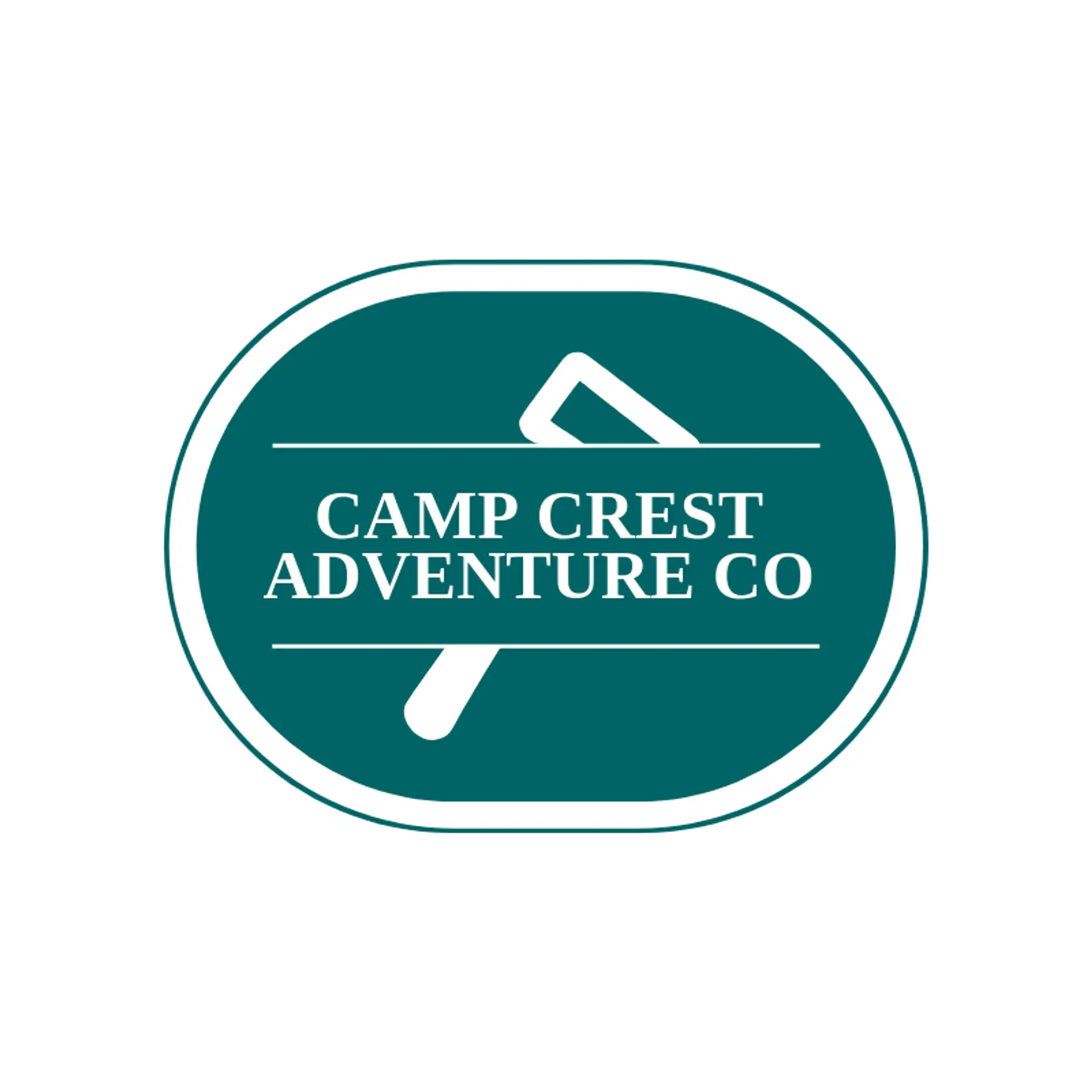
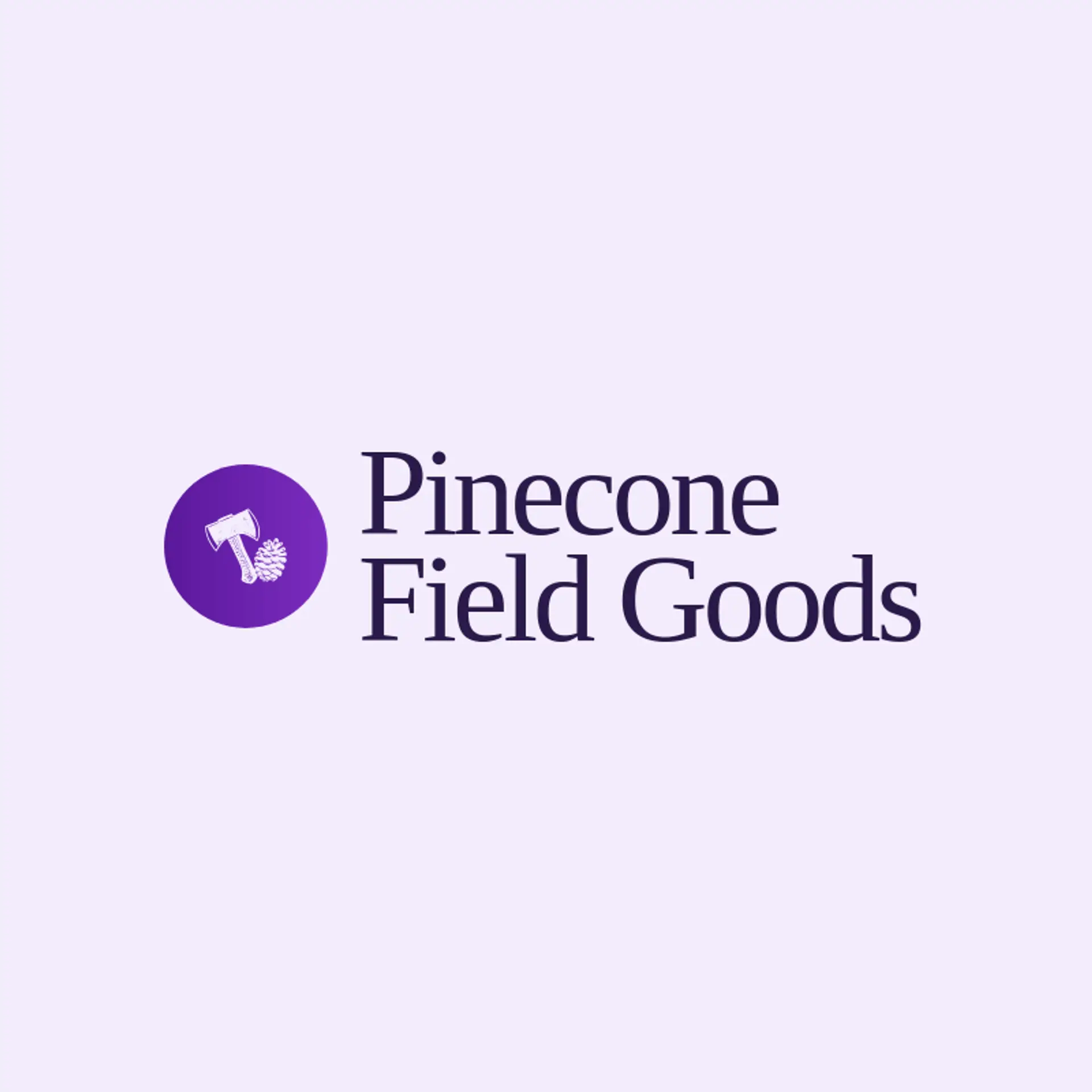
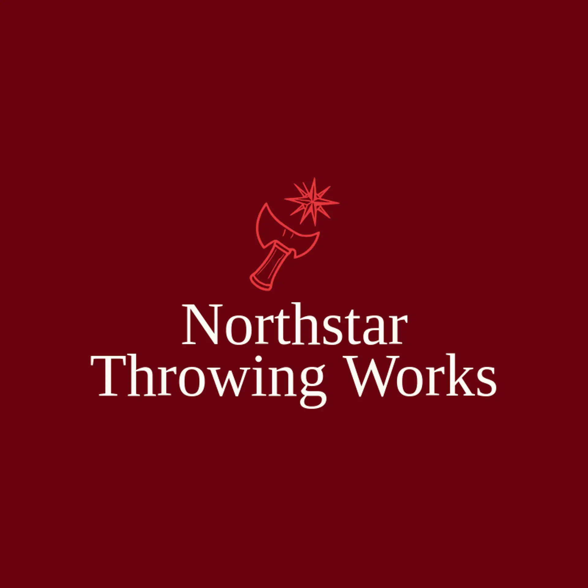
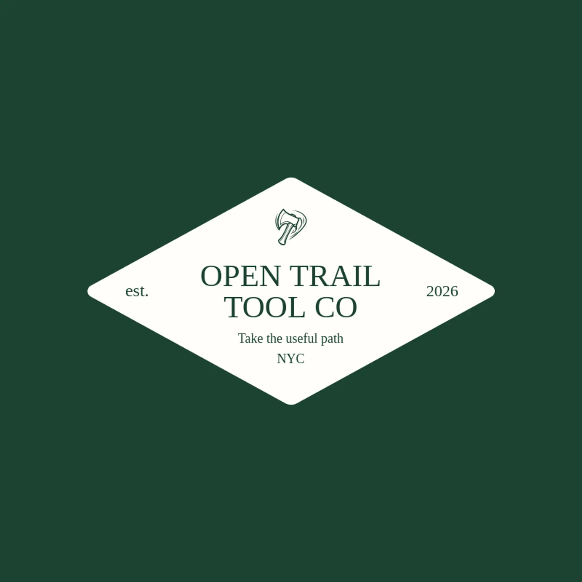
A tomahawk head is the clearest starting point, with a compact silhouette that can read at small sizes and still feel distinct beside a wordmark. A carved handle or a pair of crossed tomahawks can suggest craftsmanship, outdoor skill, or a throwing league without adding extra detail. For a more active mark, use a single tomahawk in flight with a short motion trail, or show its profile above a simple tree ring or mountain line. Keep the edge and handle bold, then use a small spark, leaf, or compass point beside the tool to give the mark a memorable twist. Before settling on a direction, connect the icon to the brand's story, whether that means camping gear, a local axe throwing club, or a maker's workshop.
Icons To Make Your Tomahawk Logo Stand Out
That same balance of clarity and natural color can guide the lettering. According to LOGO.com data, sans serif typefaces made up 82% of the font choices among logos with camping in their names over the past 12 months, with display at 11% and handwriting at 5%. The leading individual fonts were Geologica at 23%, Afacad at 11%, Bayon at 6%, Alata at 6%, and Onest at 6%. Choose sturdy, simple lettering beside a white or black base and one green accent so a tomahawk identity stays readable on a tool tag or a small profile image.
Tomahawk Logo Ideas FAQs
Browse Related Logo Ideas
Alien logosAnime character logosBattle logosCharacter logosClan logosCowboy hat logosCowboy logosCrest logosDanger logosDevil logosFamily crest logosFantasy logosGame logosGamer logosGhost logosGuild logosKing logosNinja logosPhantom logosPirate logosPrince logosQueen logosRoyal logosSamurai logosSkull logosSuperhero logosSword logosTournament logosViking logosWarrior logosZombie logosHorror logosKnight logosMermaid logosNerd logosOutlaw logosPegasus logosPoison logosReaper logosSpear logosToxic logosTrident logosZeus logosAstronaut logosPrincess logosCastle logosDice logosGothic logosGriffin logosMystery logos