Lawyer Logo Maker
Design a lawyer logo that works on your letterhead and email signature.
Need a different logo maker? Try our AI logo generator.
Logos created using LOGO.com
670,000,000
Classic scales and courthouse law logos
Bold emblems for advocates and litigators
Warm and approachable legal logos
Lawyer Logos, Ranked From Real Founder Prompts
According to LOGO.com data, the scales of justice appear in about 71 percent of the law and justice icon descriptions founders write on LOGO.com, a gavel in about 39 percent, and legal documents in about 8 percent.
Two symbols carry nearly the whole category, which is precisely why the interesting decisions sit somewhere else. Below, those nine symbols and fifteen real founder prompts are drawn across all nine LOGO.com styles, so you can watch a legal mark move from carved and traditional to plain and modern before you commit to one.
On this page
- Two symbols carry almost every lawyer logo
- Fifteen law logo ideas from real founder prompts
- Trading under your own name, and what a mark adds
- The scales problem, and three ways around it
- Old world crest or modern wordmark?
- Legal services, notaries and mediators need a mark too
- Make your lawyer logo with LOGO.com
Two shapes have run legal branding for a century. Pull the icon descriptions lawyers have typed into LOGO.com and the split is stark. Scales of justice show up in about 71 percent of them, a gavel in about 39 percent, and everything else fights over what is left. That is the awkward part of a lawyer logo. The symbols that say law loudest are the ones half your competition already has above the door. This page walks through the nine symbols the data ranks, fifteen real prompts you can borrow, and the small calls that stop your mark blending into the row.
Two symbols carry almost every lawyer logo
We grouped 458 icon descriptions written on LOGO.com into nine concepts, taking every description that names a law or justice symbol rather than filtering by industry, because the legal industry labels on their own are too thin to rank from. Scales lead at about 71 percent, the gavel follows at about 39 percent, and legal documents take about 8 percent. After that the field flattens right out across a law book, a shield, courthouse columns, a speech bubble, a handshake and a raised fist. Notice how few of them are about winning. Most are about balance, protection or a promise kept.
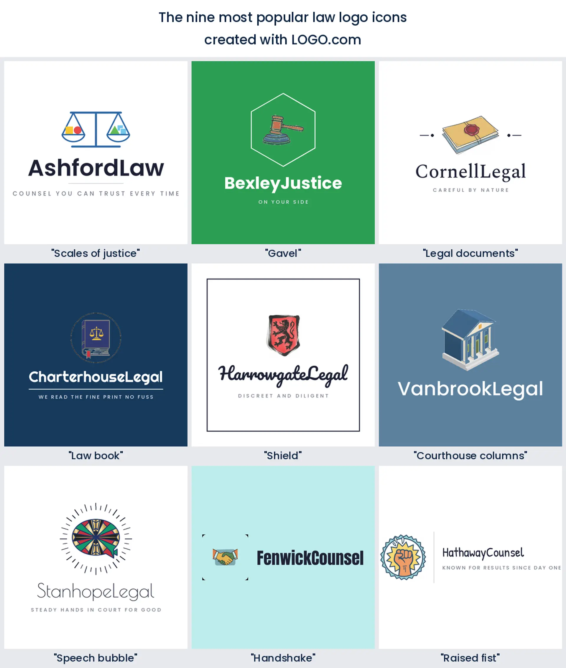
1. Scales of justice
Start here, because almost everybody else already has. About 71 percent of the law and justice icon descriptions written on LOGO.com ask for scales, which tells you both that clients read them instantly and that you are joining a very long queue. Keep the beam level and the pans simple and it is still the most legible lawyer logo on this list, especially for a general practice.
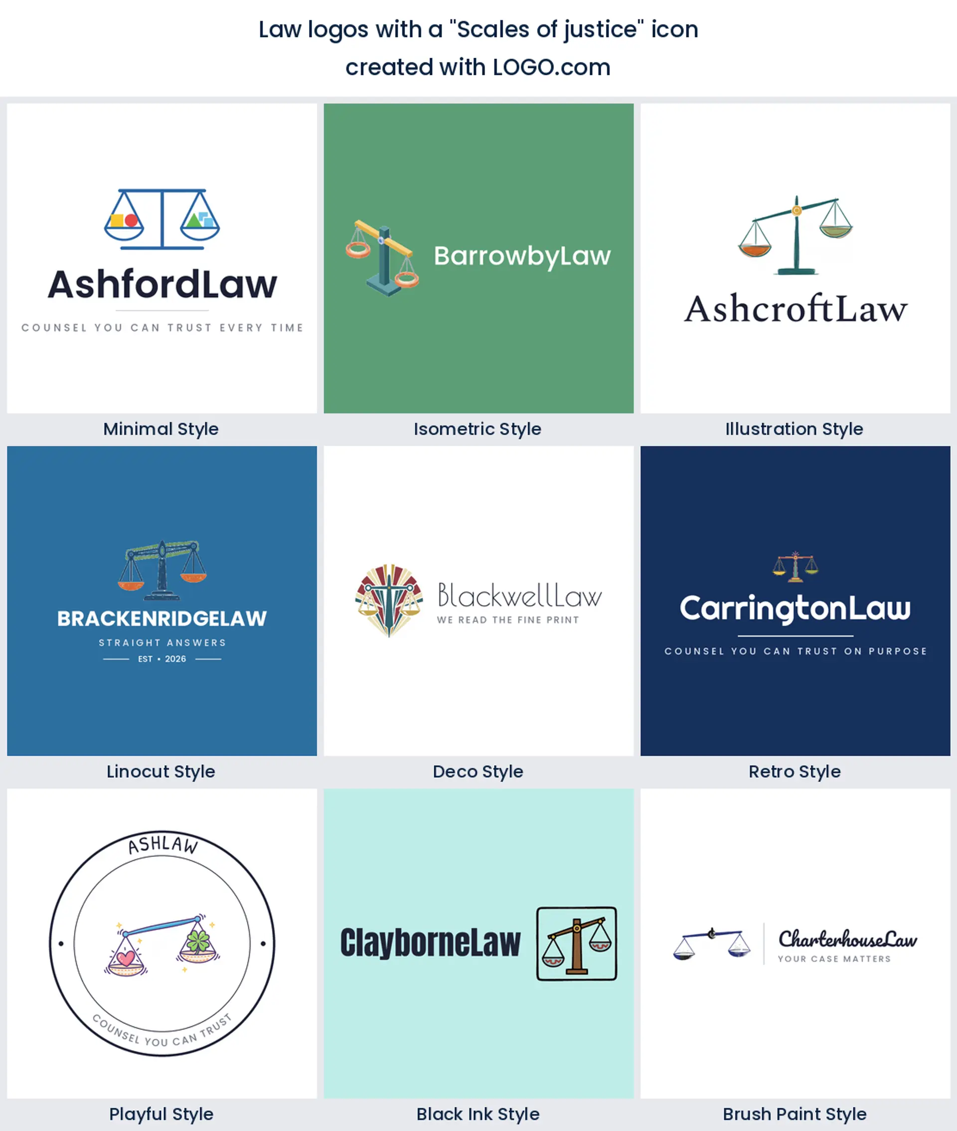
2. Gavel
A gavel turns up in roughly 39 percent of those descriptions, almost always paired with something else rather than standing alone. It carries a courtroom rather than a contract, so it suits a litigator, a criminal defense practice or any trial focused law logo far better than it suits a quiet transactional desk.
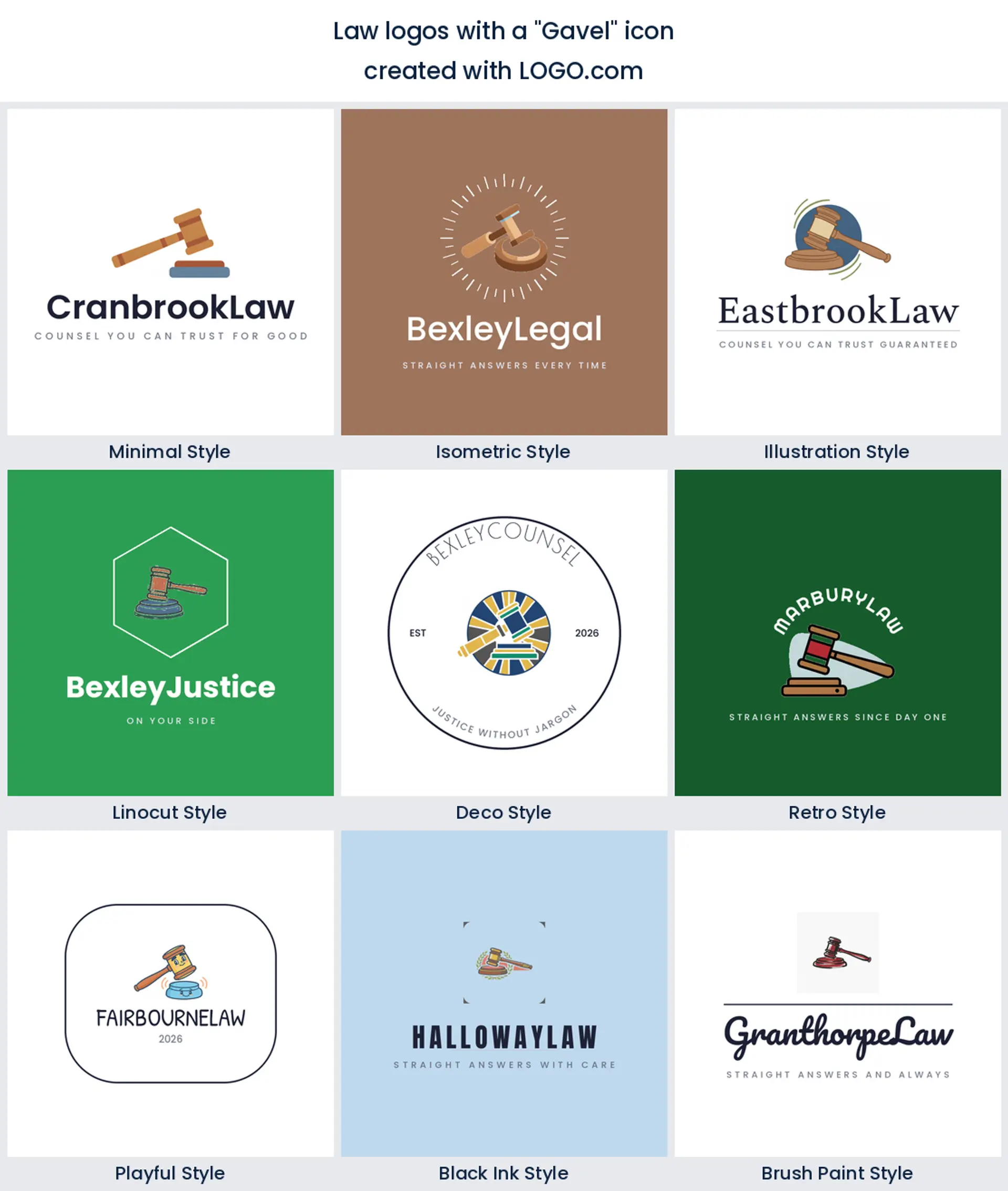
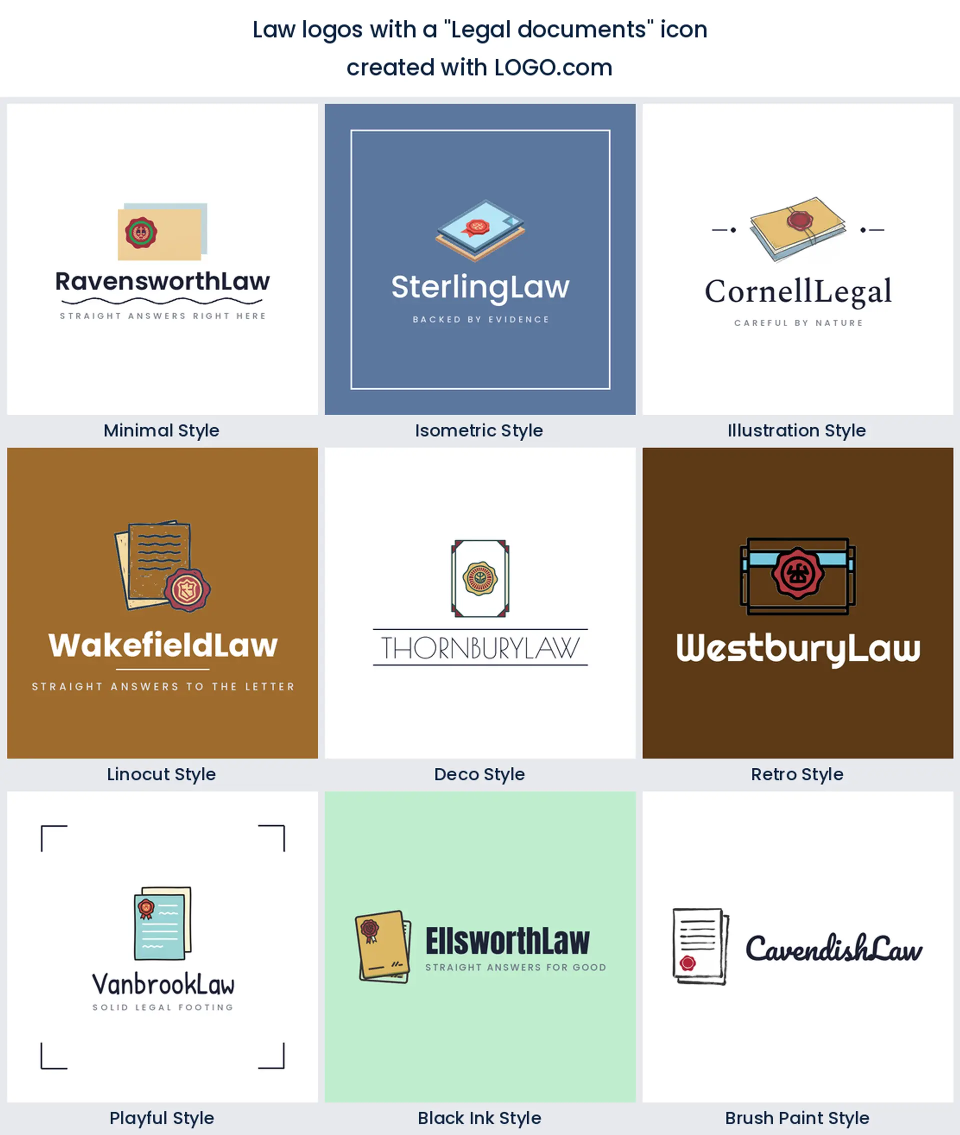
3. Legal documents
Third place goes to paperwork. About 8 percent of the descriptions name a document, a brief, a contract or an envelope with a seal, and it is the one symbol that shows what most legal work actually looks like day to day. That makes it an honest legal services logo for a notary, a conveyancer or anyone whose week is mostly drafting.
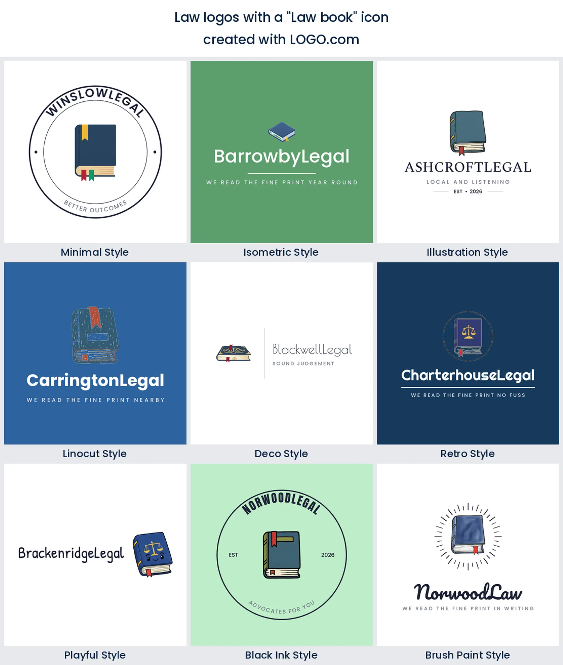
4. Law book
Fourth by volume is the law book, closed or open, sometimes with a ribbon marker tucked into it. It reads scholarly instead of adversarial, so lean on it for an appellate, academic or research heavy law logo where you would rather look well read than combative.
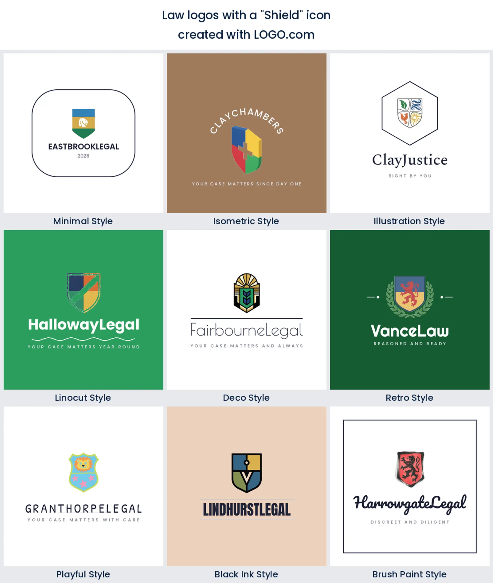
5. Shield
The shield is fifth, and it does something none of the four above it manage. It promises protection rather than judgement, which is why founders reach for it when the client on the other side of the desk is frightened. That makes a reassuring defense attorney or family law logo.
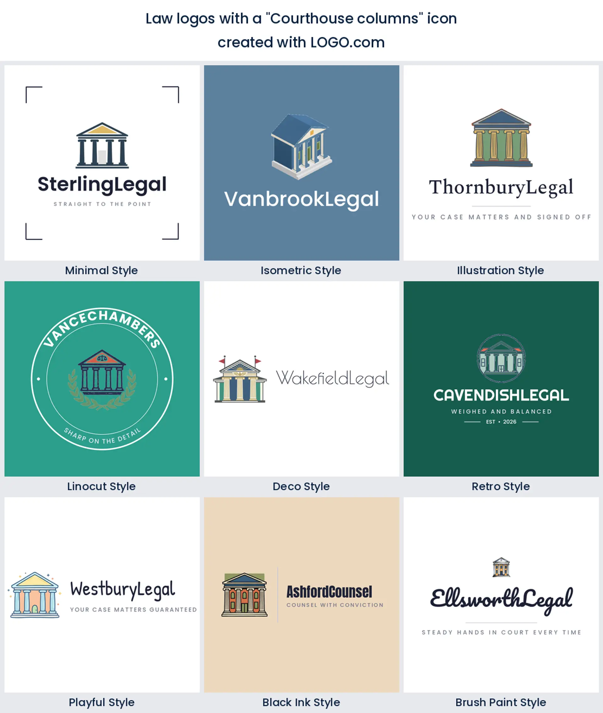
6. Courthouse columns
Sixth are the columns. Founders describe a pediment, a flight of steps, a capitol dome or an archway, and every one of them borrows the weight of a building that has stood longer than you have. A good instinct for an established law office logo, and a risky one if your practice is deliberately modern.
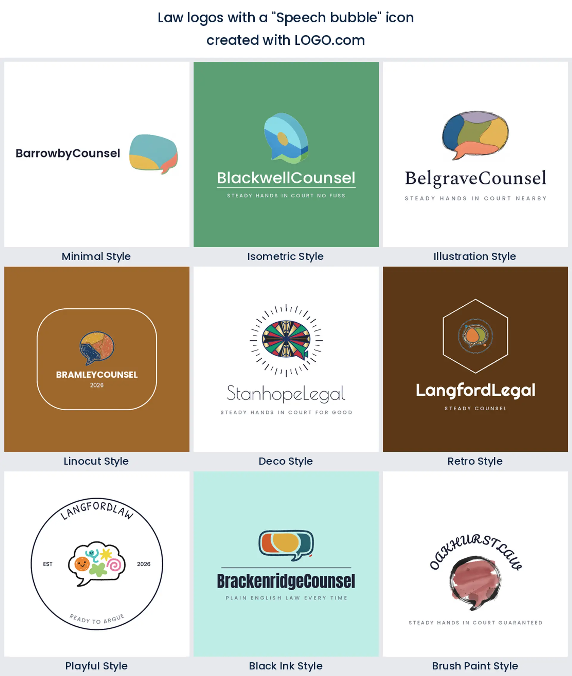
7. Speech bubble
A speech bubble in seventh place is the surprise on this list. It shows up because plenty of legal founders sell advice and access rather than litigation, and a bubble quietly says you can just ask. Put a small set of scales inside one and you have a consultation led legal logo.
8. Handshake
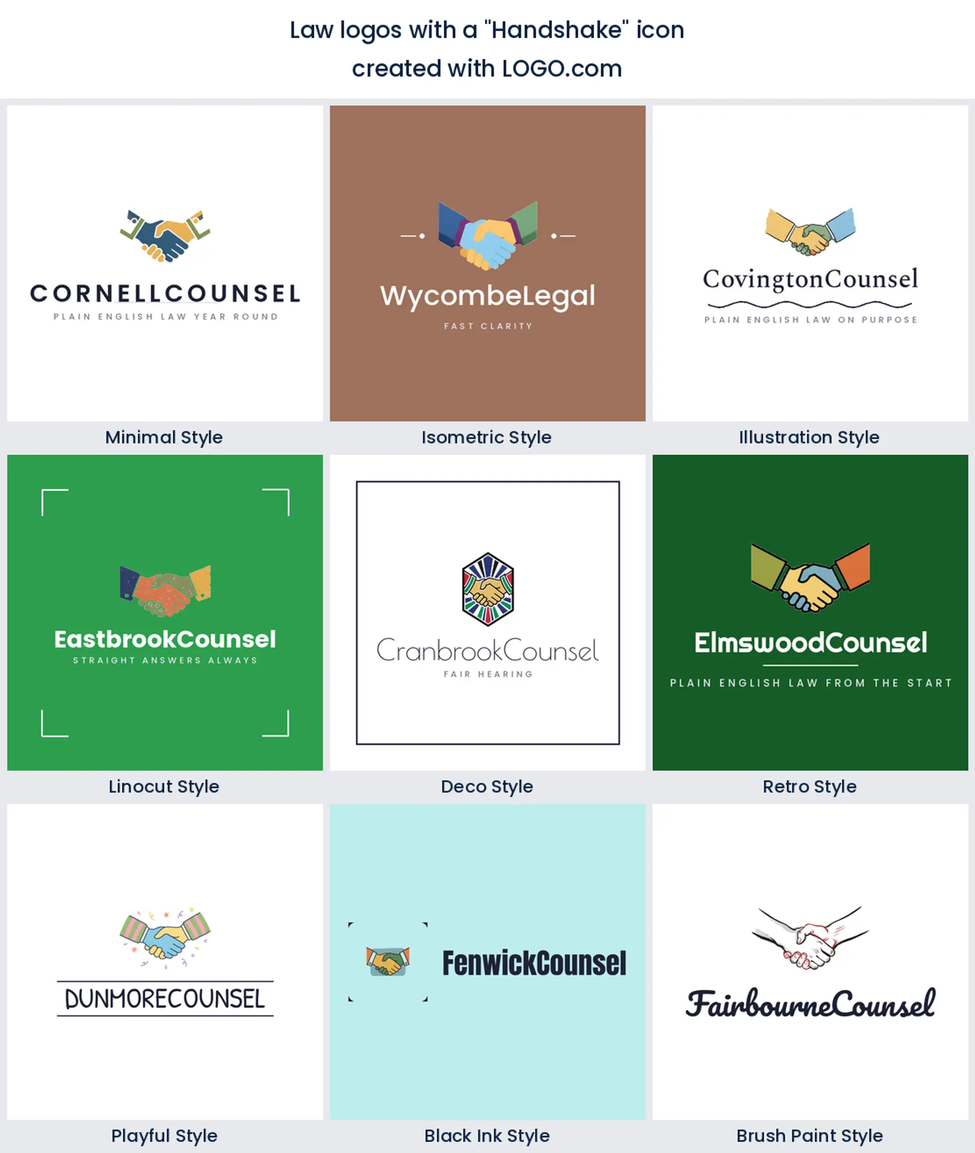
Eighth is the handshake, sometimes clasped hands, sometimes a pair of helping hands. This is the settlement symbol, the one that says the matter ends without a hearing, which makes it a natural mediation, arbitration or family law logo.
9. Raised fist
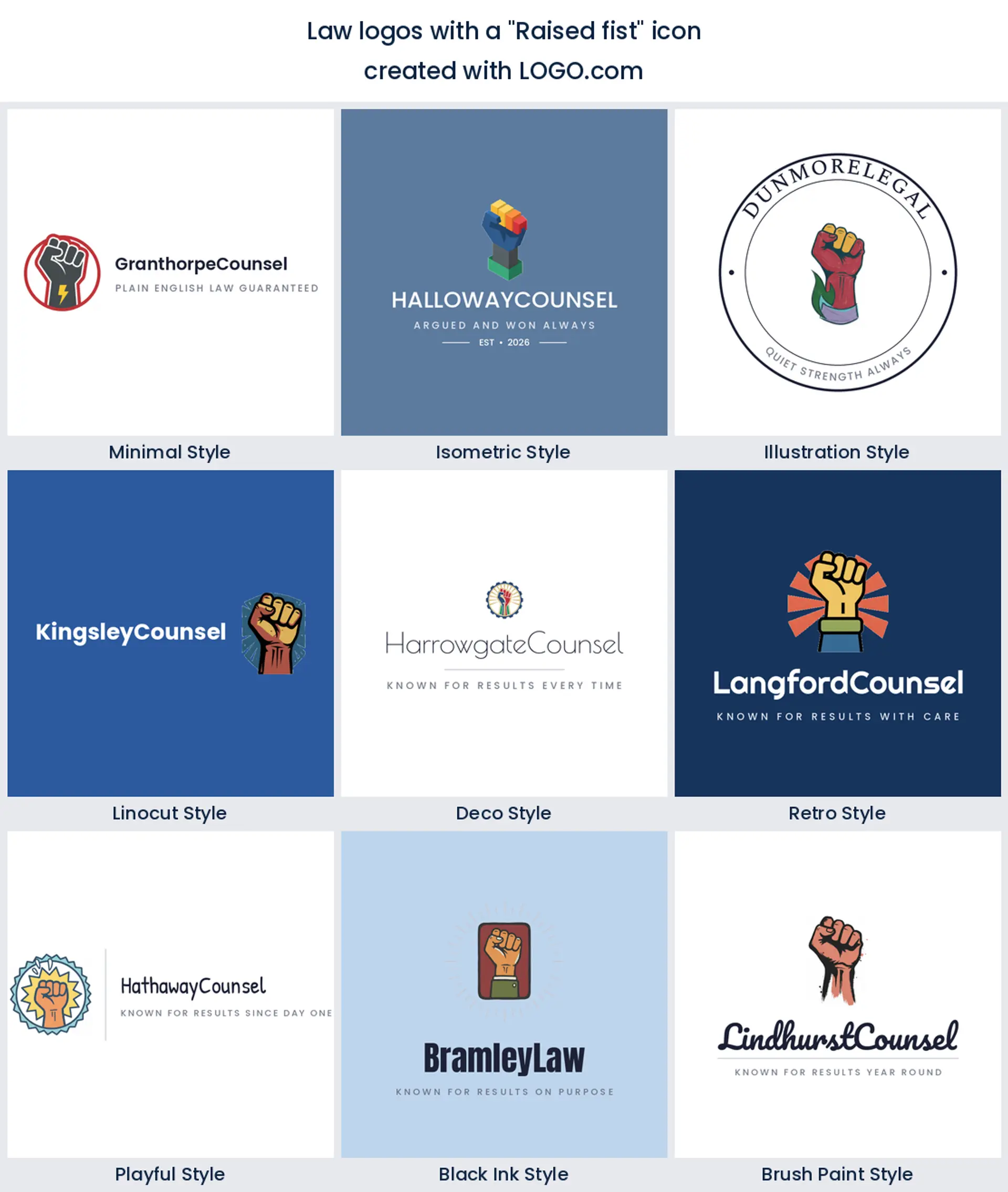
Last of the nine is the raised fist, and it is the only symbol here with an argument built into it. Founders use it for civil rights, tenant defense and workplace claims, so take it only if you want an advocacy logo that picks a side out loud.
Fifteen law logo ideas from real founder prompts
Every heading below is a real icon description somebody typed into LOGO.com, word for word, and each one is drawn here across all nine styles. They are richer than the nine ranked symbols on their own, because founders combine things. Type any of them into the generator and you will get your own version back in seconds.
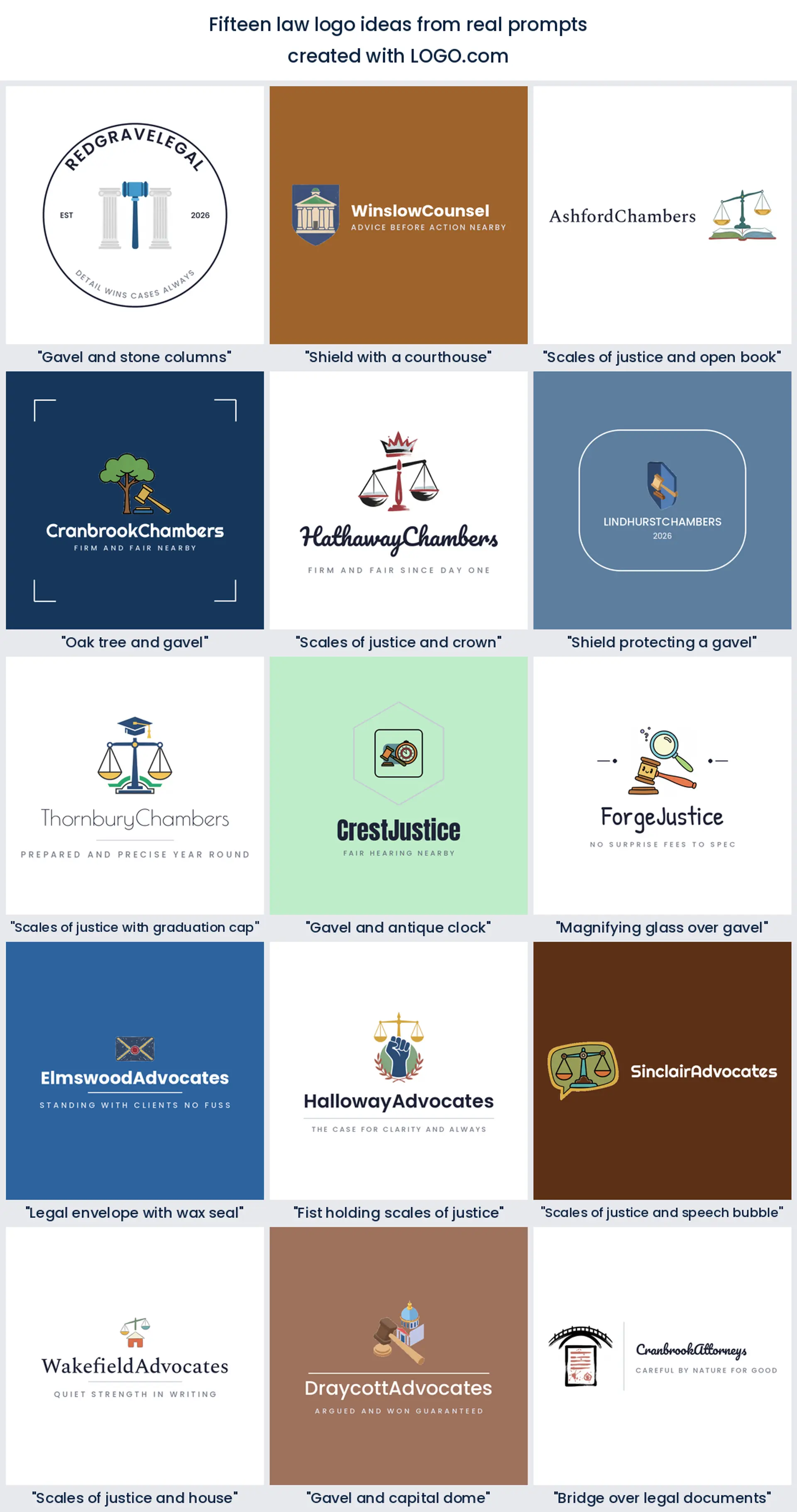
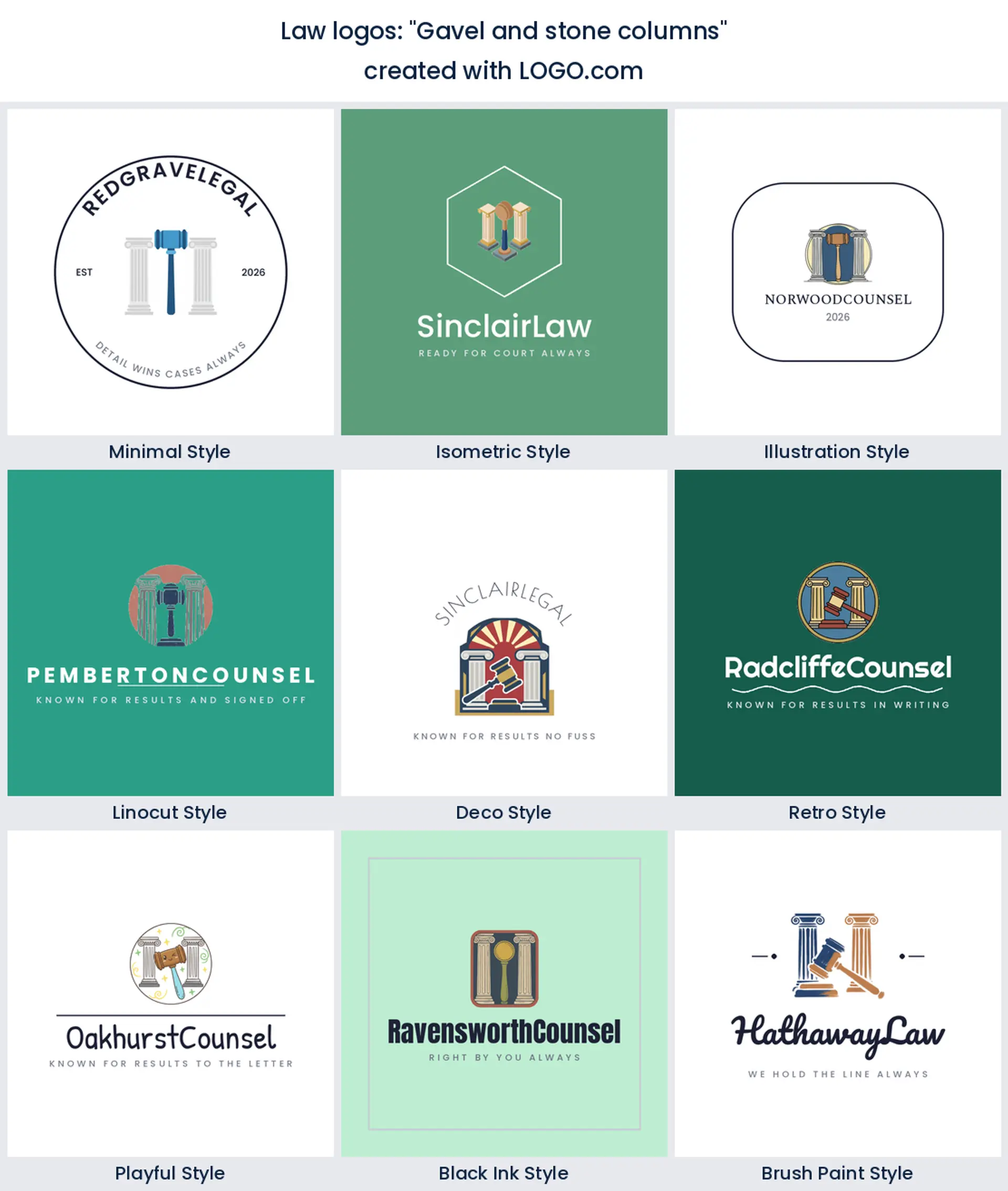
1. "Gavel and stone columns"
Somebody typed this one word for word, and it is the courthouse in shorthand. The columns hand you age and the gavel hands you the room, which together make a confident law office logo for a practice that wants to look permanent.
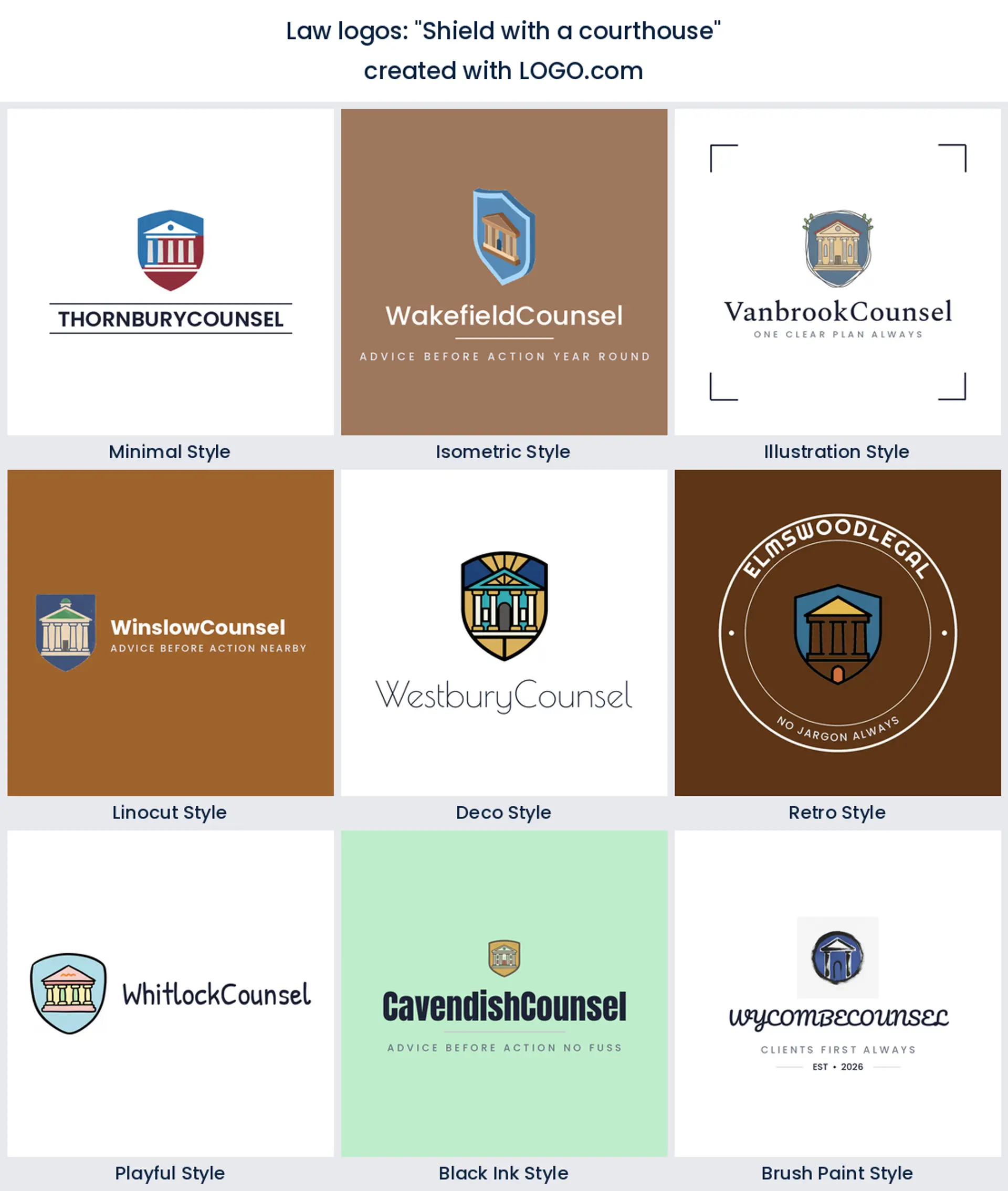
2. "Shield with a courthouse"
Tucking the building inside a shield softens the whole thing. You keep the institution and add a promise of cover, a combination that works hard for a criminal defense or immigration lawyer logo.
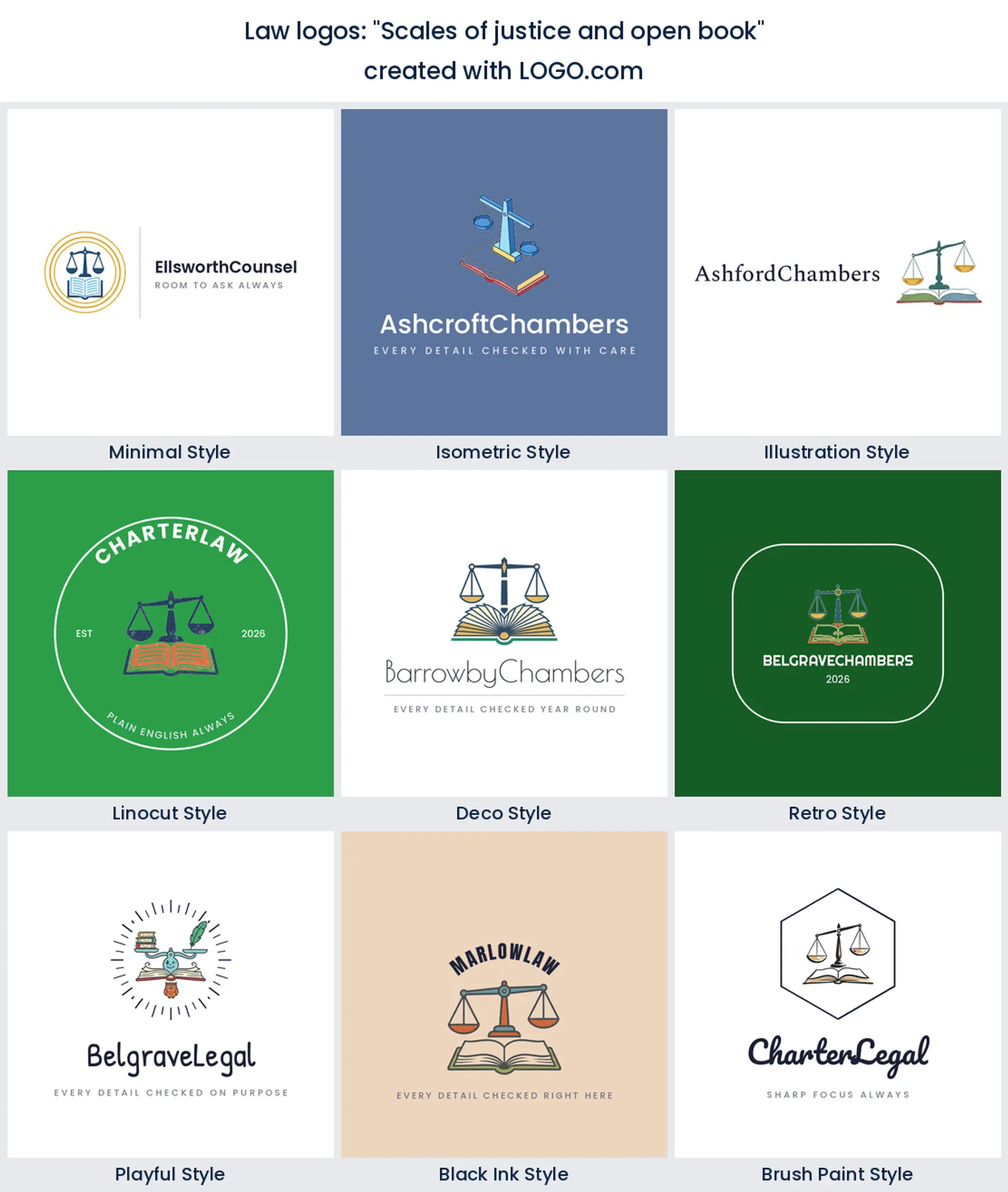
3. "Scales of justice and open book"
Scales resting over an open book is the most requested pairing in the set after the gavel. It says you argue from the text, which is the right note for an appellate or research led legal logo.
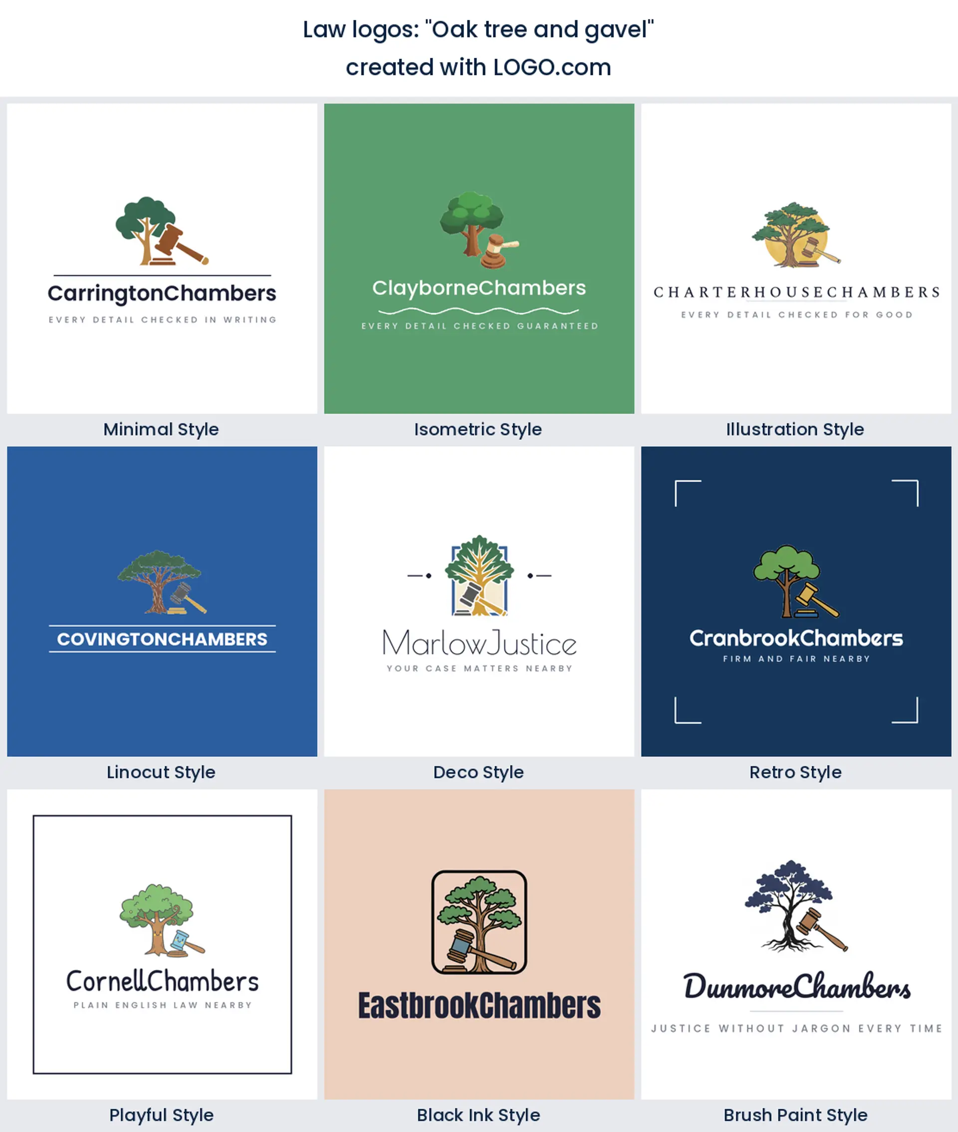
4. "Oak tree and gavel"
An oak has been standing for two hundred years and everybody knows it. Set beside a gavel it gives you continuity without a crest, which suits an estate planning or trusts law logo.
5. "Scales of justice and crown"
A crown reads as seniority here rather than royalty. Use it when you want a senior counsel or chambers style lawyer logo that signals rank without spelling anything out.
6. "Shield protecting a gavel"
Reverse the usual order and the gavel becomes the thing being defended. That inversion makes a pointed mark for a defense practice, and it is a rare way to use two very common symbols together.
7. "Scales of justice with graduation cap"
This prompt came from founders building legal education, tutoring and bar prep brands. The cap lifts the whole mark out of the courtroom and into the classroom, which is exactly what a legal training logo needs.
8. "Gavel and antique clock"
A clock is an unusual thing to put in a lawyer logo, and that is the point of it. It speaks to deadlines, limitation periods and billed time, so it fits a litigation or claims practice that competes on speed.
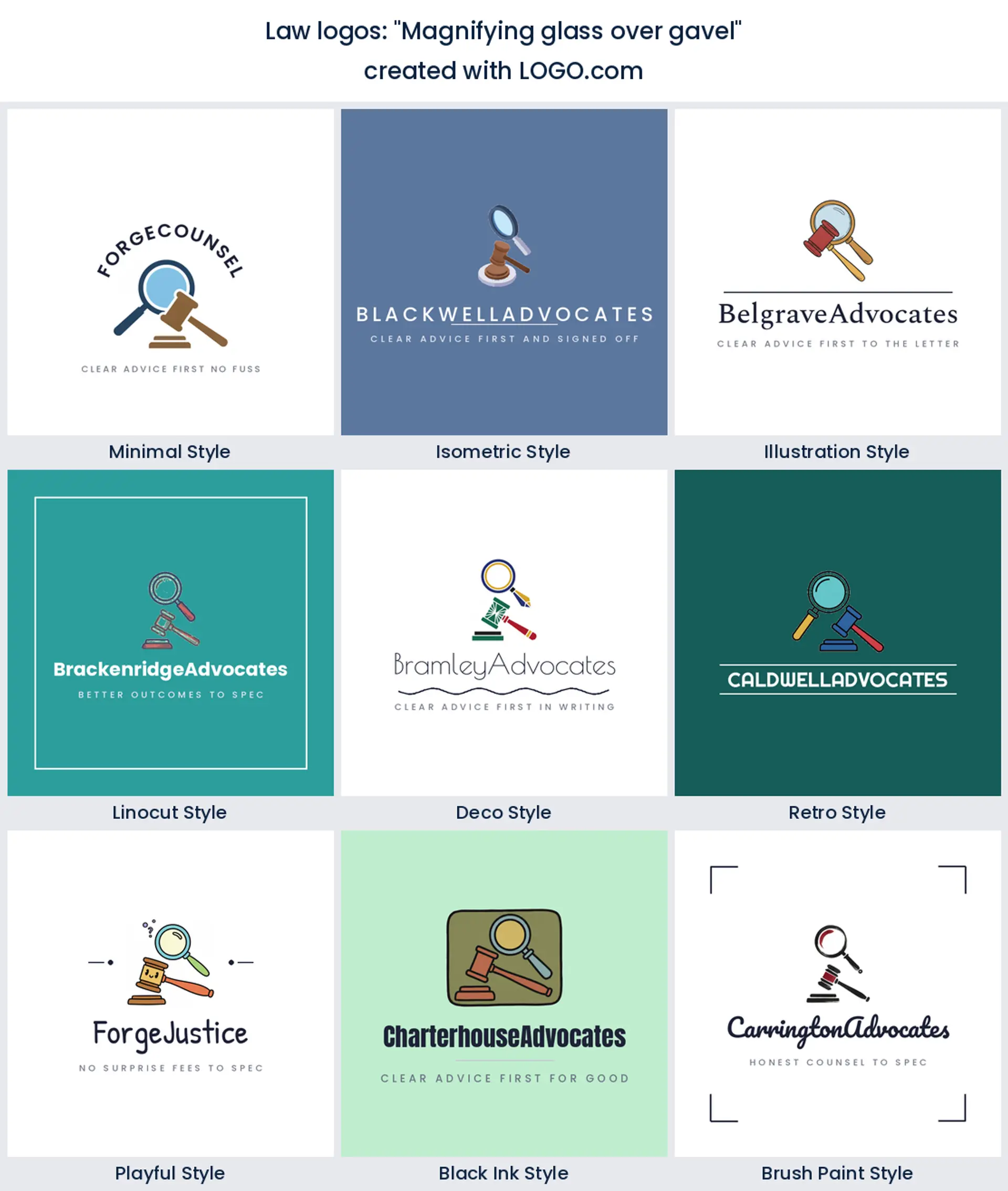
9. "Magnifying glass over gavel"
Investigation before argument. A magnifier over the gavel suits a discovery heavy practice, a legal research service, or a private client firm that sells thoroughness rather than theatre.
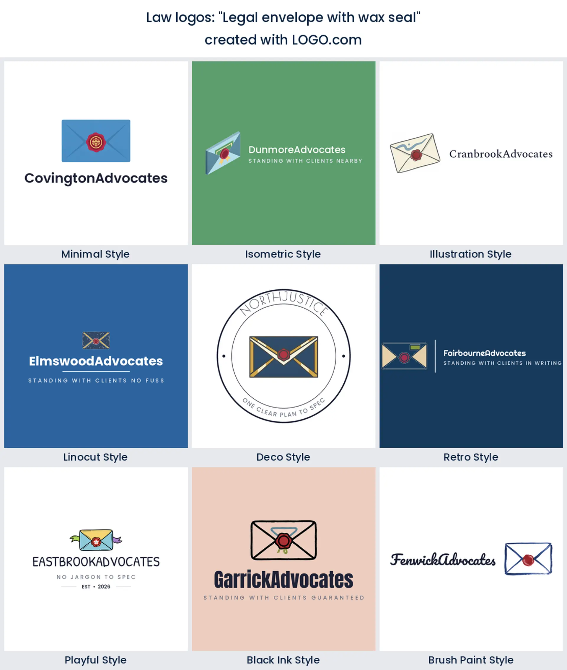
10. "Legal envelope with wax seal"
Nothing says binding quite like a wax seal. Founders use this one for notaries, apostille services and document handling, and it makes a clean legal services logo without a single courtroom prop in sight.
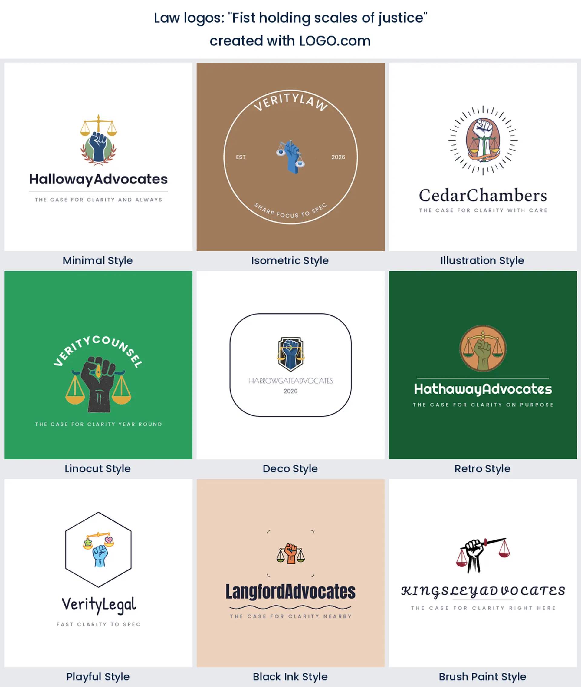
11. "Fist holding scales of justice"
Two of the nine ranked symbols in one mark, and the loudest combination on the page. Civil rights, tenant defense and employment claims all suit an advocacy logo that shows the scales being held up rather than sitting on a bench.
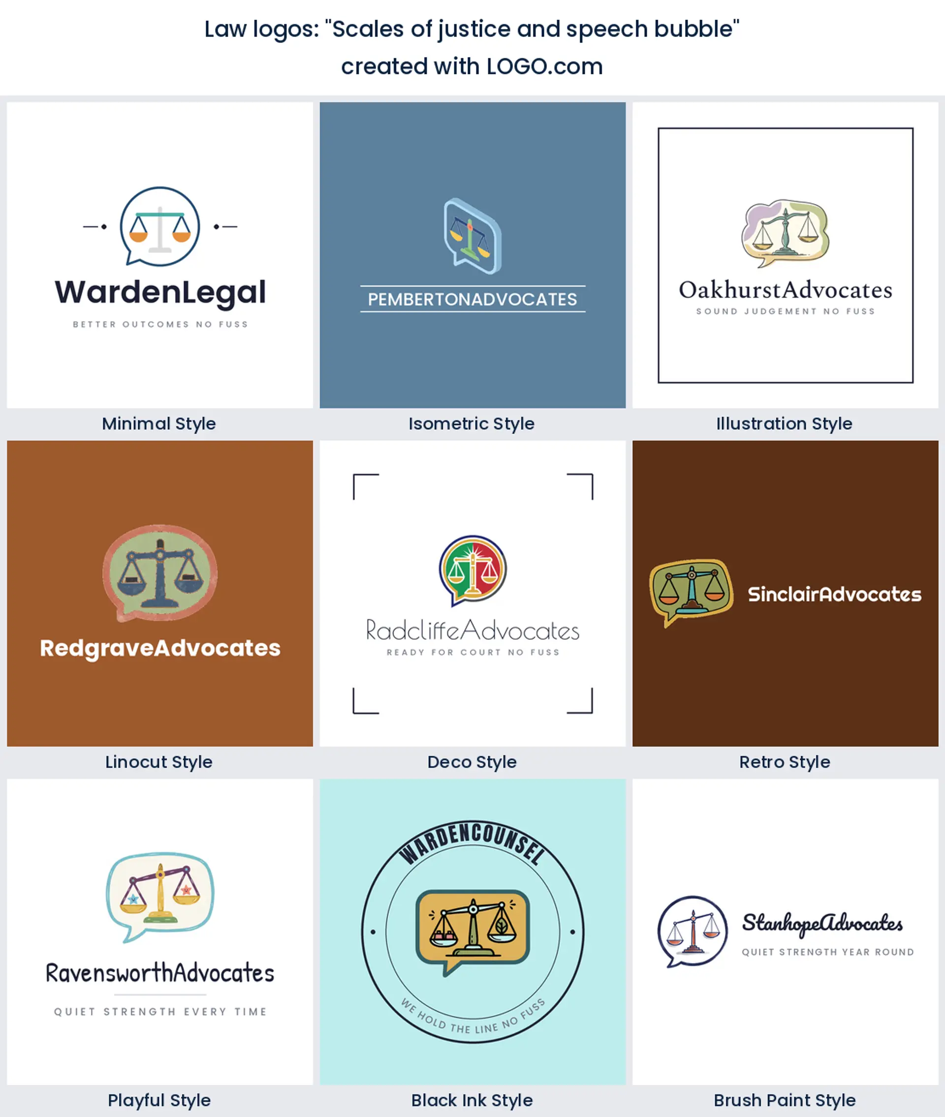
12. "Scales of justice and speech bubble"
Advice first, court later. Dropping the scales inside a bubble turns the whole mark friendly and makes a good consultation logo for a practice that does most of its work over the phone.
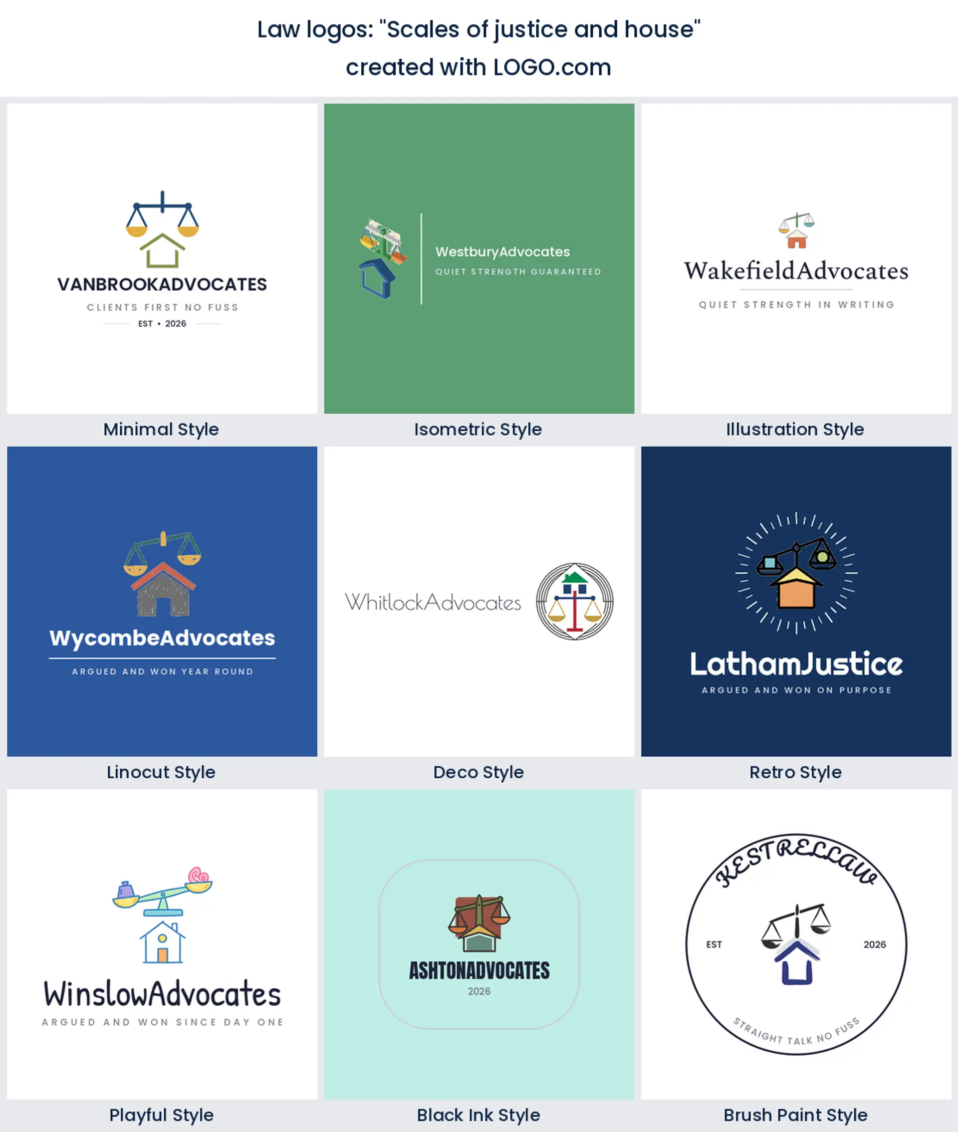
13. "Scales of justice and house"
Property work has its own visual language and this is it. Scales above a roofline read immediately as conveyancing, landlord and tenant, or real estate law logo territory.
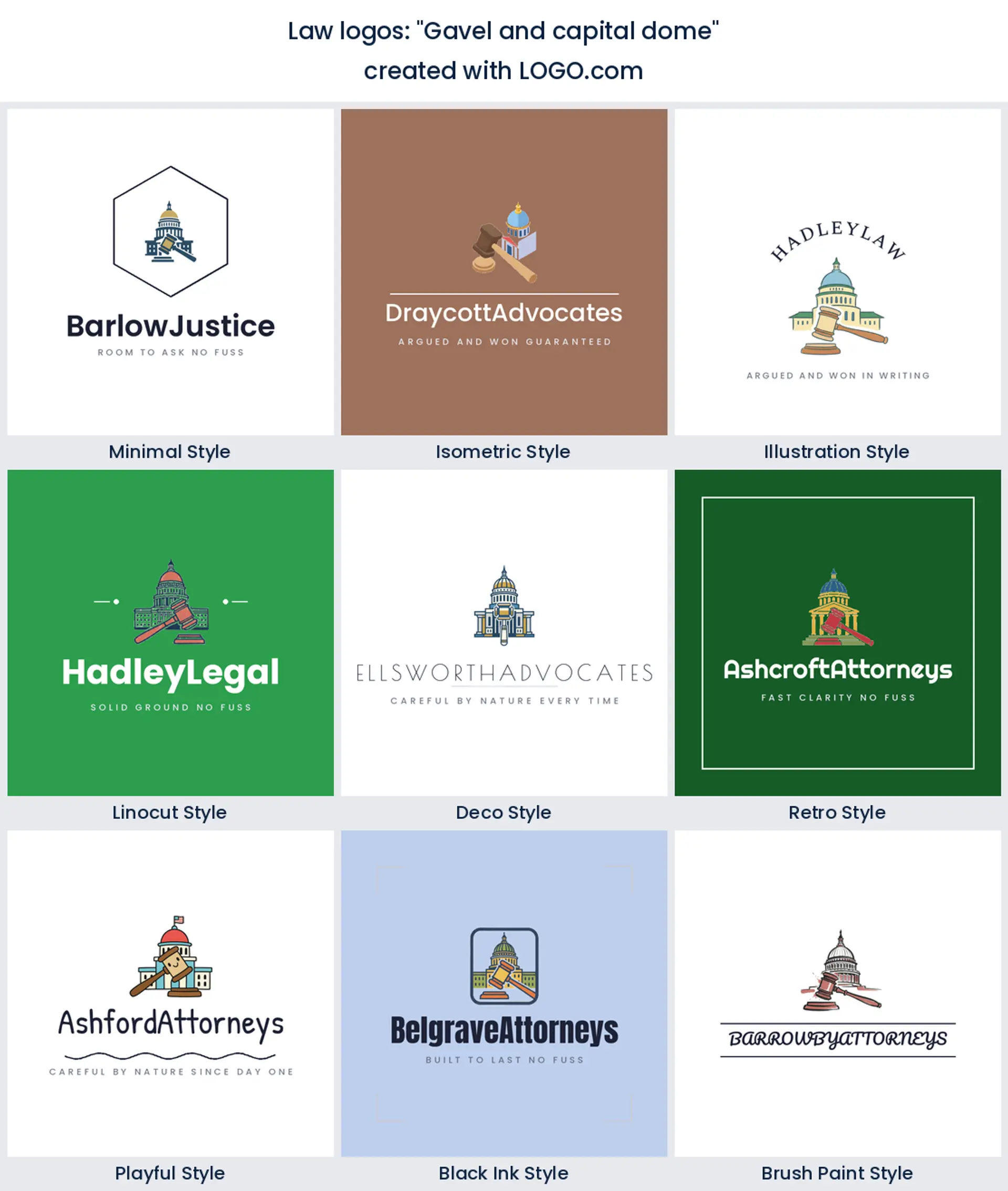
14. "Gavel and capital dome"
The dome pulls you toward legislation rather than litigation. It is the right prompt for a lobbying, policy or government relations logo, and one to avoid if you never go near a statehouse.
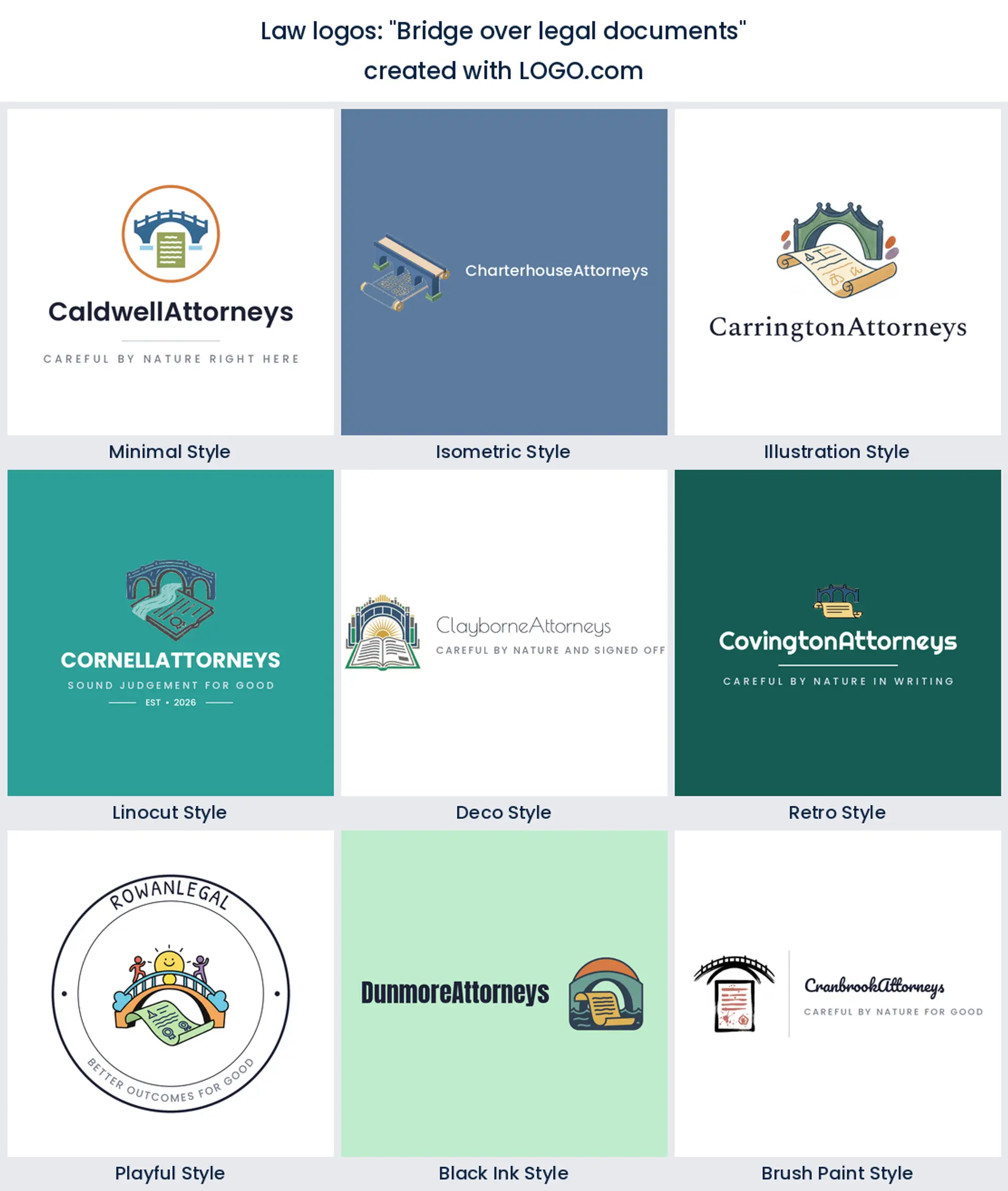
15. "Bridge over legal documents"
A bridge over paperwork is the gentlest idea in the set. It suits mediation, immigration and cross border work, where the job is getting somebody from one side to the other, so it makes a warm immigration lawyer logo.
Trading under your own name, and what a mark adds
Plenty of lawyers practice under a surname and nothing else, and that holds up right until the name has to fit somewhere small. A round avatar. A favicon. A stamp in the footer of a filing. A directory listing where every entry is set in the same grey type. Put a symbol beside your name and you have something that survives all of those, and something a client recognises before they can read anything. If the practice is you, keep the mark quiet and let the surname carry the weight. That is really the whole job of a law office logo for a solo practice, and it is why our fifteen prompts lean on one clear shape rather than a busy scene.
The scales problem, and three ways around it
You already know the honest answer. A scales of justice logo is the single most recognisable thing you can put above your name, and it is also the thing your nearest competitor probably has. The way out is not to abandon it, it is to draw it three degrees off centre. Tilt the beam so it is settling rather than settled. Reduce the pans to two plain dots on a line. Or cut the whole thing back to one balanced stroke and let the type carry the tone. Clients still search for a justice logo when they picture legal work, so keeping part of that vocabulary is a real advantage. Drop it completely and you gain originality, but you spend the first three seconds of every introduction explaining what your mark is.
Old world crest or modern wordmark?
This is the fork most legal logo design ends up at. A crest, a ring of text and a founding year buy you age, which counts for a lot when somebody is handing you a problem that frightens them. A clean wordmark with one small symbol buys you approachability, and it holds up far better on a phone. Our own color numbers point the same way as the rest of the category. Across the legal brands built on LOGO.com, blue is the most chosen non neutral hue, with green second, sitting over white and black bases. So if you want the traditional read without the fuss, a deep blue wordmark with a small mark beside it gets you most of the way there, and it is much easier to work with than a crest once you get to law logo design for a website header or a signature block.
Legal services, notaries and mediators need a mark too
Not every legal brand is a firm. Notaries, paralegals, apostille services, mediators, process servers and legal software all turn up in this data, and every one of them has to look credible without claiming to be something it is not. Lean away from the gavel, which promises a courtroom you may never set foot in, and toward the document, the wax seal, the handshake or the speech bubble. A legal services logo built on those reads as useful and precise, where a legal firm logo built on columns and crests would quietly over promise. If you sell advice by subscription or handle documents at volume, the friendlier end of this page is where to start.
Make your lawyer logo with LOGO.com
Type your practice name, pick a symbol from the nine above or borrow one of the fifteen prompts, then choose a style and push the color and the type around until it looks like you. Designing and previewing costs nothing, and every download includes four high resolution PNG files with full commercial use, so your mark can be on your letterhead and your website today without paying anything. When you need vector files for a nameplate, a window or a printed sign, the Brand Plan adds those along with unlimited edits and a brand kit. Whether this is lawyer logo design for a practice you opened last week or a refresh of one that has been on the door for years, it takes minutes rather than weeks.
Methodology. We read the 458 icon descriptions written on LOGO.com in the 24 months to August 2026 that name a law or justice symbol, grouped them into nine concepts, and ranked the concepts by how often each one appeared. Scales of justice led at about 71 percent, the gavel followed at about 39 percent, and legal documents took about 8 percent. Over the same window 411 founders chose a law, legal or attorney industry on LOGO.com. Source: LOGO.com first party product data, August 2026.
THE #1 LOGO GENERATOR
Why LOGO.com is the best lawyer logo maker
1.Every symbol here came from a real prompt
Nothing on this page was invented for a mood board. The nine ranked marks and the fifteen ideas come straight out of 458 icon descriptions legal founders typed into LOGO.com.
2.Ready before your first client meeting
Enter the practice name, pick a mark, and you have a logo you can drop onto an engagement letter the same afternoon.
3.Legible in a directory listing and an email footer
Your mark holds its shape cropped into a round avatar and shrunk beside a phone number, which is where most clients meet it first.
4.Nine styles, from carved crest to clean sans
See the same scales as a linocut seal, an isometric block, a brush stroke and a plain modern wordmark before you decide how traditional you want to look.
5.A transparent file for letterhead and filings
Download a background free PNG that drops onto a white letterhead, a covering letter or a PDF cover with no box around it.
6.Your surname set the way a practice sets it
Pair a short mark with a full name lockup, so the same brand works for Halstead Law on a window and plain Halstead in a signature.
7.Color choices grounded in what lawyers pick
Blue is the most chosen non neutral hue across the legal brands built here, with green next, so the presets start where the category already sits.
8.Scales without the stock clip art look
Each icon is generated for your brand rather than pulled from a shared library, so a scales of justice logo made here does not turn up on a rival site next month.
9.Free to design, yours to sell with
Four high resolution PNG files download free with full commercial use. The Brand Plan is the paid step, and it adds vector files for signage and merchandise plus unlimited edits and a brand kit.
Lawyer Logo Maker FAQs
Need Inspiration? See example brands in your industry...
3D3D DesignAbstractAcademic EducationAcademic WritingAccessoriesAccommodationAccountantAdventure TourismAdvertising AgencyAerospace EngineeringAestheticsAffordableAgricultural ConsultingAgricultureAgriculture BlogAgriculture CompanyAirplaneAlternative MedicineAmazonAnimalAnimal BlogAnimal ProtectionAnimal and PetsAnimalsAnimationAnime Logo MakerApartmentApp DevelopmentApplicationAppraisal ServicesAquacultureArchitectureAriesAromatherapyArrowArtArt and DesignArtificial IntelligenceArtistArtsArts & CraftsArts EducationAsian RestaurantAssociationAstrologyAthleticsAttorney FirmAudio ServicesAudio Technician