


Logo Design Considerations for a London Business
According to LOGO.com data, the five most popular colors in logos with London in their names created on LOGO.com over the past 12 months were white at 26%, black at 18%, green at 11%, yellow at 10%, and blue at 9%. White and black make up 44% of the choices, offering a crisp, high contrast start, while green, yellow, and blue bring a sense of growth, warmth, and steady confidence that suits a city connected to both heritage and new ideas. For a London logo that needs to work on a storefront, a travel listing, or a small social icon, begin with a white or black base and let one accent color make the name easy to recognize.
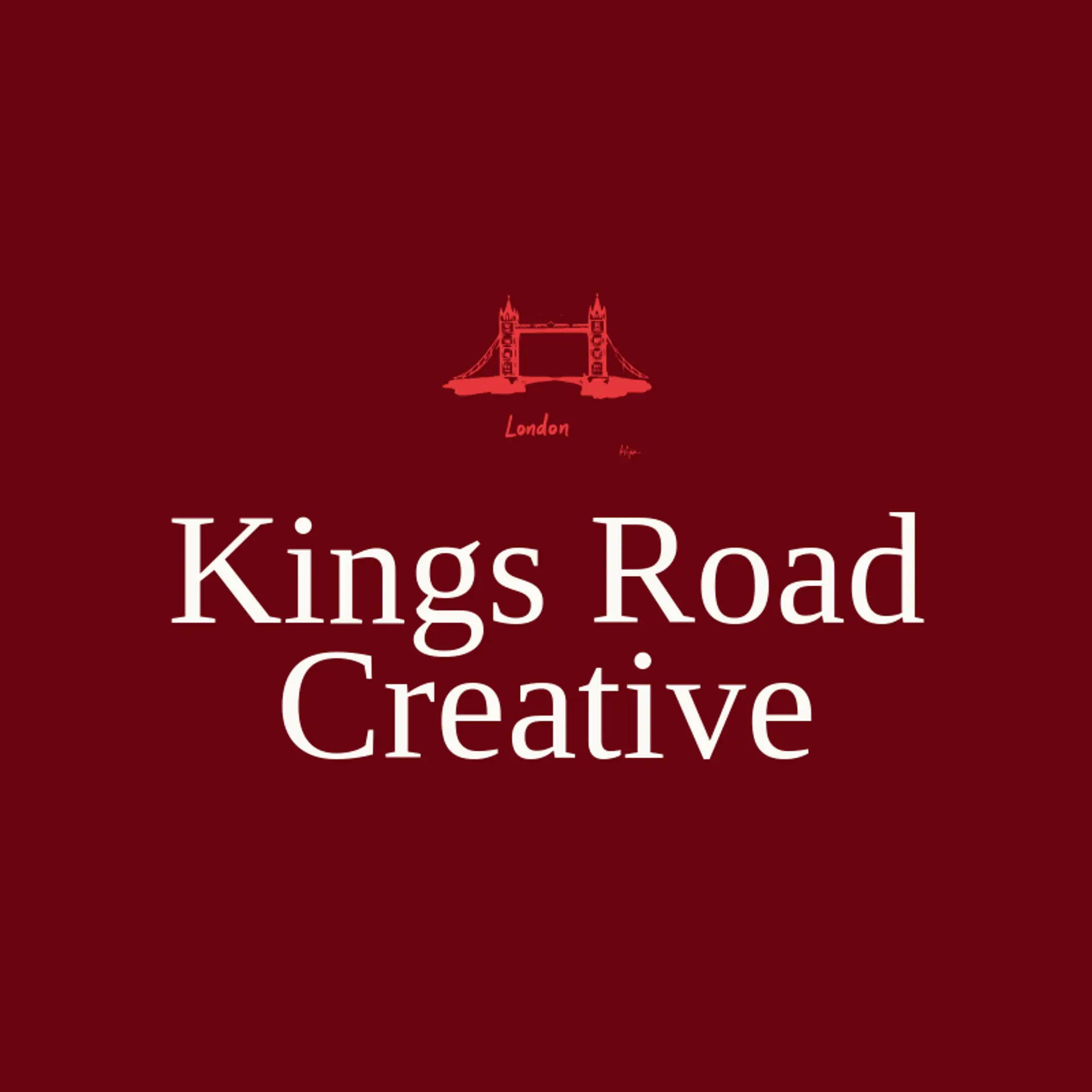
For the icon, the Thames can become a flowing line that curves beneath a wordmark or winds through a simple city outline. Tower Bridge offers a recognizable pair of towers and a central span that can frame a monogram, while a clock face inspired by the city skyline can give a mark a sense of time and place. A black cab, a red bus, or a post box can supply a compact everyday symbol, especially when reduced to a clear silhouette. For a more contemporary direction, combine a roofline with a river bend, a small crown shape with a neighborhood street, or a circular map marker with a familiar bridge profile. Before settling on a motif, consider which part of London the business calls home and turn that local detail into a simple shape that remains clear at small sizes.
Icons To Make Your London Logo Stand Out
That same focus on clarity carries into the lettering. According to LOGO.com data, sans serif typefaces made up 61% of the font choices in those same logos with London in their names over the past 12 months, followed by serif styles at 24%, display at 9%, and handwriting at 6%. The favorites include Geologica at 12%, Afacad at 7%, Schibsted Grotesk at 5%, Open Sans at 5%, and Prata at 5%. Set clear letterforms against a white or black base with one green, yellow, or blue accent, so a London logo stays readable on a shop sign, a guide, or a phone screen.
London Logo Ideas FAQs
Browse Related Logo Ideas
Africa logosAlabama logosArizona logosArkansas logosAthens logosCalifornia logosDallas logosEurope logosFlorida logosGeorgia logosHawaii logosIllinois logosIowa logosJapan logosKentucky logosLas Vegas logosLos Angeles logosMexico logosMiami logosMichigan logosMissouri logosNebraska logosNew York logosNorth Carolina logosRome logosTennessee logosWisconsin logosCanada logosUtah logosWashington logosAtlas logosIdaho logosInternational logosMaryland logosMinnesota logosNetherlands logosNew orleans logosOutback logosSpain logosAlaska logosAussie logosAustralia logosChina logosDubai logosExplorer logosFrance logosGateway logosGermany logosHawaiian logosIndia logos