












Logo Design Considerations for a Rome Business
According to LOGO.com data, the five most common colors in logos with rome in their names over the past 12 months were white at 26%, black at 18%, blue at 12%, grey at 8%, and yellow at 8%. White and black together account for 44% of the measured color choices, giving Rome inspired identities a strong, high contrast base, while blue, grey, and yellow can bring in the sky, stone, and warm light of the city. For a Rome logo that works across storefronts, signage, and social profiles, start with white or black and add one of these accents to keep the name clear and memorable.
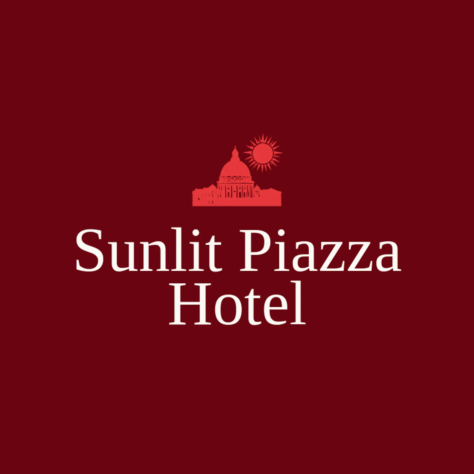
For the icon, the Colosseum is an immediate Rome reference, and its arches can form a simple silhouette that stays clear at small sizes. A laurel branch is a familiar symbol of victory and history, so it can sit beside a monogram or curve above a wordmark. Roman columns and domes offer strong architectural shapes, while a small globe or compass can connect the city to travel and hospitality brands. For food and neighborhood businesses, pair a simple outline of the city skyline with a fork, cup, or market leaf, keeping the Rome landmark and second detail side by side. Before settling on a direction, choose a detail tied to the owner's own story, such as a district, a fountain, a bridge, or the route that brought the business to Rome.
Icons To Make Your Rome Logo Stand Out
That same balance of contrast carries into the lettering. According to LOGO.com data, sans serif typefaces accounted for 60% of font category choices among logos with rome in their names over the past 12 months, followed by display at 21%, serif at 13%, and handwriting at 5%. The most used individual fonts were Geologica at 11%, Open Sans at 7%, Schibsted Grotesk at 6%, Afacad Flux at 4%, and Prata at 3%. Pair an easy to read sans serif with a distinctive display or serif accent against a clean white or black base to suggest Rome's mix of ancient character and modern city life.
Rome Logo Ideas FAQs
Browse Related Logo Ideas
Africa logosAlabama logosArizona logosArkansas logosAthens logosCalifornia logosDallas logosEurope logosFlorida logosGeorgia logosHawaii logosIllinois logosIowa logosJapan logosKentucky logosLas Vegas logosLos Angeles logosMexico logosMiami logosMichigan logosMissouri logosNebraska logosNew York logosNorth Carolina logosRome logosTennessee logosWisconsin logosCanada logosUtah logosWashington logosAtlas logosIdaho logosInternational logosMaryland logosMinnesota logosNetherlands logosNew orleans logosOutback logosSpain logos