







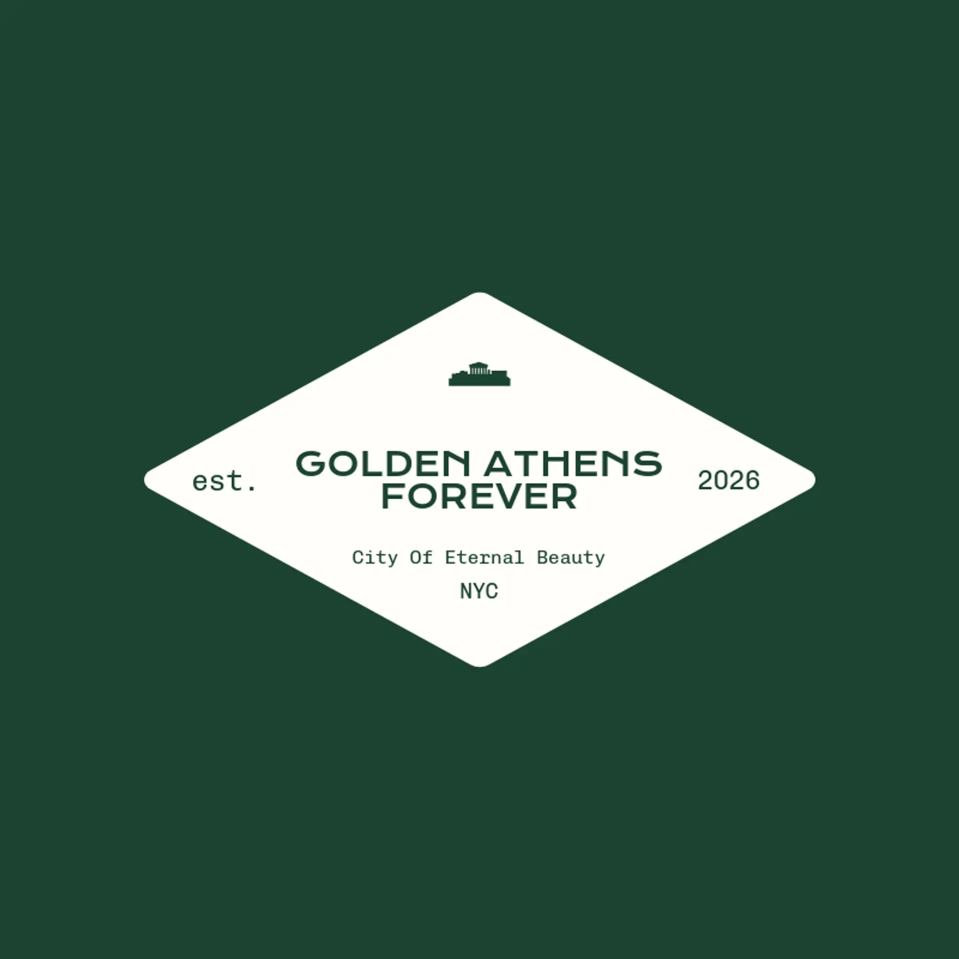
Logo Design Considerations for a Athens Business
According to LOGO.com data, the five most popular colors in Athens logos created on LOGO.com over the past 12 months were black at 23%, white at 23%, blue at 11%, green at 11%, and yellow at 9%. Nearly half of all color choices went to black or white, a natural echo of marble columns and ancient stone against the bright Greek sky, while blue, green, and yellow add the Mediterranean warmth the city is known for. If you want an Athens logo that feels at home on signage, menus, and social profiles, start from a clean black or white base and let one of these accent colors carry the character.
When it comes to the icon, the Parthenon is the obvious starting point, and it earns its popularity: those columns and pediment lines are recognizable even cropped, flattened, or reduced to simple geometry, which makes them perfect raw material for negative space tricks like tucking a column into a letter or turning the temple into a rising silhouette for a heritage brand. The olive branch is the most underused symbol in the city, since its leaves can frame a wordmark, wrap a monogram, or stand alone as a mark of peace and victory. Action and place imagery brings energy that a static temple cannot, so sketch the owl of Athena in flight, a laurel wreath crowning a letter, or the Acropolis hill rising behind a wordmark, each one reading clearly at a distance. For hospitality and retail brands, pair the temple with an amphora or a wine cup, and for clubs and academies lean on a crest, a crown, or a shield that carries the ancient spirit. Before you settle, brainstorm around the owner's own story: a cafe can pour the Parthenon into a coffee cup, a tour company can perch it on a map pin, and a design studio can bounce it off a geometric skyline.
Icons To Make Your Athens Logo Stand Out
The same instinct for clean contrast carries into the lettering. According to LOGO.com data, sans serif typefaces made up 73% of the font choices in those same Athens logos over the past 12 months, with serif styles at 14%, display styles at 9%, and handwriting scripts at 5%. The favorites read like one city guide: Afacad, Afacad Flux, Geologica, Open Sans, and Outfit at 9% each, every one a crisp sans serif. Set in bold, simple letterforms against that black or white base with a single vivid accent, an Athens logo stays legible from the first glance to the last, whether it lands on a storefront, a tour banner, or a tiny social avatar.
Athens Logo Ideas FAQs
Browse Related Logo Ideas
Africa logosAlabama logosArizona logosArkansas logosAthens logosCalifornia logosDallas logosEurope logosFlorida logosGeorgia logosHawaii logosIllinois logosIowa logosJapan logosKentucky logosLas Vegas logosLos Angeles logosMexico logosMiami logosMichigan logosMissouri logosNebraska logosNew York logosNorth Carolina logosRome logosTennessee logosWisconsin logosCanada logosUtah logosWashington logosAtlas logosIdaho logosInternational logosMaryland logosMinnesota logosNetherlands logosNew orleans logosOutback logosSpain logos