




Logo Design Considerations for a Tribe Business
According to LOGO.com data, the five most common colors among logos with tribe in their wordmarks over the past 12 months were white at 25%, black at 20%, green at 13%, blue at 13%, and yellow at 7%. White and black together account for 45% of the color choices, giving a Tribe mark a clear, high contrast foundation, while green and blue add a grounded or welcoming note. For a community brand, start with white or black and use green, blue, or a small flash of yellow to help the name feel distinct across a website, event banner, and profile image.
For a Tribe logo built around community, begin with a gathering circle, the clearest sign of people coming together. A compass point or a connecting path can suggest shared direction, while joined hands or a meeting table gives the mark a feeling of mutual support. For a modern group, explore linked dots, a shared spark, or a constellation around a simple monogram; for an outdoor community, pair a mountain line with a campfire glow or a ring of trees. Keep the symbol abstract and original to the group instead of borrowing cultural marks, and choose one recognizable shape that reads clearly beside the name at small sizes.
Icons To Make Your Tribe Logo Stand Out
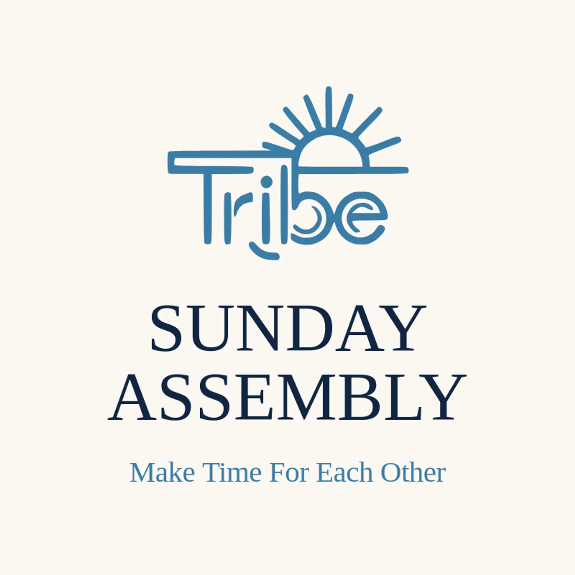
That same clear foundation can guide the lettering. According to LOGO.com data, sans serif styles accounted for 72% of font selections in logos with tribe in their wordmarks over the past 12 months, followed by display at 14%, serif at 9%, and handwriting at 6%. The leading typefaces were Geologica at 16%, Afacad at 9%, Schibsted Grotesk and Afacad Flux at 5% each, and Open Sans at 4%. Set a confident sans serif name over white or black, then bring in green or blue for warmth and contrast so the community feels easy to recognize from a group page to an event banner.
Tribe Logo Ideas FAQs
Browse Related Logo Ideas
Biology logosCare logosChess logosClub logosCommunity logosDaycare logosDriving school logosHand logosHeart logosHistory logosKindergarten logosPen logosPeople logosPride logosPrimary school logosSchool bus logosSports academy logosSTEM logosTeam logosUniversity logosAcademy logosBaby logosBook club logosCoaching logosLibrary logosSocial work logosTeacher logosTraining logosVolunteer logosProfile logosWoman logosClass logosMaze logosMission logosPerson logosChildcare logosGraduation logosMother logosResearch logosBabysitter logosDiversity logosEmpowerment logosFraternity logosFriend logosHumanity logosLearning logosSpecial education logosStudent logosTribe logosTutoring logos