






Logo Design Considerations for a Senior Business
According to LOGO.com data, the five most popular colors in logos with senior in their names created on LOGO.com over the past 12 months were white at 28%, blue at 15%, black at 14%, grey at 11%, and green at 10%. White and blue lead with a calm, clear feel, while black and grey add strong contrast and green brings a natural note. For a senior services, community, or wellness logo, try a bright white base with deep blue lettering and a measured green accent so the name stays welcoming and easy to read.
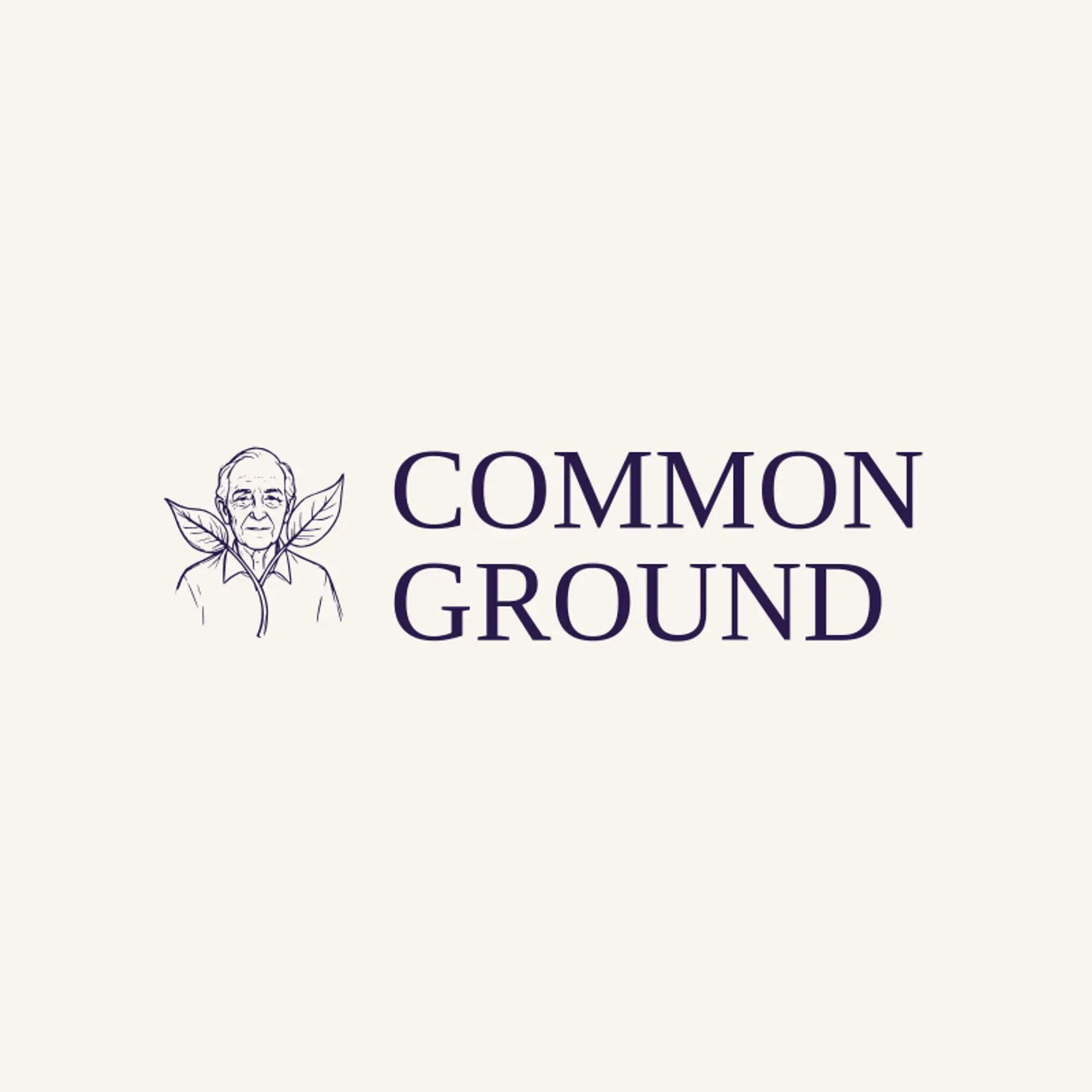
For a senior logo, start with a relaxed older adult profile paired beside a sunrise or a simple leaf, using a clear silhouette that feels capable and welcoming. A senior walking beside a companion can suggest friendship and everyday support, while two senior hands meeting beside a small sprout can express care and new possibilities. For a senior learning group, try a senior with an open book beside a small star; for an active community, show a senior stride with a light breeze line or a walking cane with a bright sun nearby. Keep faces and gestures warm rather than fragile, and let the icon work at small sizes on a door sign, program card, or community newsletter.
Icons To Make Your Senior Logo Stand Out
The same calm palette gives the lettering room to feel warm and clear. According to LOGO.com data, sans serif styles made up 66% of font choices in those same logos with senior in their names over the past 12 months, followed by serif at 13%, display at 12%, and handwriting at 6%. The leading individual fonts were Geologica at 21%, Open Sans at 11%, Schibsted Grotesk at 5%, Advent Pro at 2%, and Antic Didone at 2%. Pair Geologica or Open Sans with the white and blue colors above for a name that feels steady, readable, and welcoming across a sign, brochure, or phone screen.
Senior Logo Ideas FAQs
Browse Related Logo Ideas
Biology logosCare logosChess logosClub logosCommunity logosDaycare logosDriving school logosHand logosHeart logosHistory logosKindergarten logosPen logosPeople logosPride logosPrimary school logosSchool bus logosSports academy logosSTEM logosTeam logosUniversity logosAcademy logosBaby logosBook club logosCoaching logosLibrary logosSocial work logosTeacher logosTraining logosVolunteer logosProfile logosWoman logosClass logosMaze logosMission logosPerson logosChildcare logosGraduation logosMother logosResearch logosBabysitter logosDiversity logosEmpowerment logosFraternity logosFriend logosHumanity logosLearning logosSpecial education logosStudent logosTribe logosTutoring logos