6 Email Tips That Help Your Business Look Professional in Every Inbox
Sep 16, 2025

Sep 16, 2025
You’ve put time and care into building a brand that truly reflects your business—your logo, your colors, your voice.
But what happens when you hit “send” on an email? Does that message match the look and feel your customers see on your website or social media? Or does it feel like something completely different?
Email is one of the most common ways you connect with customers, leads, and collaborators. And every message you send, whether it’s a quick reply, a customer update, or a newsletter, is a chance to build trust (or accidentally lose it).
The good news? You don’t need fancy tools or a big design team to make your emails look polished and feel like part of your brand. With a few simple tweaks and the right tools, you can show up consistently and professionally every time you land in someone’s inbox.
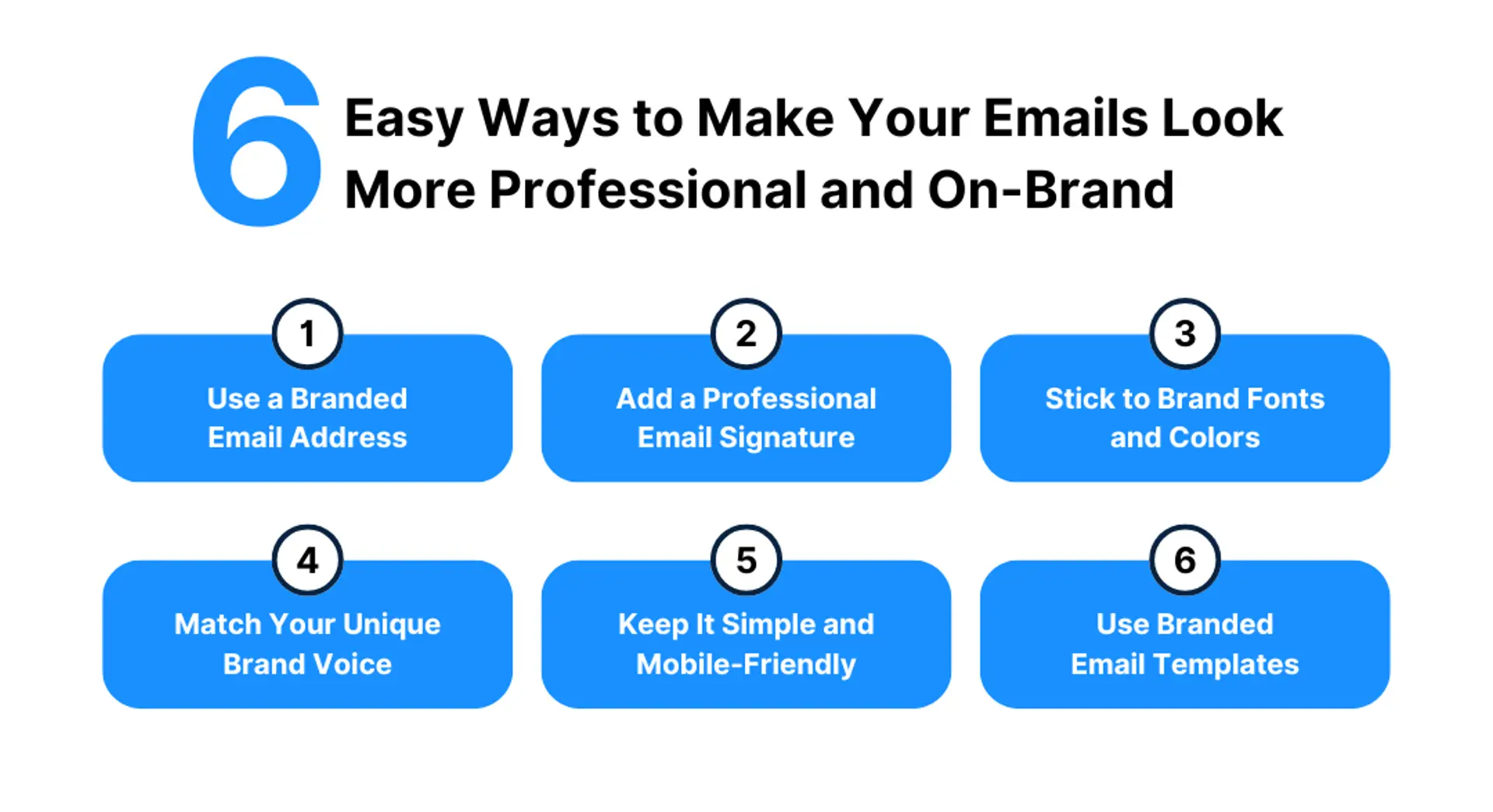
A custom-branded email address is a small change that makes a big impact. It helps you look more polished, keeps your brand front and center, and shows customers you mean business.
When your email address matches your domain name, it instantly communicates professionalism and builds credibility. It signals that your business is established, organized, and trustworthy—especially important if you’re reaching out to new leads or clients for the first time.
It also reinforces your brand name with every message you send. That kind of repetition helps people remember you and feel more confident engaging with your business.
2. Add a Professional Email Signature
Think of your email signature as a digital handshake. It’s the last thing people see and a simple way to make every message feel polished, consistent, and on-brand.
At a minimum, your signature should include your name, business name, logo, website, and social media links. This makes it easier for people to learn more about your business and reinforces your credibility with every email you send.
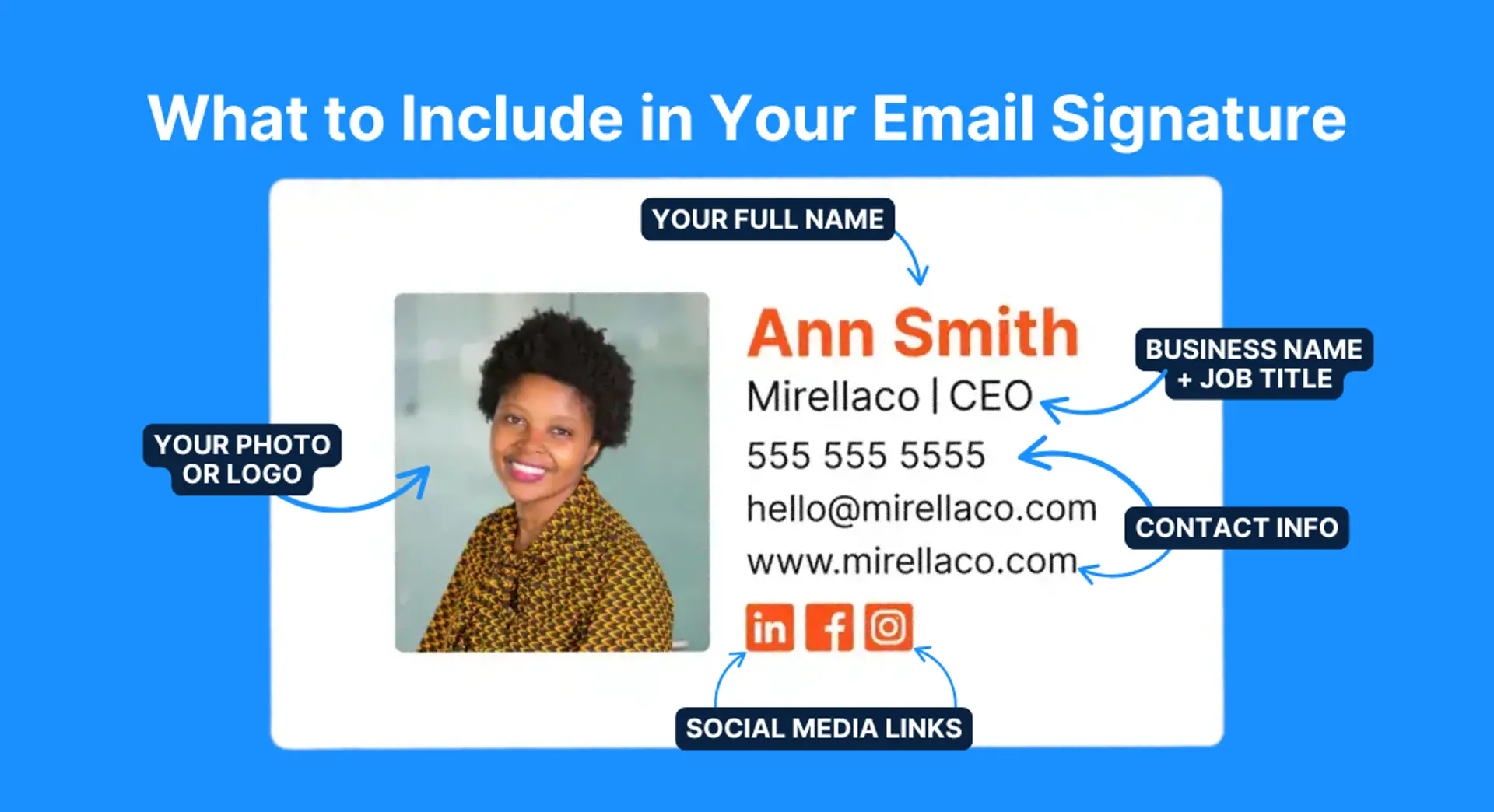
A professional signature also helps you look organized and consistent across your team, especially if multiple people are sending emails on behalf of your business. And when your branding is visible in every message, you’re building recognition over time, without any extra effort.
Need a quick way to create one? LOGO.com’s Email Signature Maker uses your logo, brand colors, and info to build a clean, professional signature in just a few clicks—no design experience needed.
The fonts and colors you use in email should match the rest of your branding. Stick to one or two fonts, use your brand colors for headings or buttons, and keep your text easy to read. This kind of visual consistency helps people instantly recognize your business, and makes your emails look more thoughtful and put-together.
Your emails should sound like you. Whether your brand voice is friendly and casual or polished and professional, consistency is key.
If your website and social media use warm, conversational language, your emails should feel the same. Use familiar phrases, contractions, and a friendly tone to make your audience feel like they’re hearing from a real person, not a script. On the other hand, if your brand leans more expert-driven or formal, your emails should still feel human but maintain that clarity, structure, and authority your audience expects.
Matching your tone builds trust over time. It helps your audience recognize your messages at a glance and creates a more cohesive brand experience across every touchpoint—whether someone first finds you through your Instagram, your homepage, or their inbox.
Tip: If you’re not sure what your brand voice is, read your website’s homepage or “About” section out loud. That’s the tone your emails should echo.
Most people open emails on their phones, so if your message isn’t easy to read on a small screen, it might not get read at all.
Keep things clean and easy to skim. Use short paragraphs, clear headings, and one main call-to-action so readers aren’t overwhelmed or unsure what to do next. Avoid clutter or multiple competing messages; simplicity makes your content more effective.
Formatting matters, too. Use single-column layouts, avoid oversized images, and make sure your buttons are big enough to tap on a touchscreen.
Before you send, take a moment to preview your email on mobile. You might catch spacing issues, broken formatting, or long subject lines that get cut off. A quick check now can mean a much better impression later.
If you find yourself sending the same types of emails, like appointment reminders, product updates, or newsletters, it’s worth creating a few go-to templates that reflect your brand.
Templates save you time, but they also help you show up consistently. Add your logo, use your brand colors for headers and buttons, and stick to a layout that’s easy to follow. When your emails have a familiar structure and style, it reinforces your professionalism and makes your messages instantly recognizable.
This is especially helpful if more than one person on your team is sending emails. Having a set of branded templates ensures that every message, no matter who it’s from, feels cohesive and on-brand.
Most email marketing platforms let you save and reuse templates, so once you’ve built them, they’re easy to update and personalize without starting from scratch.
It’s easy to get close to your own work, and even easier to miss small details that might feel off-brand to your audience. Here’s how to make sure your emails stay aligned with the rest of your branding.
When you glance at your email—logo, colors, tone, and layout—does it align with your brand identity, or could it have come from anyone?
Every email should reinforce what you do and what makes you different. Ask yourself: Is that clear, or is it missing?
Consistency builds trust. If you’re using playful colors and casual language on Instagram but send emails that are plain and overly formal, there’s a disconnect your audience might notice, even if it’s subtle.
Whether your brand is friendly, expert-driven, warm, or witty, your emails should reflect that same personality.
Sometimes, a fresh set of eyes can spot what you’ve missed.
Try this: Forward a test email to a trusted friend, colleague, or even your own inbox. Then ask:
“If you didn’t know me or my business, what would this message tell you about it?”
This outside perspective can reveal gaps in your branding or give you the confirmation you need that you're on the right track.
Want a quick way to stay consistent across every message? Try creating a simple brand checklist to review before sending emails.
Include things like:
Running through this list before you send an email takes just a minute and helps build the kind of brand trust that keeps customers coming back.
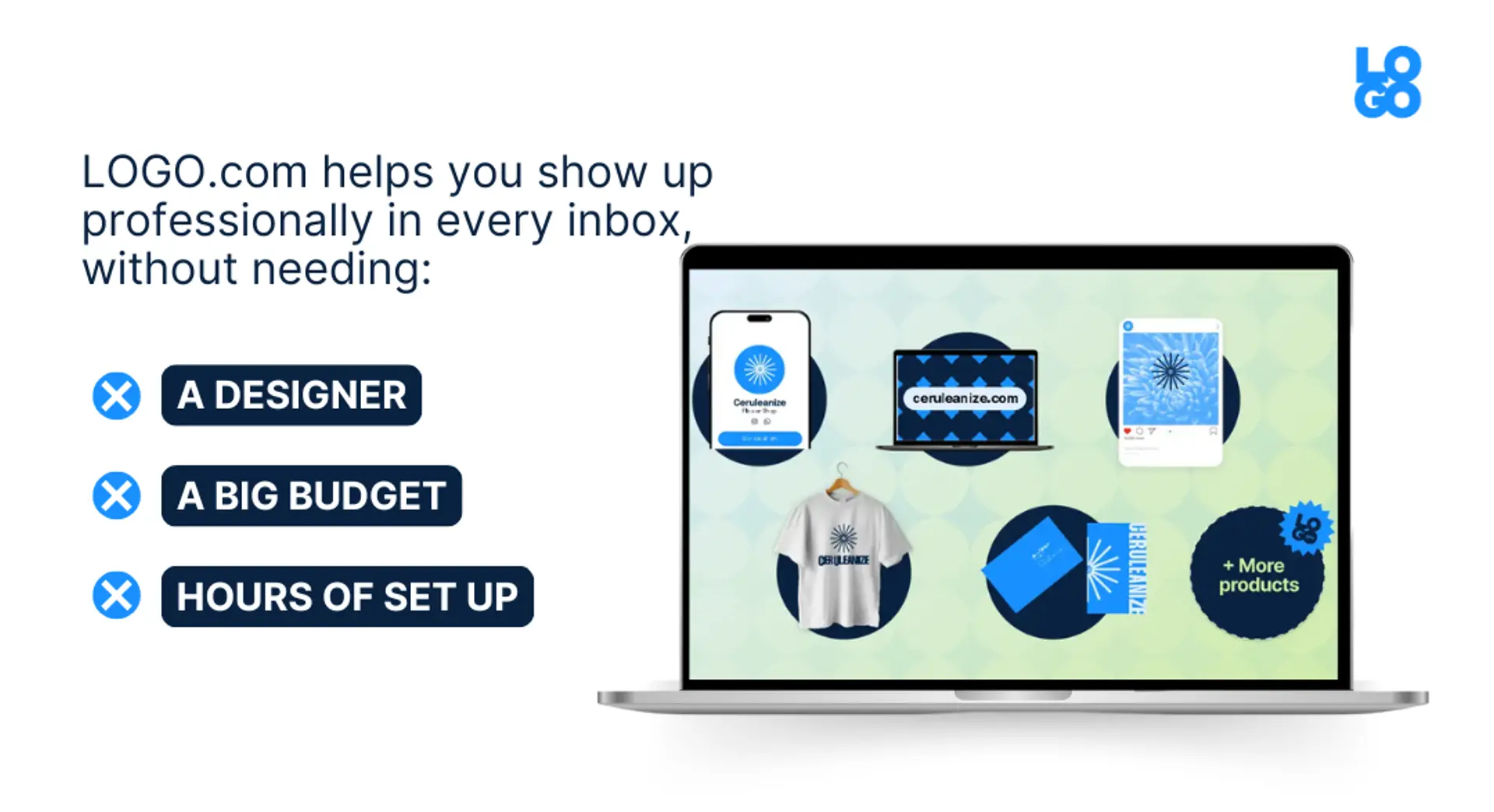
When you’re running a business, your time is limited, and design might not be your thing.
But that’s okay! LOGO.com is built to help you show up professionally in every inbox, without needing a full creative team or hours of setup.
Here’s how:
Your logo sets the tone for your entire brand, including your emails. With LOGO.com’s free logo maker, you can create a polished, professional logo in minutes.
It’s the starting point for your visual identity, and once it’s created, everything else—your colors, fonts, and brand kit—automatically falls into place.
Choosing colors doesn’t have to be stressful. Our built-in color palette generator makes it easy to find combinations that feel professional and on-brand. Whether you already have a color in mind or need inspiration, you’ll get designer-level results without needing a design degree.
No more digging through old files to find your logo or hex codes. Your brand kit lives in your LOGO.com dashboard and includes everything you need—logo files, brand colors, fonts, and more. It’s your go-to for setting up email templates, formatting headers, or adding brand touches to every message you send.
Think of your email signature as a digital business card. Our easy-to-use builder lets you create one that includes your name, title, logo, website, and social links. Every email you send becomes a chance to build trust and keep your branding consistent.
Need to direct email readers to your latest blog post, product, or social page? Instead of sending them all over the place, use your link in bio as one central hub. It’s a smart addition to your email footer, helping you drive more clicks with less clutter.
Your email and website should feel like they come from the same place. When you build your site with LOGO.com x Wix, your logo, colors, and fonts are already integrated, making it easier to keep your online presence consistent across platforms.
Choosing a domain name is one of the first steps in looking professional online. LOGO.com’s AI-powered domain tool helps you generate name ideas based on your business and instantly check what’s available. It’s fast, simple, and tailored to small business needs.
A custom email address makes a huge difference in the way customers see your business. LOGO.com partners with Titan to offer reliable, small-business-friendly email on your domain. It only takes a few minutes to set up, and it works seamlessly across devices, so you can stay connected and look professional wherever you are.
You don’t need to be a designer (or have a big marketing team) to send emails that feel thoughtful, consistent, and on-brand.
With a few simple tweaks and the right tools, every message you send can build trust and leave a lasting impression. LOGO.com is here to help you show up with confidence, so your emails look as professional as the business behind them.

Feb 24, 2026 by: Emily Harper

Jan 12, 2026 by: Emily Harper

Nov 25, 2025 by: Emily Harper

Oct 28, 2025 by: Emily Harper