











Logo Design Considerations for a Eclipse Business
According to LOGO.com data, the five most popular colors in eclipse logos created on LOGO.com over the past 12 months were white at 21%, black at 19%, blue at 11%, grey at 11%, and green at 8%. White and black together carry the moment's defining contrast, the bright face of the sun meeting the dark silhouette of the moon, while blue, grey, and green echo the cool atmosphere of a sky that dims during totality. If you want an eclipse logo that captures that thin moment of shadow, start from a clean white or black base and let one cool accent glow around the edge like the corona.
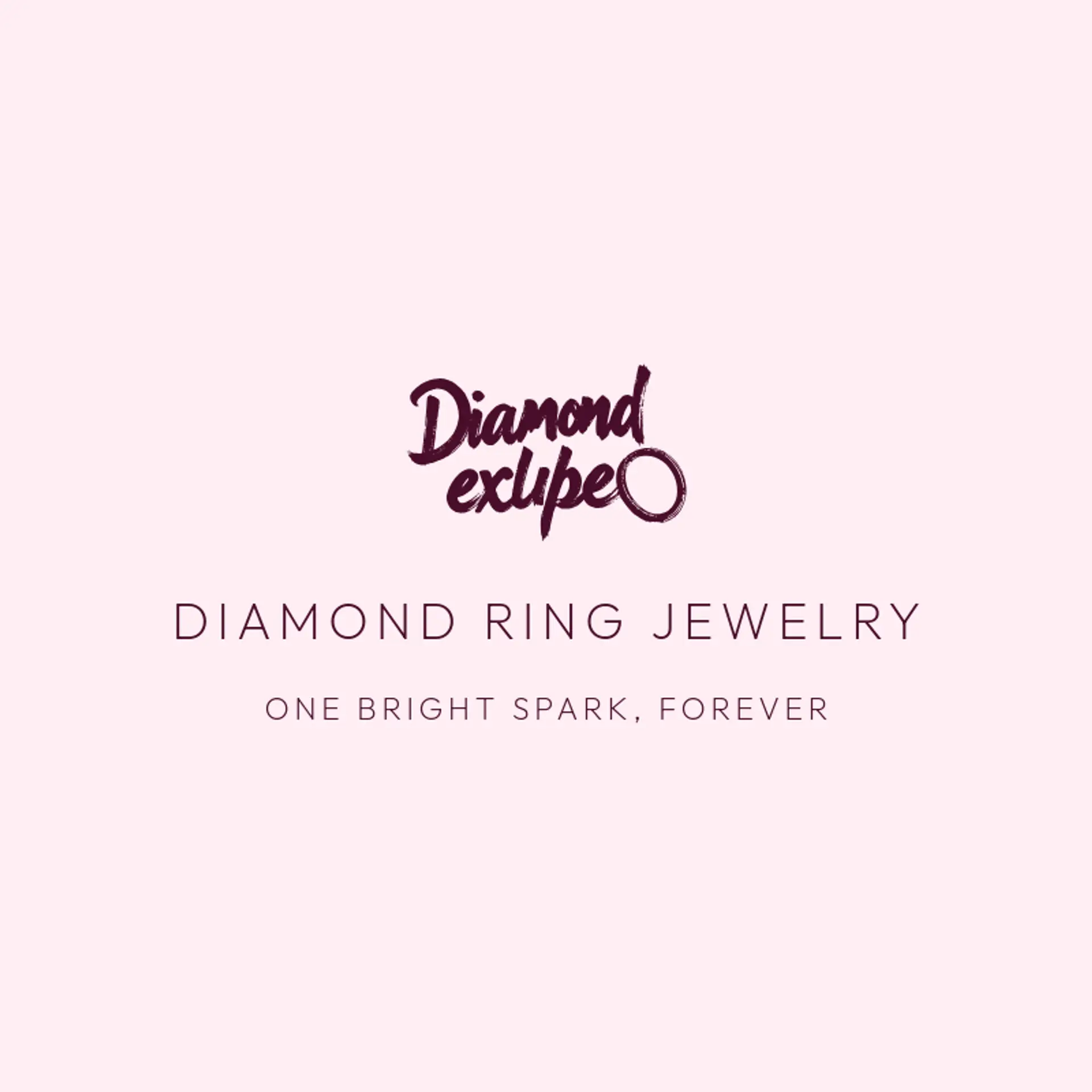
A total eclipse tells a thin story, but the sun and the moon make it unforgettable: a dark disk sliding across a bright face with a ring of corona light around it, and that ring works as the strongest icon of all, whether clean and gold, split in two, or tucked into the curve of a letter. The diamond ring effect is the underused gem, that single bright spark flaring off the edge of the moon, since one glowing point beside a dark circle reads instantly at small sizes and can sit behind a wordmark or frame a monogram. People and places give the mark its soul, so sketch an astronomer at a telescope, a viewer in paper glasses, or a city skyline falling into twilight shadow, each silhouette clear at a distance. For teams, clubs, or bands that live on the name, pair the sun and moon with a crest, a crescent, or a starfield, and for observatory and science brands pull in telescopes, orbits, or a rising band of sky. Before you settle, brainstorm around your own story: an observatory can crown the disk with its dome, a desert camp can hang it over dunes, and a coastal town can drop it into the sea's reflection.
Icons To Make Your Eclipse Logo Stand Out
The same instinct for clean contrast carries into the lettering. According to LOGO.com data, sans serif typefaces made up 63% of the font choices in those same eclipse logos over the past 12 months, with display styles at 20%, serif at 11%, and handwriting scripts at 6%. The favorites lean modern and geometric: Geologica at 8%, Aboreto and Afacad at 5% each, Bebas Neue at 4%, and Afacad Flux at 3%, every one clean edged and contemporary. Set in simple letterforms against that white or black base with a single cool accent, an eclipse logo keeps its gravity whether it lands on a science program, an astronomy club shirt, or a tiny social avatar.
Eclipse Logo Ideas FAQs
Browse Related Logo Ideas
Ace logosAnchor logosBullseye logosCactus logosCompass logosCyclone logosDairy farm logosEclipse logosFire logosFishing logosFleur de lis logosFlower logosFrost logosGlobe logosHexagon logosHiking logosHurricane logosInfinity logosLeaf logosLightning logosLotus logosMoon logosMountain logosNegative space logosPoultry farm logosRose logosSpace logosStar logosStorm logosSummit logosTree logosWater logosWave logosWood logosBeach logosClover logosConstellation logosFlame logosLight bulb logosLighthouse logosLightning bolt logosMushroom logosOrbit logosPalm tree logosRain logosShooting star logosSnow logosSpring logosStone logosSunset logos