
Logo Design Considerations for a Art Deco Business
According to LOGO.com data, the sample of logos with art deco in their names over the past 12 months is too small for reliable color percentages (%), so this palette guidance is editorial. Art Deco logos benefit from a dramatic base and a restrained metallic accent that feels polished across signage, packaging, and digital profiles. Deep navy, black, emerald, and warm cream can create the confident contrast associated with geometric architecture, while gold or brass adds a refined glimmer without overwhelming the mark. Choose a simple color structure with one strong jewel tone and a bright supporting shade so the angular forms remain clear at every size.
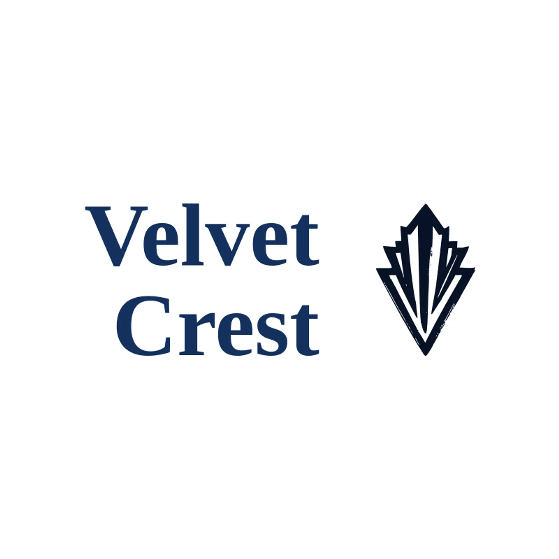
When it comes to the icon, a sunburst is an obvious starting point because its stepped rays instantly suggest Art Deco optimism and movement. Fan shapes, chevrons, diamonds, and stylized columns can add a recognizable geometric language beside a wordmark without making the symbol feel crowded. For hospitality and beauty brands, consider a peacock feather, a fountain, a gemstone, or a palm with clean repeated lines and a strong silhouette. A skyline, theater mask, or crane can give an event, architecture, or creative studio a more specific story while keeping the construction simple. Before settling on one direction, connect the icon to the setting: a coastal venue might use a fan and wave rhythm, while a city brand could build its identity around a stepped tower and starburst.
Icons To Make Your Art Deco Logo Stand Out
That same editorial balance of contrast should guide the lettering. According to LOGO.com data, the sample of logos with art deco in their names over the past 12 months is too small for reliable font percentages (%), so these lettering suggestions are editorial. A high contrast serif can bring period elegance to an Art Deco hotel or salon, while a geometric sans serif gives a gallery, studio, or modern event a sharper voice. Look for symmetrical letterforms, distinctive capitals, and spacing that preserves the rhythm of the design at small sizes. Pair ornate details with sturdy lettering so the name stays readable against the dark and jewel toned colors from the first paragraph.
Art Deco Logo Ideas FAQs
Browse Related Logo Ideas
Ace logosAnchor logosBullseye logosCactus logosCompass logosCyclone logosDairy farm logosEclipse logosFire logosFishing logosFleur de lis logosFlower logosFrost logosGlobe logosHexagon logosHiking logosHurricane logosInfinity logosLeaf logosLightning logosLotus logosMoon logosMountain logosNegative space logosPoultry farm logosRose logosSpace logosStar logosStorm logosSummit logosTree logosWater logosWave logosWood logosBeach logosClover logosConstellation logosFlame logosLight bulb logosLighthouse logosLightning bolt logosMushroom logosOrbit logosPalm tree logosRain logosShooting star logosSnow logosSpring logosStone logosSunset logos