
Logo Design Considerations for a Detective Business
According to LOGO.com data, the five most popular colors in detective logos created on LOGO.com over the past 12 months were white at 23%, black at 15%, blue at 13%, green at 13%, and grey at 9%. White and black together took nearly two fifths of all color choices, a fitting echo of the high contrast noir palette that detective stories live in, while blue, green, and grey add the cool, observant tones of night work and city streets. If you want a detective logo that feels at home on agency cards, case files, and social profiles, start from a clean white or black base and let one of these cooler accents carry the mystery.
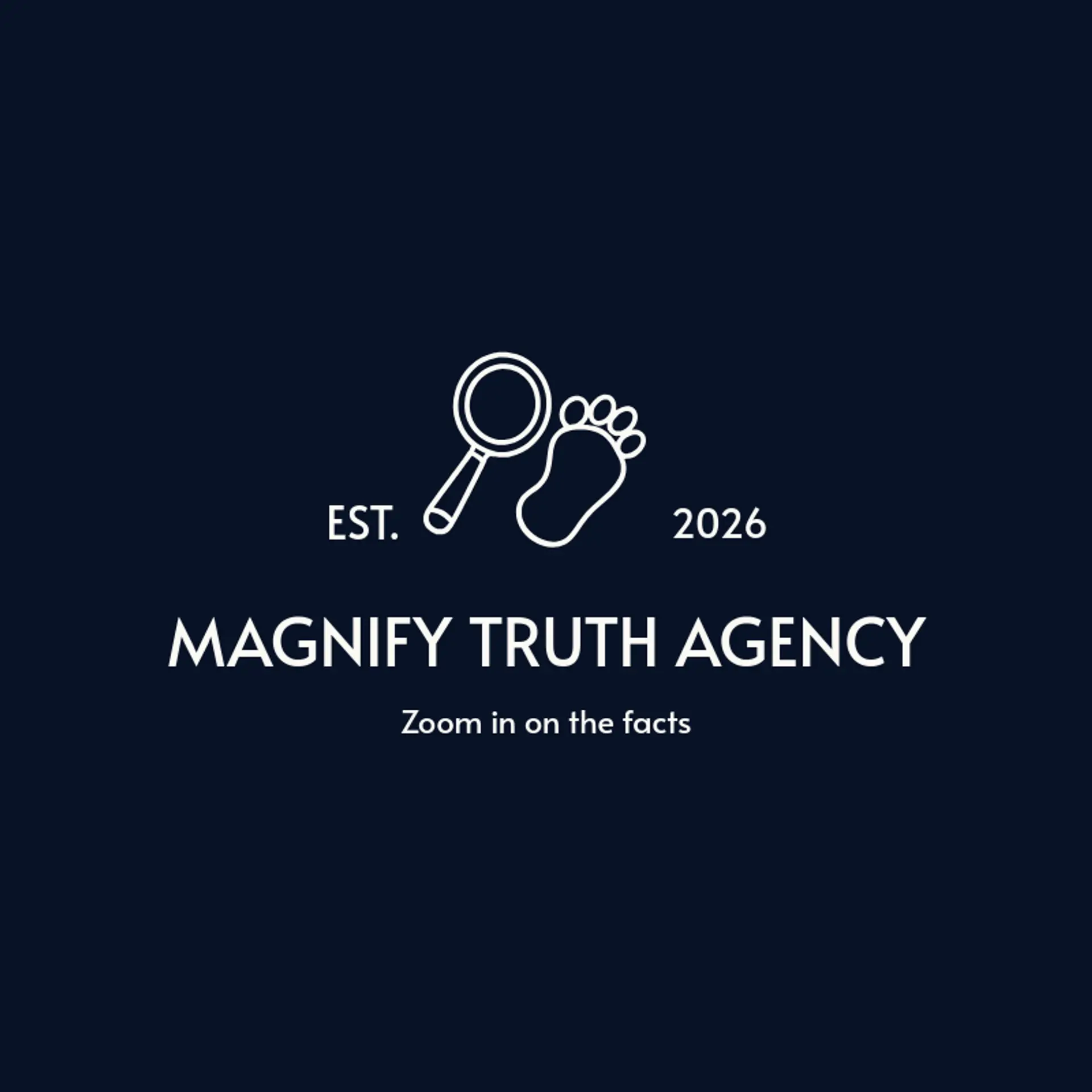
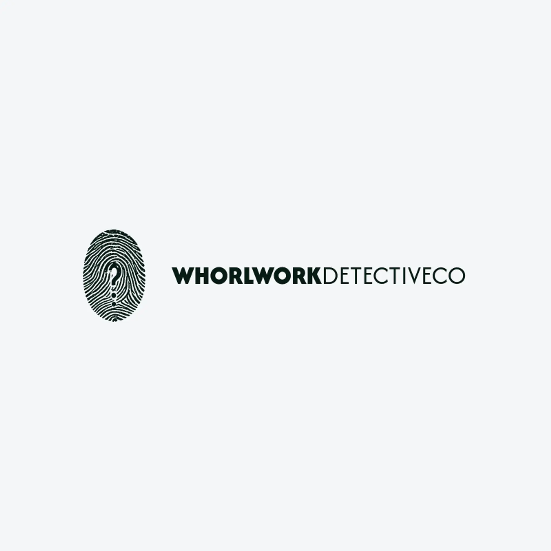
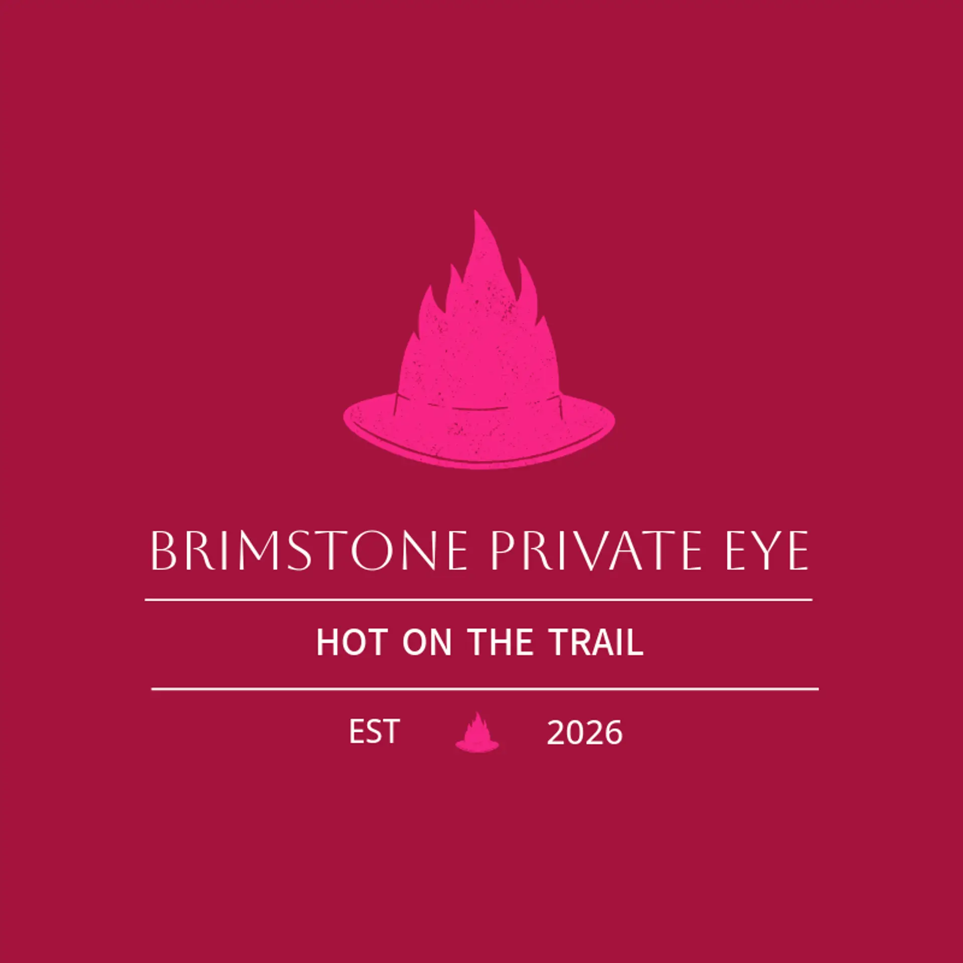
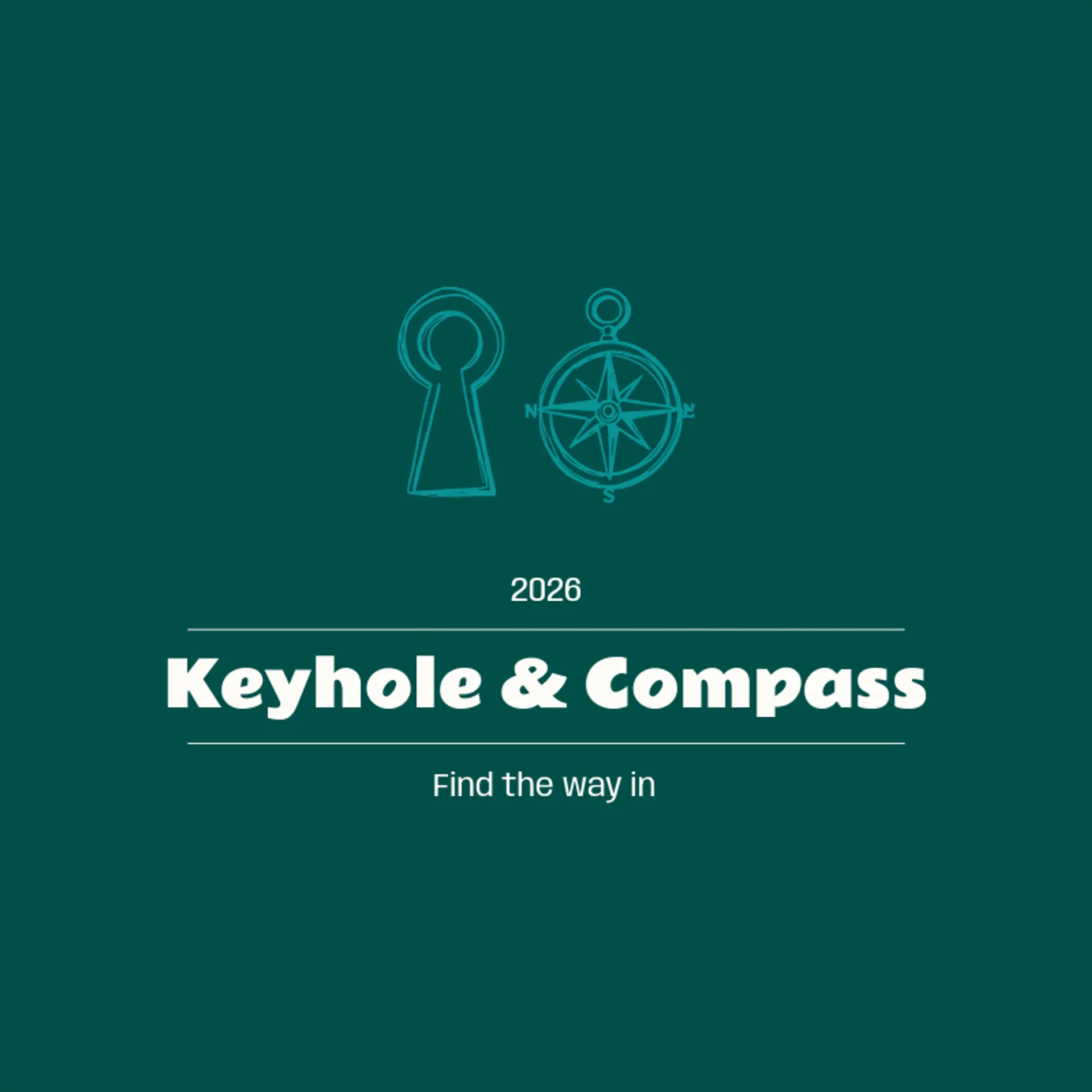
When it comes to the icon, the magnifying glass is the obvious starting point, and it earns its popularity: that round lens and handle read instantly even cropped or reduced to a few simple lines, which makes it perfect raw material for negative space tricks like hiding a fingerprint inside the lens or turning the handle into a question mark. The fingerprint is the most underused symbol in the trade, since its whorls can sit behind a wordmark, frame a monogram, or dissolve into a subtle texture for a modern forensic feel. Silhouettes bring drama that a static object cannot, so sketch a fedora and trench coat profile, a figure peering through a lens, or a hand holding a case file, each one reading clearly at a distance. For agency identities, pair the glass with a badge, a keyhole, or an emblem shape like a shield or a crest, and for private eye brands lean on city skylines, lampposts, and long shadows. Before you settle, brainstorm around your own story: a cold case specialist can crack an egg, a cyber sleuth can scan a circuit, and a missing persons firm can trace a dotted line across the map.
Icons To Make Your Detective Logo Stand Out
The same instinct for clean contrast carries into the lettering. According to LOGO.com data, sans serif typefaces made up 59% of the font choices in those same detective logos over the past 12 months, with serif styles at 28% and handwriting scripts at 7%. The favorites read like a case file: Open Sans and Outfit at 9% each, then Afacad, Geologica, and Schibsted Grotesk at 6% apiece, a mix of sturdy modern sans serifs and a touch of classic serif weight. Set in confident, readable letterforms against that white or black base with a cool accent, a detective logo stays sharp whether it appears on a business card, a storefront sign, or a tiny social avatar.
Detective Logo Ideas FAQs
Browse Related Logo Ideas
American logosCourt logosDetective logosEmpire logosFire department logosFirefighter logosFlag logosImmigration logosIndian flag logosJustice logosLaw firm logosLaw logosLaw office logosLawyer logosPolice logosSheriff logosShield logosVeteran owned logosLegal logosAmerican flag logosRanger logosSwiss logosUSA flag logosVote logosDemocracy logosFire station logosVeteran logosCrime logosFireman logosPyramid logosTactical logosTank logosGas mask logosJudge logosLandmark logosLegal services logosMilitia logosOfficial logosRescue logosSoldier logosVillage logosAir force logosAirforce logosArmy logosCoast guard logosRepublican logosVisa logosGuardian logosPatriot logosPost office logos