

Logo Design Considerations for a Court Business
According to LOGO.com data, the five most popular colors in court logos created on LOGO.com over the past 12 months were white at 24%, black at 16%, green at 14%, blue at 11%, and grey at 10%. White and black together made up 40% of all color choices, a natural echo of painted court lines and high contrast uniforms, while green, blue, and grey add the fresh energy of outdoor courts and team colors. If you want a court logo that feels at home on jerseys, banners, and social profiles, start from a clean white or black base and let one of these accent colors carry the personality.
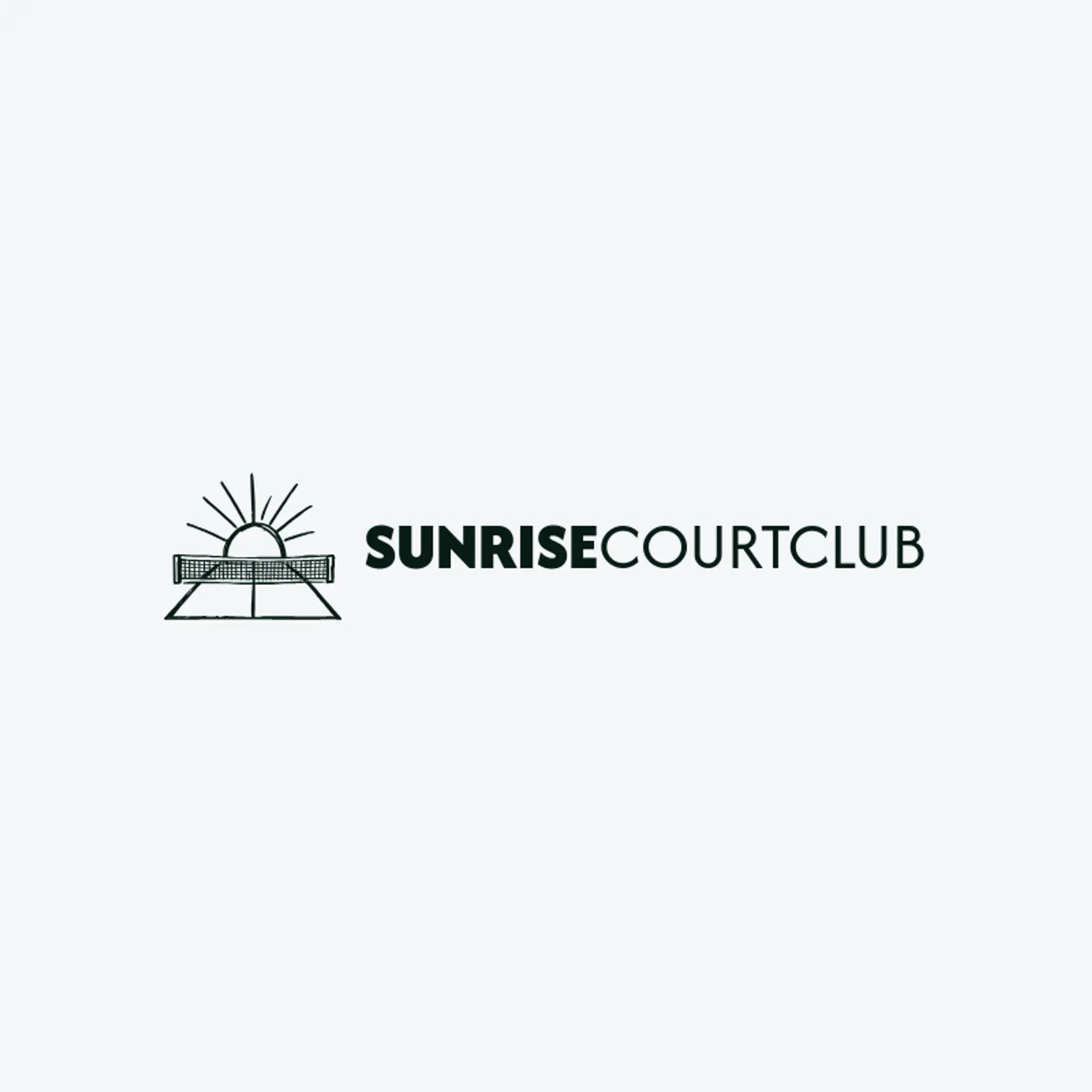
When it comes to the icon, the court itself is the obvious starting point, and it earns its popularity: those painted lines, the center circle, and the key are recognizable even cropped, flattened, or reduced to a few simple strokes, which makes them perfect raw material for negative space tricks like tucking a line into a letter or turning the center circle into a rising sun for an outdoor league. The net is the most underused symbol in court branding, since its grid can sit behind a wordmark, frame a monogram, or dissolve into pixels for a modern tech feel, while a ball can bounce beside the name for a playful touch. Action silhouettes bring energy that a static court cannot, so sketch a player driving to the hoop, a racket mid swing, or a serve at full extension, each one reading clearly at a distance. For team identities, pair the court with a mascot or an emblem shape like a crest or a shield, and for street leagues lean on city grids, chain link fences, and sunset backboards. Before you settle, brainstorm around your club's own story: a beach town can anchor the court in sand, a mountain league can perch it on a peak, and a city squad can bounce the ball off the skyline.
Icons To Make Your Court Logo Stand Out
The same instinct for clean contrast carries into the lettering. According to LOGO.com data, sans serif typefaces made up 61% of the font choices in those same court logos over the past 12 months, with display and serif styles at 17% each and handwriting scripts at 5%. The favorites read like a scoreboard: Geologica at 14%, Open Sans at 7%, Afacad at 5%, Schibsted Grotesk at 4%, and Aboreto at 3%. Set in bold, simple letterforms against that white or black base with a single vivid accent, a court logo stays legible from the first whistle to the final point, whether it lands on a jersey, a gym banner, or a tiny social avatar.
Court Logo Ideas FAQs
Browse Related Logo Ideas
American logosCourt logosDetective logosEmpire logosFire department logosFirefighter logosFlag logosImmigration logosIndian flag logosJustice logosLaw firm logosLaw logosLaw office logosLawyer logosPolice logosSheriff logosShield logosVeteran owned logosLegal logosAmerican flag logosRanger logosSwiss logosUSA flag logosVote logosDemocracy logosFire station logosVeteran logosCrime logosFireman logosPyramid logosTactical logosTank logosGas mask logosJudge logosLandmark logosLegal services logosMilitia logosOfficial logosRescue logosSoldier logosVillage logosAir force logosAirforce logosArmy logosCoast guard logosRepublican logosVisa logosGuardian logosPatriot logosPost office logos