

































Logo Design Considerations for a Tire Business
According to LOGO.com data, the five most popular colors in tire logos created on LOGO.com over the past 12 months were white at 25%, black at 18%, green at 11%, blue at 10%, and yellow at 9%. White and black create the high contrast associated with clean service bays and dependable road equipment, while green, blue, and yellow bring signals of trust, movement, and practical energy. If you want a tire logo that works on storefronts, service vans, uniforms, and social profiles, start with a crisp white or black base and let one bright accent carry the motion.
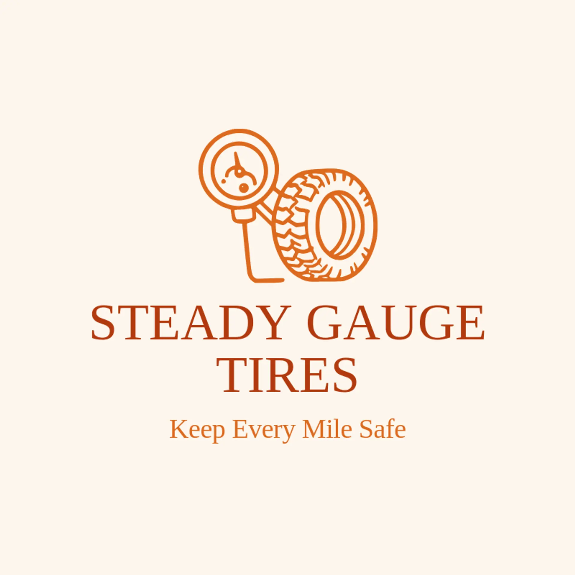
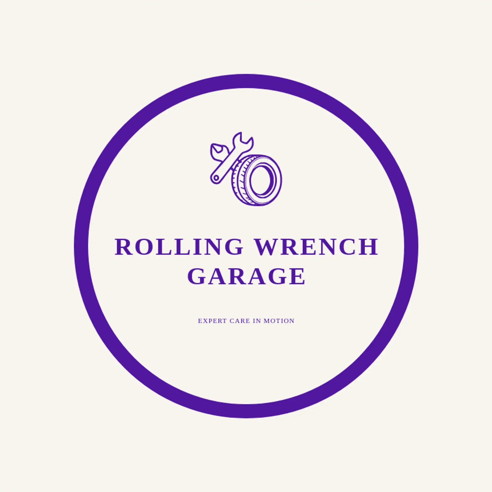
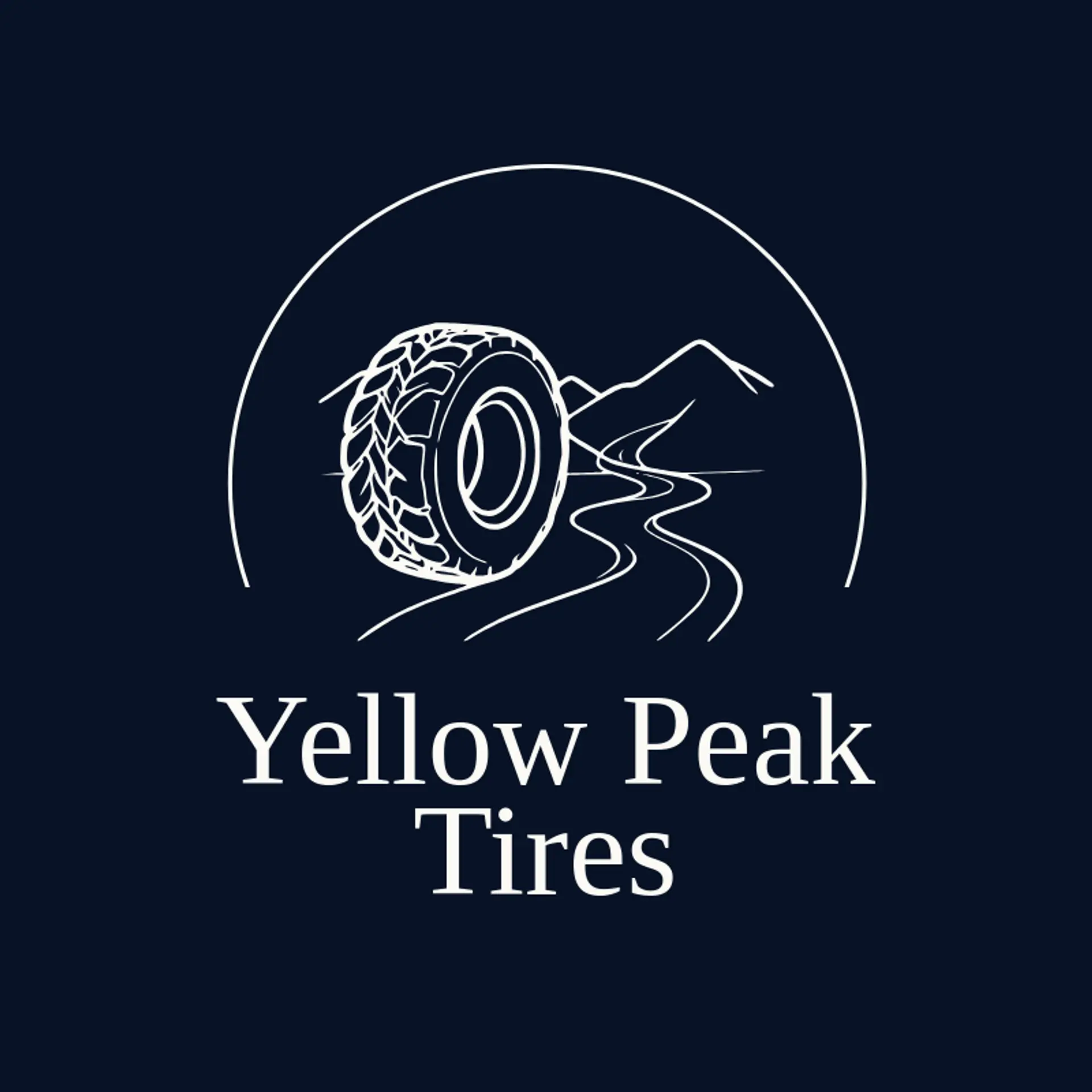
When it comes to the icon, a tire is the obvious starting point, and its circular tread already reads clearly at a small size, making it useful for twists like a rotating mark, a road curve beside it, or a spark that suggests fresh traction. A tread pattern is a more distinctive direction than a plain wheel, since its repeating blocks can become a compact rhythm behind a wordmark or a trail that points forward. Road imagery adds motion, so sketch a curved highway, a lane marker, a mountain road, or a clean speed line beside the tire rather than placing one subject inside another. For service brands, pair the tire with a wrench, a pressure gauge, a shield, or a small leaf to suggest care, reliability, or efficient driving. Before you settle, brainstorm around the shop's own story: a touring business can use a route curve, a racing brand can use a bold tread sweep, and a neighborhood garage can anchor the mark with a simple roadside sign shape.
Icons To Make Your Tire Logo Stand Out
That same balance of clarity and energy should guide the lettering. According to LOGO.com data, sans serif typefaces made up 51% of the font choices in those same tire logos over the past 12 months, with display styles at 22%, serif styles at 21%, and handwriting at 5%. The leading choices were Geologica at 8%, Schibsted Grotesk at 7%, Afacad at 5%, Afacad Flux at 3%, and Albert Sans at 3%, giving the field a practical mix of sturdy sans serif forms and expressive display options. Set bold, open letterforms against the strongest white or black contrast from the first paragraph, and the name will stay readable on a tire wall, a moving van, or a small service profile.
Tire Logo Ideas FAQs
Browse Related Logo Ideas
Airline logosAuto spa logosAutomotive logosAutomotive pick up logosAutomotive repair logosAutomotive truck logosBus logosCar detailing logosDetailing logosDispatcher logosDriver logosEngine logosKayak logosMotorcycle logosPetrol logosRailway logosTaxi logosTractor logosTrain logosTransport logosTruck logosTurbo logosBike logosCharger logosMetro logosPlane logosStreet logosTransportation logosTrucking company logosShipping logosAerospace logosAuto detailing logosDump truck logosElectric car logosFlight logosMobile detailing logosLogistics logosAirport logosCar dealership logosCar mechanic logosCar rental logosCargo logosRailroad logosTire logosAuto parts logosAutomobile logosAviator logosBox truck logosCar dealer logosCar repair logos