








Logo Design Considerations for a Design Business
Railroad logos benefit from a strong base color and one clear accent that feels dependable on locomotives, workwear, signage, and digital profiles. Deep navy, charcoal, and forest green can suggest heritage and engineering, while rust red, warm gold, or cream can bring in the character of rails, signals, and historic stations. Choose a combination with firm contrast so the mark stays recognizable on metal, painted surfaces, embroidery, and small screens.
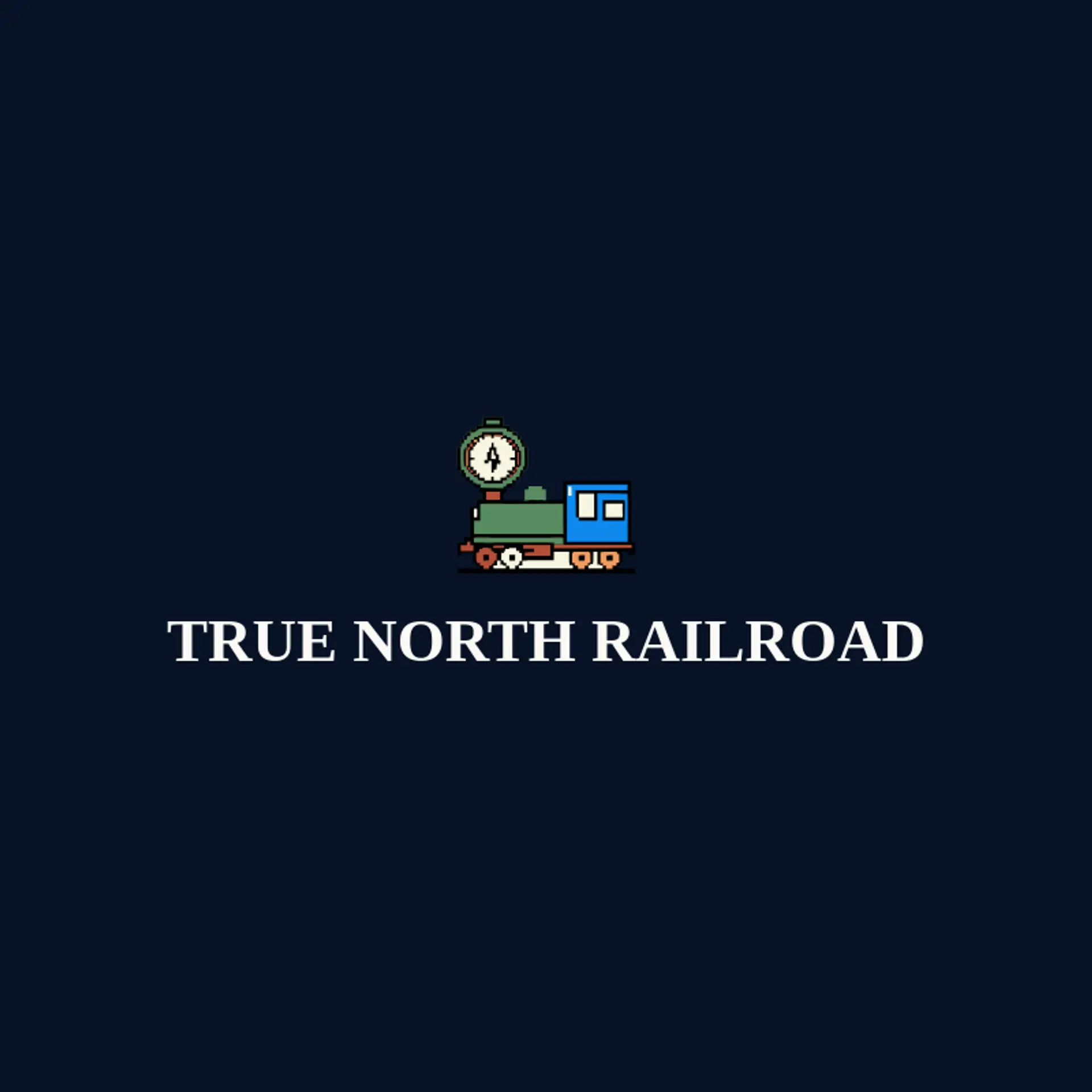
When it comes to the icon, a locomotive is the obvious starting point, and its front silhouette can stay recognizable even when reduced to a few geometric shapes. Rails and a crossing signal offer strong supporting directions, with parallel lines, a signal light, or a rail switch placed beside the main subject rather than inside it. A steam plume, wheel, lantern, or mountain tunnel can add movement and place without making the mark too detailed for a small profile image. For a heritage identity, pair the train with a star, bridge, or station clock, while a modern logistics brand might use a rail arrow, compass, or stacked track lines. Before settling on a route, connect the symbol to the story behind the business: a scenic operator can use a mountain ridge, a freight company can lean on a wheel and signal, and a railway museum can combine a lantern with a classic locomotive silhouette.
Icons To Make Your Railroad Logo Stand Out
That sense of dependable contrast should guide the lettering. A sturdy sans serif can give a railroad brand a precise modern voice, while a compact serif can suggest tradition for a heritage line, museum, or established operator. Look for strong vertical shapes, open counters, and confident spacing so the name remains clear beside tracks, on uniforms, and in small social images. Pair restrained lettering with the strongest contrast from the first paragraph so the wordmark feels as reliable as the route it represents.
Railroad Logo Ideas FAQs
Browse Related Logo Ideas
Airline logosAuto spa logosAutomotive logosAutomotive pick up logosAutomotive repair logosAutomotive truck logosBus logosCar detailing logosDetailing logosDispatcher logosDriver logosEngine logosKayak logosMotorcycle logosPetrol logosRailway logosTaxi logosTractor logosTrain logosTransport logosTruck logosTurbo logosBike logosCharger logosMetro logosPlane logosStreet logosTransportation logosTrucking company logosShipping logosAerospace logosAuto detailing logosDump truck logosElectric car logosFlight logosMobile detailing logosLogistics logosAirport logosCar dealership logosCar mechanic logosCar rental logosCargo logosRailroad logosTire logosAuto parts logosAutomobile logosAviator logosBox truck logosCar dealer logosCar repair logos