










Logo Design Considerations for a Jazz Business
According to LOGO.com data, the five most popular colors in logos with jazz in their names created on LOGO.com over the past 12 months were white at 19%, black at 15%, green at 12%, blue at 11%, and red at 9%. White and black bring the crisp contrast of piano keys and a dark stage, while green, blue, and red can add a lively musical accent. For a jazz logo that feels at home on a venue sign, album cover, or event poster, start with a clear white or black base and let one accent color carry the mood.
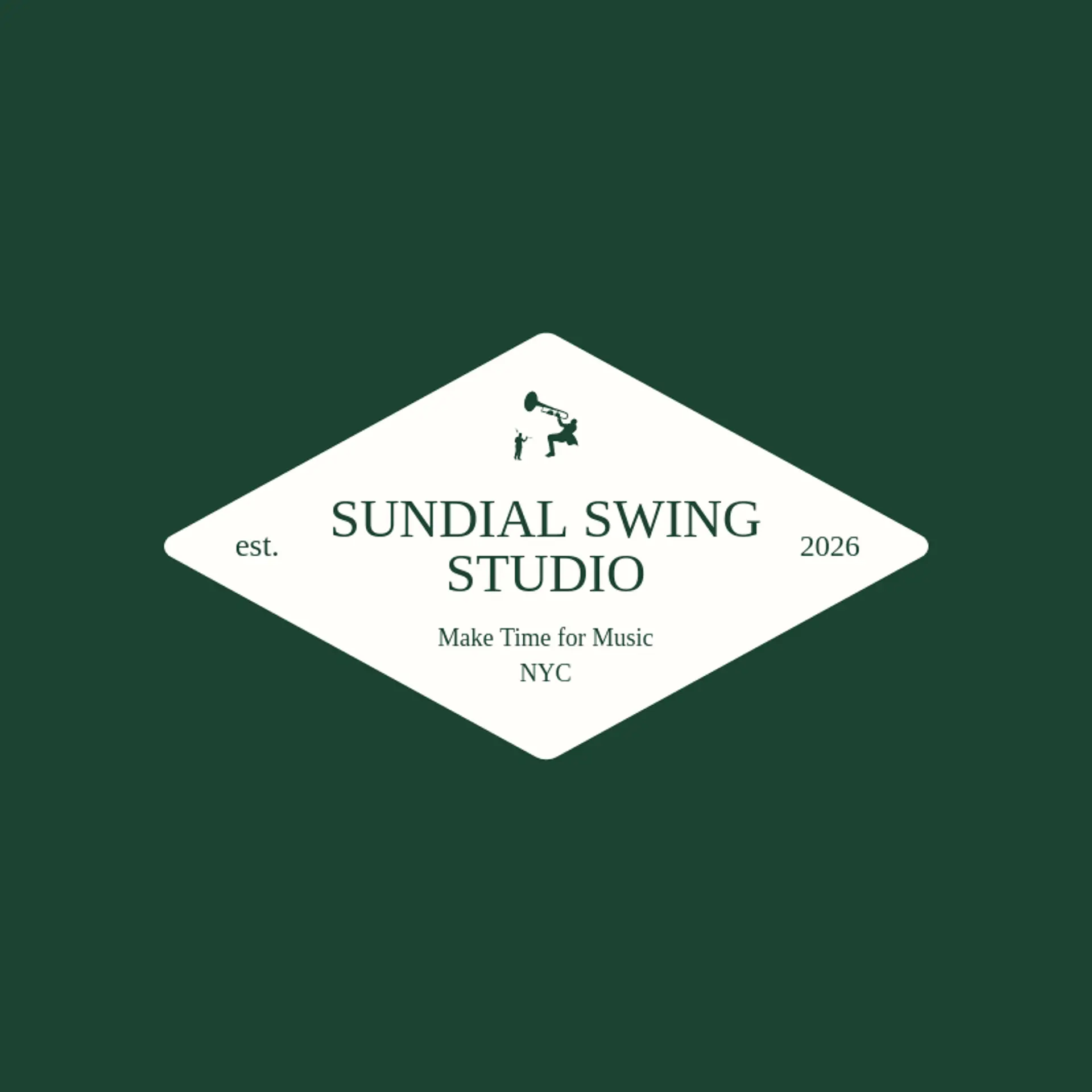
A saxophone is an unmistakable starting point for a jazz icon, and its curved bell or looping keys can become a clean visual signature. A trumpet brings a brighter, more celebratory feel, while a piano keyboard can turn into a repeating rhythm or a row of simple geometric bars. For a club or festival, try a saxophone beside a starburst, a trumpet with a rising musical phrase, or a compact drum and cymbal mark that suggests swing without adding clutter. A record, microphone, or upright bass can point toward a particular era or venue, while a small constellation of notes gives the mark a sense of improvisation. Sketch several directions around the sound and story of the brand, then keep the final symbol clear enough to read on a stage banner or a tiny album thumbnail.
Icons To Make Your Jazz Logo Stand Out
The same clear contrast from that palette can shape the lettering. According to LOGO.com data, sans serif typefaces made up 58% of the font choices in those same logos with jazz in their names over the past 12 months, with display styles at 25% and serif styles at 12%. The favorites range from Geologica at 18% to Prata and Afacad Flux at 7% each, followed by Afacad and Aboreto at 4% each. Pair bold, readable lettering with a white or black base and one expressive accent, so a jazz logo feels polished on a club marquee and remains legible on a small streaming tile.
Jazz Logo Ideas FAQs
Browse Related Logo Ideas
ASMR logosAudio logosBass logosCool music logosCountry music logosCreative music logosDance logosDeath metal logosGuitar logosHeadphones logosHouse music logosMetal band logosMicrophone logosMusic app logosMusic artist logosMusic band logosMusic festival logosMusic label logosMusic logosMusic producer logosMusic production logosMusic studio logosRock band logosRock logosSound logosMusic note logosDrum logosHarp logosDance studio logosDisco logosHip hop logosVinyl logosConcert logosDancer logosHeadphone logosKaraoke logosRave logosRecording logosRock and roll logosSinging logosSound wave logosVoice logosKeyboard logosRock music logosSalsa logosStereo logosSymphony logosRockstar logosSoundcloud logosViolin logos