
Logo Design Considerations for a Hijab Business
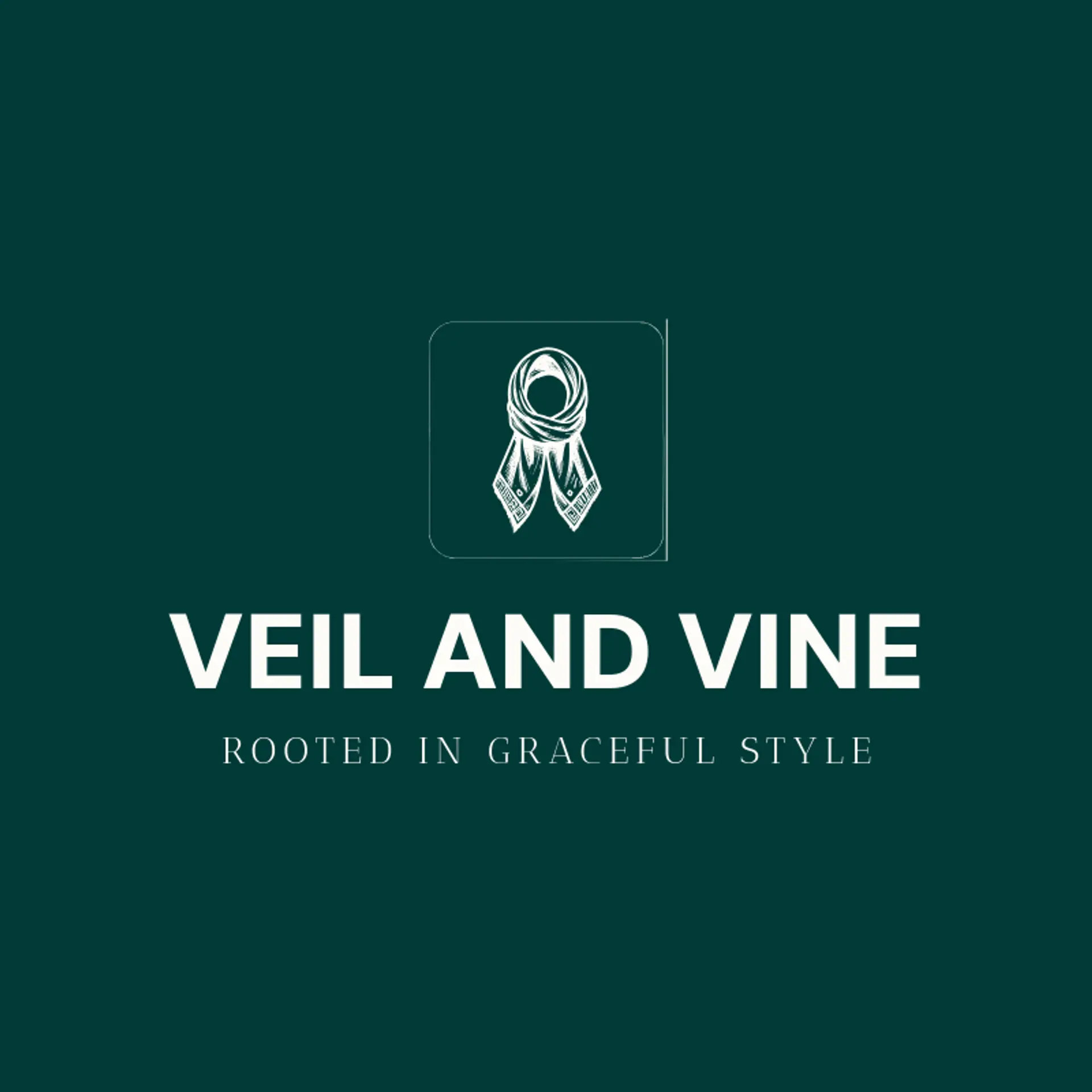
Hijab logos benefit from a calm base color and one graceful accent that feels refined across fabric labels, packaging, and social profiles. Deep navy, forest green, or plum can give a modest fashion brand a confident presence, while cream and soft blush create warmth and breathing room. Choose a palette with clear contrast and a gentle sense of movement so the mark stays elegant in embroidery, print, and digital use.
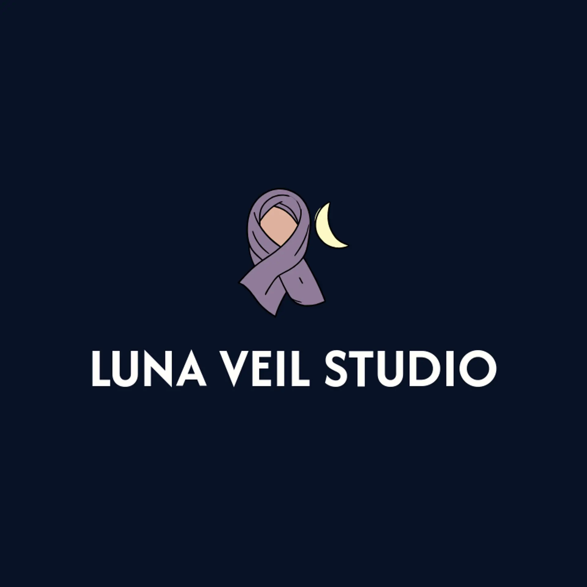
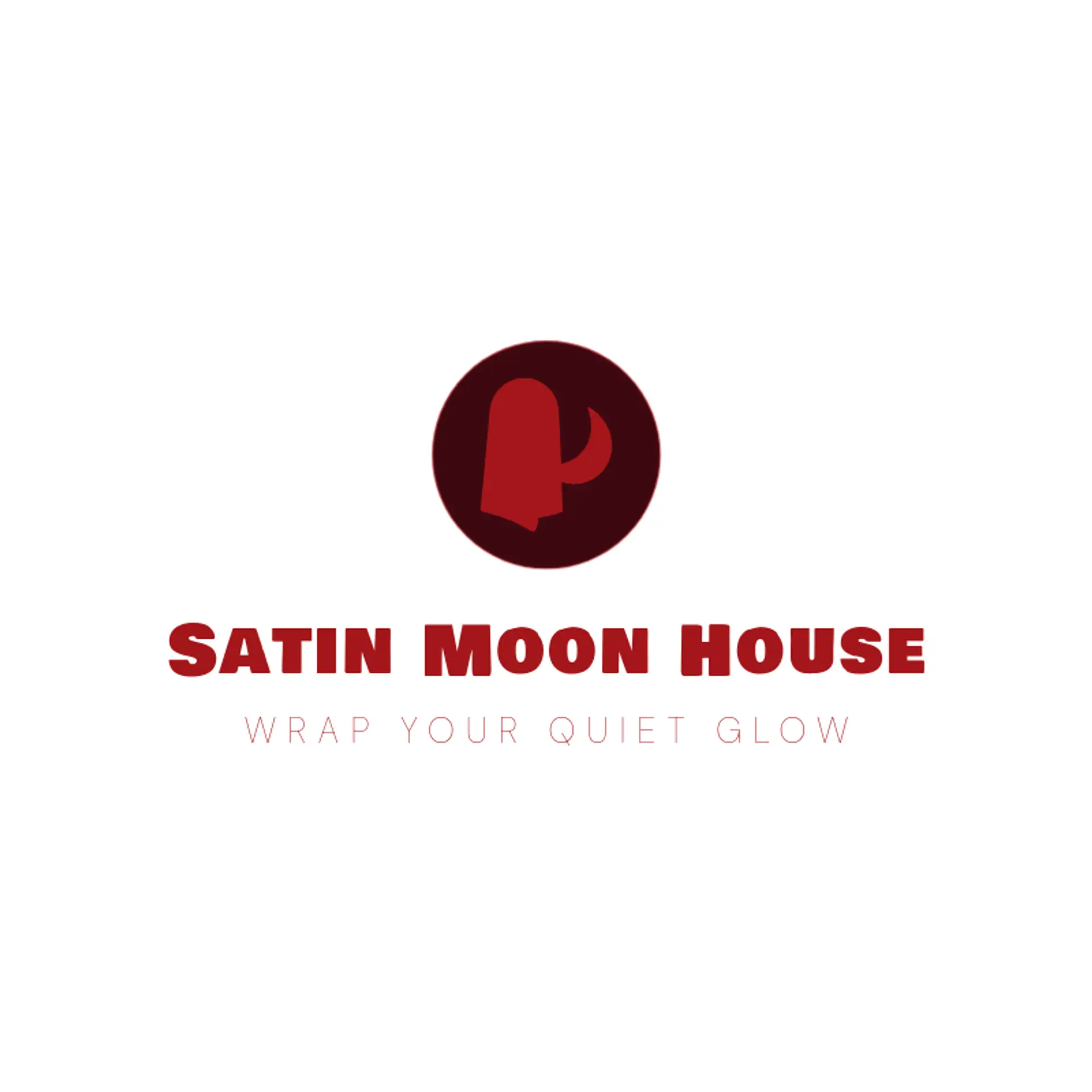
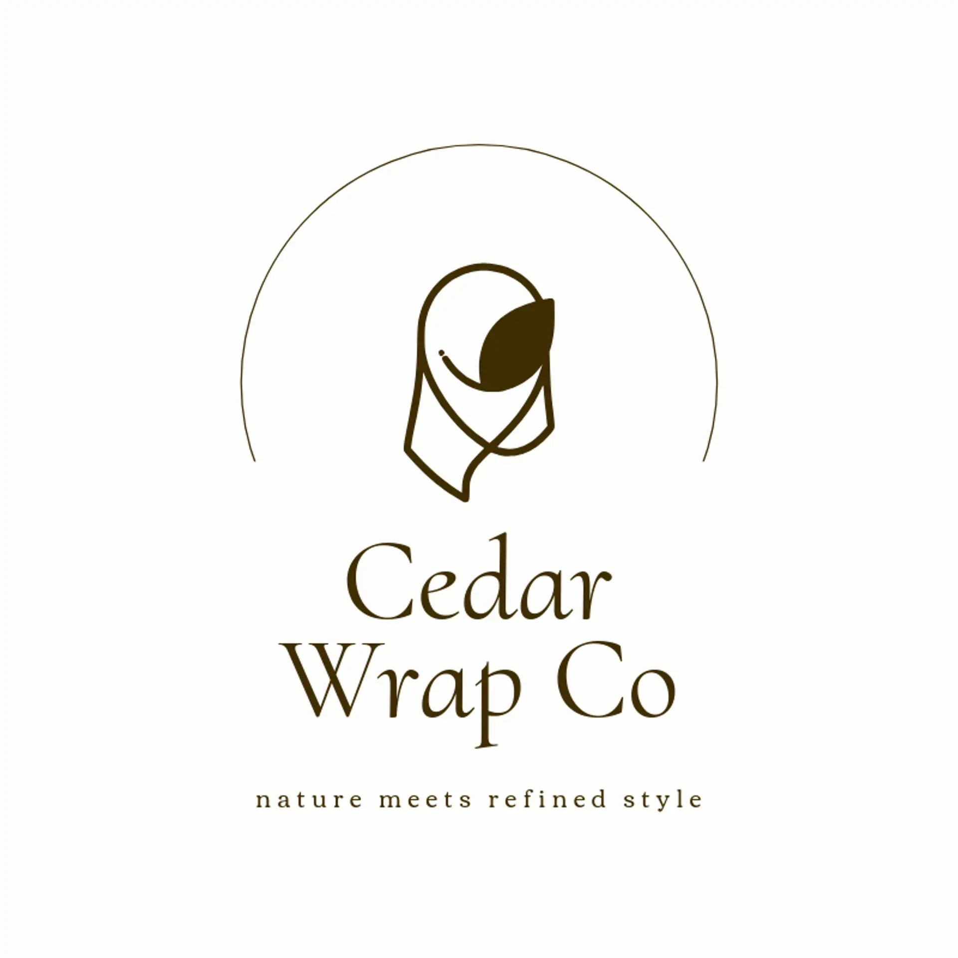
When it comes to the icon, a flowing hijab scarf is the natural starting point, with a clean folded silhouette that remains clear at small sizes. A crescent can add a quiet sense of tradition, while a leaf beside the scarf suggests softness, care, and natural fabric. A flower, star, or delicate arch can bring a graceful boutique feeling without making the mark feel busy. For a more contemporary direction, try a draped ribbon, a thread spool, or a pair of abstract folds that suggest motion. Before settling, connect the symbol to the brand story: a family atelier can use a needle and thread, a travel inspired label can use a moon and star, and a youthful shop can pair a bright flower with a simple scarf shape.
Icons To Make Your Hijab Logo Stand Out
That balance of calm color and graceful detail should guide the lettering. A polished sans serif can give a hijab boutique a modern voice, while a high contrast serif can suggest heritage and craftsmanship. Look for open letter shapes, comfortable spacing, and a confident weight that remains clear on small tags and profile images. Pair restrained lettering with the strongest contrast from the first paragraph so the brand name feels composed beside a flowing scarf icon.
Hijab Logo Ideas FAQs
Browse Related Logo Ideas
Classic fashion logosCreative fashion logosDesigner fashion logosFancy fashion logosFashion accessories logosFashion blog logosFashion boutique logosFashion brand logosFashion business logosFashion clothing logosFashion company logosFashion designer logosFashion label logosFashion line logosFashion logosFashion photography logosFashion show logosFashion store logosFashion studio logosFashion stylist logosFashion wear logosHijab logosHoodie logosJersey logosSaree logosShirt logosStreetwear logosTailor logosApparel logosClothes logosPolo shirt logosApron logosBeanie logosDenim logosJacket logosKids clothing logosDress logosHanger logosHippie logosMasculine logosMens fashion logosScrub logosAmerican eagle logosUniform logosBuckle logos