















Logo Design Considerations for a Foodie Business
According to LOGO.com data, the five most popular colors in foodie logos created on LOGO.com over the past 12 months were white at 26%, black at 14%, green at 12%, red at 9%, and orange at 9%. White and black offer a clear, inviting foundation, while green and warm red or orange can bring fresh ingredient cues and energy. For a foodie logo used on menus, packaging, delivery bags, and social profiles, start with a white or black base and add one fresh accent that gives the name appetite appeal.
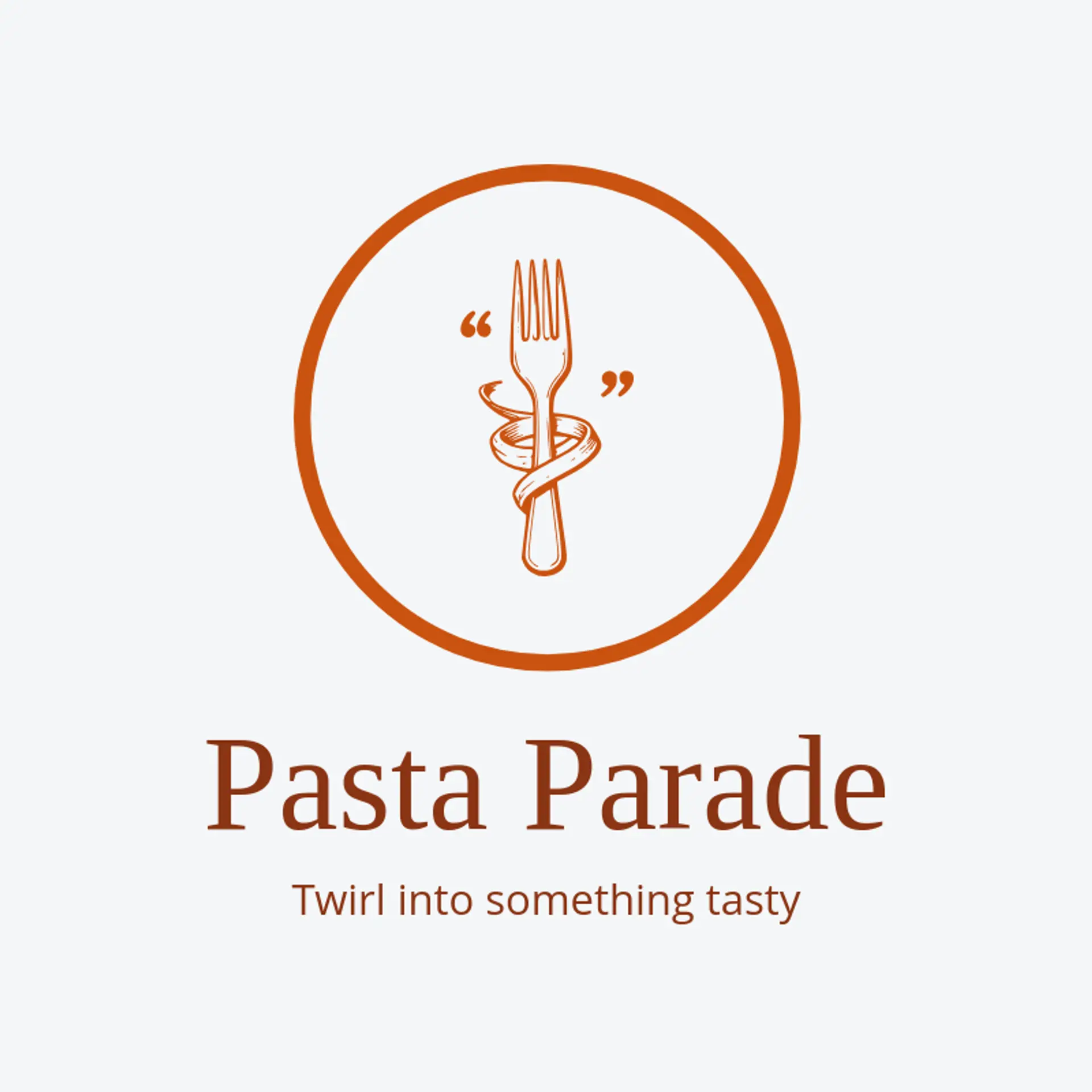
A fork paired with a fresh leaf can make a simple, recognizable food mark, while a steaming bowl gives a cafe or comfort food brand an immediate sense of warmth. Citrus slices, herb sprigs, wheat stalks, or a spoon beside a small plate suit ingredient led shops and neighborhood markets. A rolling pin with a flour sparkle can work for a bakery, and a takeaway cup with a rising steam curl fits a quick lunch counter. For playful food brands, sketch a smiling dumpling, a tomato with a tiny crown, or a noodle swirl beside the name. Before settling on a symbol, think about what customers come for: a salad shop might use a leafy bowl, a pasta maker a fork with a ribbon of noodles, and a coffee stand a cup with a sunburst.
Icons To Make Your Foodie Logo Stand Out
That fresh, high contrast palette carries through to the lettering. According to LOGO.com data, sans serif typefaces made up 66% of font category choices in those same foodie logos over the past 12 months, with display styles at 19%, serif styles at 9%, and handwriting at 5%. The leading individual choices were Geologica at 19%, Afacad at 9%, Open Sans at 4%, Schibsted Grotesk at 4%, and Aboreto at 3%, pairing clear everyday lettering with a little personality. Set readable letterforms against the white or black base above, then use green, red, or orange as an accent so a foodie name stays clear on a menu, jar label, or delivery bag.
Foodie Logo Ideas FAQs
Browse Related Logo Ideas
Bar restaurant logosBBQ restaurant logosBiryani logosBurger restaurant logosCanteen logosChef logosChicken restaurant logosChinese logosCloud kitchen logosCool restaurant logosCreative restaurant logosFast food restaurant logosFine dining restaurant logosFood restaurant logosFood truck logosGarden restaurant logosHealthy restaurant logosHotel restaurant logosItalian logosLechon logosMexican logosPizza restaurant logosRestaurant logosSeafood restaurant logosSiomai logosSports bar logosSushi logosTaco logosVegan restaurant logosGrill logosLobster logosMexican restaurant logosChef hat logosChinese food logosChinese restaurant logosCulinary logosFried chicken logosHospitality logosLunch logosSteakhouse logosFoodie logosNoodle logosSpoon logosCurry logosDish logos