The Most Popular Photography Logo Ideas: What 30,466 Brands Can Teach Us About Design Trends
Inside 30,466 photography logos: the 12 custom icons and 12 stock icons photography founders pick most on LOGO.com in 2026.
Every month, thousands of new photography brands launch on LOGO.com. Between May 2025 and May 2026, 30,466 of them chose "photography" as their industry inside our editor, making it one of the largest creative service categories on the platform.
If you are starting a photography brand, picking the right symbol for your logo is one of the first design decisions you will make. Every photography logo on LOGO.com has a symbol at its core. That symbol is either a stock icon, a ready made mark from our library, or a custom icon, drawn by our AI generator from a description you type. That is why we wanted to share the most popular photography logo ideas on LOGO.com to help you decide.
How we put this together
These rankings come from LOGO.com platform data between May 2025 and May 2026. We looked at the 30,466 logos created by people who selected "photography" as their industry inside our editor, then ranked the symbols they actually chose. Half come from our stock icon library and half come from descriptions they typed into our custom icon generator (powered by AI). We counted every distinct pick rather than unique users, because the question we wanted to answer for you is: given the chance to pick any symbol, what do photography founders pick for their logo?
Part One: Custom Icons
When a photography founder types a description into the custom icon generator, the words they choose tell us what they were already imagining before they sat down to type. The symbol that comes back is one of a kind, drawn from scratch based on your description rather than pulled from a library other brands use too.
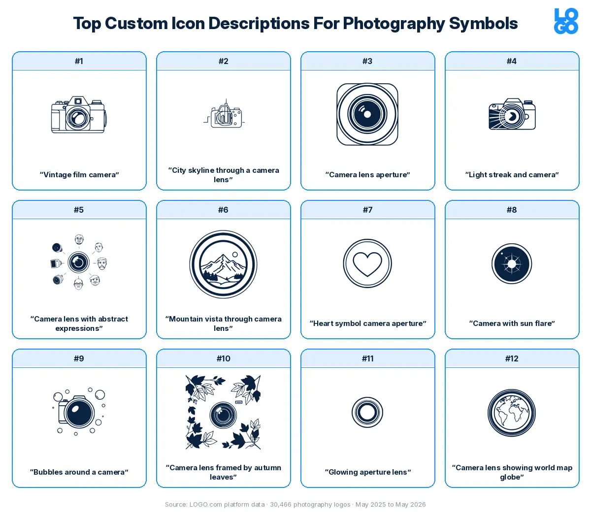
We took the twelve most typed photography descriptions and ran each one through all nine visual styles the custom icon generator offers, so you can see how the exact same words become a minimal line drawing, a detailed illustration, a pixel mark, a deco emblem, and five other looks. The version that is right for your brand probably is not the same one that is right for someone else's, which is exactly why the comparison is useful.
1. "Vintage film camera"
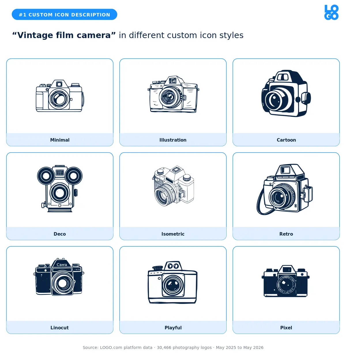
The most typed description in the photography dataset, by a wide margin. The founders reaching for "vintage film camera" are usually shooting weddings, family portraits, or anything where slow craft matters more than speed. The retro and linocut styles carry that nostalgia best. The pixel and isometric versions push it too far toward a hobby aesthetic. Pick the deco or illustration variant if you want the warmth without the gimmick.
2. "City skyline through a camera lens"
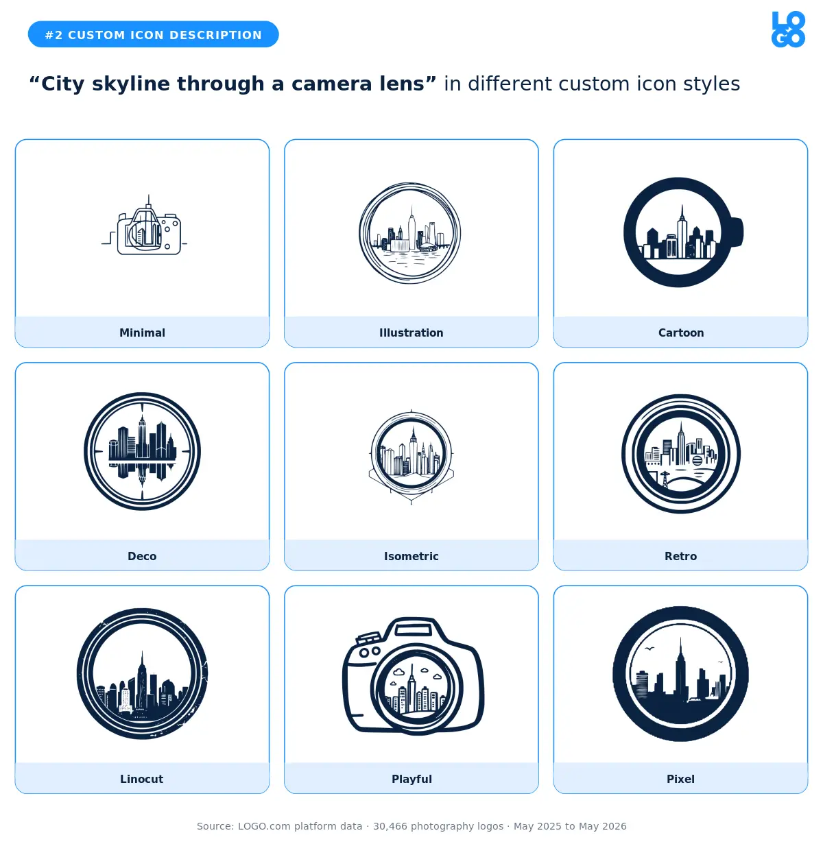
Urban photographers, real estate shooters, and editorial brands gravitate to this one. The lens becomes a viewfinder onto the city, which is a smart visual shorthand for "I see your story". Minimal and deco both render the skyline cleanly. Cartoon and playful soften it too much. If you shoot architecture or commercial real estate, the minimal version is the safest pick.
3. "Camera lens aperture"
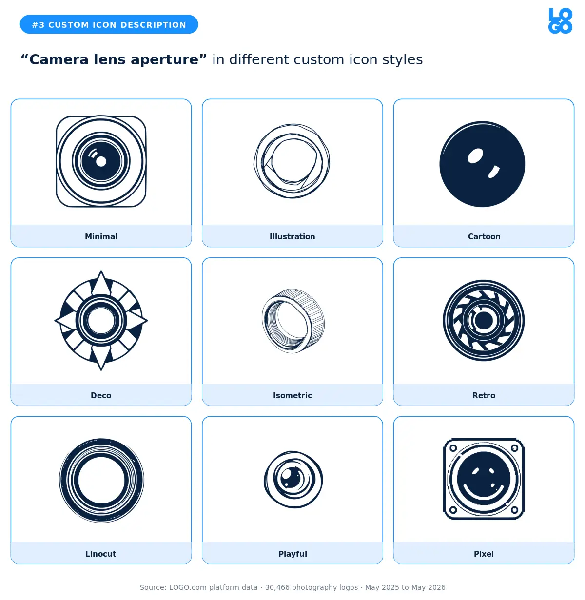
The aperture is the part of a camera most photographers obsess over, so it shows up in logos for shooters who want to signal "I know my craft". The minimal and deco styles read instantly as aperture without any extra explanation. Pixel and isometric overcomplicate a shape that works best when it stays geometric.
4. "Light streak and camera"
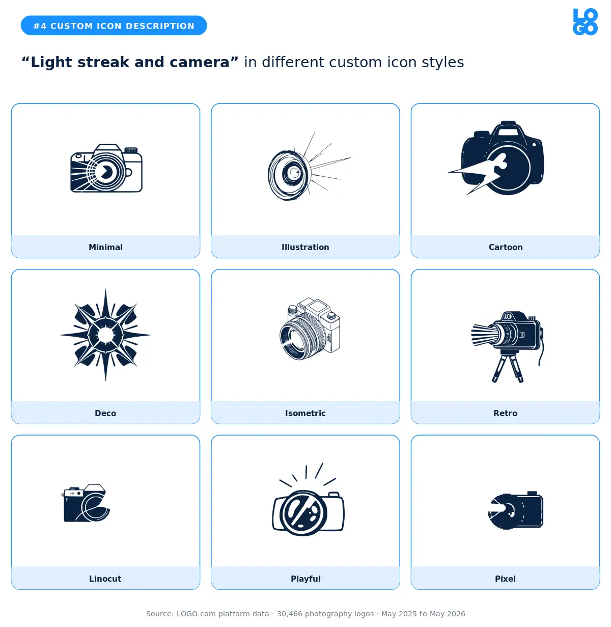
A camera with a light leak or sun flare hints at the moment of capture, not just the gear. Photographers who lean into a warm, golden hour aesthetic pick this one. The illustration and retro styles handle the streak best. The minimal version loses the energy the description was reaching for, so skip that one unless the rest of your brand is already loud.
5. "Camera lens with abstract expressions"
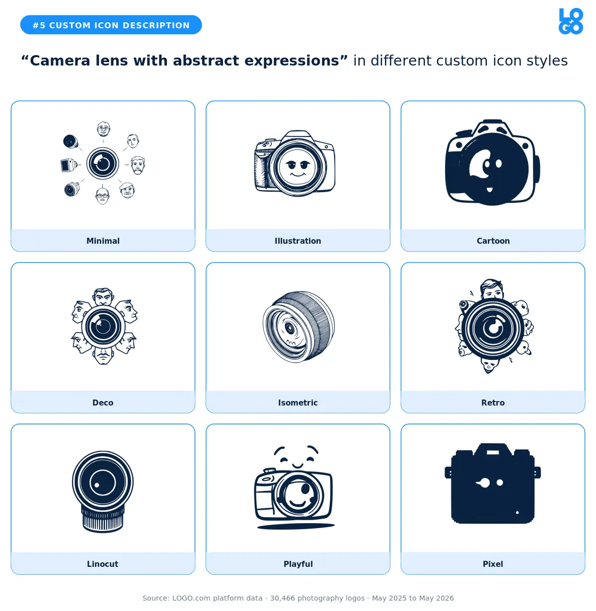
Fine art and conceptual photographers reach for this when they want to feel less literal. The deco and linocut styles add character without losing the lens as the anchor. Cartoon and playful drift too far from the brief. If you shoot portraits and want to feel like an artist rather than a vendor, this description with a deco render is a strong starting point.
6. "Mountain vista through camera lens"
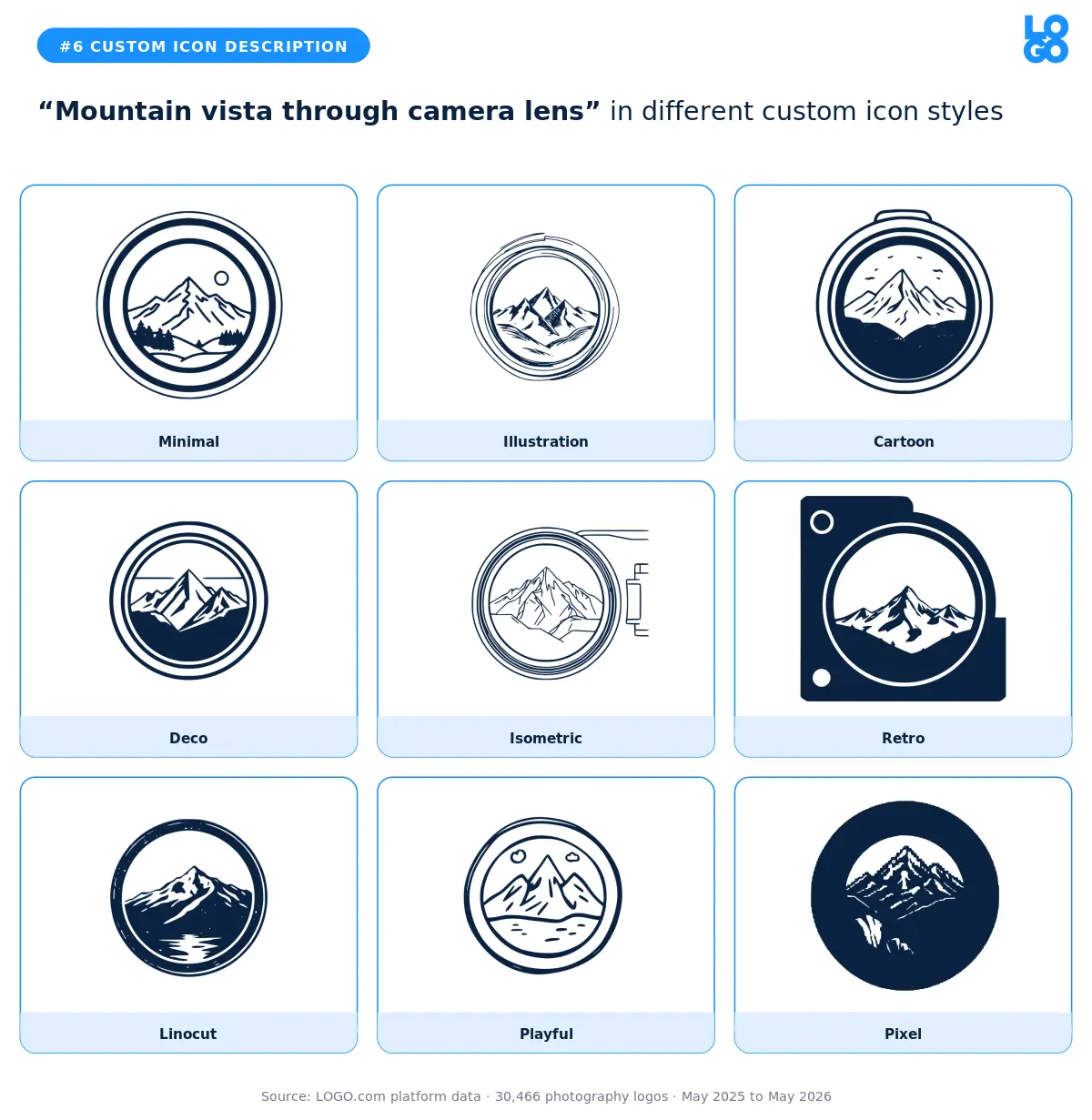
Landscape, adventure, and outdoor photographers pick this one to tie themselves to a specific subject. The illustration and retro variants both look like vintage national park badges, which works well for outdoor specialists. The minimal style strips out everything the description was trying to evoke, so use it only if your brand is already image heavy elsewhere.
7. "Heart symbol camera aperture"
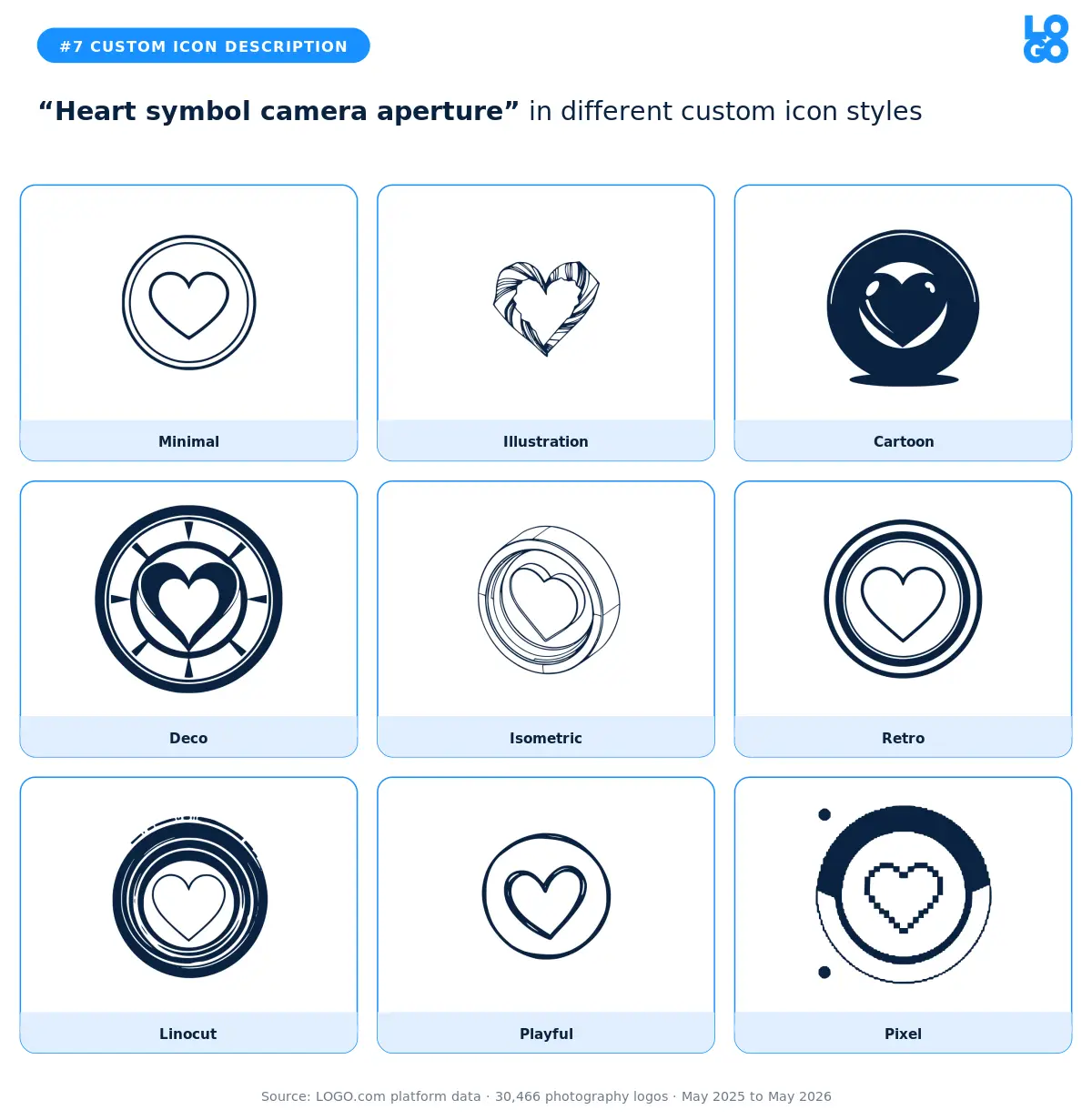
Wedding and family photographers reach for this combination. A heart inside an aperture is direct without being saccharine, especially in the deco or linocut styles. The cartoon and playful versions push it toward greeting card territory. If you shoot weddings, the deco render gives you warmth with a frame that still feels professional.
8. "Camera with sun flare"
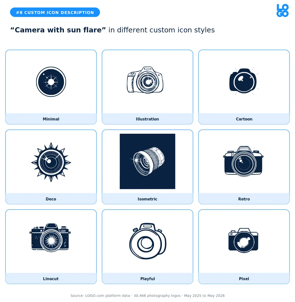
Close cousin of the light streak description, but with the source of the light made explicit. Outdoor and lifestyle photographers pick this when they want their brand to feel sunny. Illustration and retro carry the warmth best. The isometric version turns the sun flare into a graphic element that loses the feeling, so skip that one.
9. "Bubbles around a camera"
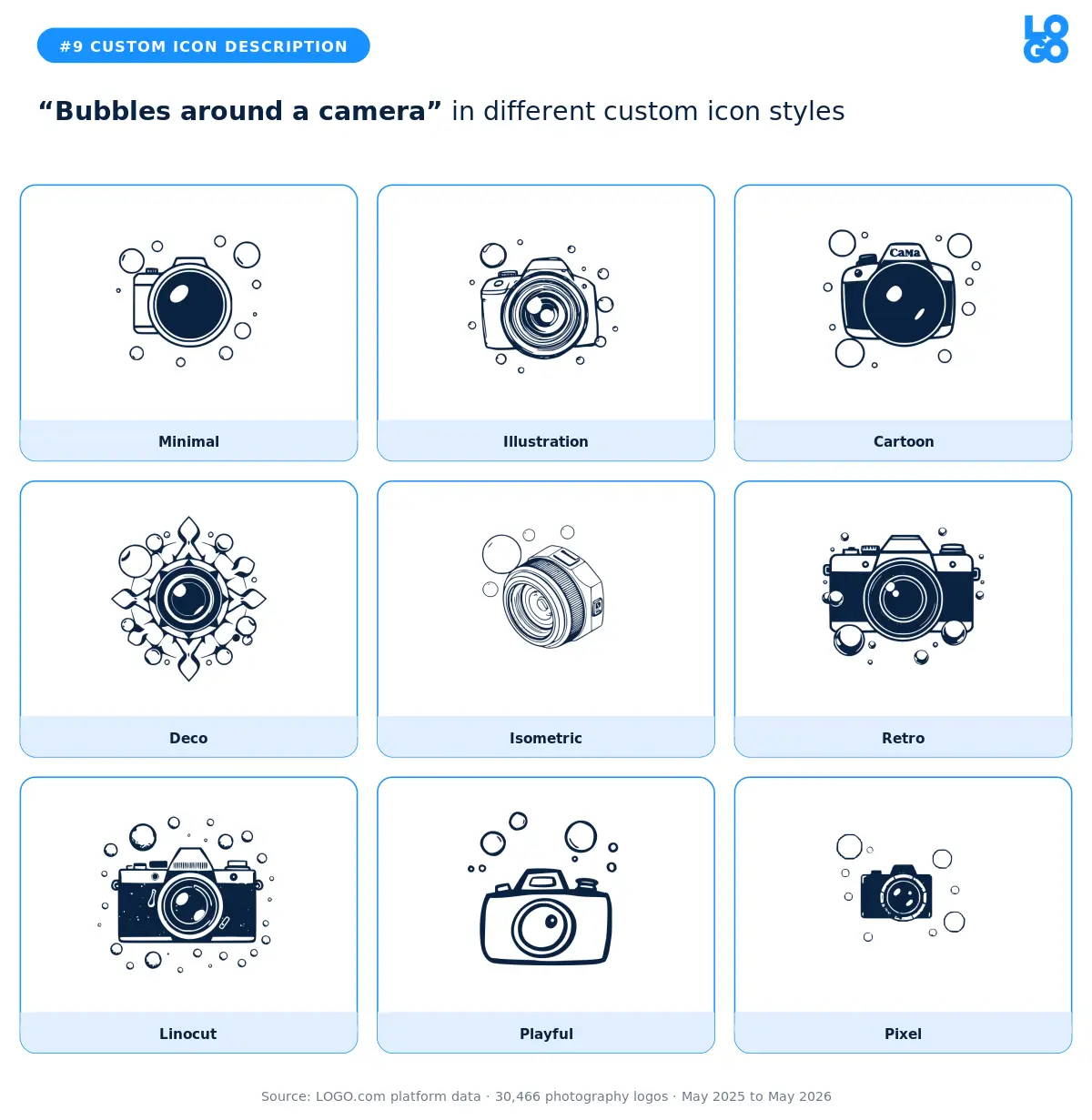
Newborn, family, and underwater photographers all type some version of this. The playful and cartoon styles fit naturally with the subject matter. Minimal and deco strip the joy out of an intentionally joyful description. Pick the cartoon or playful render and lean in.
10. "Camera lens framed by autumn leaves"
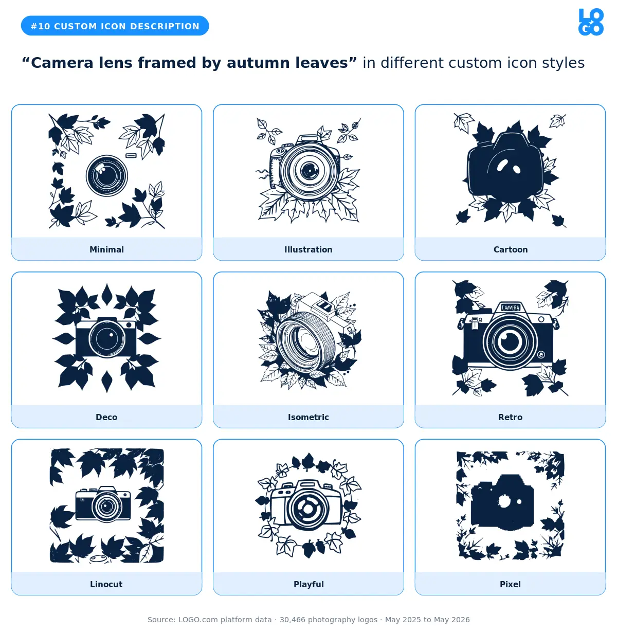
Family portrait shooters who do fall sessions, nature photographers, and anyone with a seasonal speciality. The illustration and deco styles handle the leaves without making the icon feel cluttered. The pixel and isometric variants lose the organic quality the description needs.
11. "Glowing aperture lens"
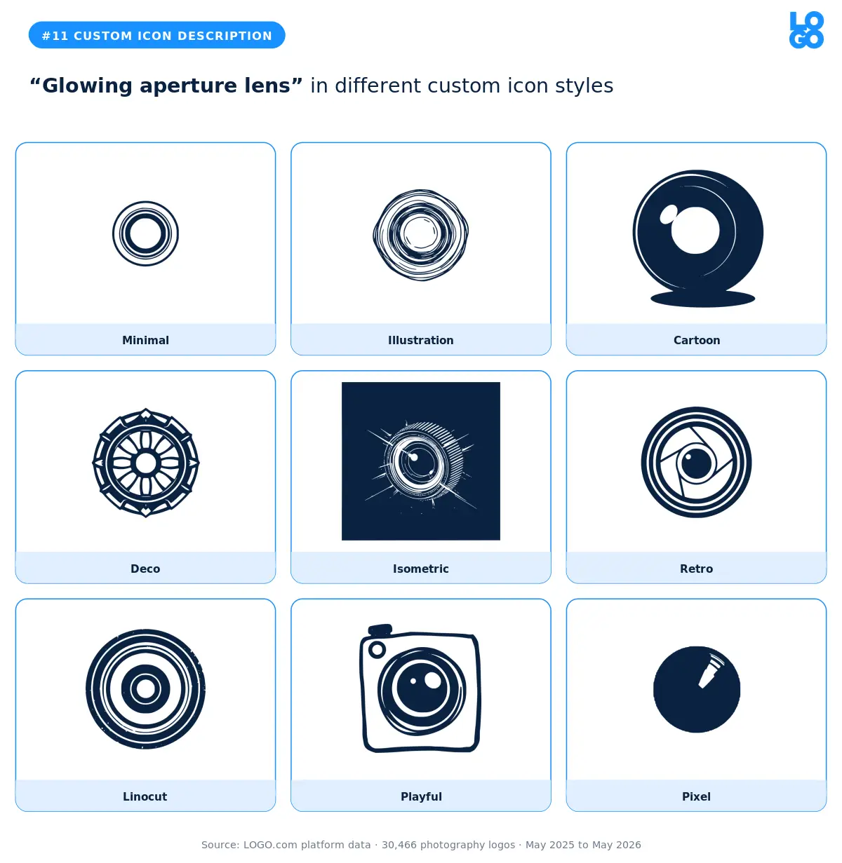
This one is for photographers who want to feel modern and technical. The illustration style adds the glow effect cleanly. The minimal version reads as a regular aperture without the magic. Commercial, fashion, and product photographers can lean on the illustration or retro render to feel current.
12. "Camera lens showing world map globe"
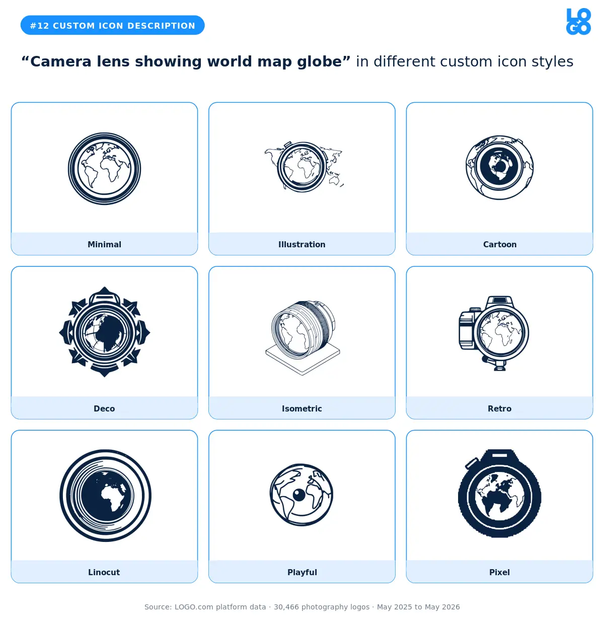
Travel photographers and documentary shooters reach for the globe inside a lens. Illustration and deco both handle the layered concept well. The minimal version flattens it into something generic. If you shoot for travel publications or run an international wedding business, the illustration render is the strongest pick.
Part Two: Stock Icons
Roughly half of photography founders on LOGO.com skip the custom icon generator and head straight for the stock icon library instead. They want speed, they want a symbol they can recognize instantly, and they want a mark that is already proven on other brands. The library has thousands of options. Twelve of them account for almost all of the photography picks.
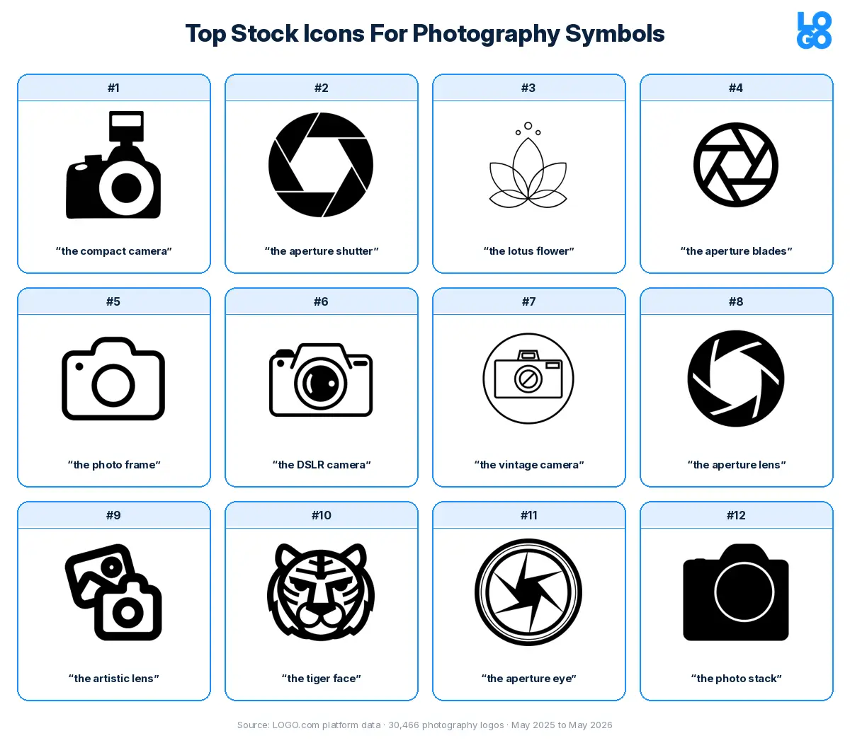
Here is our take on each of those twelve. The visual gives you the short version. The paragraphs underneath unpack the why and offer some guidance on which kinds of brands each icon actually fits.
1. The Compact Camera
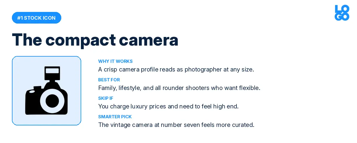
The single most picked photography icon on the platform. A compact camera silhouette reads as "photographer" the moment anyone sees it, no extra context required. It works at any size, it pairs with almost any wordmark, and it does not commit you to a specific specialty. That last part is why so many founders pick it. They want a flexible brand that fits weddings, portraits, events, and commercial work without locking them in.
Where it can backfire is at the higher end of the market. If you are charging premium prices for editorial or luxury wedding work, this silhouette can feel too casual. In that case, the vintage camera at number seven gives you the same instant recognition with more polish.
2. The Aperture Shutter
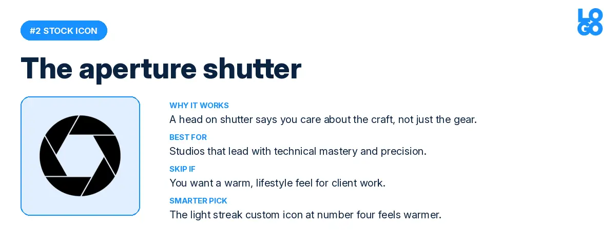
A circular shutter pattern, viewed straight on. Photographers who pick this are signaling that they care about the technical side of their craft. It pairs well with serif wordmarks and minimalist layouts. The risk is that it feels cold, especially for client work that needs warmth. The light streak custom icon at number four still says "photography" but feels significantly warmer.
3. The Lotus Flower
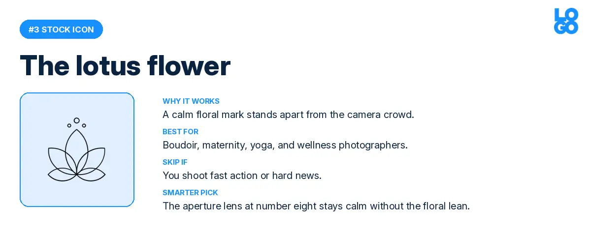
This one surprised us until we looked at who was picking it. Boudoir, maternity, yoga, and wellness photographers all gravitate to floral marks to signal something softer than gear. The lotus carries calm and intention in a way no camera silhouette ever will. Skip it if you shoot fast paced action or hard news; the lotus will set the wrong expectations. The simple aperture lens at number eight gives you a calm mark without the floral lean.
4. The Aperture Blades
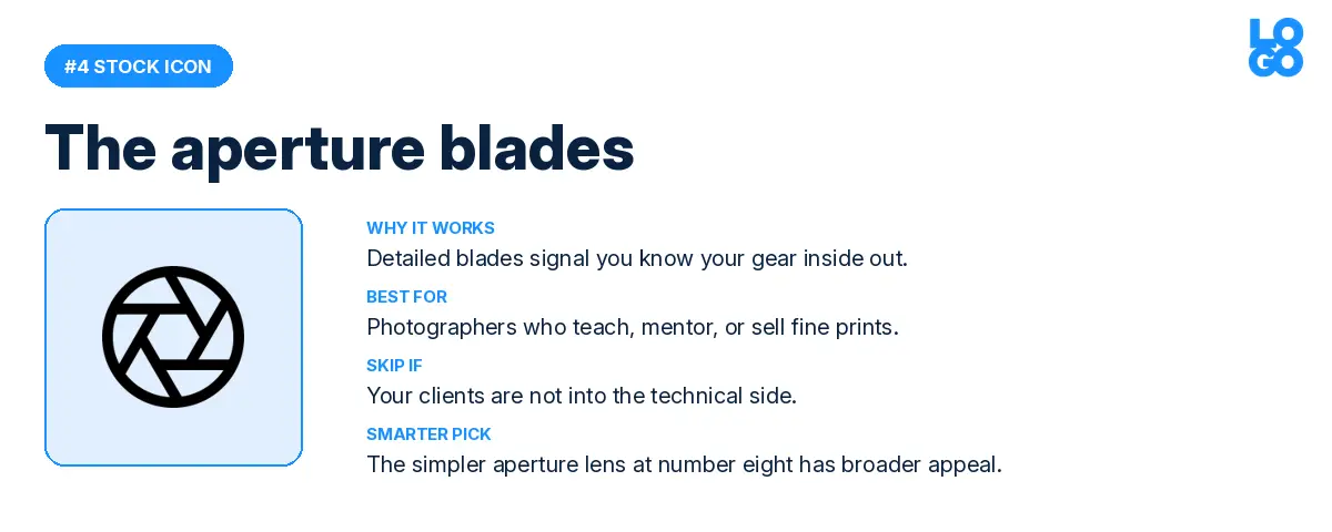
Detailed, almost mechanical, the aperture blades icon says "I know my gear" to anyone who reads logos closely. Photographers who teach, mentor, or sell prints reach for this one. It does not work as well for first time clients who are not into the technical side of things. For broader appeal, the simpler aperture lens at number eight is a better fit.
5. The Photo Frame
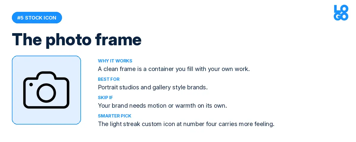
A simple rectangle. The photo frame is a container you fill with whatever story your work tells. Portrait studios and gallery style brands often pick it because it leaves room for the work to do the talking. The downside is that it lacks energy on its own. If your brand needs motion or warmth, the light streak custom icon at number four carries more feeling.
6. The DSLR Camera
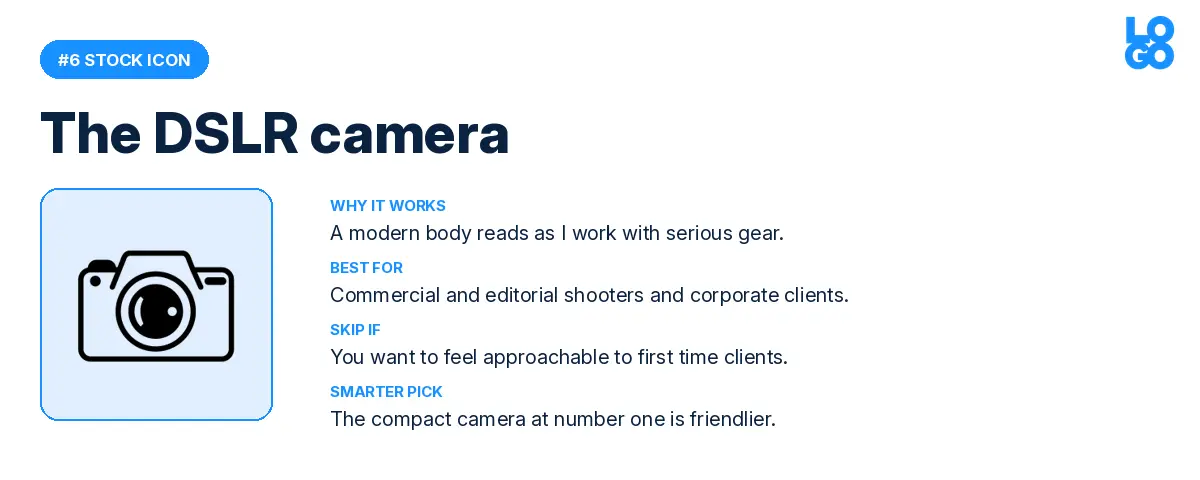
The modern professional camera silhouette. Commercial and editorial photographers pick this when they want to feel serious. It reads as "I work with real gear", which can be exactly the right signal for corporate clients or magazine editors. It can feel intimidating to first time clients though, in which case the compact camera at number one is a friendlier alternative.
7. The Vintage Camera
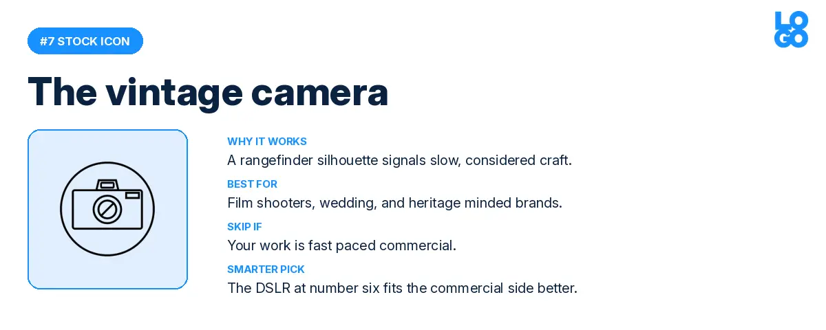
A vintage rangefinder silhouette with a clearly defined lens. Film shooters, wedding photographers, and anyone leaning into a slow craft aesthetic pick this one. It is warmer than the modern DSLR and more interesting than the compact camera. The trade off is that it can feel out of step with fast paced commercial work. For that side of the market, the DSLR at number six is the better pick.
8. The Aperture Lens
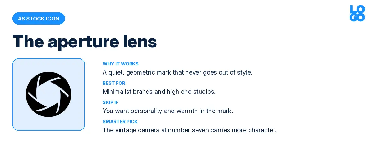
Quiet, geometric, and timeless. The aperture lens icon works as well in 2026 as it would have in 2006, and probably as well in 2046. Minimalist brands and high end studios pick this because it never goes out of style. If you want personality and warmth in your mark, the vintage camera at number seven carries more character.
9. The Artistic Lens
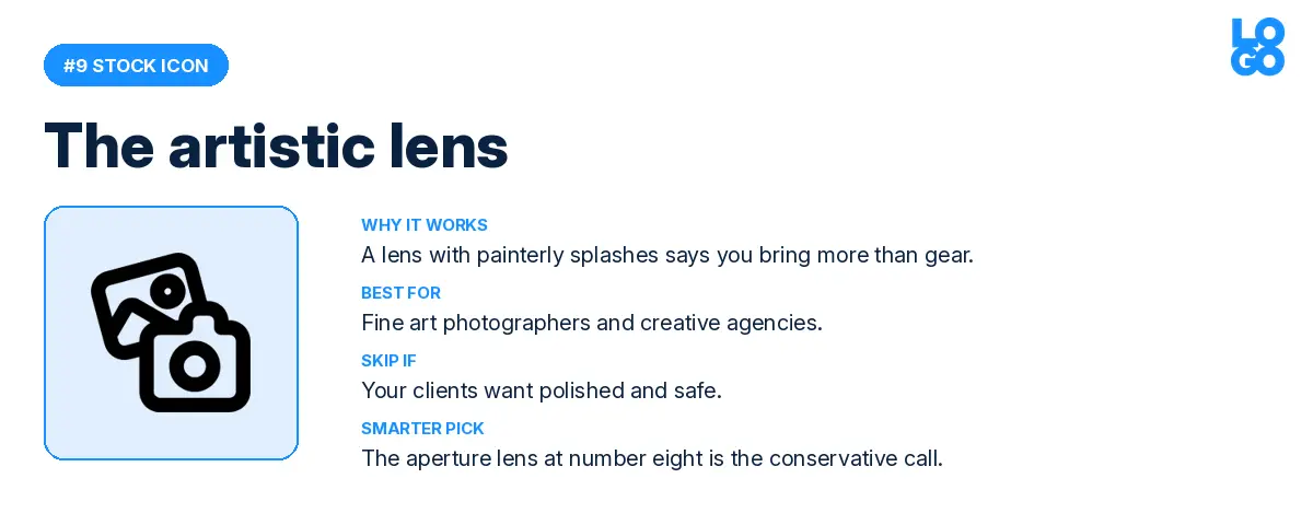
A camera lens surrounded by painterly splashes. This one is for fine art photographers and creative agencies who want to signal that they bring more than gear to the job. The risk is that it can feel too loud for clients who want polished and safe. For those clients, the conservative aperture lens at number eight is a better fit.
10. The Tiger Face
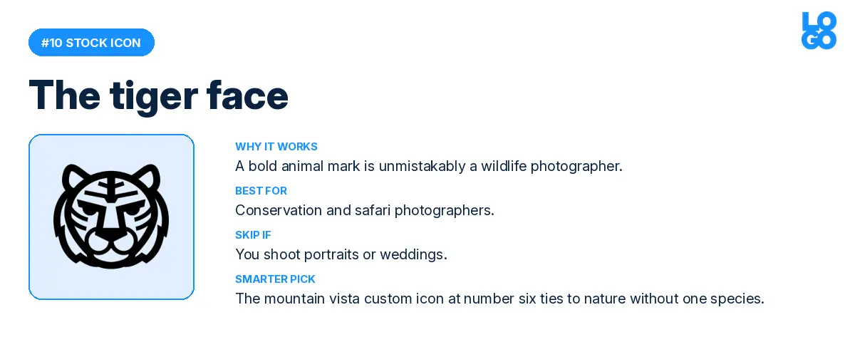
Bold, memorable, and unmistakably a wildlife photographer. Conservation and safari photographers pick this when they want their specialty to live in their logo. Skip it if you shoot portraits or weddings; the tiger will set the wrong expectations. For a nature tie that does not lock you into one species, the mountain vista through a lens at custom icon number six is a smarter pick.
11. The Aperture Eye
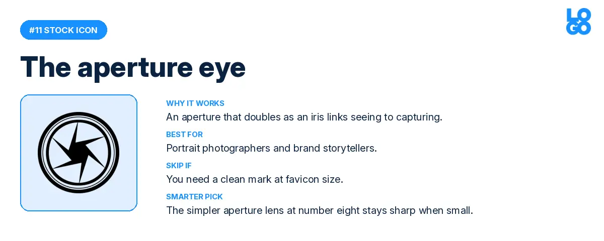
An aperture that doubles as an iris. Portrait photographers and brand storytellers reach for this one because of the smart visual pun, which connects seeing to capturing. The trade off is that it can feel busy in small sizes. If you need something clean at favicon scale, the simpler aperture lens at number eight is the better call.
12. The Photo Stack
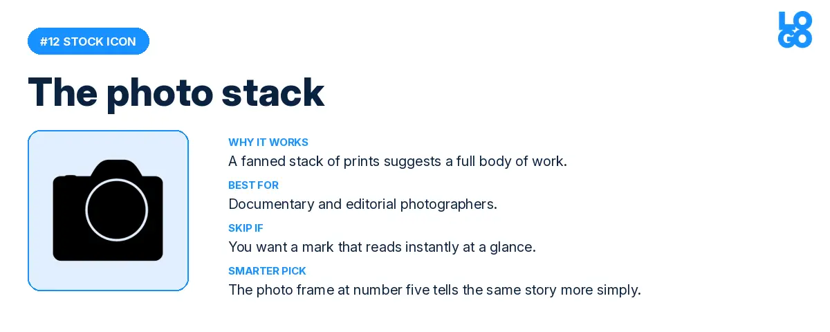
A stack of prints, slightly fanned out. Documentary and editorial photographers pick this because it suggests a body of work rather than a single shot. The drawback is that print stacks read less universally than a camera or lens. For a tighter, icon only mark with the same idea, the photo frame at number five is a simpler version of the same story.
Three takeaways before you pick your symbol.
Photography founders are split between gear and craft. Half the most popular symbols are cameras and lenses; the other half are atmospheric ideas like light streaks, mountain vistas, and bubbles. Pick a symbol that signals which side you are on. Gear says reliable and professional. Craft says story and feeling.
The stock library wins on speed; custom icons win on differentiation. If your competitors are using the same compact camera icon, your brand becomes harder to spot in a crowded local market. The custom icon path costs you ten extra minutes and gives you a symbol no one else has. For markets where every photographer in town uses the same icon, that ten minutes pays off fast.
Specialty photographers should lean into their niche. Wedding, wildlife, travel, and newborn shooters all show up in the data picking symbols that lock them into a category. That sounds risky, but it actually works in your favor when ideal clients are searching for someone who only does the thing they need. Pick a symbol that signals your specialty if your goal is to be the obvious pick for one kind of client rather than a fine pick for everyone.
For founders launching in 2026, here is the simplest way to think about it. A stock icon is the right call when speed matters more than standing out. A custom icon is the right call when standing out matters more than speed. The data above shows you which side of that line your gut is sitting on, before you even open the editor.
Source: LOGO.com platform data, May 2025 to May 2026. n = 30,466 photography logos. Rankings reflect the most picked stock icons and the most typed custom icon descriptions among users who selected "photography" as their industry on LOGO.com.
Recent posts

Oct 19, 2026 by: Sean Baker

Oct 14, 2026 by: Vanessa Lam
Oct 12, 2026 by: Sean Baker

Oct 5, 2026 by: Sean Baker