The Most Popular Landscaping Logo Ideas: What 8,248 Brands Can Teach Us About Design Trends
Inside 8,248 landscaping logos: the most popular symbols brands picked, split into stock icons and custom icons. Plus the design trends that show up across both.
Every month, thousands of new landscaping brands launch on LOGO.com. Between May 2025 and May 2026, 8,248 of them chose "landscaping" as their industry inside our editor, which makes it one of the most active service categories on the platform. Solo lawn care startups, tree care specialists, hardscape and design build firms, commercial grounds crews, and family run yard services all show up in this data, and they all start with the same first design choice.
If you're starting a landscaping brand, picking the right symbol for your logo is the decision that sets the tone for everything else. Every landscaping logo on LOGO.com has a symbol at its core. That symbol is either a stock icon, a ready made mark from our library, or a custom icon, drawn by our AI generator from a description you type. We pulled the data on what 8,248 landscaping founders actually picked so you can see the patterns before you sit down to make your own.
How we put this together
These rankings come from LOGO.com platform data between May 2025 and May 2026. We looked at the 8,248 logos created by people who selected "landscaping" as their industry inside our editor, then ranked the symbols they actually chose. Half come from our stock icon library and half come from descriptions they typed into our custom icon generator (powered by AI). We counted every distinct pick rather than unique users, because the question we wanted to answer for you is: given the chance to pick any symbol, what do landscaping founders pick for their logo?
Part One: Custom Icons
When a landscaping founder types a description into the custom icon generator, the words they choose tell us what they were already imagining before they sat down to type. The symbol that comes back is one of a kind, drawn from scratch based on your description rather than pulled from a library other brands use too.
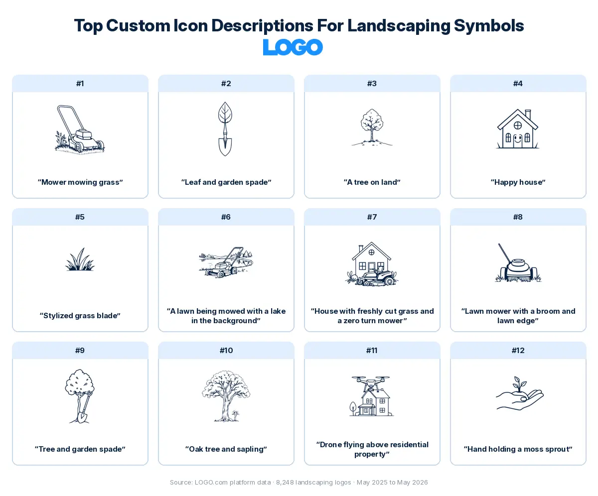
We took the twelve most typed landscaping descriptions and ran each one through all nine visual styles the custom icon generator offers, so you can see how the exact same words become a minimal line drawing, a detailed illustration, a pixel mark, a deco emblem, and five other looks. The version that's right for your brand probably isn't the same one that's right for someone else's, which is exactly why the comparison is useful.
1. "Mower mowing grass"
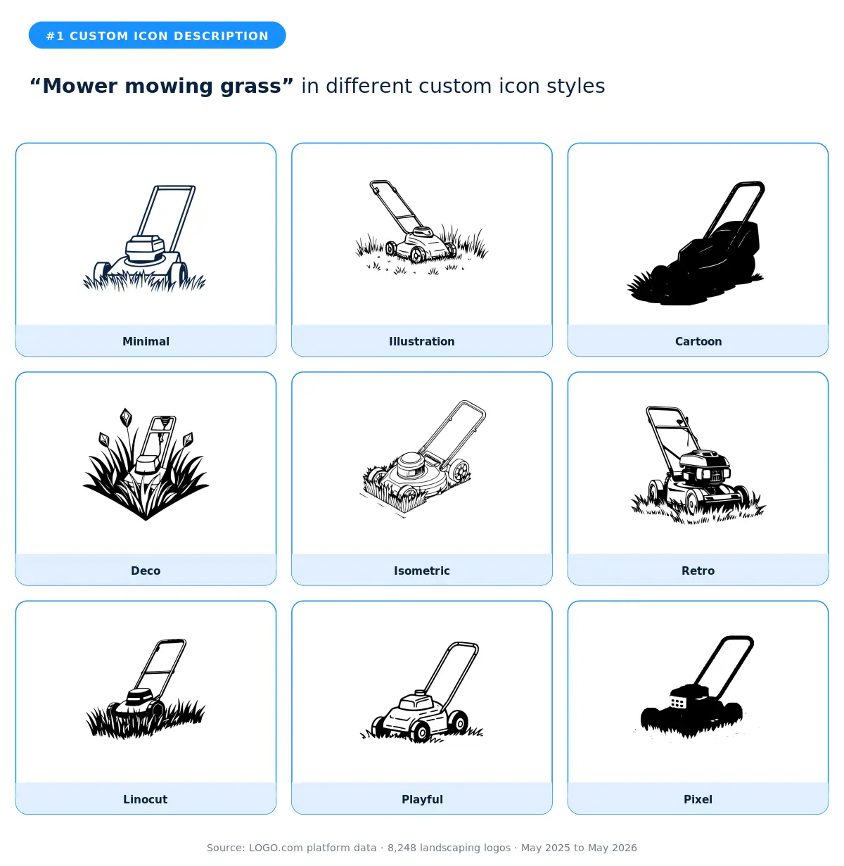
This was the most typed description in the landscaping data, and the simplicity is the point. Founders who typed it weren't reaching for clever metaphors, they were reaching for the most direct visual their customers would recognize on a lawn sign or a truck door. The cartoon and playful styles work best when your brand voice is friendly and approachable. The minimal style is the right call for a modern, service first brand that wants the mower as a quiet companion to the wordmark. According to LOGO.com data, this is also the most generic of the top picks, which means the styling you choose is what separates your logo from the next mower icon on the search results page.
2. "Leaf and garden spade"
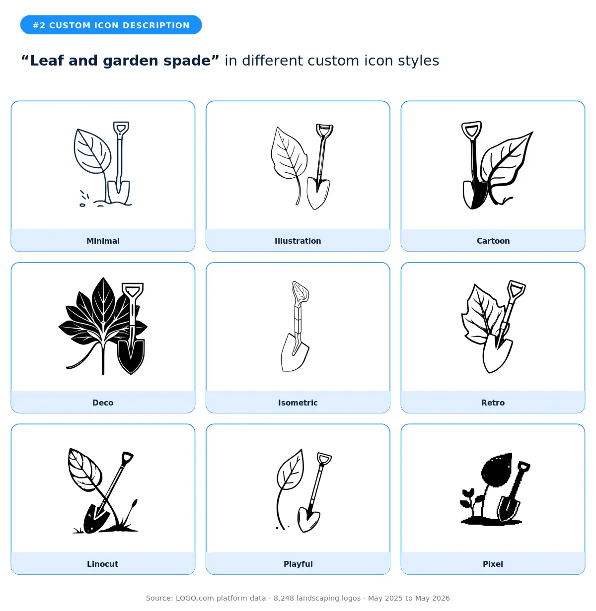
A leaf paired with a garden spade is one of the most useful combinations in this category because it signals both the living plant and the human hand doing the work. The illustration and isometric styles give you the room to show both elements without crowding the mark. The deco style turns this into a more formal emblem that fits design build firms and landscape architects. The retro style is the surprise pick for brands that want to feel established rather than scrappy. Skip the pixel and linocut versions unless your full aesthetic leans hard into a single texture.
3. "A tree on land"
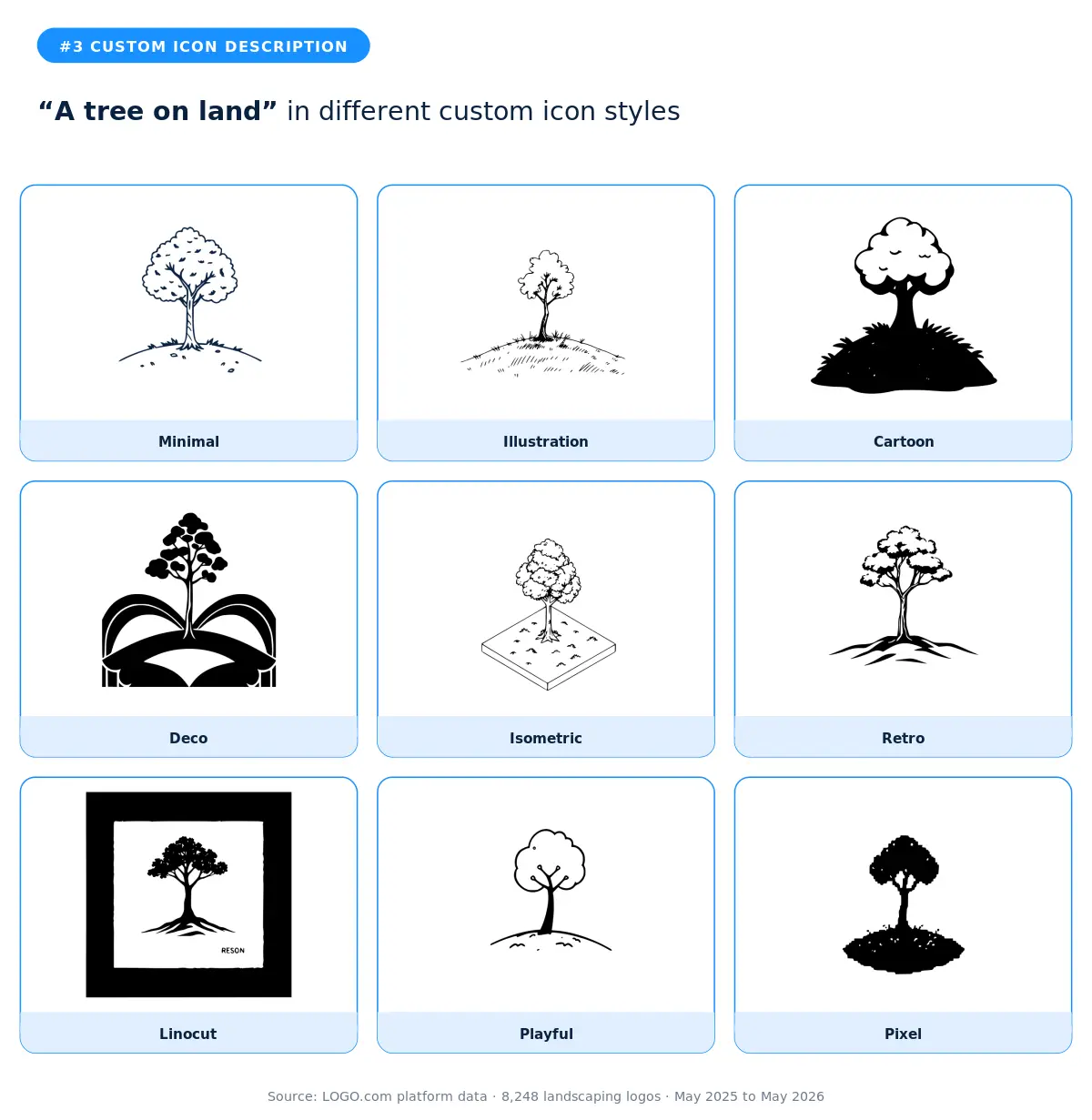
The simplest description in the top twelve, and the founders who chose it knew exactly what they were doing. A tree on land is the elemental version of landscaping. The minimal and illustration styles deliver the most flexible marks because they keep the shape readable at every size. The deco and retro styles take the same simple input and make it feel grown up, which is what you want if your brand competes on craft rather than speed. According to LOGO.com data, the cleanest descriptions tend to produce the most timeless logos, and this one is the clearest example of that pattern in the landscaping set.
4. "Happy house"
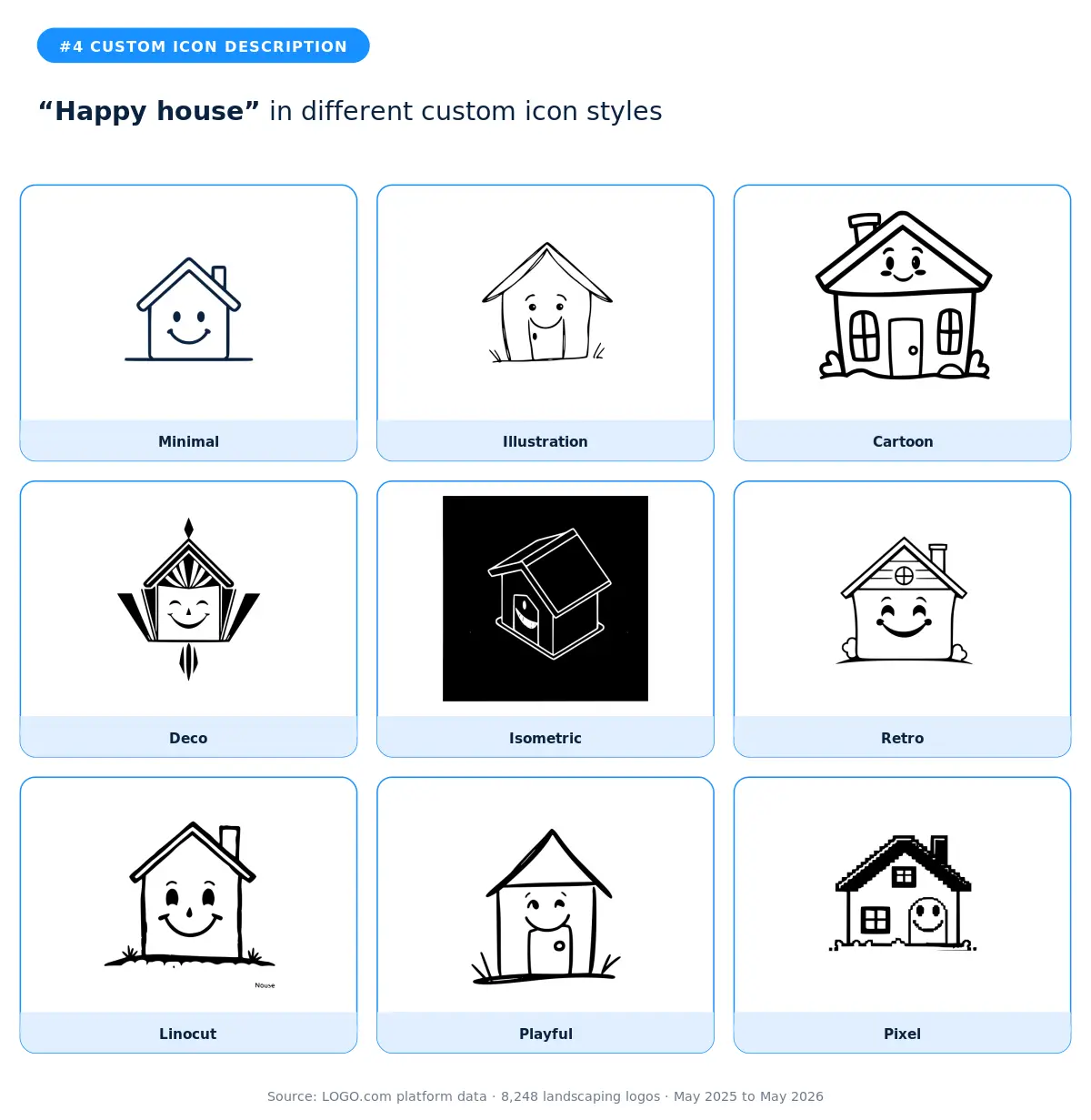
A happy house is a tell about what landscaping is selling at the customer level. It isn't grass, it's the feeling of pulling into a driveway that looks cared for. The cartoon and playful styles capture that warmth most directly. The retro style is the wild card that works for family run businesses with multigenerational stories. Skip the minimal and linocut versions if you want the smile to land, because a stripped down face loses its emotional weight fast.
5. "Stylized grass blade"
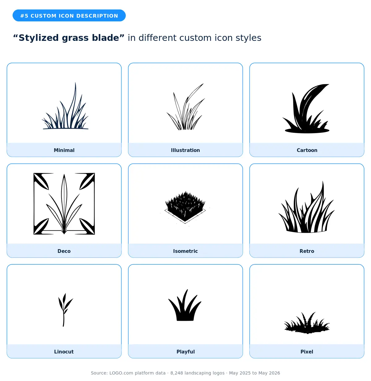
A single stylized grass blade is the cleanest abstract option in the landscaping vocabulary. It signals lawn care without showing any tools, which makes it ideal for brands that want to compete on quality rather than equipment. The minimal and deco styles are the strongest fits because they treat the blade as a designed shape rather than a literal piece of grass. The isometric style is the surprise pick for modern brands because the dimensional rendering reads as professional even when the underlying mark is simple.
6. "A lawn being mowed with a lake in the background"
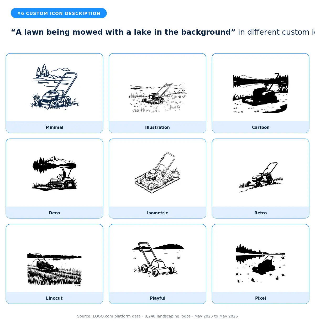
This is the most cinematic description in the top twelve, and the founders who typed it were buying into a sense of place. The illustration and isometric styles are the natural fits because they have room to show the full scene. The retro style is the standout because old travel poster cues work beautifully here, evoking summer afternoons by the water. Skip the pixel and minimal versions, because reducing this scene to its essentials loses the lake, and the lake is the whole point.
7. "House with freshly cut grass and a zero turn mower"
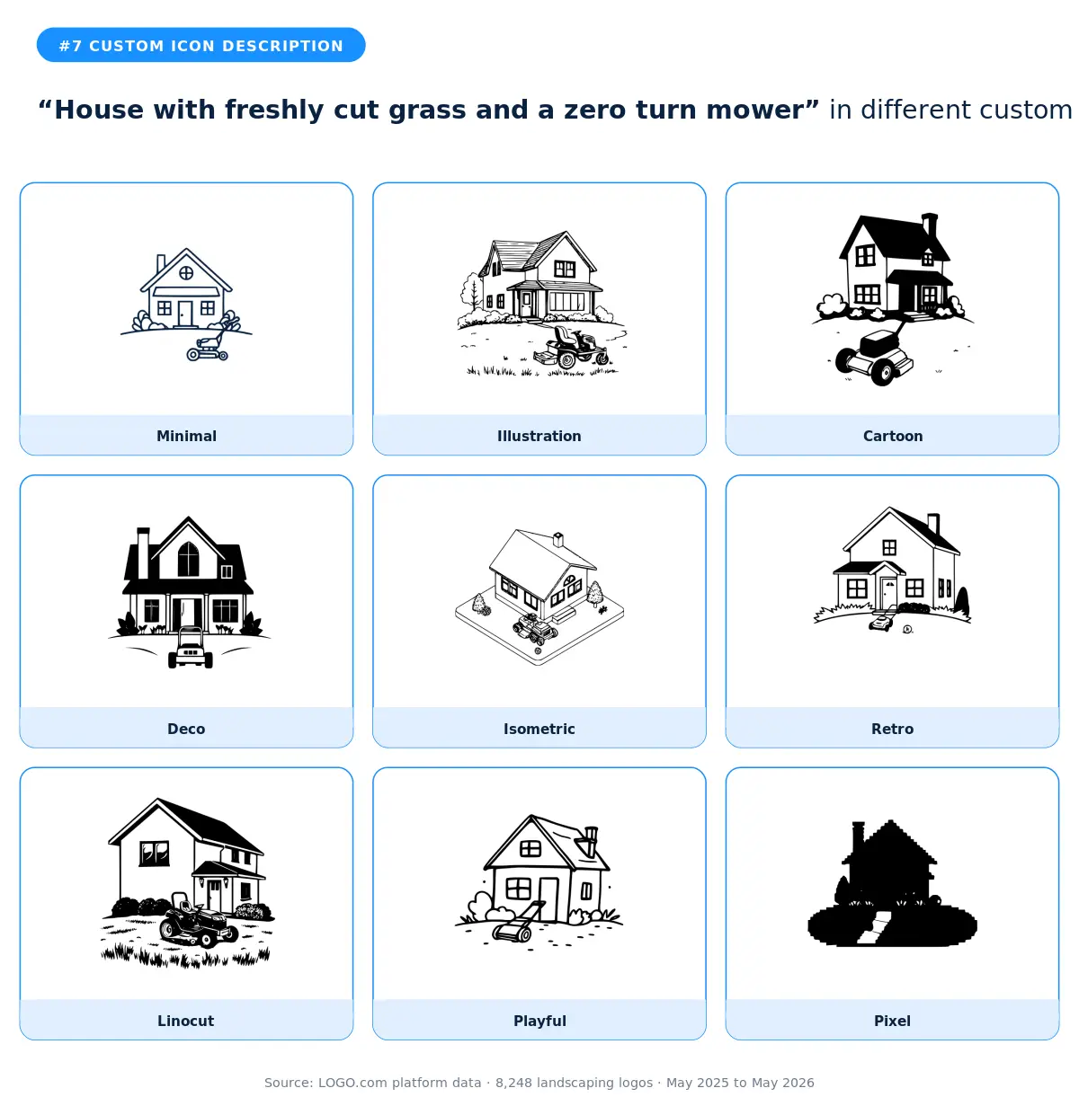
A descriptive scene that captures the before and after of a service in one mark. Zero turn mower mentions are a signal that the founder is professional grade, not casual weekend mowing. The illustration and isometric styles handle the multiple visual elements best. The cartoon style softens the seriousness for residential audiences. The minimal style is the surprise pick because reducing all three elements to clean shapes makes the mark scale better across signs, vehicle wraps, and digital.
8. "Lawn mower with a broom and lawn edge"
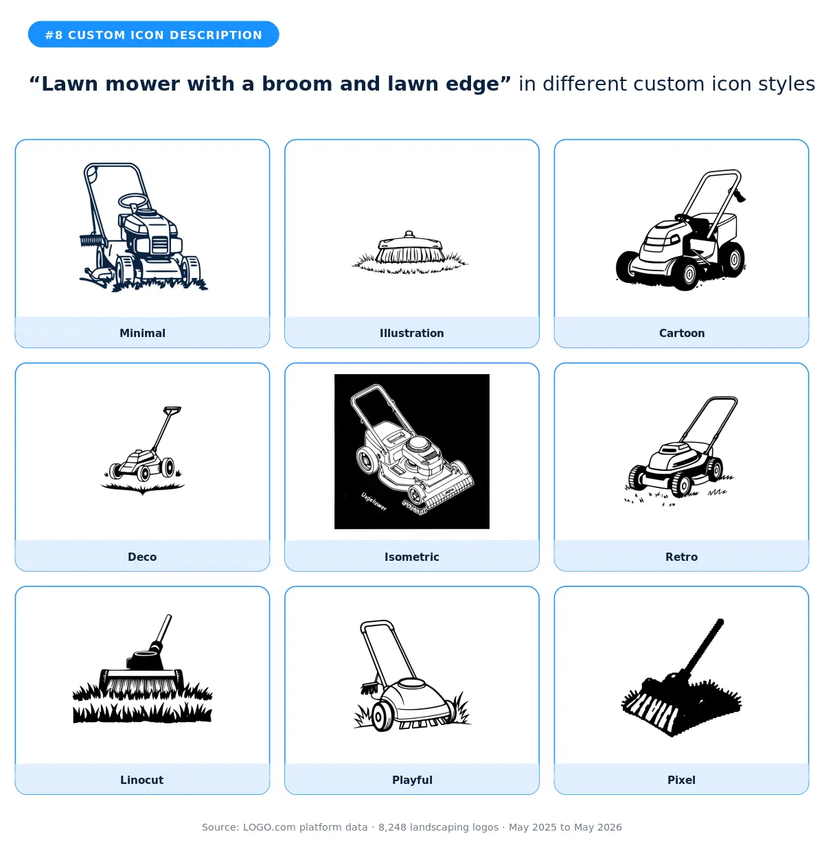
The full toolkit in one description. Founders who typed this were saying the quiet part loud: they don't just mow, they finish. The illustration and isometric styles are the best fits because the three tools need room to read clearly. The deco style turns the toolkit into a heraldic crest, which is a strong direction for premium residential brands. Avoid the pixel and linocut versions because the elements get muddied at small sizes.
9. "Tree and garden spade"
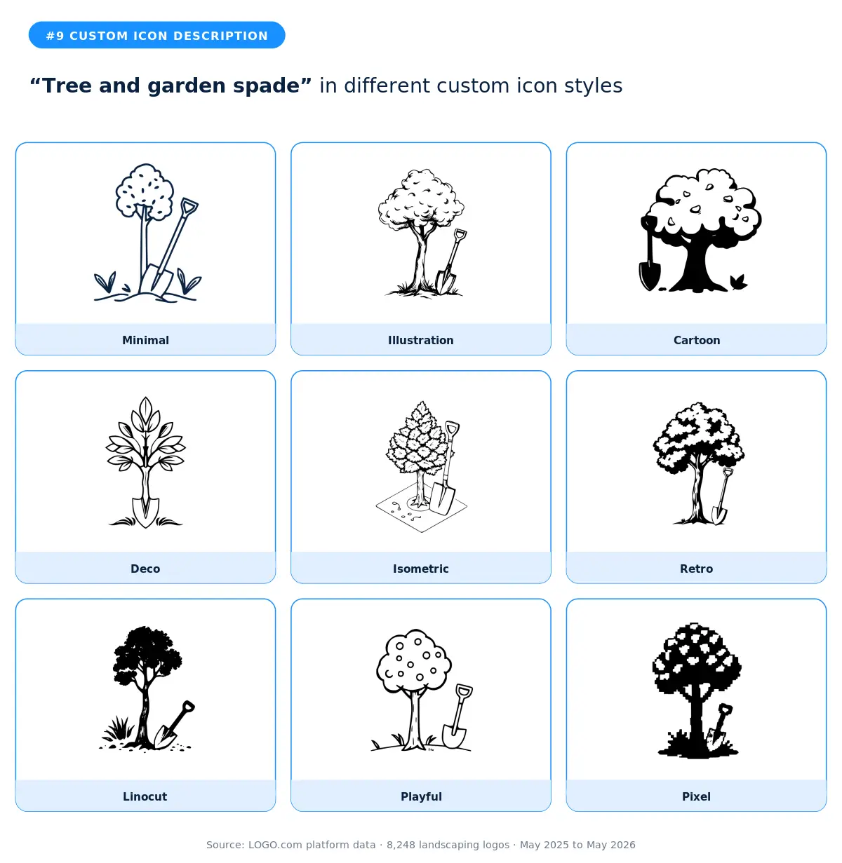
A close cousin of the leaf and garden spade at number two, but with a tree in place of the leaf. The mark reads more mature and more design build than the leaf version. The illustration and deco styles are the strongest fits. The minimal style works if your wordmark is doing most of the heavy lifting. According to LOGO.com data, founders who type tree descriptions tend to be the ones doing tree care, hardscape, and full property design rather than weekly mowing.
10. "Oak tree and sapling"
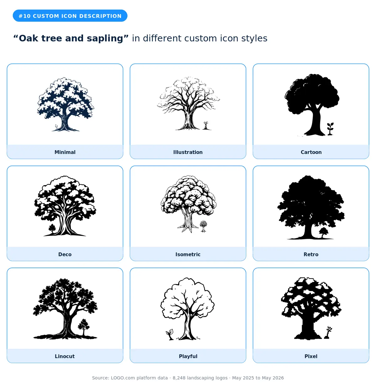
An oak tree next to a sapling is the most metaphorical description in the top twelve. It captures growth, mentorship, and time, which makes it a smart pick for landscapers who position themselves on long term relationships with customers. The illustration and deco styles do this idea justice because they have room to show both trees at different scales. The retro style adds nostalgia that complements the generational theme. Skip the pixel and cartoon versions because the metaphor depends on a certain quietness that those styles undercut.
11. "Drone flying above residential property"
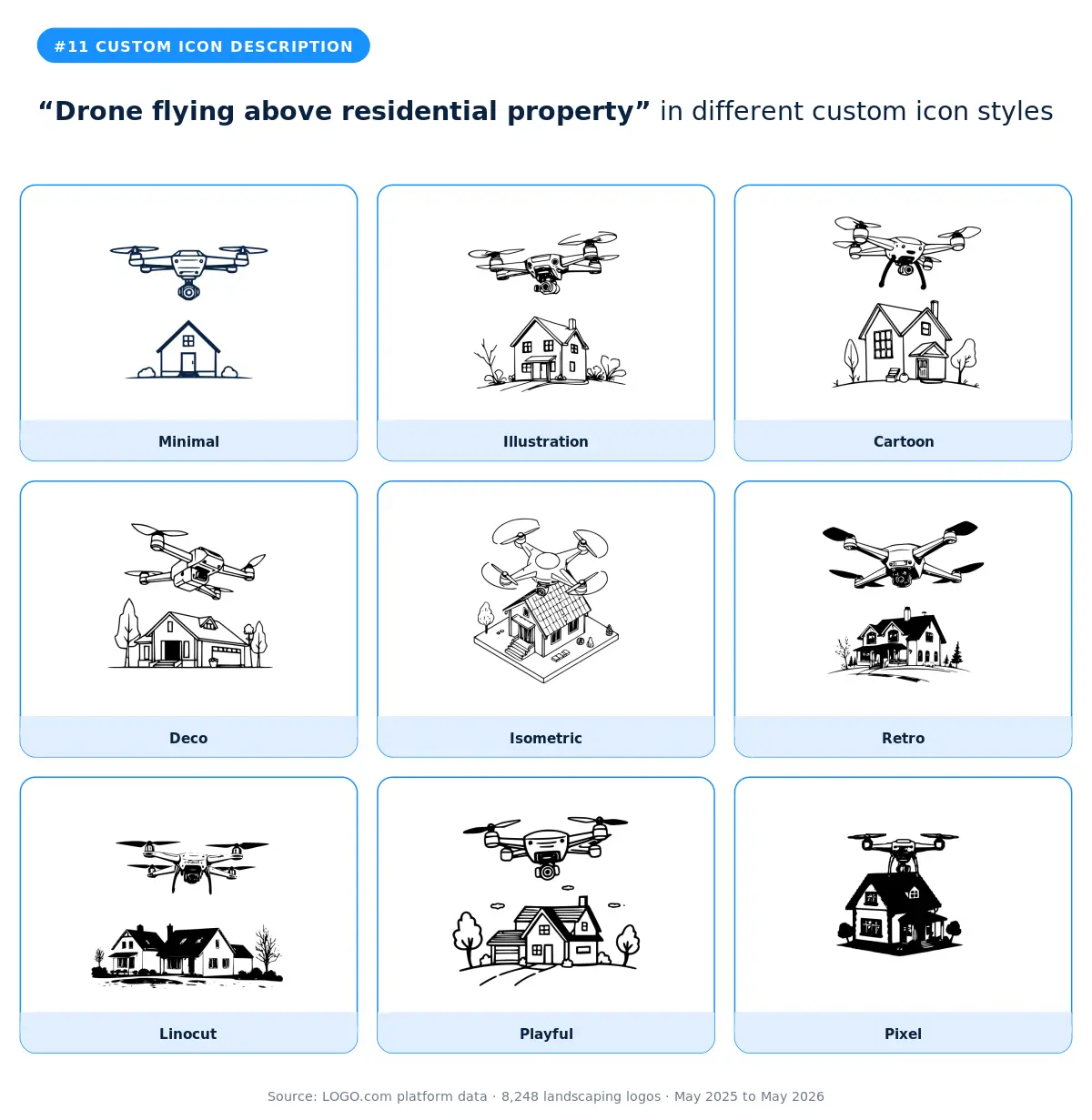
The most modern description in the landscaping top twelve, and a clear signal that the founder is using drone surveys, aerial photography, or quoting tools. The isometric and minimal styles fit best because both lean into clean geometric rendering. The illustration style adds a friendlier touch for landscapers using drones for marketing rather than measurement. The pixel and retro styles give you tech forward cues that work well for app first lawn care brands.
12. "Hand holding a moss sprout"
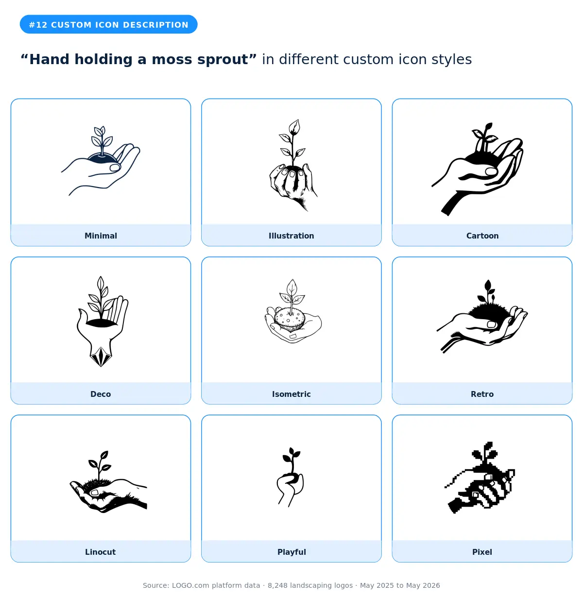
The most tactile description in the set, and the most niche. A hand holding a moss sprout reads as boutique, hand cultivated, and personal. The illustration and deco styles work best because they have room to show the detail. The cartoon and playful styles soften the seriousness for residential brands. Skip the pixel and minimal versions unless your wordmark is doing the heavy work, because the gesture loses its meaning at small sizes.
Part Two: Stock Icons
Roughly half of landscaping founders on LOGO.com skip the custom icon generator and head straight for the stock icon library instead. They want speed, they want a symbol they can recognize instantly, and they want a mark that's already proven on other brands. The library has thousands of options. Twelve of them account for the bulk of the landscaping picks.
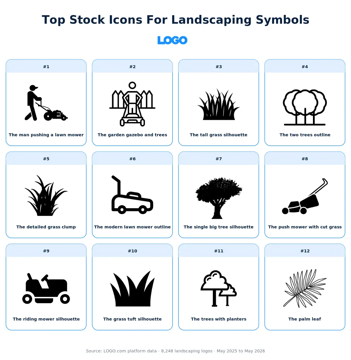
Here's our take on each of those twelve. The visual gives you the short version. The paragraphs underneath unpack the why and offer some guidance on which kinds of brands each icon actually fits.
1. The man pushing a lawn mower
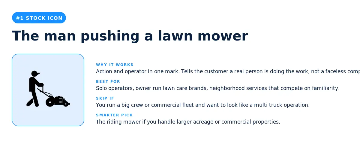
The most picked stock icon among landscaping brands on LOGO.com is a person actively pushing a lawn mower. That tells you something real about what this industry sells. Customers aren't hiring abstract concepts, they're hiring someone who is going to show up, push a mower across their lawn, and leave it better than they found it. The icon makes that promise visible in a single mark.
The pick makes sense for solo operators, owner run lawn care brands, and any service that competes on the human relationship rather than a fleet of trucks. Where it backfires is when you want to scale your brand to look like a multi vehicle commercial operation, because a single person with a mower under sells your capacity. In that case the riding mower silhouette at number nine is the stronger signal.
2. The garden gazebo and trees
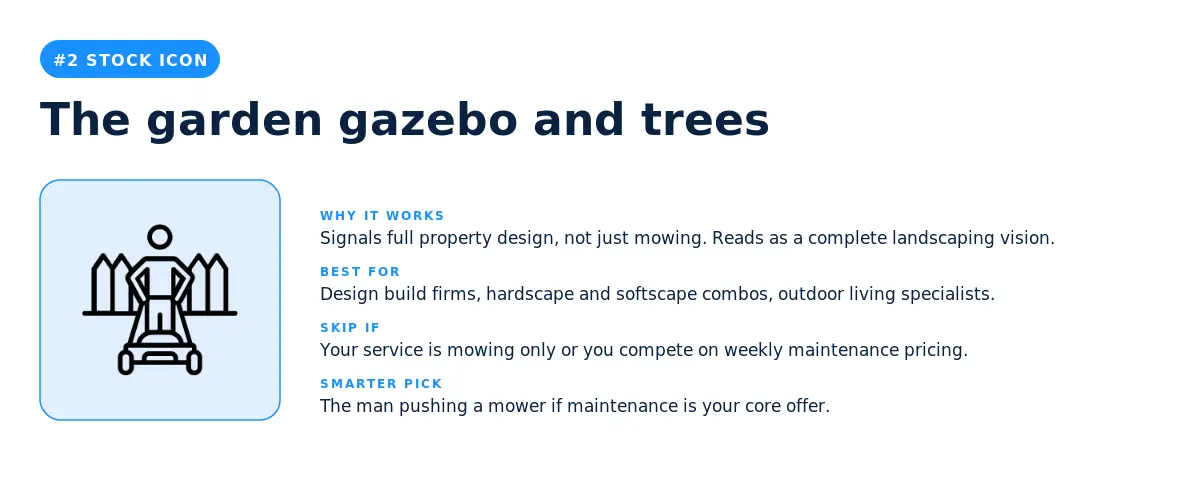
A gazebo framed by trees is the icon for landscapers who design full properties, not just maintain lawns. It signals hardscape, outdoor living, and the kind of work that turns a yard into a destination. Best fit is design build firms, outdoor living specialists, and the high end of residential landscaping. Skip it for weekly mowing routes or budget focused services, because the icon over promises scope.
3. The tall grass silhouette
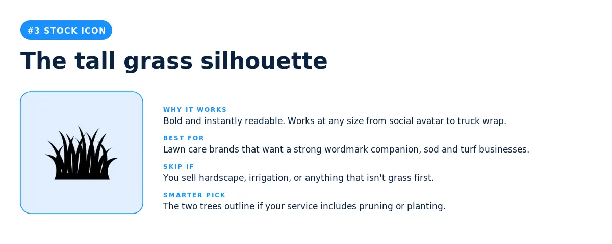
A bold silhouette of three grass blades clumped together. The visual is so direct that customers know what you do before they read your wordmark. Best fit is sod and turf businesses, lawn care brands that want a strong wordmark companion, and any landscaper whose brand voice is no nonsense. Skip it if your service is more about plants, hardscape, or property design, because the icon will pigeonhole you into grass.
4. The two trees outline
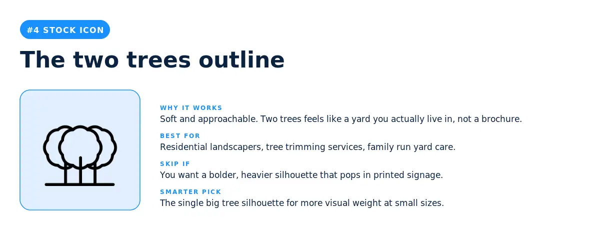
Two cloud shaped trees in a clean outline style. The mark reads as approachable, residential, and lived in rather than commercial. Residential landscapers and family run yard care brands are the natural fit. The two tree arrangement also works for tree trimming services because it implies care for living things over time.
5. The detailed grass clump
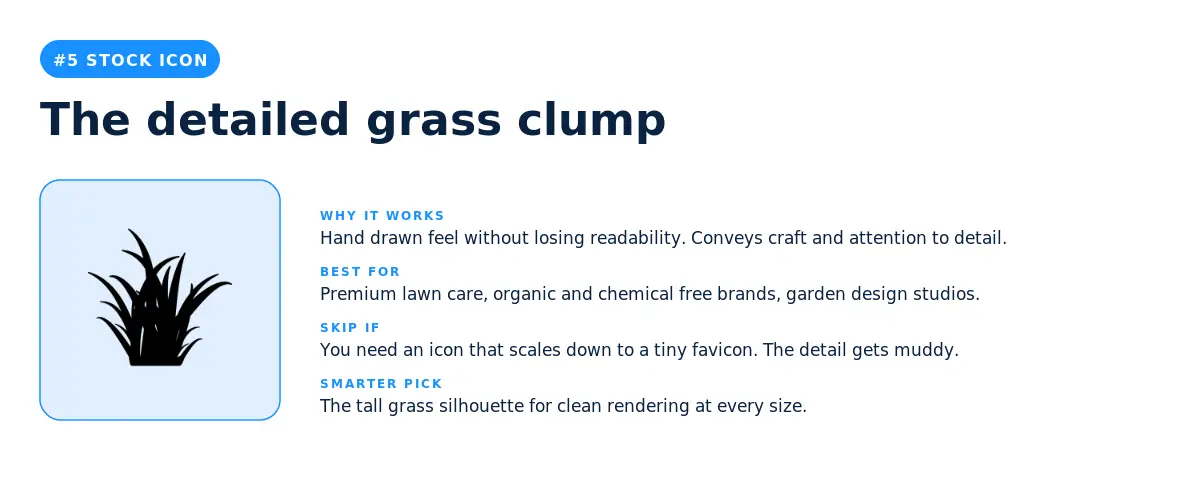
A more textured, hand drawn take on the grass theme. The individual blade strokes convey craft and attention to detail. Best fit is premium lawn care, organic and chemical free brands, and garden design studios that want to signal a more boutique aesthetic. The trade off is that the detail can muddy at smaller sizes, so plan for a simplified version of your logo for favicons and small social avatars.
6. The modern lawn mower outline
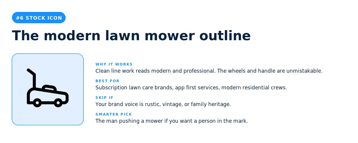
A clean, single line drawing of a push mower. The icon reads modern, app first, and professional. Subscription lawn care brands, modern residential crews, and tech adjacent services pick this when they want their logo to feel current rather than rustic. The minimalism makes it scale beautifully from app icon to truck wrap.
7. The single big tree silhouette
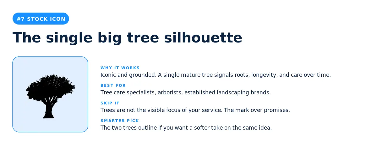
A heavy, mature tree in solid silhouette. This icon signals roots, longevity, and a service that has been around long enough to be trusted. Tree care specialists and arborists are the obvious fit, but it also works for established landscaping brands that want to communicate experience rather than novelty. Skip it if trees are not visibly part of your service, because the icon makes a promise the brand will need to deliver on.
8. The push mower with cut grass
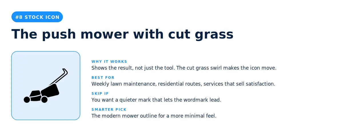
A push mower with a swirl of cut grass behind it. The motion in the mark makes it feel like work in progress rather than a static object. Weekly lawn maintenance brands and residential routes are the natural fit because the icon implies the visible result customers care about. Skip it if you want a quieter mark that lets the wordmark lead.
9. The riding mower silhouette
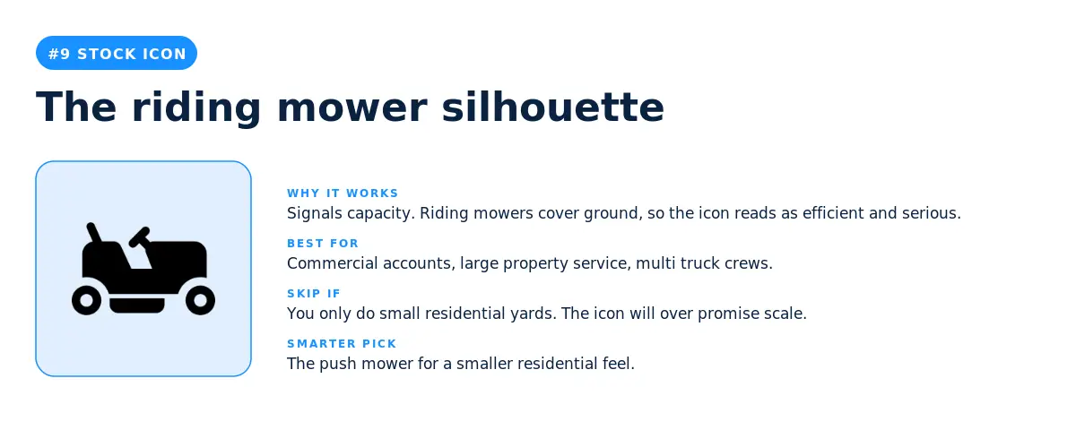
A ride on mower silhouette that signals capacity and serious equipment. Commercial accounts, multi truck crews, and any landscaper handling large properties are the natural fit. Skip it for small residential routes because the icon over promises the size of your operation.
10. The grass tuft silhouette
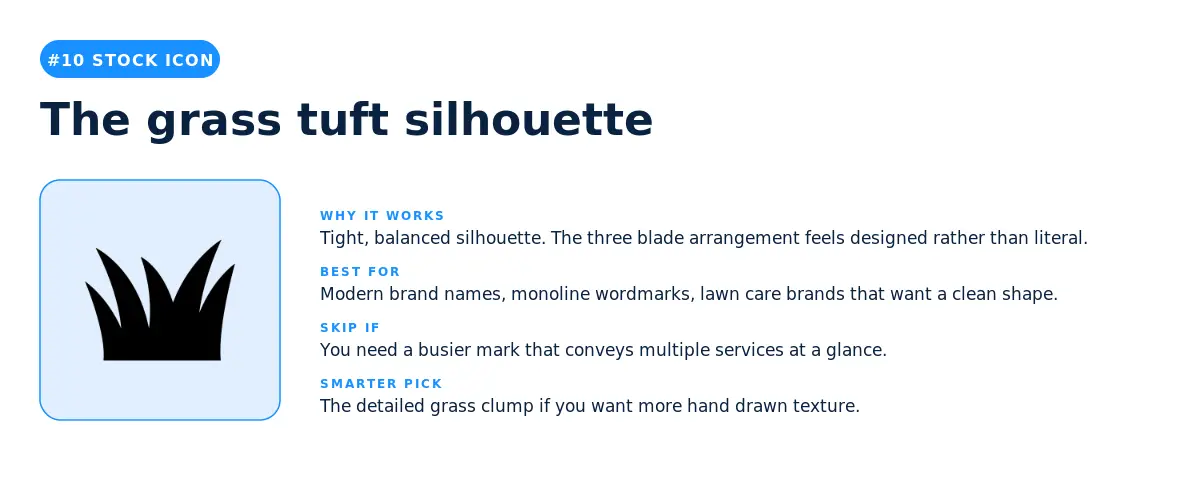
A tighter, more designed grass shape than the detailed clump at number five. Three balanced blades form a tuft that reads as deliberate rather than literal. Best fit is modern brand names with monoline wordmarks and lawn care brands that want a clean shape they can pair with bold typography.
11. The trees with planters
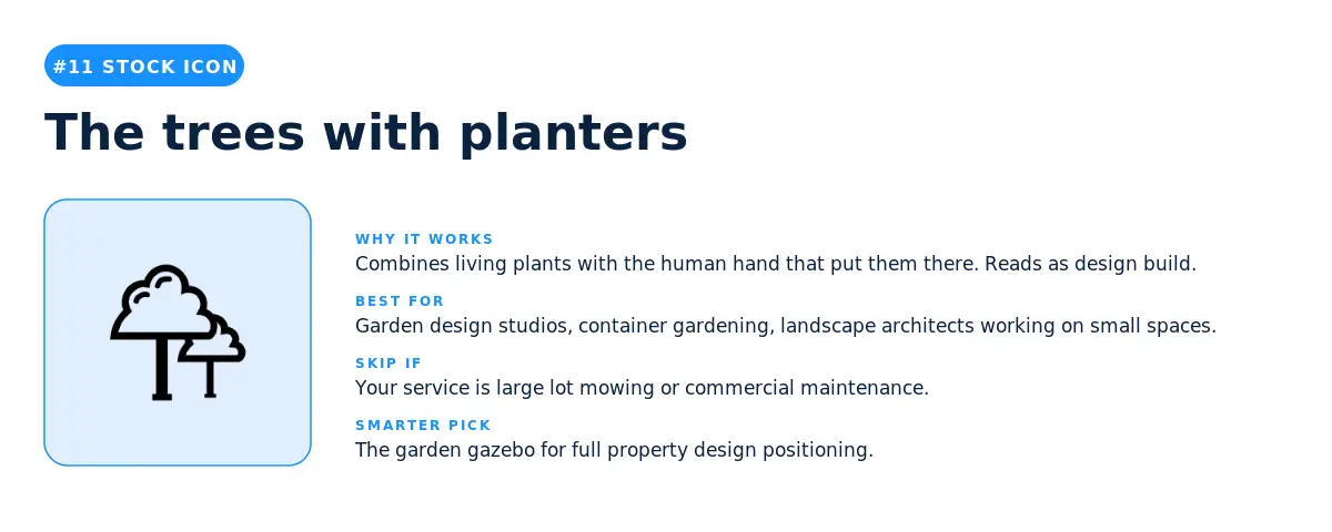
A pair of cloud shaped trees in raised planters. The icon combines living plants with the visible work of putting them there, which makes it ideal for garden design studios and container gardening specialists. Skip it for large lot mowing or commercial maintenance because the planters signal small scale and intentional design.
12. The palm leaf
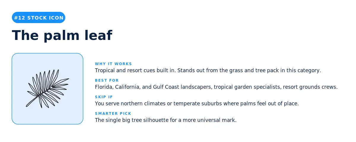
A single palm leaf in clean line work. The icon stands out in the landscaping category because most of the other top picks are grass and deciduous trees. Florida, California, and Gulf Coast landscapers pick this when they want to signal climate first. Resort grounds crews and tropical garden specialists also lean into it. Skip it in northern climates where the regional cue feels off.
Three takeaways from the data before you decide.
1. Equipment is the dominant motif of the landscaping category. Whether founders typed a description or picked a stock icon, lawn mowers showed up everywhere. They appear in five of the twelve most typed descriptions and in four of the twelve most picked stock icons. If your logo carries a mower of some shape, you're speaking the visual language of the category. If it doesn't, you're either differentiating on purpose (design build, tree care, hardscape) or unintentionally signaling a different industry.
2. Custom icons let you specialize, stock icons let you compete. The custom icon descriptions in this data are full of niches like drone flying above residential property, hand holding a moss sprout, and oak tree and sapling. The stock icon picks are general purpose symbols that work for almost any landscaper. According to LOGO.com data, the landscapers who use the custom icon generator are usually building specialty brands, while the landscapers who use the stock library are building general services that compete on availability and price. Pick a symbol that matches the strategy you actually want to run.
3. The middle of the list is where the smart design choices live. The icons and descriptions at number one are the safest bets, but they're also the most common. The picks at numbers four through ten are where you'll find symbols with enough recognition to land instantly and enough specificity to set you apart from the next landscaper on the search results page. Look hard at the middle of both lists before you settle on a number one.
For founders launching in 2026, here is the simplest way to think about it. A stock icon is the right call when speed matters more than standing out. A custom icon is the right call when standing out matters more than speed. The data above shows you which side of that line your gut is sitting on, before you even open the editor.
Source: LOGO.com platform data, May 2025 to May 2026. n = 8,248 landscaping logos. Rankings reflect the most picked stock icons and the most typed custom icon descriptions among users who selected "landscaping" as their industry on LOGO.com.
Recent posts

Oct 19, 2026 by: Sean Baker

Oct 14, 2026 by: Vanessa Lam
Oct 12, 2026 by: Sean Baker
Oct 5, 2026 by: Sean Baker