The Most Popular Cleaning Logo Ideas: What 2,018 Brands Can Teach Us About Design Trends
Inside 2,018 cleaning logos: the most popular symbols brands picked, split into stock icons and custom icons. Plus the design trends that show up across both.
Every month, thousands of new cleaning brands launch on LOGO.com. Between May 2025 and May 2026, selecting "cleaning" as the industry inside our editor was one of the most active service categories on the platform. Maid services, vacation rental crews, janitorial outfits, eco focused startups, solo cleaners going independent.
If you're starting a cleaning brand, picking the right symbol for your logo is the decision that sets the tone for everything else. Every cleaning logo on LOGO.com has a symbol at its core. That symbol is either a stock icon, a ready made mark from our library, or a custom icon, drawn by our AI generator from a description you type. We pulled the data on what 2,018 cleaning founders actually picked so you can see the patterns before you sit down to make your own.
How we put this together
These rankings come from LOGO.com platform data between May 2025 and May 2026. We looked at the 2,018 logos created by people who selected "cleaning" as their industry inside our editor, then ranked the symbols they actually chose. Half come from our stock icon library and half come from descriptions they typed into our custom icon generator (powered by AI). We counted every distinct pick rather than unique users, because the question we wanted to answer for you is: given the chance to pick any symbol, what do cleaning founders pick for their logo?
Part One: Custom Icons
When a cleaning founder types a description into the custom icon generator, the words they choose tell us what they were already imagining before they sat down to type. The symbol that comes back is one of a kind, drawn from scratch based on your description rather than pulled from a library other brands use too.
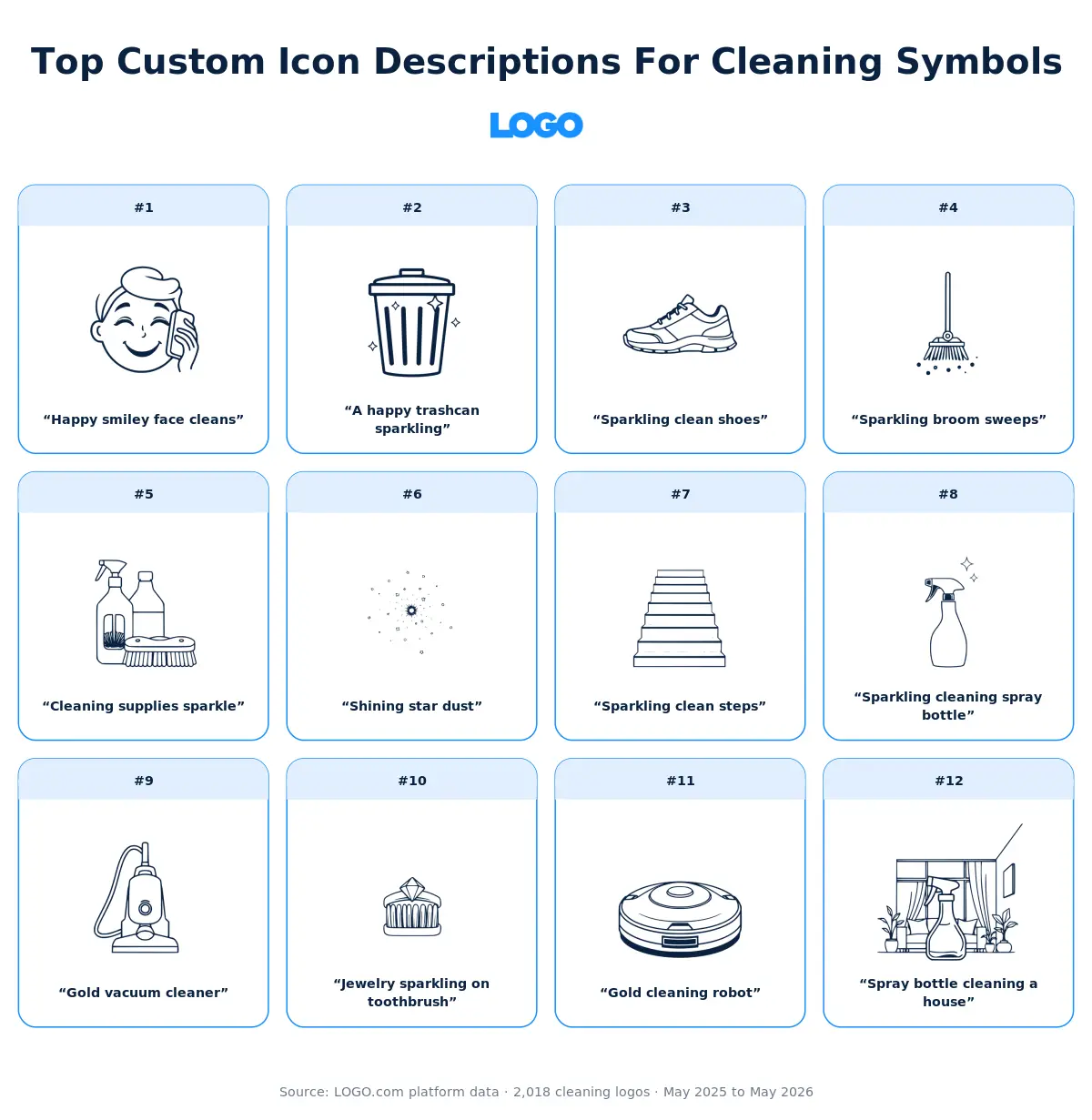
We took the twelve most typed cleaning descriptions and ran each one through all nine visual styles the custom icon generator offers, so you can see how the exact same words become a minimal line drawing, a detailed illustration, a pixel mark, a deco emblem, and five other looks. The version that's right for your brand probably isn't the same one that's right for someone else's, which is exactly why the comparison is useful.
1. "Happy smiley face cleans"
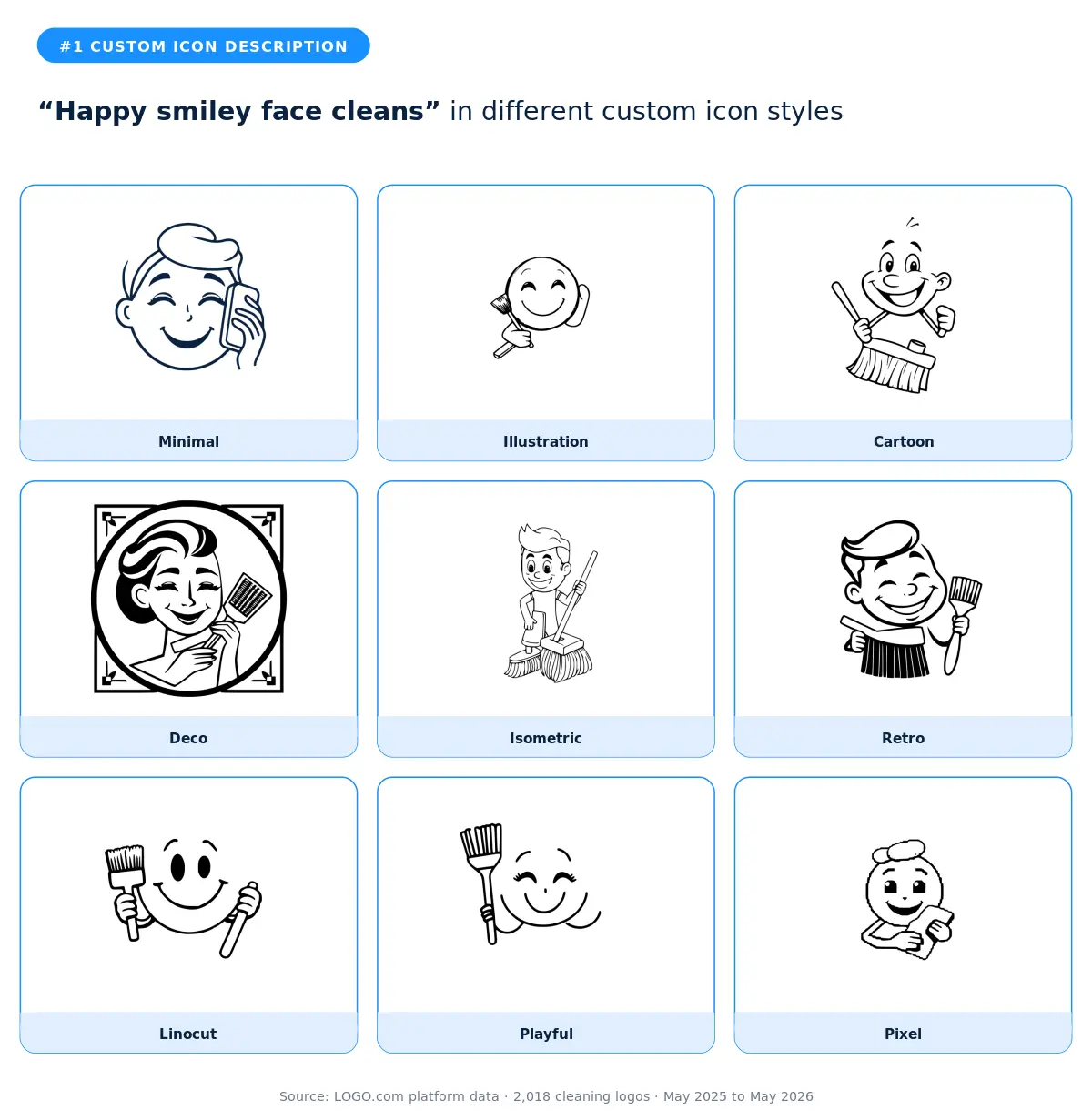
This was the single most typed description in our cleaning data, and it tells you something important about how founders in this industry think about themselves. They want warmth. They want a logo that smiles at the customer before the customer has even said hello. The cartoon and playful styles do this best because they treat the smile as a character. The retro style is the surprise winner if you want warmth without looking like a cartoon brand, because it gives you a nostalgic, friendly face that still feels grown up. Skip the minimal and linocut versions unless your wordmark is doing the heavy lifting elsewhere, because the smile gets lost without color or detail.
2. "A happy trashcan sparkling"
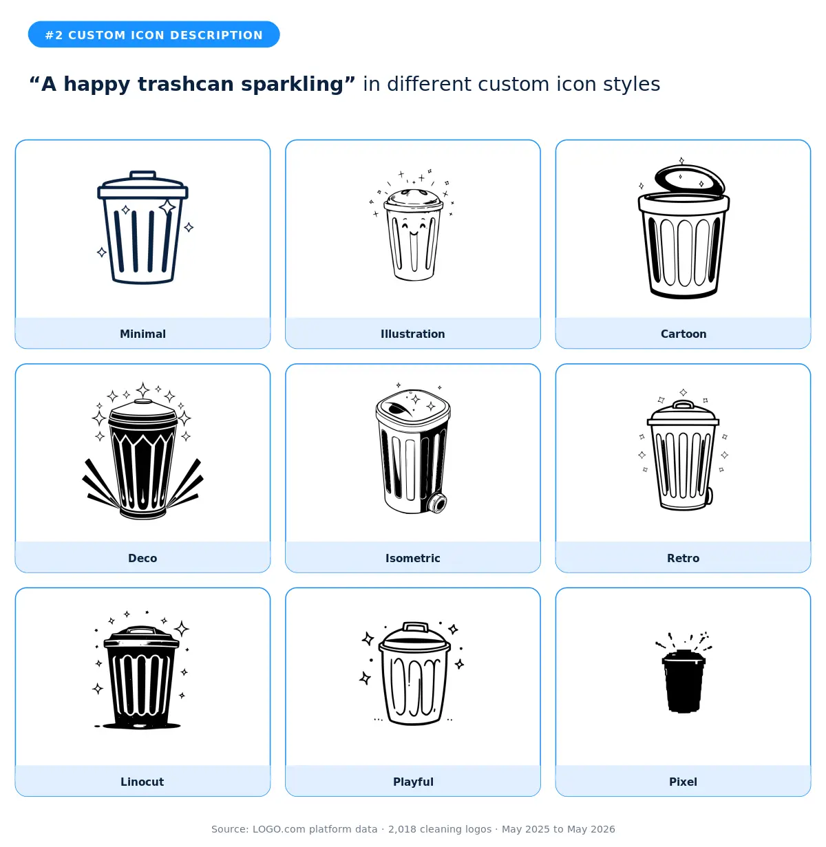
A trash can with a face and a few sparkles is the cleaning industry's version of an emoji come to life. The fact that this exact phrase came up multiple times across different founders means it isn't a one off, it's a pattern. Cartoon is the obvious match here because the description is already cartoon shaped in your head. The playful and isometric styles are the more interesting plays if you want to keep the warmth but look less juvenile. According to LOGO.com data, cleaning is one of the few industries where founders consistently turn an unglamorous object into the brand mascot, which says a lot about how proud this community is of the unsexy parts of the work.
3. "Sparkling clean shoes"
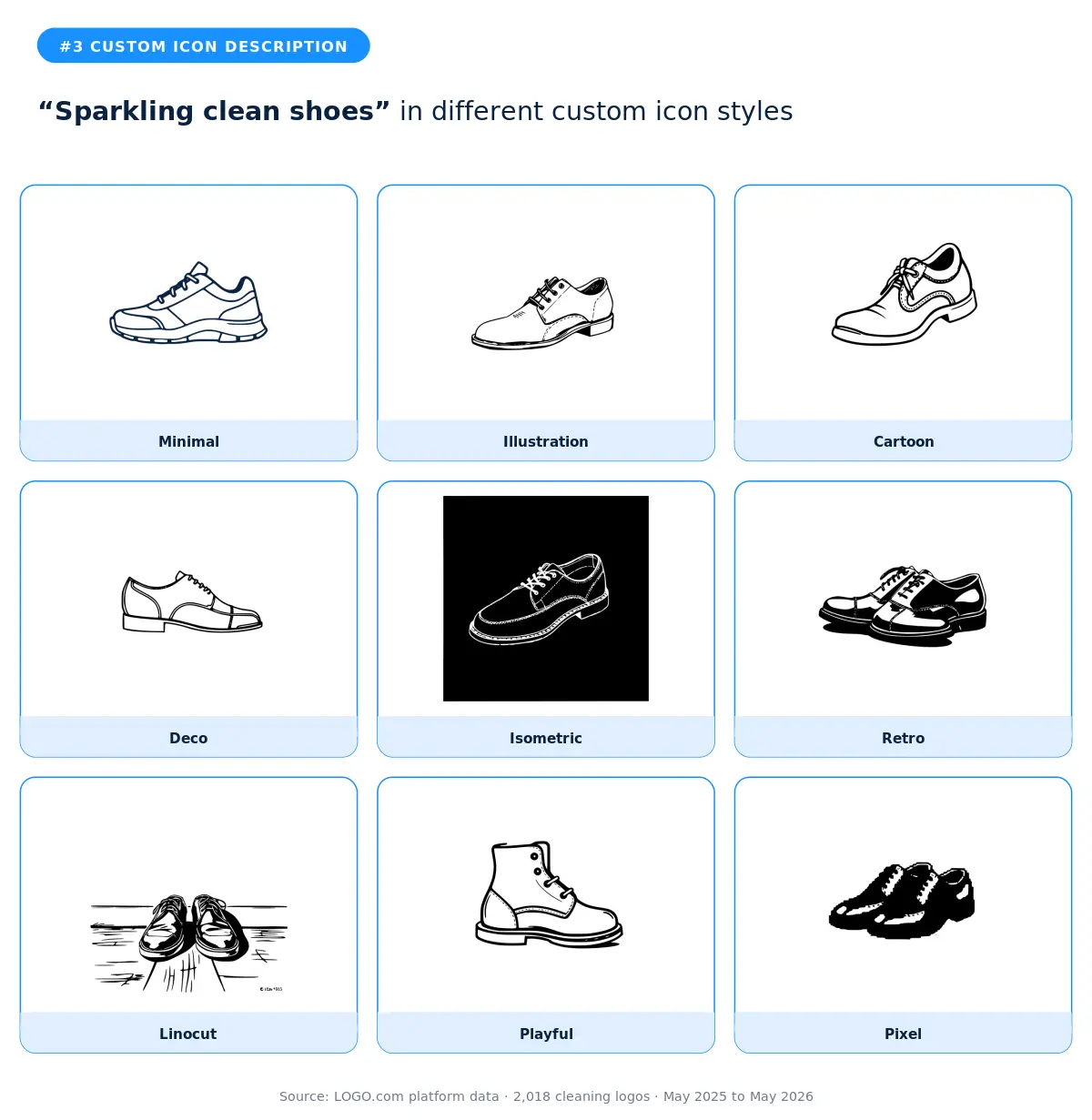
Shoe cleaning is a specialty inside the cleaning category, and the founders going after it know it. The illustration and isometric styles are the two best fits because they show enough detail to communicate the niche without crowding the mark. The deco and retro versions lean into vintage barbershop and shoeshine territory, which is a strong direction if your brand voice is craft over speed. Skip the pixel and linocut versions unless you're going hyper specific with your aesthetic, because the shoe loses its silhouette fast at small sizes.
4. "Sparkling broom sweeps"
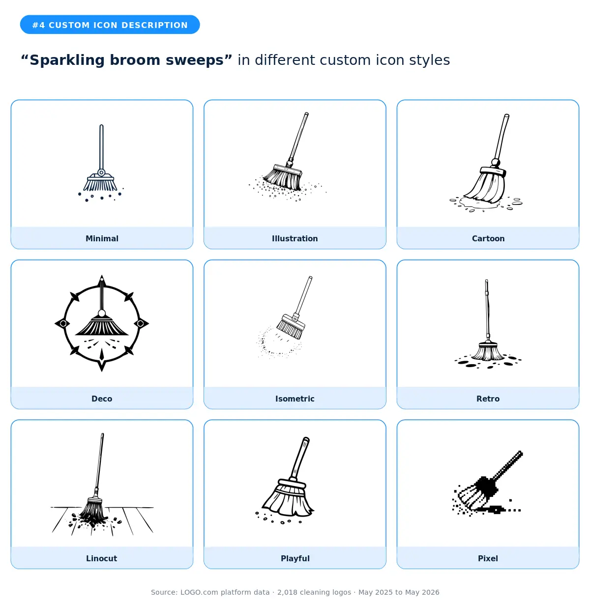
The broom plus sparkles combination shows up across the cleaning data because it captures both the action and the result in one phrase. The cartoon and playful styles work best when your brand voice is friendly and approachable. The minimal style is the right call for a modern, service first brand that wants the broom as a quiet symbol rather than a centerpiece. The deco style turns this into a heraldic mark, which is the surprise that works for premium cleaners marketing themselves as boutique rather than budget.
5. "Cleaning supplies sparkle"
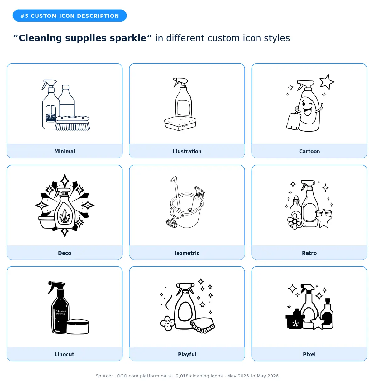
When founders typed the words "cleaning supplies sparkle" they were asking for the whole kit, not a single tool. That's a tell. These are full service cleaners who want their logo to show they bring everything the job needs. Isometric and illustration are the two strongest styles because they have room to show the full set without losing readability. The cartoon and playful versions read as a more family friendly version of the same idea. Avoid the linocut and deco styles here, because the multiple objects get muddied when they fight for the same visual weight.
6. "Shining star dust"
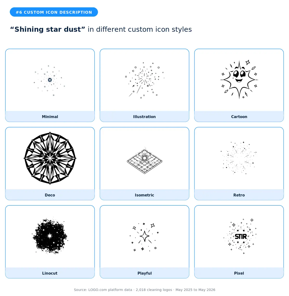
This is the most abstract description in the cleaning top twelve, and the founders who chose it were buying into a feeling rather than a tool. Star dust signals magic, finish, the after. The minimal and deco styles are the strongest fits because they treat the dust as decoration rather than illustration. The retro style is the surprise pick for cleaners who want their logo to feel timeless rather than trendy. Skip the cartoon and playful versions, because star dust loses its meaning the moment it gets a character or a face.
7. "Sparkling clean steps"
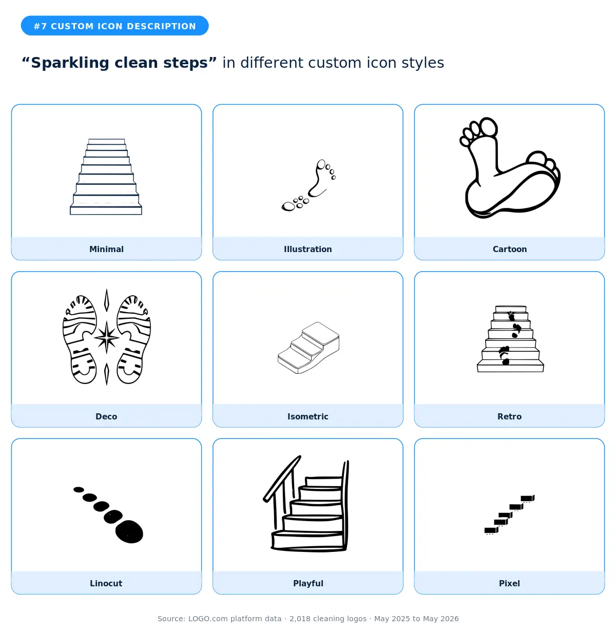
Steps in this context can mean two things. The literal stairs a cleaner mops on their way up a house, or the step by step satisfaction of going from dirty to done. The isometric style is the best fit because steps and stairs translate naturally into the isometric perspective. The minimal style gives you a clean architectural feel for high end residential cleaners. The illustration and retro styles soften the geometry for a warmer brand. Skip the pixel and linocut versions unless your brand identity is already leaning into a heavy aesthetic.
8. "Sparkling cleaning spray bottle"
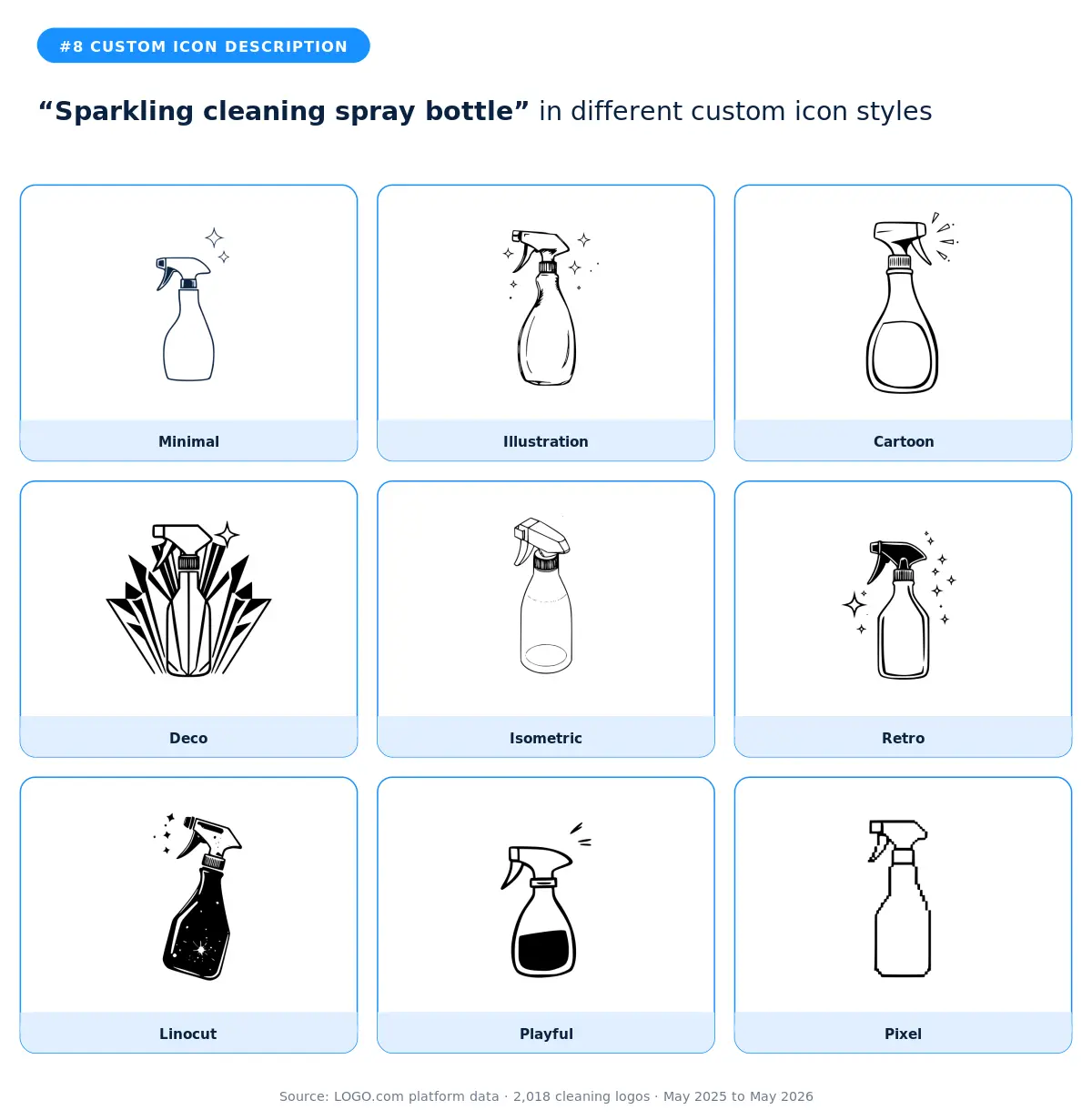
The spray bottle is the workhorse of the cleaning visual vocabulary, and the founders who typed this description wanted it dressed up with sparkles to show the finish, not the chemicals. Illustration and isometric give you the most detail without sacrificing readability. The cartoon and playful versions are the friendlier picks, especially for residential cleaners marketing to families. The retro style is a strong choice if you want your brand to feel established rather than scrappy, because retro design suggests longevity.
9. "Gold vacuum cleaner"
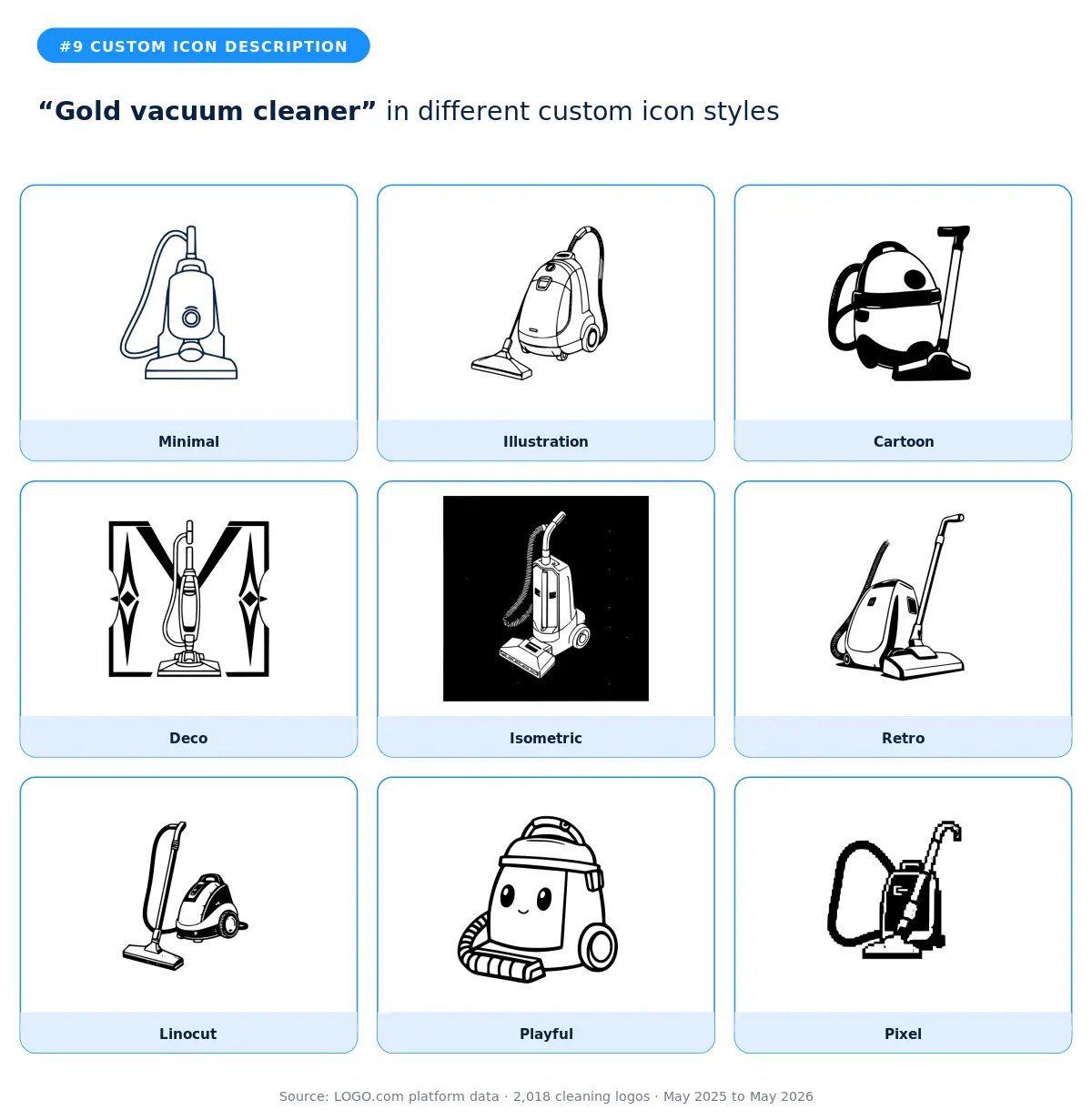
A gold vacuum cleaner sounds like a joke, but it's not. The cleaners who typed this were positioning themselves as premium. They wanted a logo that signals the most expensive option on the page, the white glove version of the job. The deco and retro styles deliver on that positioning because gold reads as luxury in those visual languages. The minimal style with a navy fill (or whatever brand color you choose) is the modern interpretation, where gold becomes more of a metaphor than a literal color. According to LOGO.com data, the gold vacuum appears almost exclusively in markets where cleaners compete on quality rather than price.
10. "Jewelry sparkling on toothbrush"
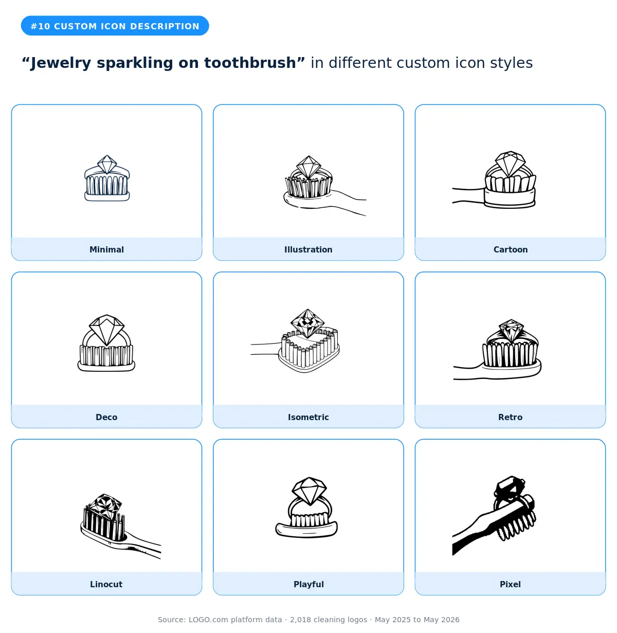
This is a hyper specific niche description, and the founders who chose it were almost certainly building a jewelry cleaning service. That kind of specificity is rare in cleaning, and it's a smart positioning move because nobody else in the category is competing for that exact customer. Illustration is the strongest style here because the description needs detail to make sense. The deco style is the wildcard, taking the description into ornate territory that fits high end jewelry brands. Skip the cartoon and playful versions, because the seriousness of jewelry care doesn't survive a smiling toothbrush.
11. "Gold cleaning robot"
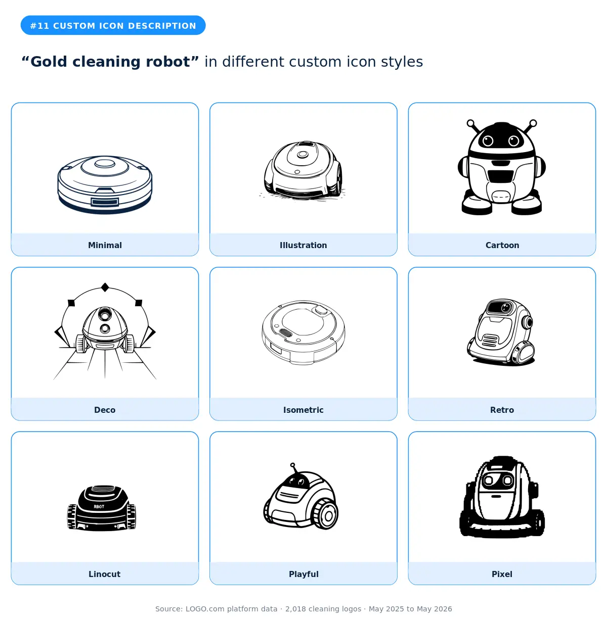
The gold cleaning robot description is a tell that the founder thinks of themselves as the modern, tech forward option in their market. The isometric and minimal styles are the obvious fits because both lean into the geometry of a robot. The pixel and retro styles give you nostalgic computer era vibes, which is a great move if your service is a subscription product or an app first cleaning brand. The illustration style is your fallback when you want the robot to feel friendly rather than industrial.
12. "Spray bottle cleaning a house"
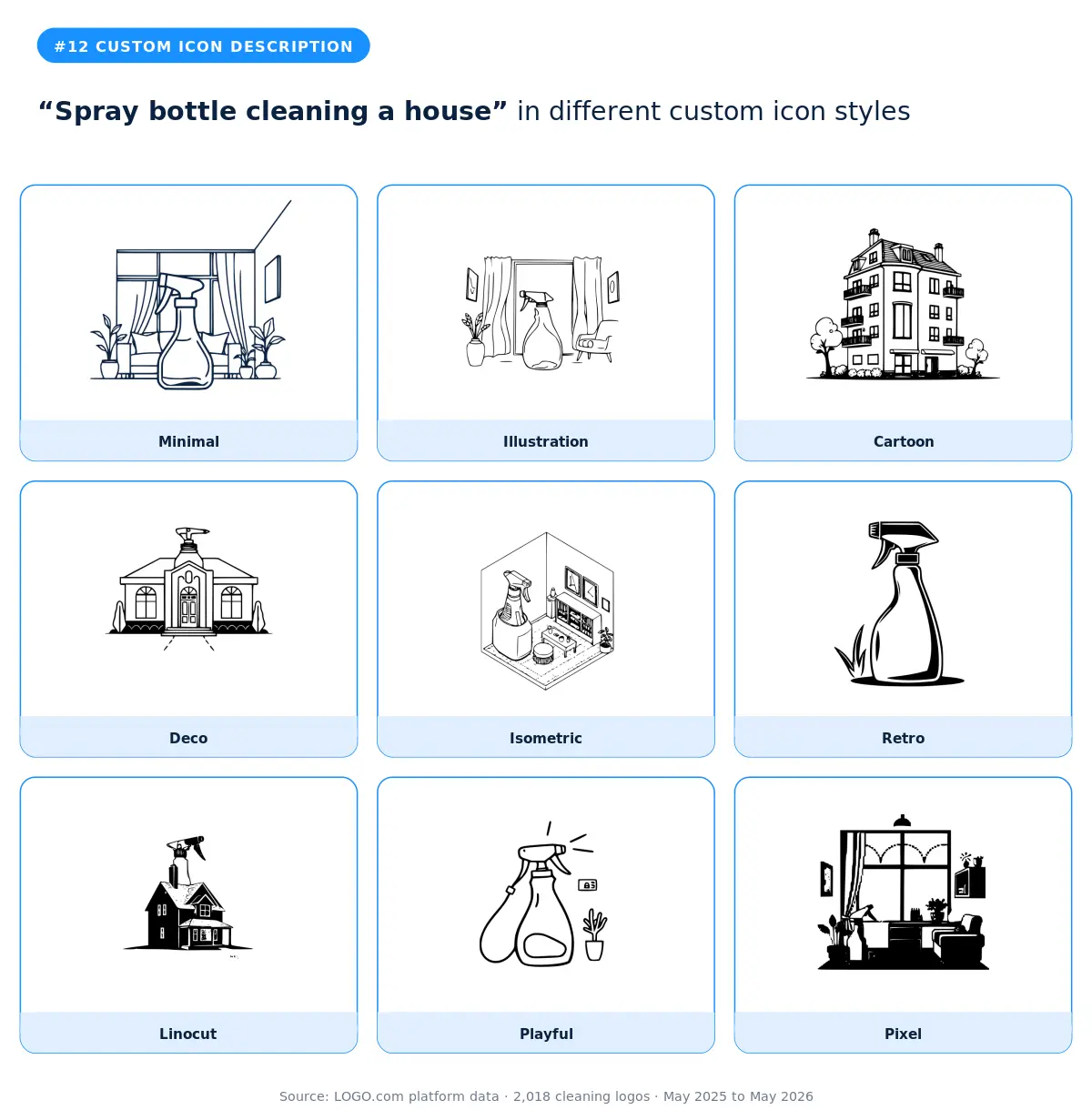
A spray bottle cleaning a house is the cleaning industry's version of a customer testimonial in icon form. The whole job is in the description. The illustration and isometric styles are the natural fits because they give you the room to show both the tool and the setting. The cartoon and playful versions read as approachable and family safe. The minimal style is the surprise pick for branding that wants to lean modern while still showing the work, because reducing both the house and the bottle to their essential shapes makes the logo more flexible across signage, vehicles, and digital.
Part Two: Stock Icons
Roughly half of cleaning founders on LOGO.com skip the custom icon generator and head straight for the stock icon library instead. They want speed, they want a symbol they can recognize instantly, and they want a mark that's already proven on other brands. The library has thousands of options. Twelve of them account for the bulk of the cleaning picks.
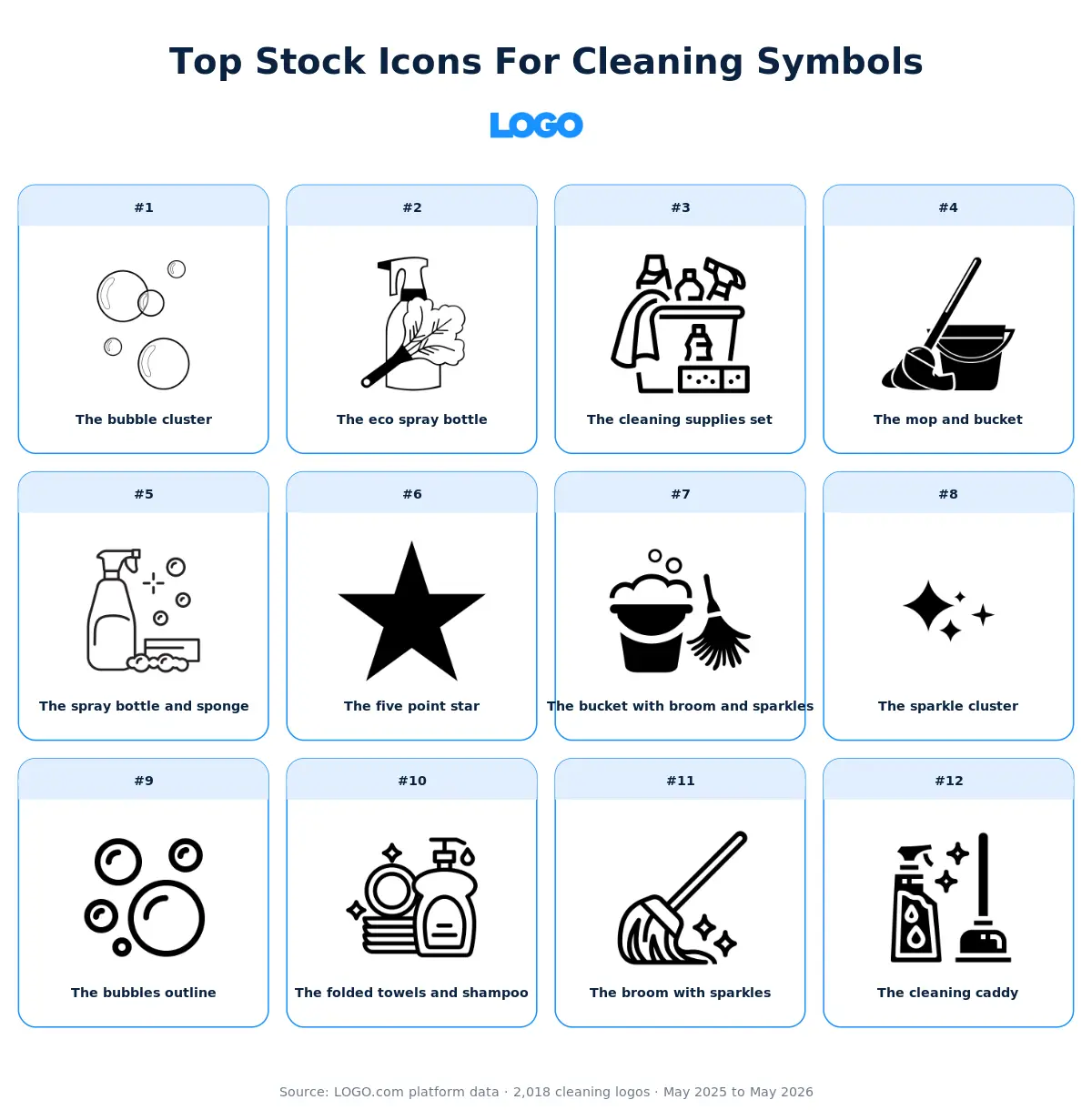
Here's our take on each of those twelve. The visual gives you the short version. The paragraphs underneath unpack the why and offer some guidance on which kinds of brands each icon actually fits.
1. The bubble cluster
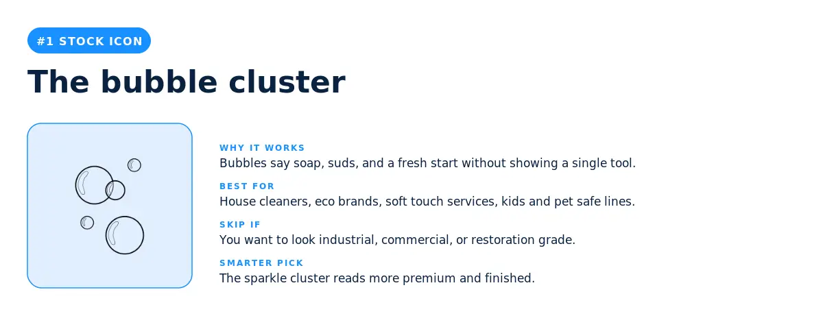
The most picked stock icon among cleaning brands on LOGO.com isn't a mop or a spray bottle. It's three bubbles floating together. That's a real signal about how cleaning founders want to be perceived. They aren't selling the work, they're selling the feeling. Bubbles say soap, suds, lightness, a fresh start, all without showing a single tool. The icon also has the rare advantage of looking clean (no pun intended) at every size, from a tiny favicon to a vehicle wrap.
The pick makes sense for eco brands, family run residential cleaners, and any service that markets on softness, safety, and reliability. Where it backfires is when you want to compete on industrial muscle or restoration grade work. If your customer needs to know you can handle a flooded basement, three bubbles will not do the job. In that case the cleaning supplies set or the mop and bucket are stronger signals.
2. The eco spray bottle
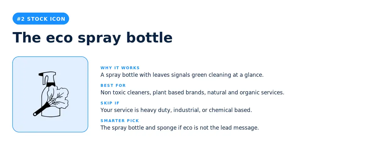
Two leaves sprouting out of a spray bottle is the cleaning industry's shorthand for green cleaning, and the fact that it lands at number two on this list says a lot about where the category is heading. Eco positioning is no longer the differentiator it was five years ago, but it's still a clear signal of values. Use it when your products genuinely are plant based, non toxic, or kid and pet safe, and when those things are part of why customers hire you over the cheapest option in their area.
3. The cleaning supplies set
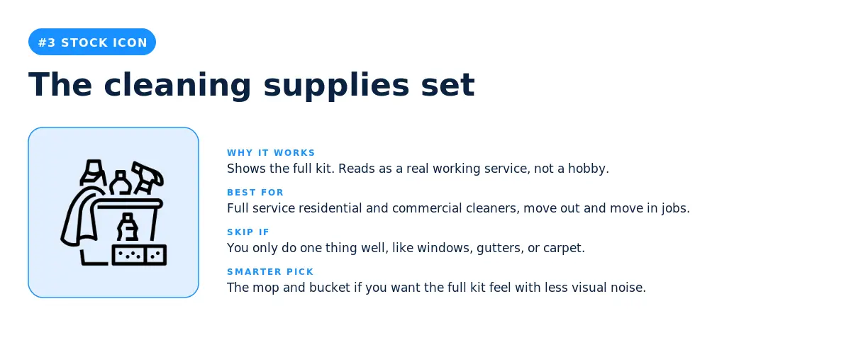
The supplies set works because it shows the whole job in a single mark. There's no ambiguity about what you do, and the visual density signals a real working business rather than a freelancer with one bucket. Best fit is full service residential and commercial cleaners, especially the ones who do move out and move in cleanings, post construction cleanups, and anything else where the value comes from showing up with everything you need.
4. The mop and bucket
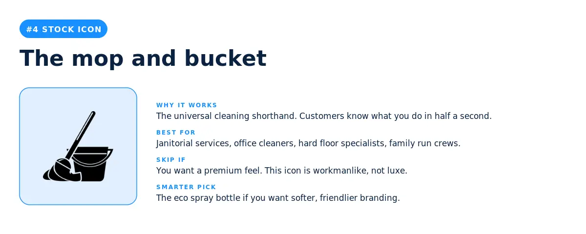
The mop and bucket is the cleaning industry's universal symbol, and that's exactly why it's both the strongest and the riskiest pick on this list. Customers know what you do the moment they see it, but every other cleaner in town can use the same icon. If you go this route, the wordmark and the color palette have to do the work of making your logo recognizable. Janitorial services and office cleaners are the natural fit here because the icon matches the no nonsense, workmanlike brand voice that wins in those markets.
5. The spray bottle and sponge
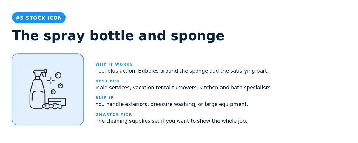
This is the action shot of the cleaning icon library. A spray bottle on one side, a sponge with bubbles on the other, and the implied motion between them. The icon works for maid services, vacation rental turnovers, and any service that markets on the satisfying part of the job. Skip it for exterior cleaners, pressure washing services, or anyone whose actual work happens outside the home, because the implied setting is a kitchen or a bathroom.
6. The five point star
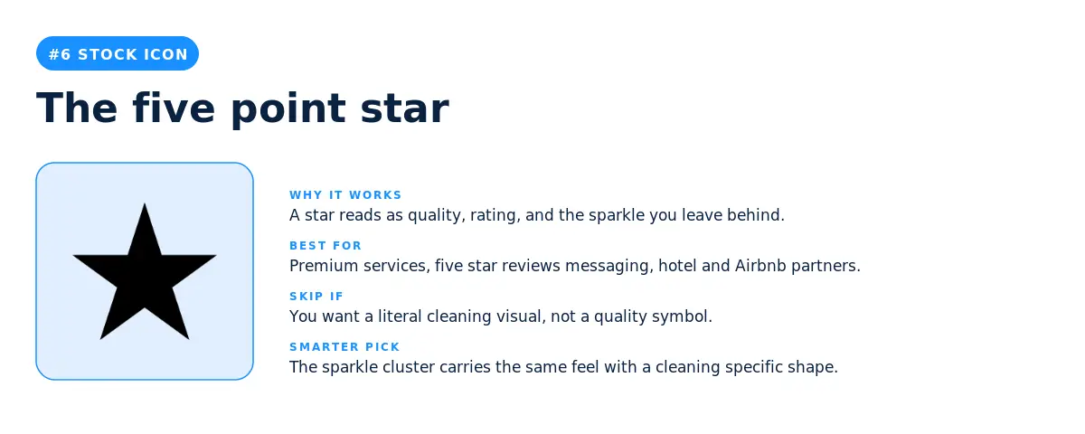
A solid black star is the most stripped down icon on this list, and the cleaners who picked it weren't choosing a literal cleaning visual at all. They were choosing a quality mark. The star reads as five star reviews, premium service, and the sparkle you leave behind on the surfaces you clean. Best fit is for cleaners who already compete on reputation, who get most of their business from referrals and ratings rather than search. Skip it if your brand needs to do any visual work to explain what you sell, because a star without context could be a gym, a bar, or a restaurant.
7. The bucket with broom and sparkles
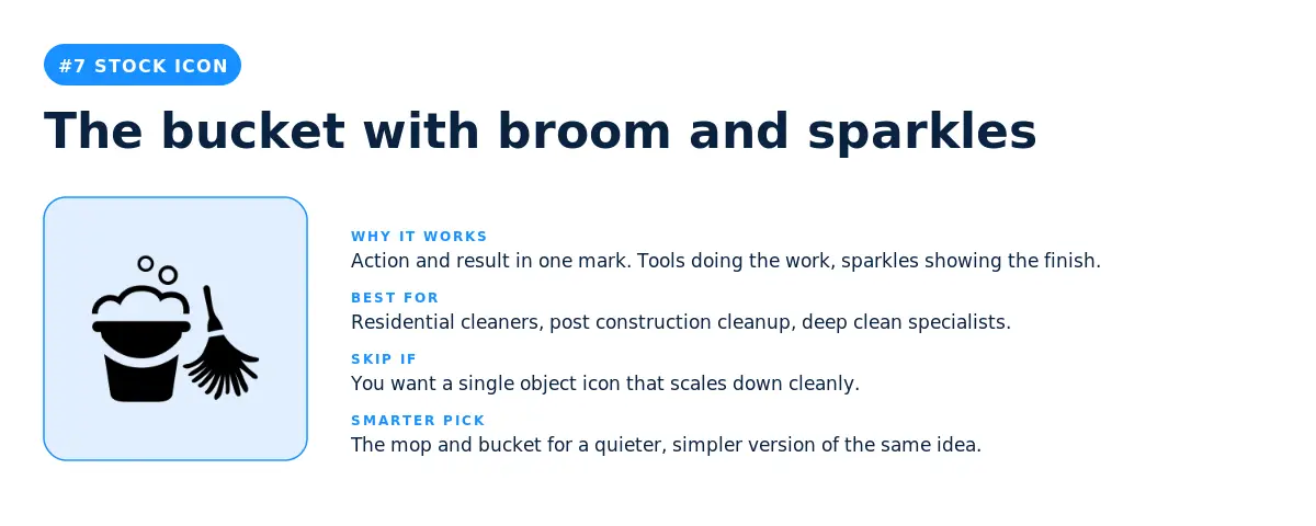
This icon combines the workman feel of the mop and bucket with the finish of the sparkle cluster. Action plus result in one mark. Residential cleaners are the obvious fit, especially the ones who do deep cleans, spring cleans, and anything else where the dramatic before and after is part of the sales pitch. The trade off is visual density. The icon has a lot going on, which makes it harder to scale down for small social avatars or app icons.
8. The sparkle cluster
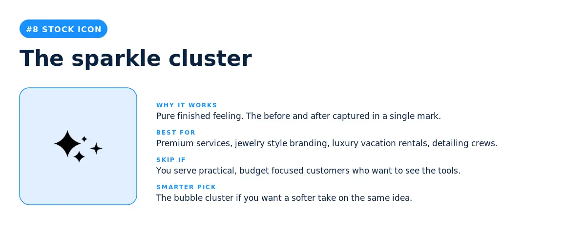
If the bubble cluster sells the feeling of soap, the sparkle cluster sells the feeling of done. Three sparkles arranged in a loose triangle, no tools, no setting, just the result. Premium cleaners pick this when they want their logo to look more like a jewelry brand than a service business. Vacation rental turnovers, luxury home cleaners, and detailing services all benefit from the upgrade in perceived value. Skip it for budget focused or industrial work, where customers need to see the tools to trust the price.
9. The bubbles outline
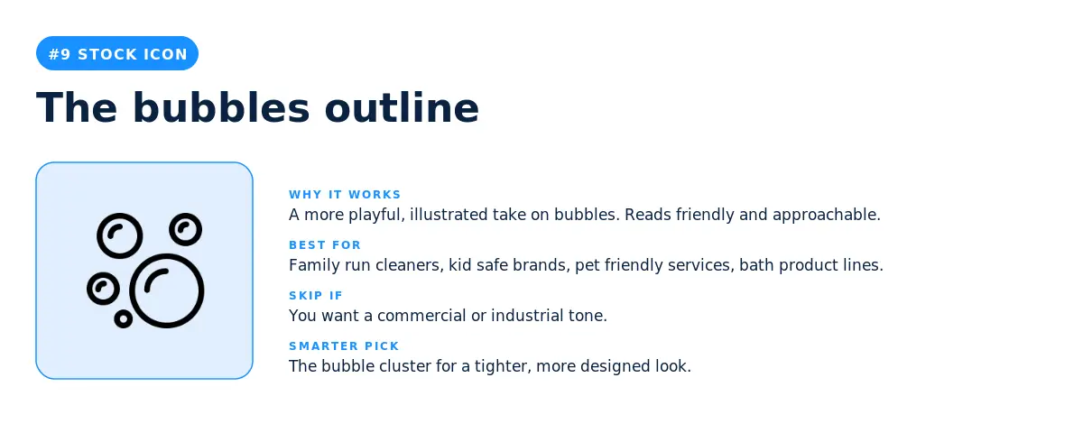
A more playful, hand drawn take on the bubble theme. The line work is looser, the bubbles vary in size, and the whole icon feels friendlier than the precise bubble cluster at number one. Family run cleaners pick this because it carries a more approachable, less corporate tone. Kid safe and pet friendly cleaning brands also lean into it because the looser style signals that the people behind the business are human, not a franchise.
10. The folded towels and shampoo
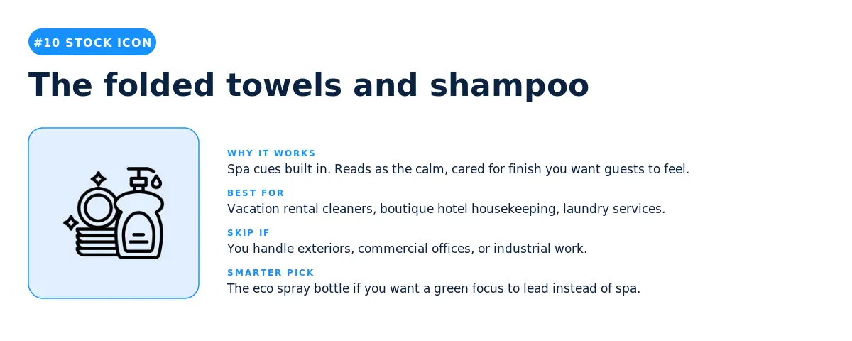
This icon brings spa cues into the cleaning category, which is a smart move for any service that wants to sit between cleaning and hospitality. Vacation rental cleaners pick it because their customers (Airbnb hosts) sell on guest experience, not on cleanliness alone. Boutique hotel housekeeping services and high end laundry brands also fit naturally here. Skip it for exterior, commercial, or industrial work where the spa connotation sets the wrong expectation.
11. The broom with sparkles
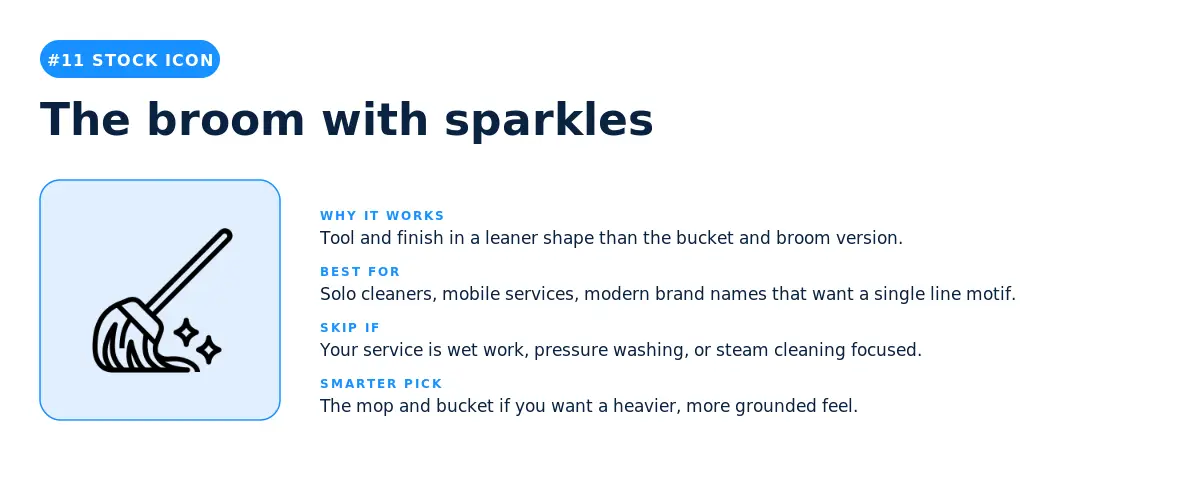
A leaner version of the bucket with broom and sparkles at number seven. Same idea, fewer visual elements. The simpler shape makes it easier to scale and easier to pair with a longer wordmark. Solo cleaners, mobile services, and any cleaner with a modern brand name benefit from the single line motif. The narrow silhouette also works well as a stencil for vehicle wraps and uniform embroidery, which matters more than people expect when they're picking a logo for a service business.
12. The cleaning caddy
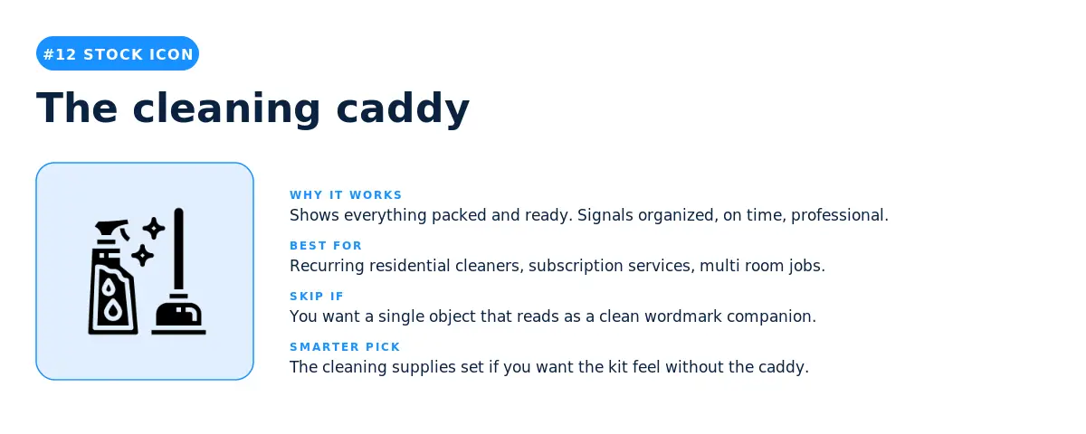
The caddy is the icon for cleaners who want their brand to read as organized, on time, and prepared. Everything is packed and ready to go. Recurring residential cleaners, subscription cleaning services, and any cleaner who does multi room jobs all benefit from the implied professionalism. The trade off is that the caddy is a busy shape, with multiple visual elements competing for attention, which makes it harder to use as a small social avatar or favicon. If you go this route, plan for a simplified version of your logo for the small spaces.
Three takeaways from the data before you decide.
1. Sparkles are the unifying motif of the cleaning category. Whether founders typed a description or picked a stock icon, sparkles showed up everywhere. They appear in five of the twelve most typed descriptions and in four of the twelve most picked stock icons. If your logo carries even one sparkle, you're speaking the visual language of the category. If it has none, you might be a confident outlier, but make sure you have the brand voice to back that choice up.
2. Custom icons let you specialize, stock icons let you compete. The custom icon descriptions in this data are full of niches like gold vacuum cleaners, jewelry sparkling on toothbrushes, and sparkling clean shoes. The stock icon picks are general purpose symbols that work for almost any cleaner. According to LOGO.com data, the cleaners who use the custom icon generator are usually building specialty brands, while the cleaners who use the stock library are building general services that compete on availability and price. Pick a symbol that matches the strategy you actually want to run.
3. The middle of the list is where the smart design choices live. The icons and descriptions at number one are the safest bets, but they're also the most common. The picks at numbers four through ten are where you'll find symbols with enough recognition to land instantly and enough specificity to set you apart from the next cleaner on the search results page. Look hard at the middle of both lists before you settle on a number one.
For founders launching in 2026, here is the simplest way to think about it. A stock icon is the right call when speed matters more than standing out. A custom icon is the right call when standing out matters more than speed. The data above shows you which side of that line your gut is sitting on, before you even open the editor.
Source: LOGO.com platform data, May 2025 to May 2026. n = 2,018 cleaning logos. Rankings reflect the most picked stock icons and the most typed custom icon descriptions among users who selected "cleaning" as their industry on LOGO.com.
Recent posts
Oct 19, 2026 by: Sean Baker

Oct 14, 2026 by: Vanessa Lam
Oct 12, 2026 by: Sean Baker
Oct 5, 2026 by: Sean Baker