The Most Popular Bakery Logo Ideas: What 35,158 Brands Can Teach Us About Design Trends
Inside 35,158 bakery logos: the most popular symbols brands picked, split into stock icons and custom icons. Plus the design trends that show up across both.
Every month, thousands of new bakery brands launch on LOGO.com. Between May 2025 and May 2026, 35,158 of them chose "bakery" as their industry inside our editor, which makes it one of the most popular food and drink categories on the platform.
If you're starting a bakery and looking for bakery logo ideas, picking the right symbol for your logo is one of the first design decisions you'll make. Every bakery logo on LOGO.com has a symbol at its core. That symbol is either a stock icon, a ready made mark from our library, or a custom icon, drawn by our custom icon generator (powered by AI) from a description you type. That's why we wanted to share the most popular bakery logo ideas on LOGO.com to help you decide.
How we put this together
These rankings come from LOGO.com platform data between May 2025 and May 2026. We looked at the 35,158 logos created by people who selected "bakery" as their industry inside our editor, then ranked the symbols they actually chose. Half come from our stock icon library and half come from descriptions they typed into our custom icon generator. We counted every distinct pick rather than unique users, because the question we wanted to answer for you is: given the chance to pick any symbol, what do bakery founders actually pick for their logo?
Part One: Custom Icons
When a bakery founder types a description into the custom icon generator, the words they choose tell us what they were already imagining before they sat down to type. The symbol that comes back is one of a kind, drawn from scratch based on your description rather than pulled from a library other brands use too.
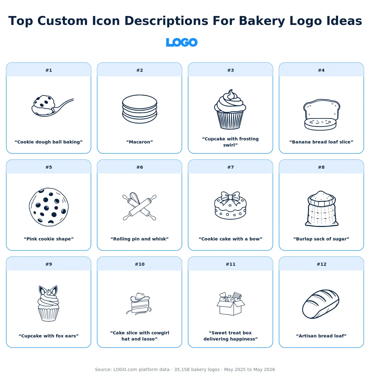
We took the twelve most typed bakery descriptions and ran each one through all nine visual styles the custom icon generator offers, so you can see how the exact same words become a minimal line drawing, a detailed illustration, a pixel mark, a deco emblem, and five other looks. The version that's right for your brand probably isn't the same one that's right for someone else's, which is exactly why the comparison is useful.
1. "Cookie dough ball baking"
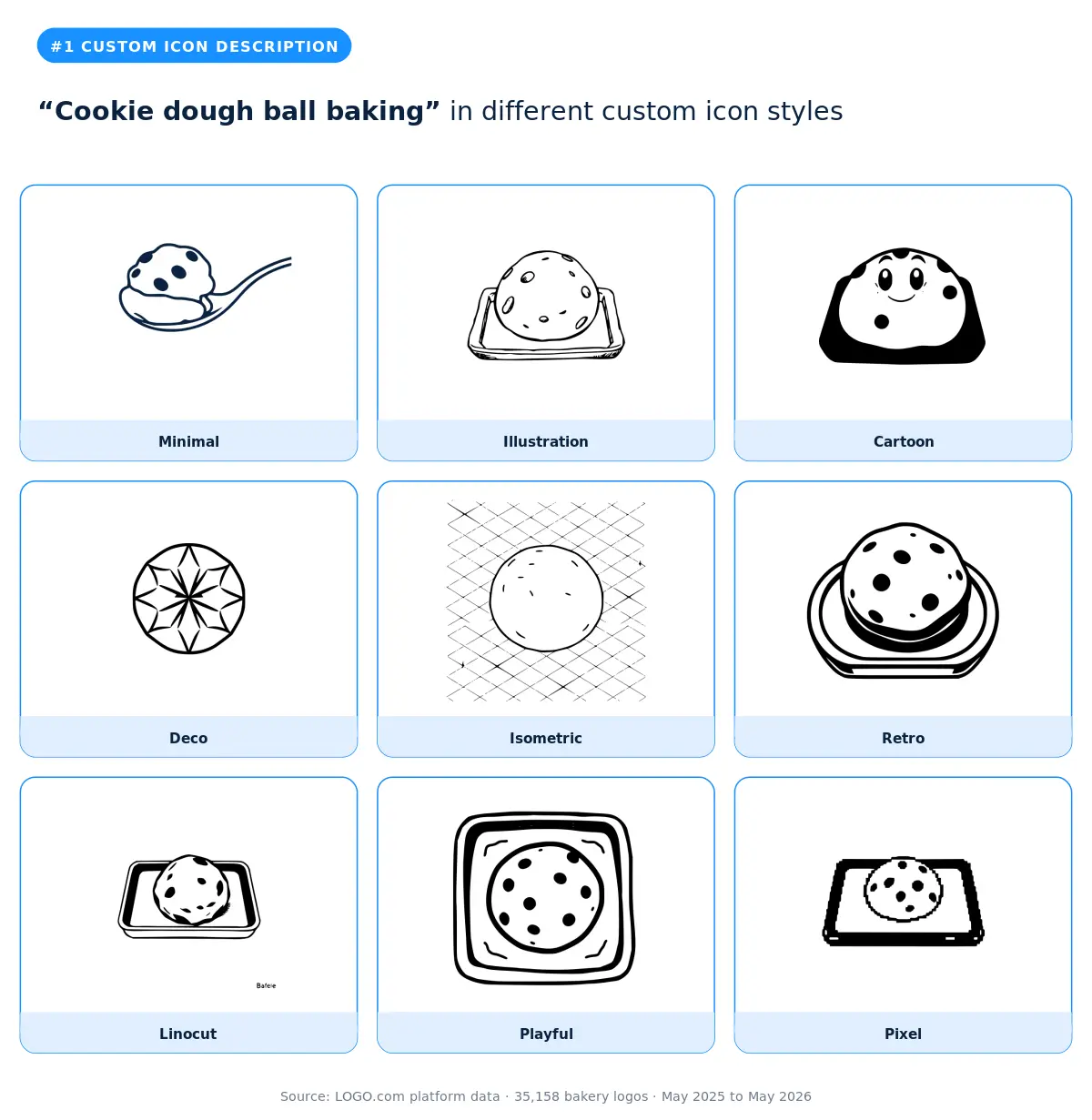
The most typed bakery description on LOGO.com puts the moment of becoming at the centre of the brand. Not the finished cookie, not the bag of dough, but the in between moment when a scoop turns into a cookie in the oven. Founders who land on this description tend to be small batch operators who want their brand to feel handmade and warm. The cartoon and playful styles read the most homey, the linocut and deco versions feel like an old fashioned bakery stamp, and the minimal version is the cleanest fit if your packaging is mostly text and you want a subtle mark beside your name.
2. "Macaron"
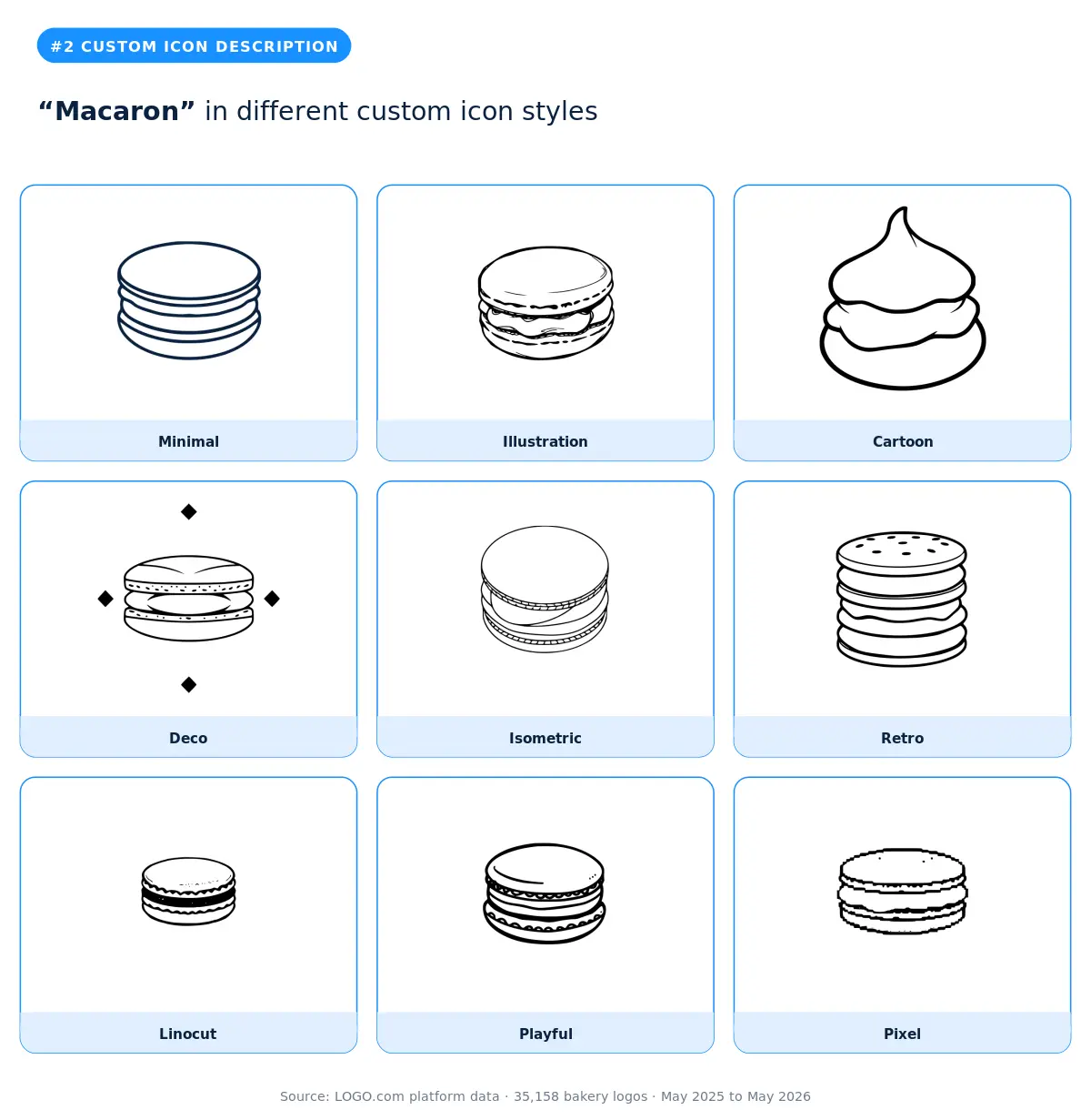
A one word description, but a strong one. Macarons are the most photographed bakery item on the internet, and naming one as your logo idea signals that aesthetics matter as much as flavour to your brand. The illustration and retro styles lean into the soft, layered shape that makes the cookie photogenic in the first place. Cartoon and playful add personality, which can be a smart move if you sell at markets or pop ups where you need to stand out. Skip the pixel style here unless your brand is intentionally lo fi.
3. "Cupcake with frosting swirl"
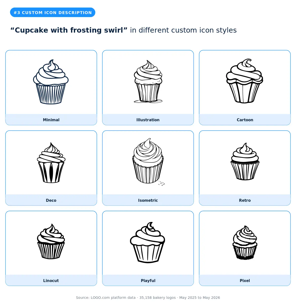
The cupcake is one of the most universally beloved single serve treats, and adding "with frosting swirl" tells us the founder is thinking about decoration as the hero of the brand. Bakers who type this description are often running custom order businesses, kids party catering, or wedding favour shops. Cartoon and playful render with the biggest smile, retro and deco give it more grown up appeal, and the isometric style is a fun choice if your brand is digital first and you want a 3D feel on the website and app.
4. "Banana bread loaf slice"
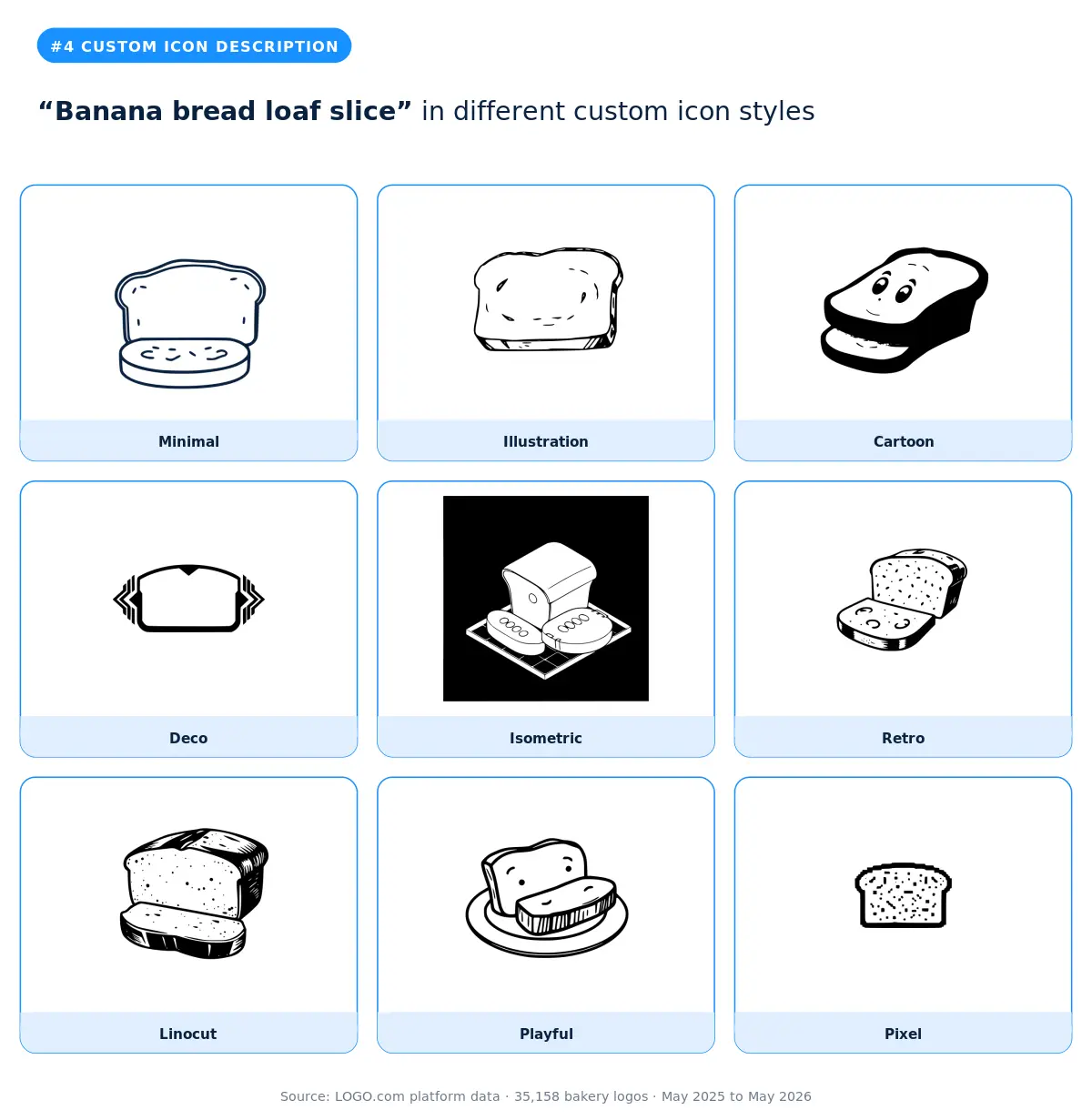
Banana bread has had a long second life as the comfort bake of the last few years, and bakeries selling slices through cafes or by delivery often want a logo that says "homemade but better." The illustration and linocut styles give it the most rustic, kitchen table feel. Cartoon and playful are friendlier and a good fit if your brand voice is upbeat. The minimal version is the right call if you want banana bread to be one of many items rather than the headline.
5. "Pink cookie shape"
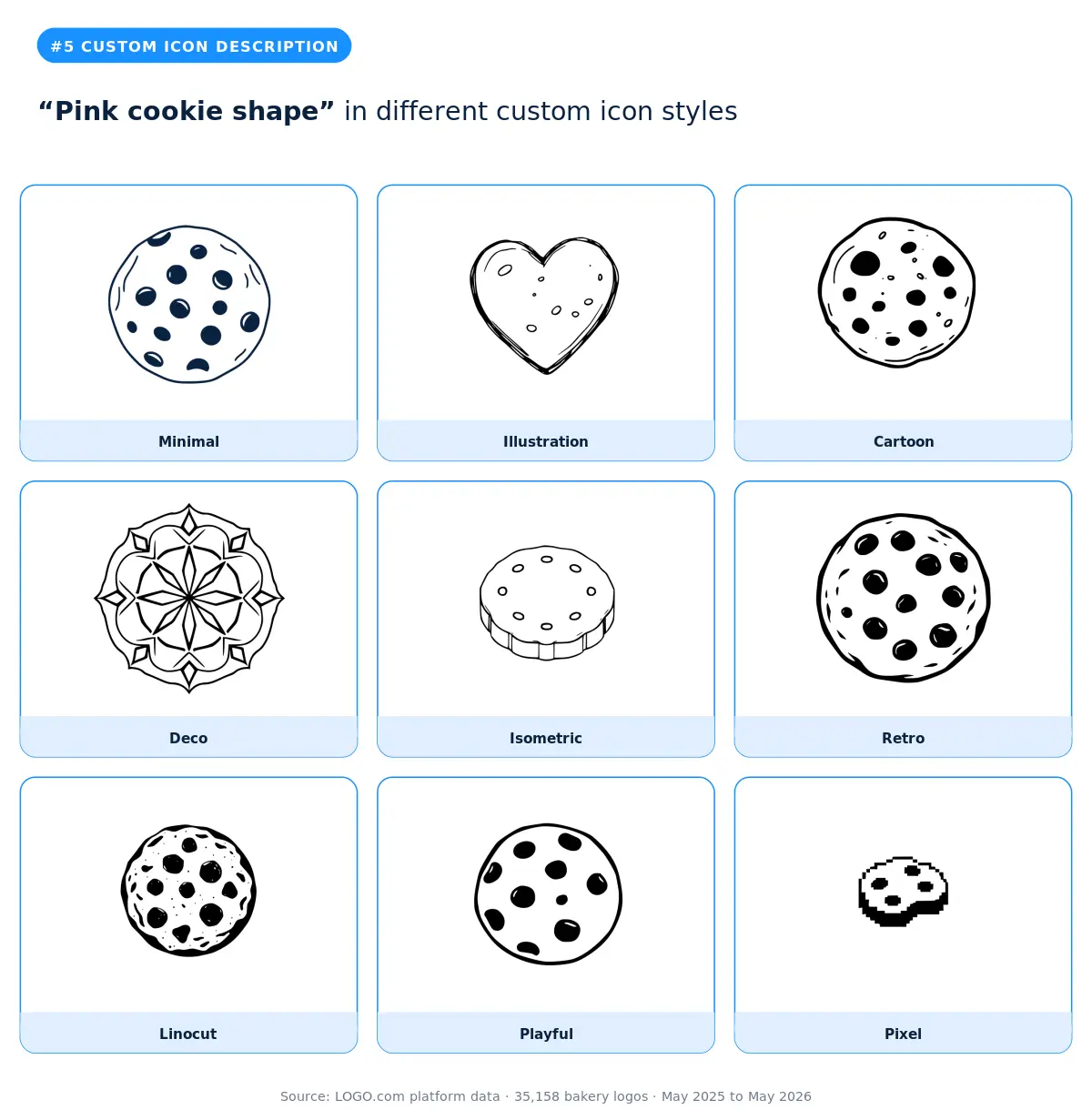
When a founder specifies a colour in the description, they're telling you the colour matters more than the shape. Pink cookies are the visual shorthand for a feminine, gift forward, celebration adjacent bakery. The cartoon, playful, and retro styles render the colour the most clearly. The minimal style trades pink for navy, which is intentional. According to LOGO.com data, navy is the most consistent fallback colour across bakery logos because it pairs cleanly with the pastel packaging colours that pink cookies usually sit on.
6. "Rolling pin and whisk"
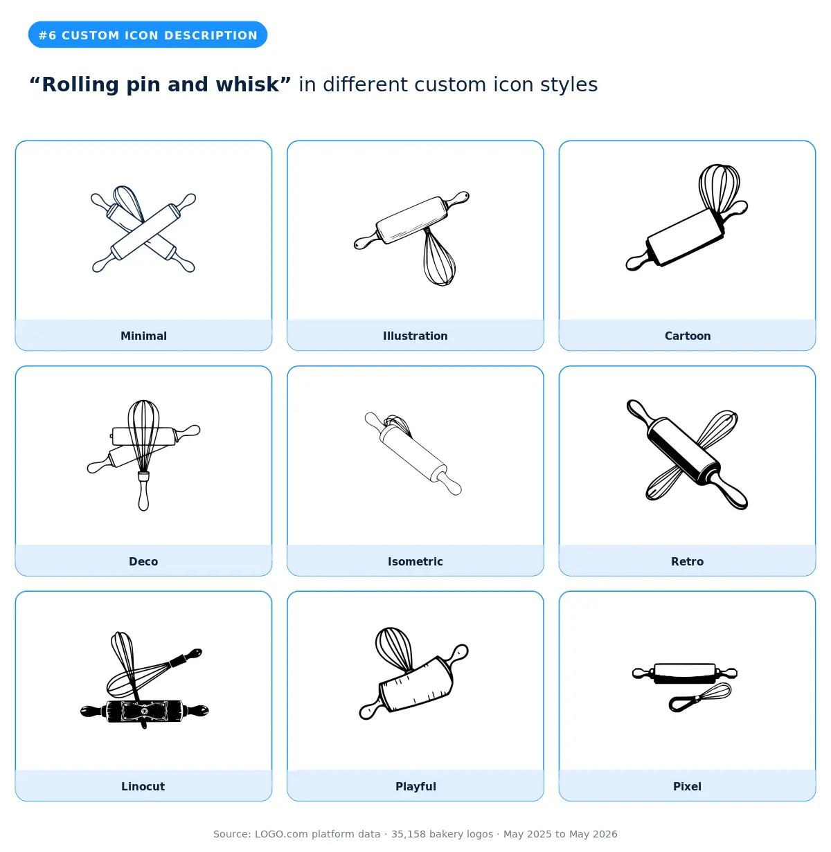
The combination of two tools instead of one finished product is a quiet flex. It says the bakery cares about process as much as output. Founders who pick this description tend to be teaching too, with workshops or classes alongside their retail. The deco, retro, and linocut styles work like a craft emblem, which fits the moodboard of a baker school or cooking studio. The illustration version is the most approachable, and the pixel and isometric versions are fun if your social presence is bigger than your storefront.
7. "Cookie cake with a bow"
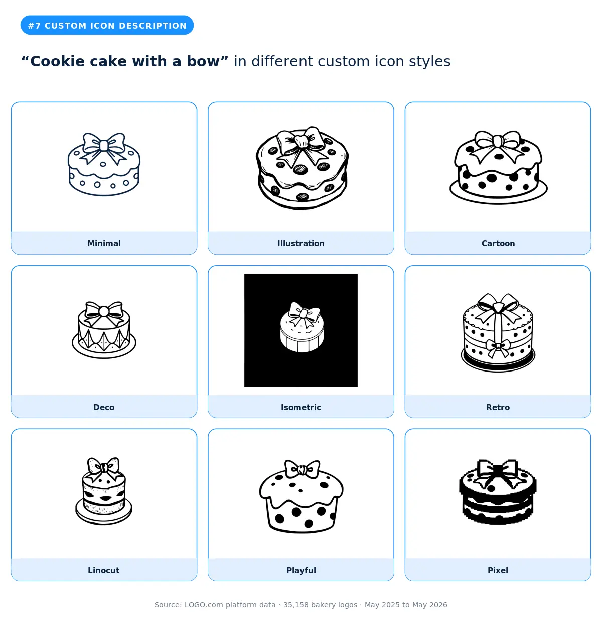
Cookie cakes are the cake industry's friendly answer to people who do not like buttercream. Adding a bow on top signals gifting. Bakeries that type this description are often running custom order or party catering. The cartoon and playful styles are the most gift wrappy. The retro version reads like a vintage bakery sign. The deco version feels more upscale, which is a smart fit if your cookie cakes are aimed at corporate gifting or wedding favour orders.
8. "Burlap sack of sugar"
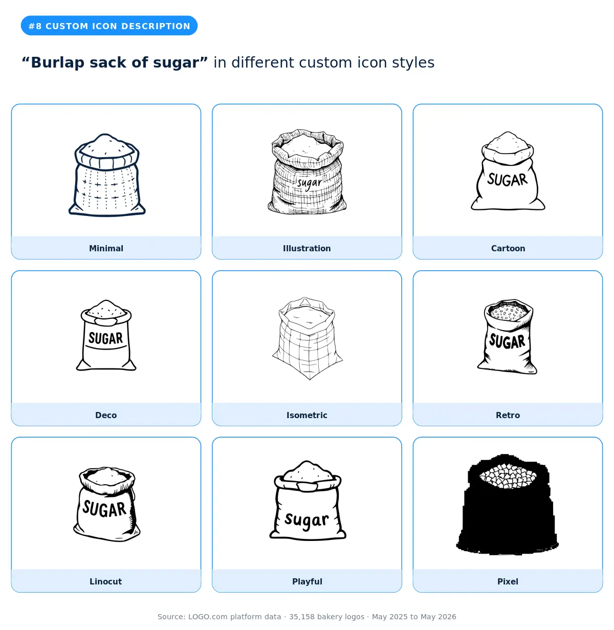
A throwback move. The burlap sack is shorthand for "we mill our own flour" or "we source carefully," even when the sack on the icon is sugar specifically. Founders who pick this description tend to run sourdough programs, slow food bakeries, or farm to bakery concepts. The linocut and retro styles fit this story best. Skip cartoon and playful unless your brand voice is intentionally cheeky. The minimal version is also strong if your packaging already does the rustic work.
9. "Cupcake with fox ears"
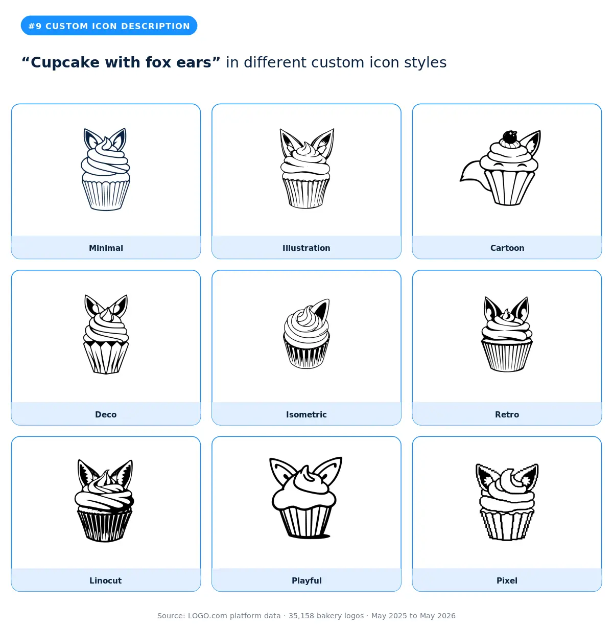
The cupcake plus character mashup is becoming a small genre of its own. Adding fox ears, cat whiskers, or other animal features lets the brand feel playful without becoming a literal cartoon mascot. Bakeries that type this description tend to lean kids party, themed cake, or character cake. The cartoon and playful styles are the obvious fits. The retro version is a surprise winner if you want the character to feel a little vintage rather than 2026 cute. Skip the deco and isometric versions here, since the character details get lost.
10. "Cake slice with cowgirl hat and lasso"
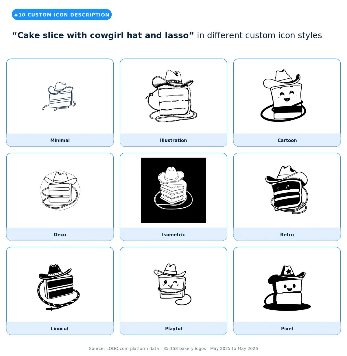
Western themed bakeries are having a moment, and this description is a perfect example of how specific founders are getting with their logo ideas. Cowgirl bakeries, country fair concepts, and dessert trailers at rodeos all show up under this header. The cartoon and playful versions are the friendliest. The retro version reads as authentic Americana. The linocut version looks like a vintage rodeo poster, which is a fun fit if your brand voice leans nostalgic.
11. "Sweet treat box delivering happiness"
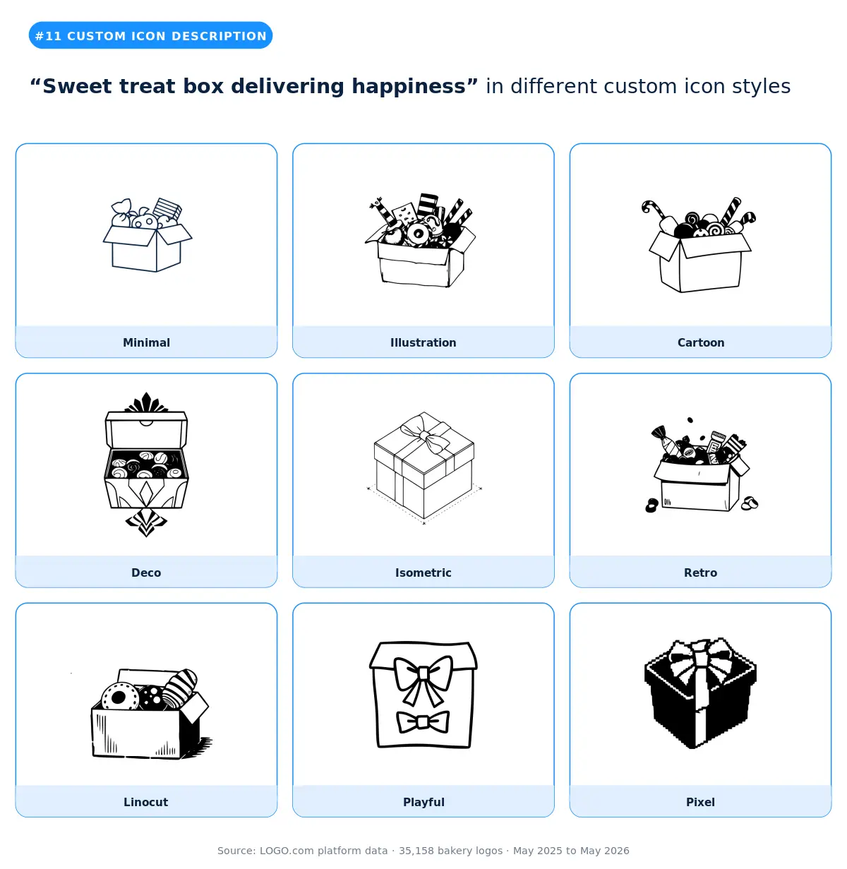
The most concept led description in the top twelve. Founders typing this are thinking about packaging and gifting more than any single product. The brand is the box. The illustration and retro styles give the box the most personality. The minimal version is the right call if your packaging is already visually loud and the logo needs to stay quiet on the box. Cartoon and playful are a strong fit if your treats are aimed at kids or are corporate gifting forward.
12. "Artisan bread loaf"
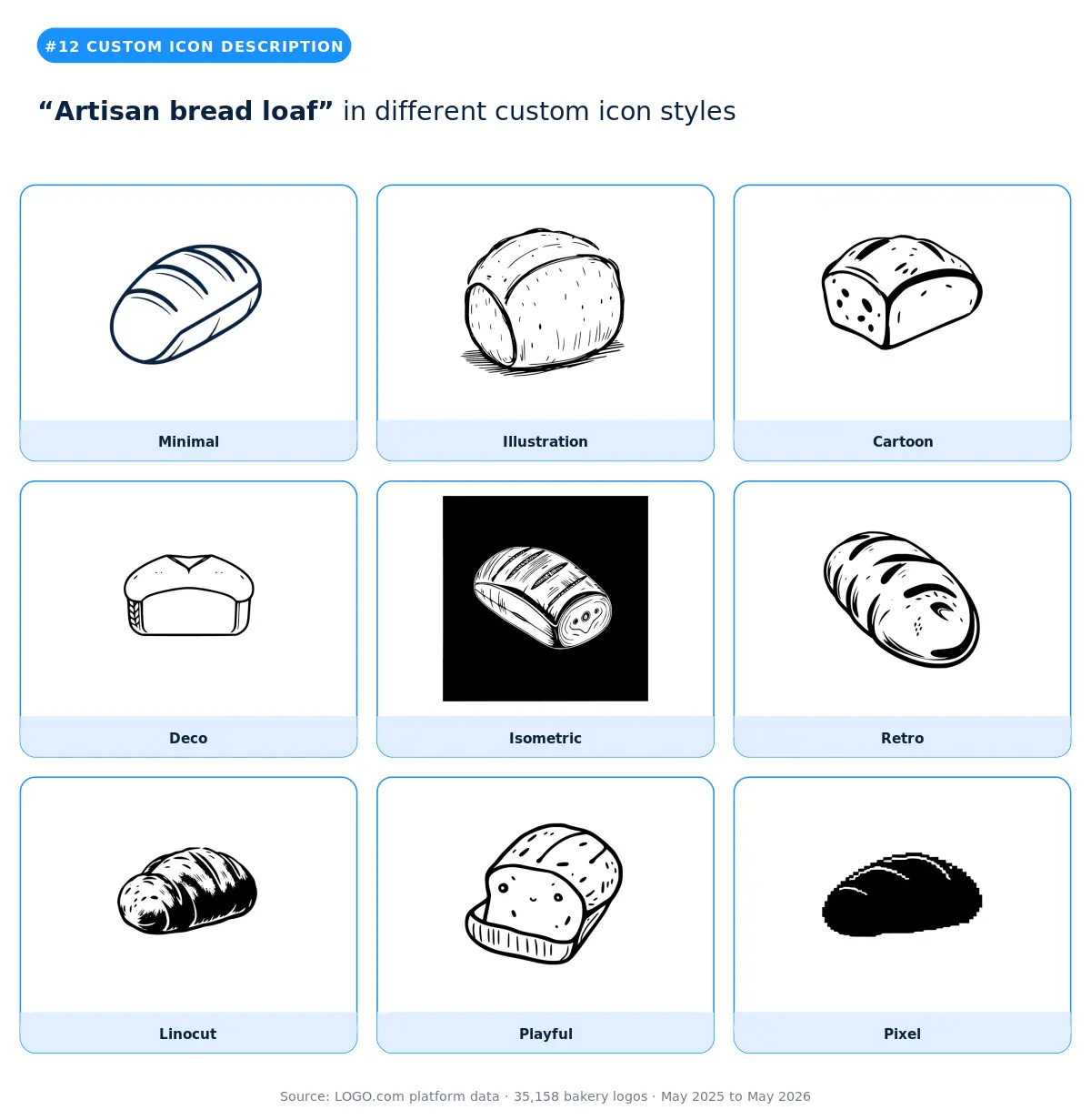
Sourdough culture, micro bakeries, and slow bread brands all converge on this description. The illustration and linocut styles read as the most artisan. The retro version feels like a 1950s neighbourhood bakery sign. The isometric and pixel versions are unexpectedly strong here because they make a humble loaf feel modern and design forward. Skip cartoon if your brand voice is serious or if you sell at premium price points.
Part Two: Stock icons
Roughly half of bakery founders on LOGO.com skip the custom icon generator and head straight for the stock icon library instead. They want speed, they want a symbol they can recognize instantly, and they want a mark that's already proven on other brands. The library has thousands of options. Twelve of them account for almost all of the bakery picks.
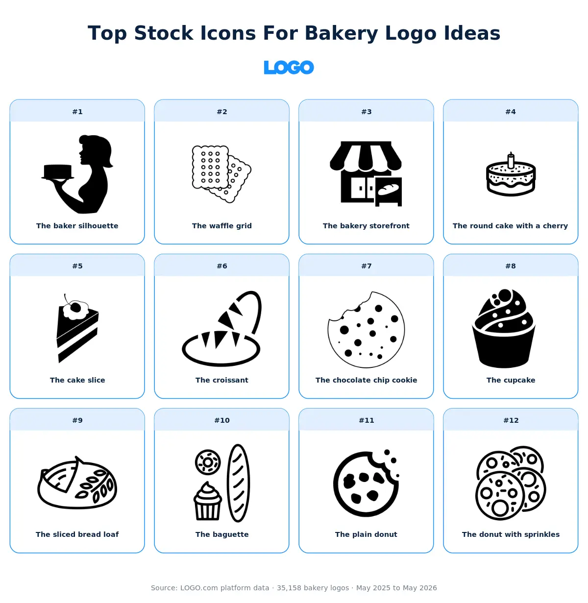
Here's our take on each of those twelve. The visual gives you the short version. The paragraphs underneath unpack the why and offer some guidance on which kinds of brands each icon actually fits.
1. The baker silhouette
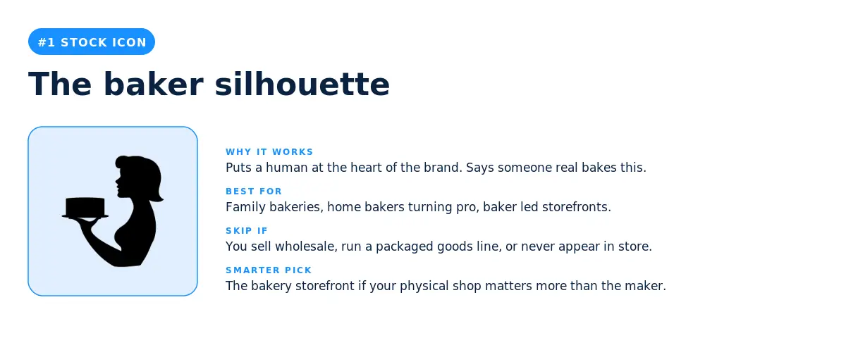
The most picked stock icon among bakery founders puts a human at the heart of the brand. It says someone real is making this. That matters a lot more than founders sometimes realise, because the difference between a homemade brand and a factory brand often comes down to whether the buyer can picture a maker behind the counter.
The baker silhouette wins for family run bakeries, home bakers turning their hobby into a business, and storefronts where the baker is also the face of the brand. It can backfire if you run a packaged goods line that lives on grocery shelves, since the buyer never meets the maker. In that case the bakery storefront reads as more honest.
2. The waffle grid
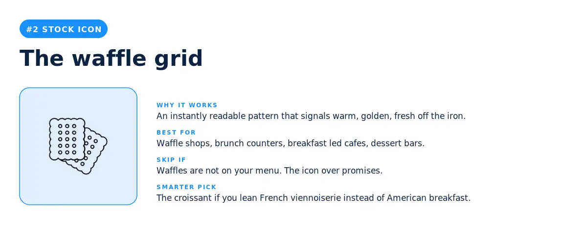
A pattern is doing a lot of work here. The grid reads as warm, golden, and fresh off the iron without having to spell out the product. Waffle shops, brunch counters, and dessert bars use this icon to skip the menu explanation and land straight on the product feel. If waffles are not on your menu it will mislead, so skip it. If you lean French viennoiserie instead of American breakfast, the croissant is the better grab.
3. The bakery storefront
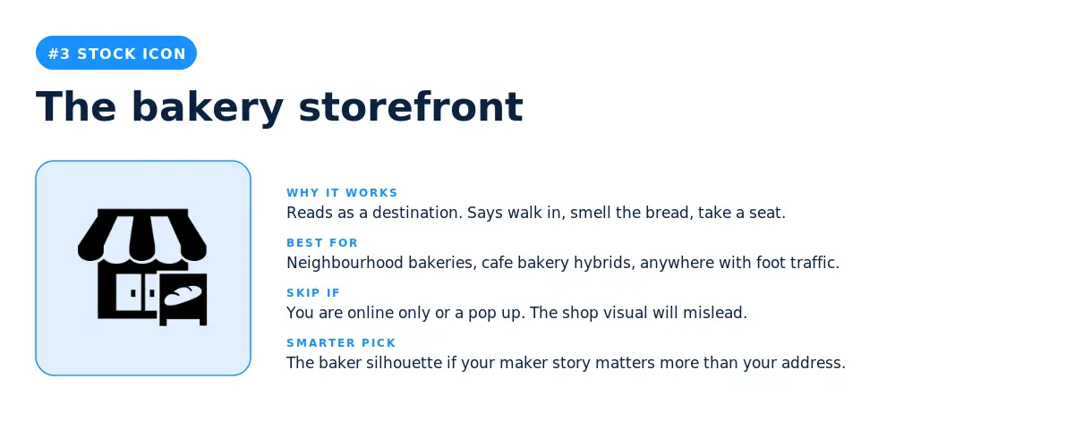
A literal building reads as a destination. Walk in, smell the bread, take a seat. Neighbourhood bakeries and cafe bakery hybrids do well with this icon because it tells the local customer the physical space is part of the experience. Online only bakeries or pop up brands should skip it, since promising a storefront you do not have will confuse the buyer. The baker silhouette is the smarter pick if your maker story matters more than your address.
4. The round cake with a cherry
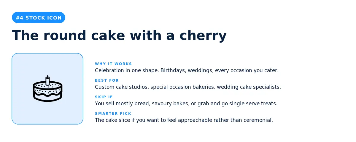
Celebration in one shape. Birthdays, weddings, every occasion you cater. Custom cake studios and wedding cake specialists pick this icon because it sets the right expectation before the customer even reads the menu. Skip it if you mostly sell bread, savoury bakes, or grab and go single serve treats. The cake slice is the friendlier alternative if you want to feel approachable rather than ceremonial.
5. The cake slice
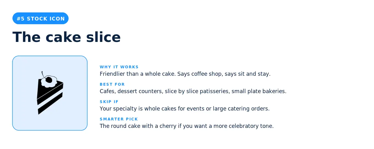
The cake slice is friendlier than a whole cake. It says coffee shop. It says sit and stay. Cafes, dessert counters, and slice by slice patisseries pick this icon because it signals you are not just for special occasions, you are for Tuesday afternoon too. If your specialty is whole cakes for events, the round cake with a cherry is the better fit because it does more occasion work.
6. The croissant
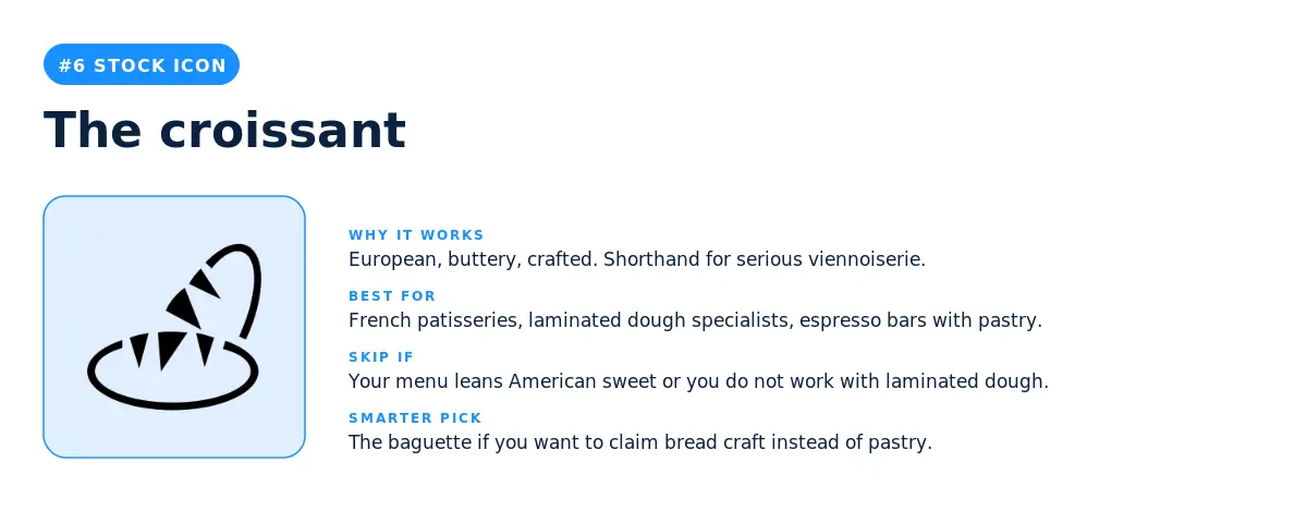
The croissant is European, buttery, and crafted. It is shorthand for serious viennoiserie, which is exactly what laminated dough bakers want their brand to communicate. French patisseries, dough laminators, and espresso bars with serious pastry programs land here. Skip it if your menu leans American sweet or if you do not work with laminated dough. The baguette is the right pivot if you want to claim bread craft instead of pastry.
7. The chocolate chip cookie
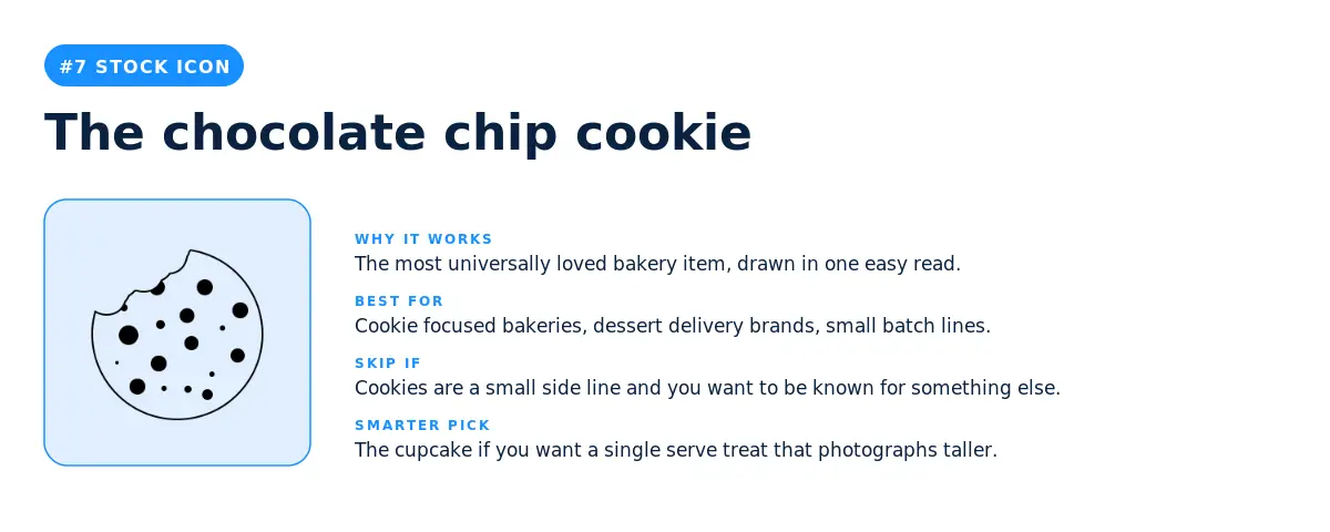
The most universally loved bakery item, drawn in one easy read. Cookie focused bakeries, dessert delivery brands, and small batch lines pick this icon because it does the menu explanation in one frame. Skip it if cookies are a small side line and you want to be known for something else. The cupcake is the smarter pick if you want a single serve treat that photographs taller.
8. The cupcake
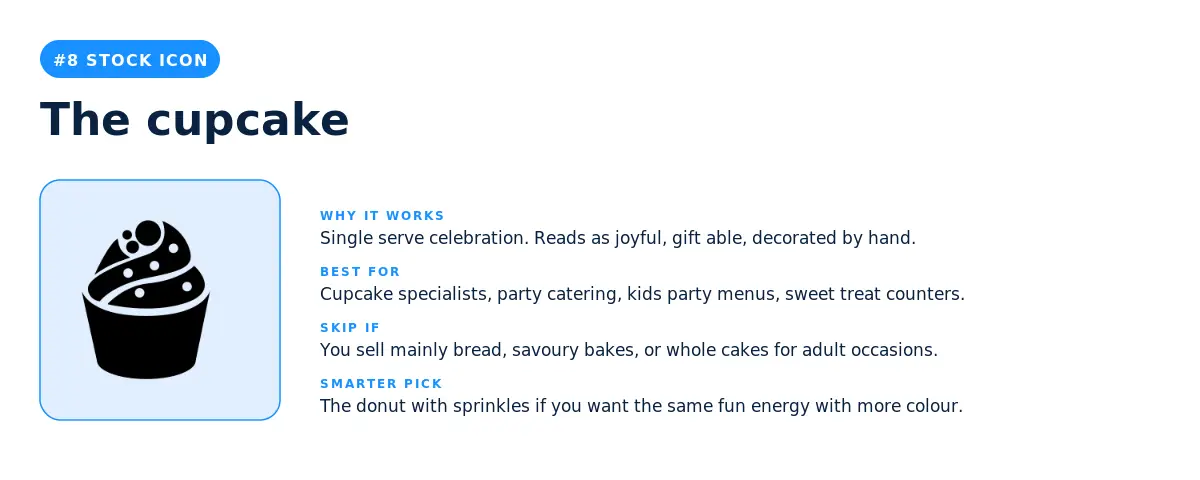
Single serve celebration. The cupcake reads as joyful, gift able, decorated by hand. Cupcake specialists, party catering, and sweet treat counters use this icon because it captures the small ceremony of a single decorated thing. Bakeries that sell mainly bread or whole cakes for adult occasions should skip it, since it leans more kids party than wedding cake. The donut with sprinkles is the smarter pick if you want the same fun energy with more colour.
9. The sliced bread loaf
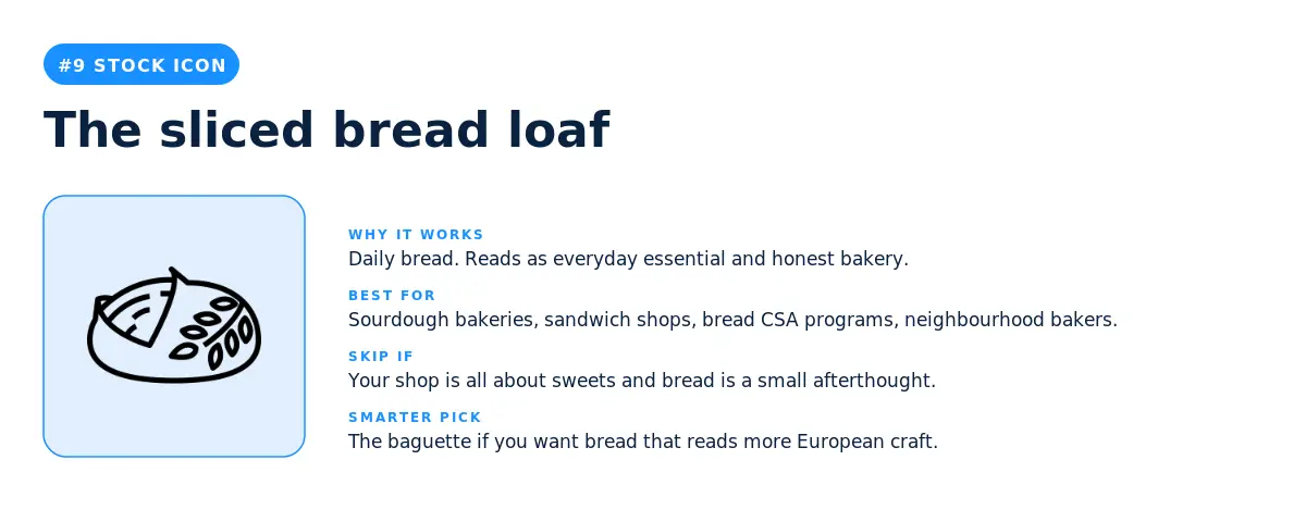
Daily bread. The sliced loaf reads as everyday essential and honest bakery. Sourdough bakeries, sandwich shops, and neighbourhood bakers pick this icon because it signals you are part of the customer's weekly routine, not just their birthday. Skip it if your shop is all about sweets and bread is a small afterthought. The baguette is the smarter pick if you want bread that reads more European craft.
10. The baguette
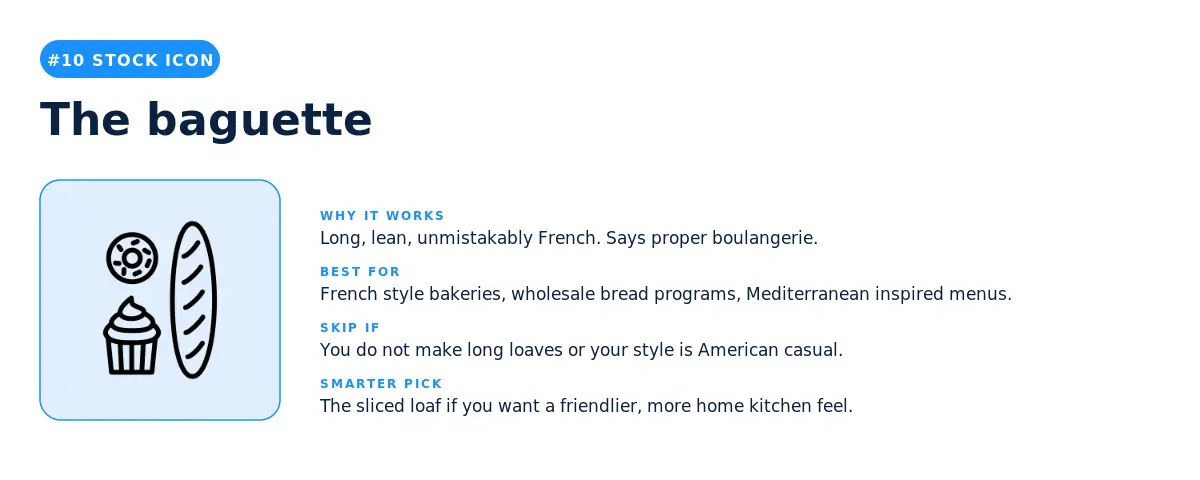
Long, lean, unmistakably French. The baguette says proper boulangerie. French style bakeries, wholesale bread programs, and Mediterranean inspired menus all use this icon. Skip it if you do not make long loaves or if your style is American casual. The sliced loaf is the friendlier alternative if you want a more home kitchen feel.
11. The plain donut
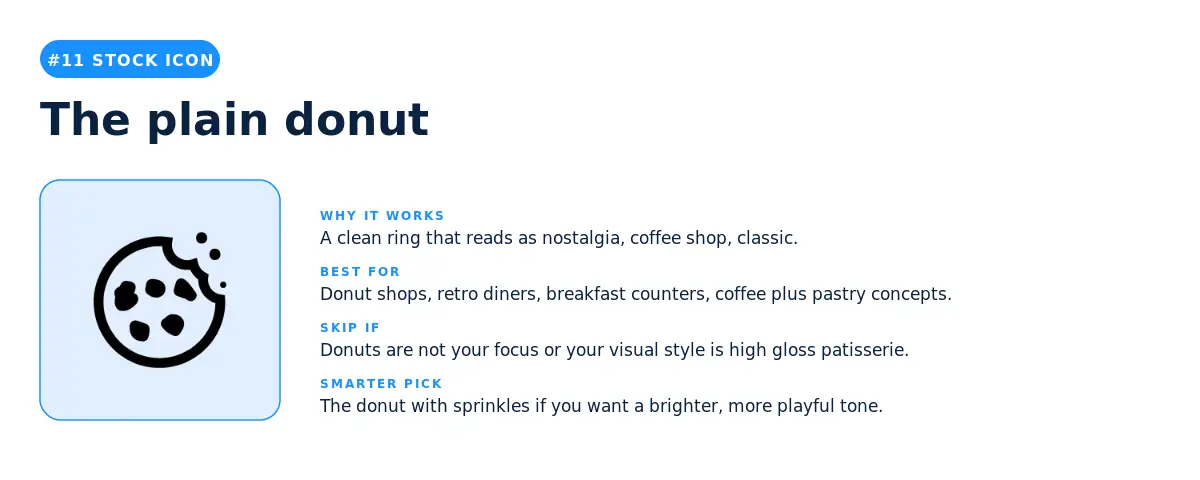
A clean ring that reads as nostalgia, coffee shop, and classic Americana. Donut shops, retro diners, and coffee plus pastry concepts pick this icon because it is a category defining shape with built in cultural memory. Skip it if donuts are not your focus or if your visual style is high gloss patisserie. The donut with sprinkles is the smarter pick if you want a brighter, more playful tone.
12. The donut with sprinkles
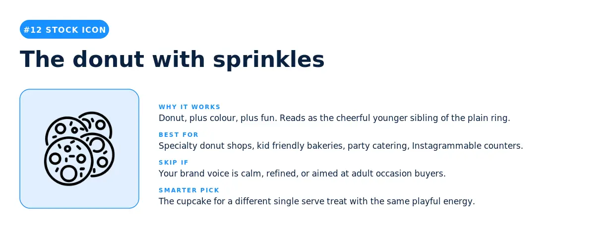
Donut, plus colour, plus fun. The donut with sprinkles is the cheerful younger sibling of the plain ring. Specialty donut shops, kid friendly bakeries, and Instagrammable counters pick this icon because it carries playful energy without any extra wordmark work. Skip it if your brand voice is calm, refined, or aimed at adult occasion buyers. The cupcake is the smarter pivot if you want a different single serve treat with the same fun feel.
Three takeaways before you pick your symbol
1. The single most popular bakery logo idea is not a product, it is a person. The top stock pick is the baker silhouette, and the top custom description is a moment of becoming, "Cookie dough ball baking", not the finished cookie. Bakery founders are telling us the brand starts with the maker, then with the moment of creation, and only then with the finished product. Pick a symbol that puts your hands somewhere in the frame.
2. Stock icons play it safe, custom icons get specific. Stock picks cluster around universal categories like cupcake, croissant, and cake slice. Custom descriptions get oddly specific: cowgirl cake slices, fox ear cupcakes, sweet treat boxes that deliver happiness. If you can describe the exact image in your head in under ten words, the custom icon generator is the right tool. If you want a category defining shape that any customer will read in half a second, stock is the right tool.
3. The two paths converge on the same shapes more than you'd think. Cupcakes, cookies, and bread appear at the top of both lists. The difference is how specific you want to be about them. The stock cookie is a generic chocolate chip cookie. The custom cookies are pink, in a bow, or wearing sunglasses. Pick a path based on how distinct your brand is from the bakery next door.
For founders launching in 2026, here is the simplest way to think about your bakery logo ideas. A stock icon is the right call when speed matters more than standing out. A custom icon is the right call when standing out matters more than speed. The data above shows you which side of that line your gut is sitting on, before you even open the editor.
Source: LOGO.com platform data, May 2025 to May 2026. n = 35,158 bakery logos. Rankings reflect the most picked stock icons and the most typed custom icon descriptions among users who selected "bakery" as their industry on LOGO.com.
Recent posts
Oct 19, 2026 by: Sean Baker
Oct 14, 2026 by: Vanessa Lam
Oct 12, 2026 by: Sean Baker
Oct 5, 2026 by: Sean Baker