Most Popular Construction Logo Ideas: A Data-Backed Guide
Inside 147,974 construction logos: the symbols founders actually picked, the icons they reached for first, and the color palettes that separate a generic contractor brand from one that wins the bid.
Every month, thousands of new construction brands launch on LOGO.com. Between May 2025 and May 2026, 147,974 of them chose "construction" as their industry inside our editor, which makes construction one of the largest trade verticals on the platform.
If you're starting a residential build, a commercial contracting firm, a remodel shop, or a specialty trade business, the symbol you put at the center of your construction logo carries more weight than most founders realize. It signals what you do before a single word gets read on a truck door, a yard sign, or an invoice. And the data on construction logo ideas carries a surprise that may invert your first instinct: a literal house icon does not appear in the most picked construction logo icons. Workers, tools, and abstract structures all beat it. The patterns below explain why.
How we put this together
These construction logo rankings come from LOGO.com platform data between May 2025 and May 2026. We looked at the 147,974 logos created by founders who selected "construction" as their industry inside our editor, then split the symbol and icon choices into two groups. Some of those founders picked from our stock icon library. The rest typed a description into our custom icon generator and let the AI draw something one of a kind. We counted every distinct pick rather than unique users, because the question we wanted to answer for you is: given the chance to choose any construction logo symbol or icon, what do construction founders actually pick?
Stock icons vs custom symbols: the real quality difference in construction logos
Before we get into the data, it helps to name the two paths every construction logo idea starts from, because they don't produce the same kind of mark.
Stock icons come from a fixed library of ready made graphics. They're fast, recognizable, and built to read clearly at small sizes. The trade off is that thousands of other brands have access to the same library, and the most popular construction logo icons get picked again and again. The crane and building icon at the top of our ranking is the single most reached for stock graphic in the construction logo category.
Custom symbols are different. When you type a description into the custom icon generator, the AI draws a symbol from scratch based on the words you choose. The output is unique to you. No other construction logo on the platform has the same mark, because no other brand typed the same description in the same style. Custom symbols also tend to carry more visual weight in print and on physical signage, because the generator produces clean vector geometry rather than flat library art. For founders who plan to put their construction logo on hard hats, vehicle wraps, business cards, and job site banners, that extra fidelity matters.
The simplest way to think about it: stock icons get your construction logo looking presentable in five minutes. Custom symbols get your construction logo looking unmistakable. Both have a place in this list, and we've ranked both, because the right call depends on whether speed or distinctiveness matters more for your business.
Part one: the most popular construction logo symbols
The most distinctive construction logo ideas on the platform start here, with the custom symbols founders typed into the AI generator. When a construction founder types a description into the custom icon generator, the words they choose tell us what they were already imagining before they opened the editor. The mark that comes back is one of a kind, drawn fresh from those words rather than pulled from a library other construction logos use too.
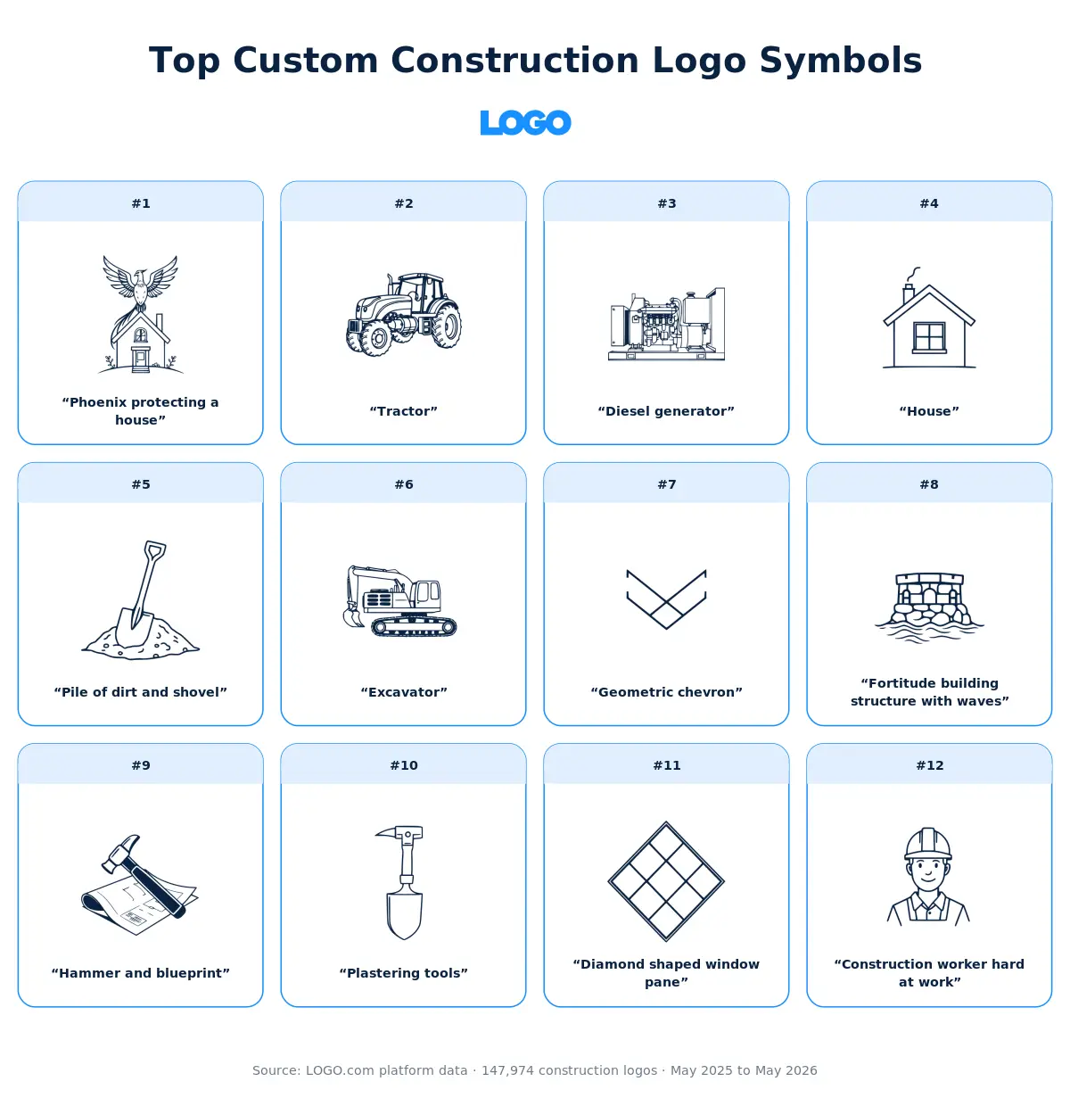
We took the twelve most typed construction logo symbol descriptions and ran each one through all nine visual styles the custom icon generator offers, so you can see how the same words become a minimal line drawing, a detailed illustration, a pixel mark, a deco emblem, and five other looks. The version that's right for your construction logo probably isn't the same one that's right for someone else's, which is exactly what makes the comparison useful.
1. "Phoenix protecting a house"
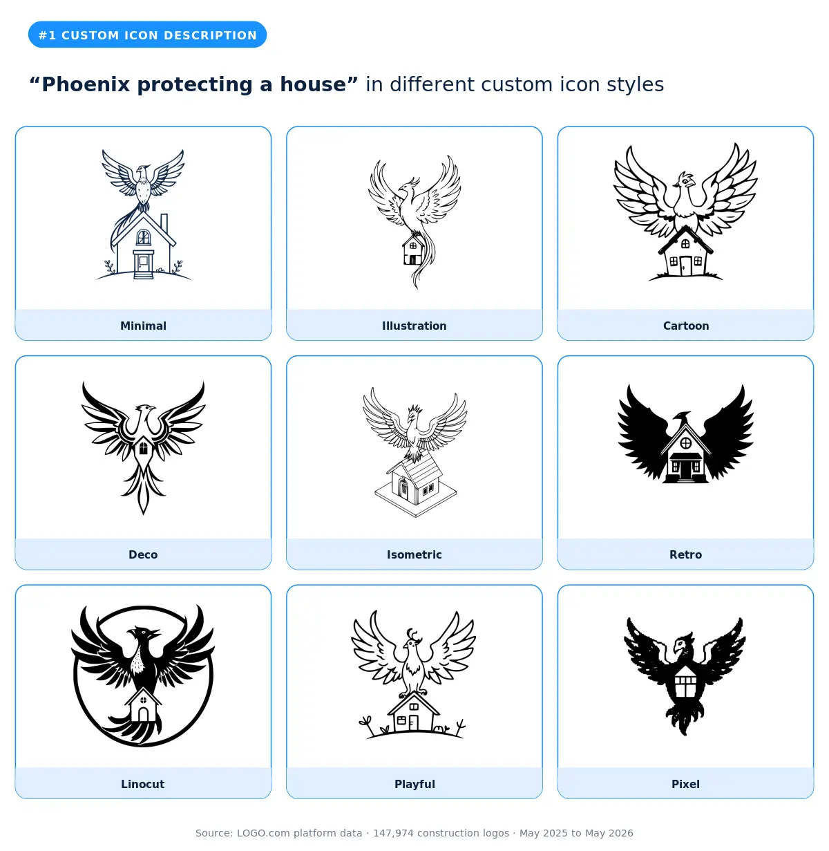
The phoenix protecting a house is the single most typed concept in the construction custom data, with variants like "stylized phoenix bird protecting a two story house" and "phoenix protecting a house but make the logo look like a crest" collapsing into the same theme. Our data shows this is the symbol of choice for restoration contractors, fire damage rebuilders, and protection focused residential brands. The illustration and deco styles carry the phoenix's wings and the house silhouette without either element collapsing. Skip the minimal and pixel styles, because the layered narrative needs detail to read. The smarter pick for restoration brands that want simpler execution is the diamond shaped window pane covered later in this list, which signals the same protective quality with less visual complexity. Pair the phoenix with the plastering tools symbol if your service line covers both rebuilds and finishing work.
2. "Tractor"
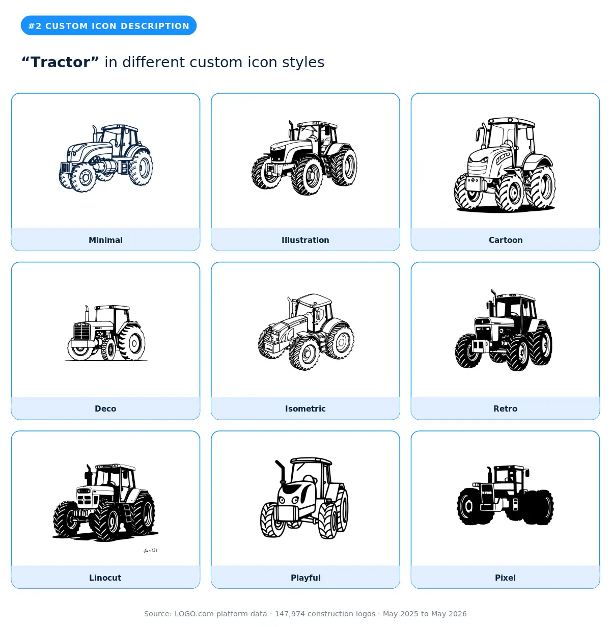
Tractor is the second most typed custom symbol on the platform, and the founders who choose it are almost always running site preparation, land clearing, or rural construction businesses. The illustration and isometric styles preserve the tractor's mechanical character, while the linocut style gives it a heritage feel that works well for family owned contracting brands. Skip the cartoon style if you want to be hired on commercial work, because the playfulness undercuts the seriousness of larger jobs. The tractor is a strong specialist signal that will narrow your perceived service range, so pair it with a generalist wordmark if you also chase residential remodels.
3. "Diesel generator"
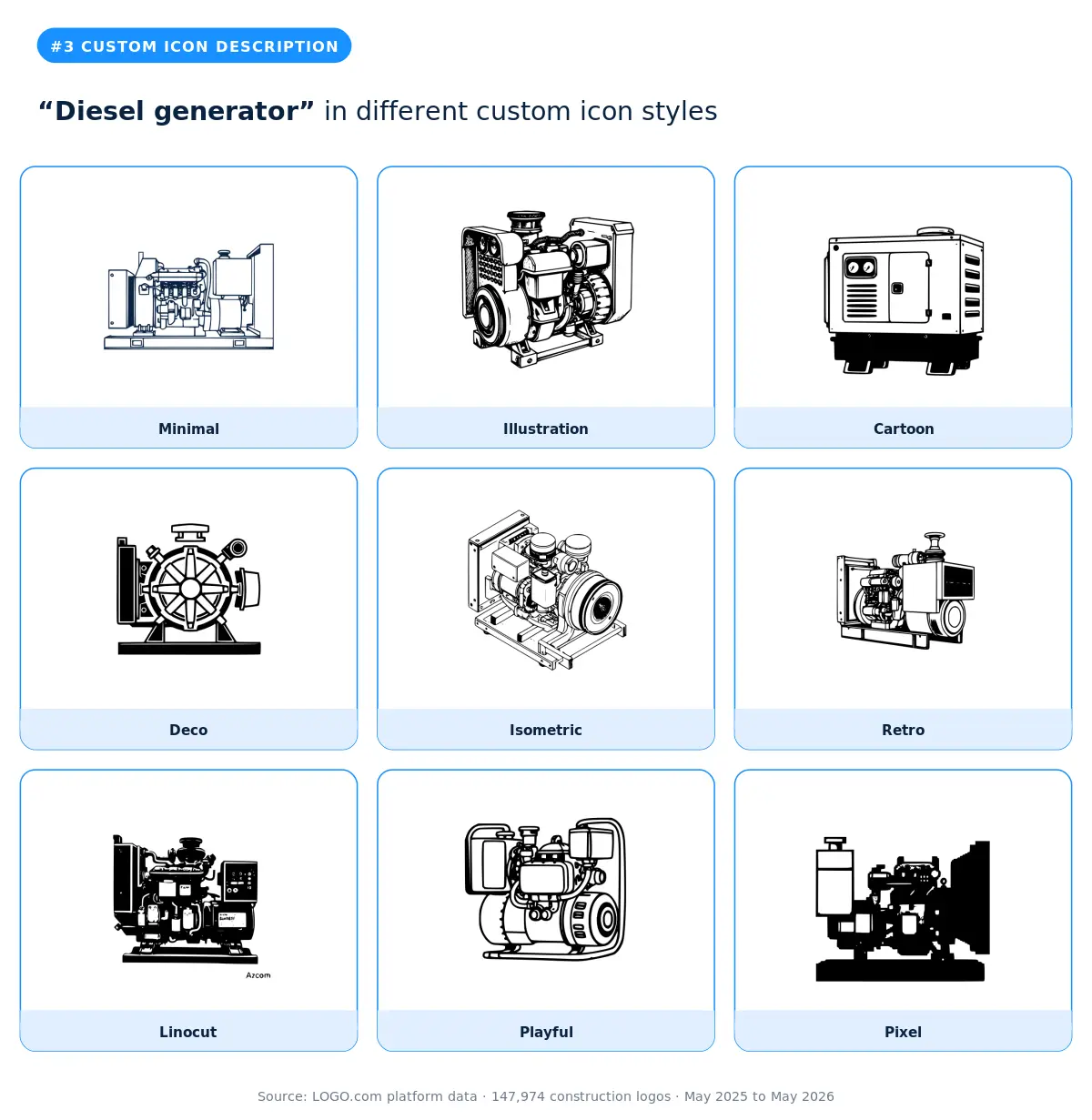
Diesel generator is the third most typed custom symbol (counting variants like "diesel silent generator"), and it's an unusually specific symbol that points to electrical contractors, off grid construction services, and backup power installers. The minimal and deco styles read cleanest at small sizes, which matters because most founders typing this description are putting their logo on service vehicles and uniforms where clarity beats decoration. Skip the illustration and cartoon styles unless your brand voice is intentionally casual, because the generator's mechanical detail can clutter the mark.
4. "House"
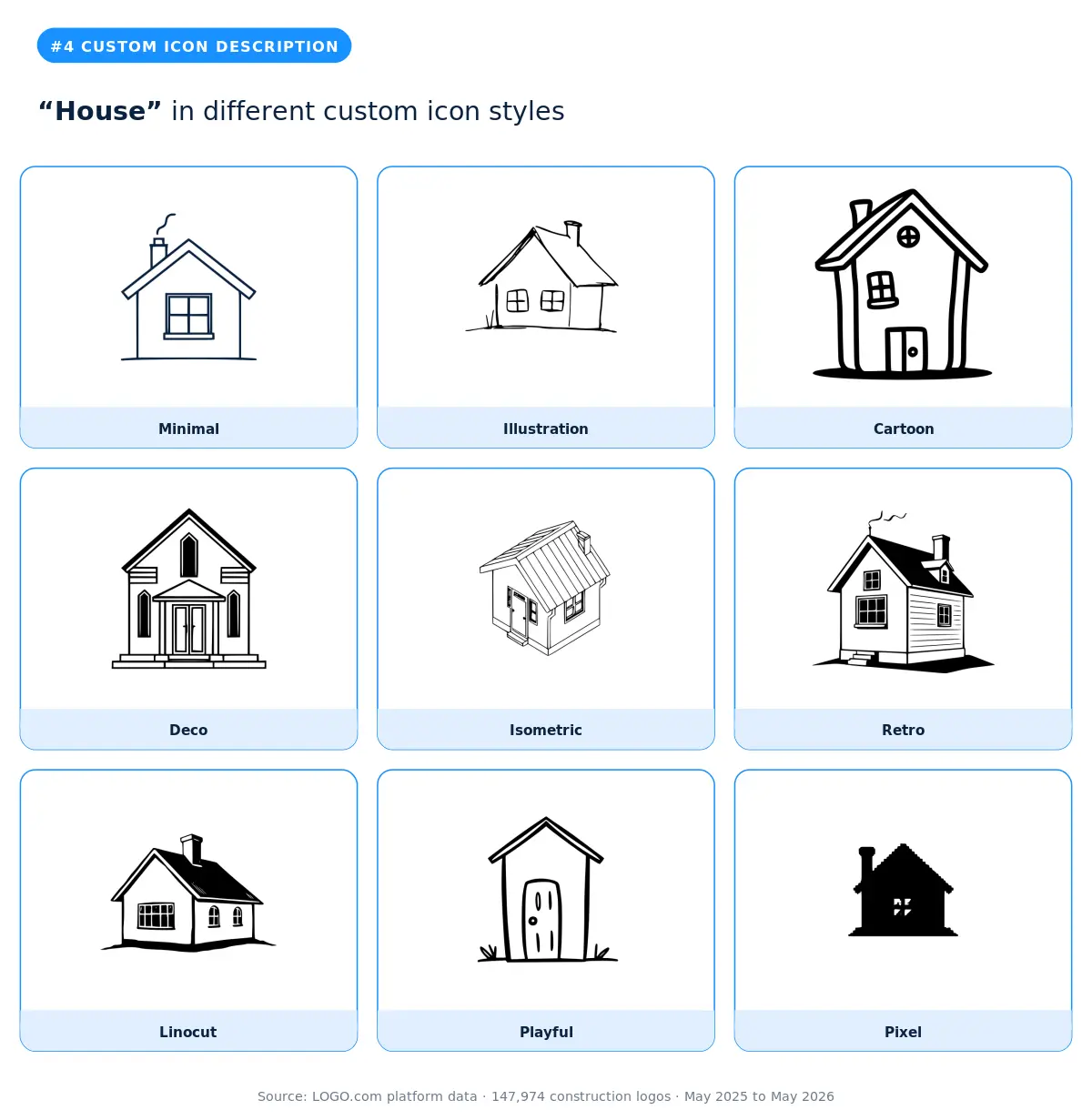
A plain "house" is the fourth most typed construction custom description, and the fact that it sits at number four rather than number one is itself the story. Construction founders who reach for the custom generator are not typing "house," they're typing distinctive concepts the stock library can't deliver. If you do type "house," the minimal and deco styles give the simplest description the most architectural polish. The smarter pick if you want a residential signal without being generic is to combine "house" with a defining feature (sloped rooflines, brick texture, pitched gables) the way the more popular phoenix protecting a house and the diamond shaped window pane do.
5. "Pile of dirt and shovel"
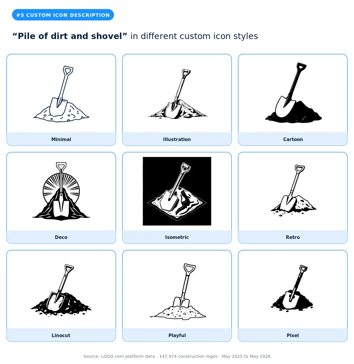
Pile of dirt and shovel ties with "House" near the top of the custom list and signals excavation, landscaping, demolition, and ground preparation services. The linocut and illustration styles work best for this description, because the shovel needs visible weight to feel like a real tool rather than an outline. The smarter pick if you do larger scale excavation work is the excavator description that ranks one position below this one, because the machine signals commercial capability where the shovel signals manual labor.
6. "Excavator"
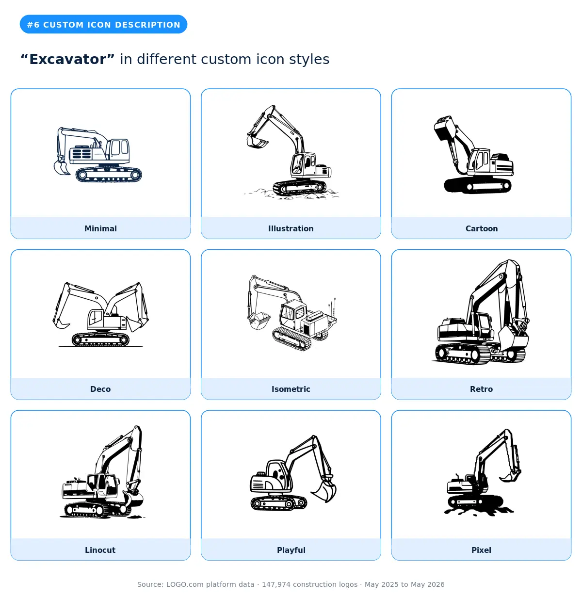
Excavator is the sixth most typed custom symbol, plus additional combined variants like "mini excavator" and "excavator and gator." It's the symbol of choice for site preparation, demolition, and civil contracting brands that want a heavy machinery signal without committing to the full crane scale. The illustration and isometric styles render the excavator's profile most cleanly. Skip the cartoon style for commercial work, because it undercuts the price point excavator businesses typically charge. The excavator is the smarter pick over the shovel above if your average job size is over five figures.
7. "Geometric chevron"
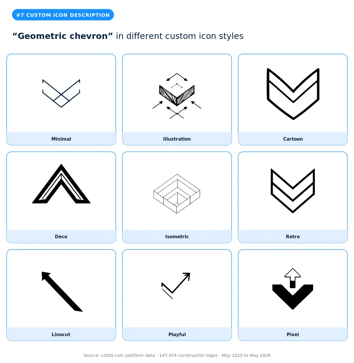
The geometric chevron is the most abstract custom symbol in the construction top twelve. The founders who pick it are almost always positioning premium: design build firms, architectural contractors, and modern residential brands targeting higher end clients. Our data shows abstract geometric descriptions like the chevron, hexagons, and triangulated marks are the fastest growing category year over year, while literal tool symbols stayed flat. The minimal and deco styles work hardest for this description, because the chevron only carries weight when its lines are precise. The smarter pick over a hammer or a house for any contractor planning to expand into adjacent verticals like real estate development.
8. "Fortitude building structure with waves"
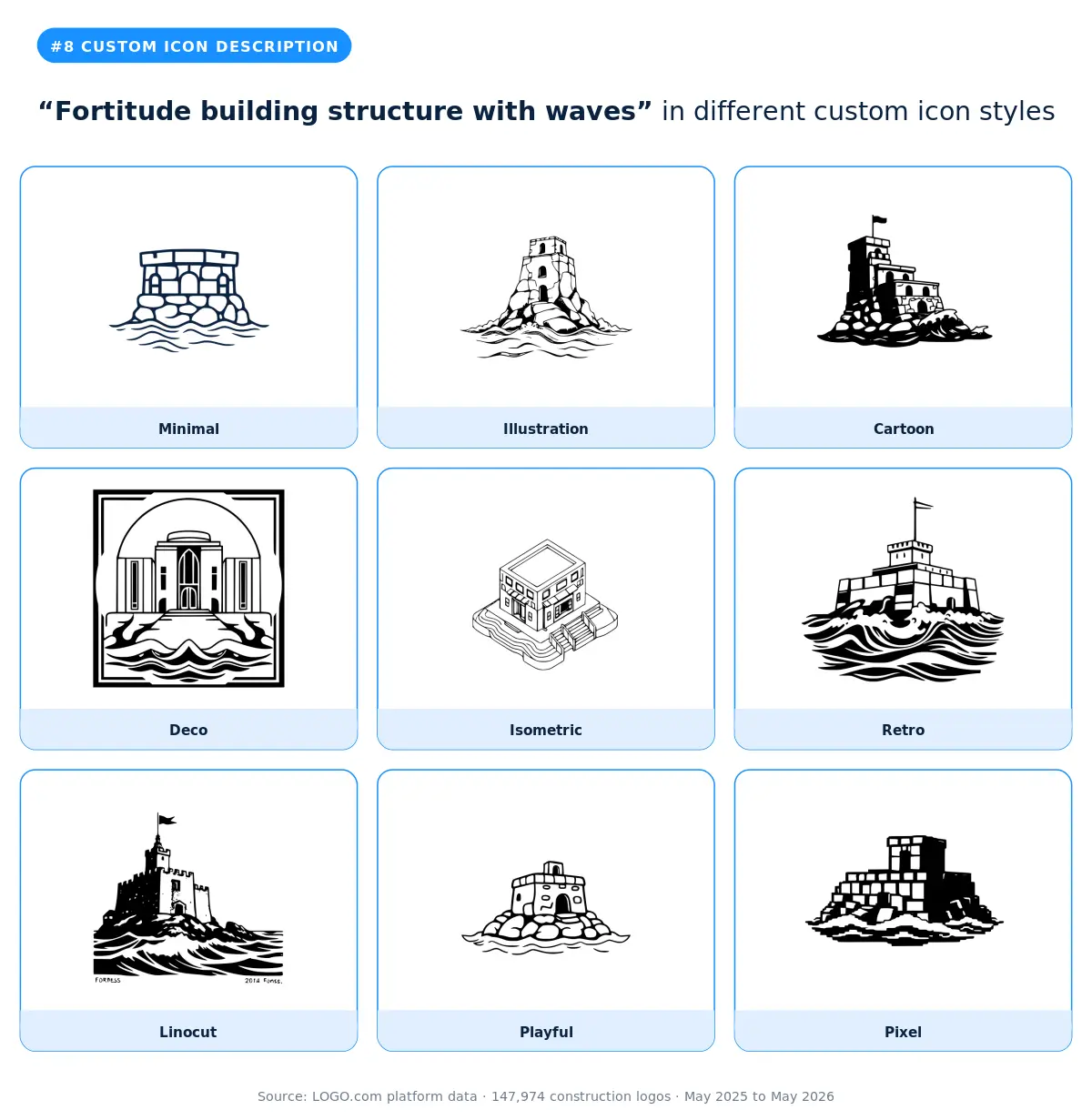
Fortitude building structure with waves is one of the most metaphorical descriptions in the data. It's a brand positioning move: founders combining structure (the build) with waves (resilience, fluidity, or coastal location) to signal a brand that adapts. The illustration and deco styles render this layered concept best. Skip the minimal style, because the two element narrative needs space to read.
9. "Hammer and blueprint"
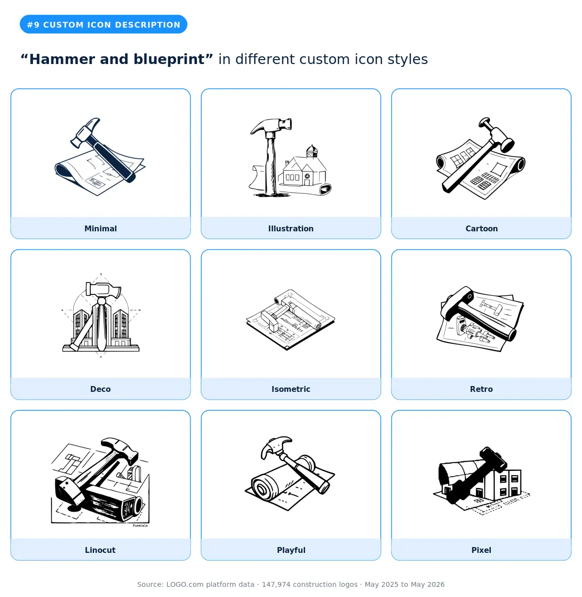
Hammer and blueprint appears in the top twelve with additional combined variants like "Hammer building outline shape" and "Hammer and house silhouette" that share the same concept. It's the design build symbol: founders signaling both craftsmanship (the hammer) and planning (the blueprint) in one mark. The illustration and linocut styles preserve the dual element narrative. This is the smarter pick over a plain hammer if your business positions on planning and execution rather than trade skill alone.
10. "Plastering tools"
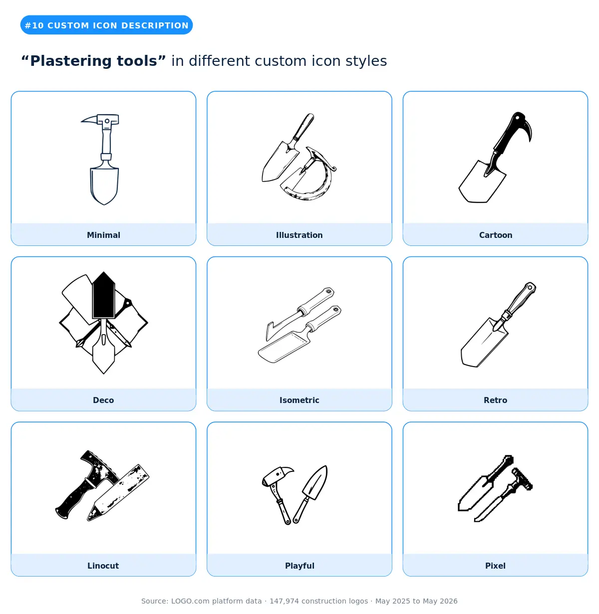
Plastering tools rounds out the top ten construction logo symbols on the platform, with variants like "Plastering trowel", "Plaster trowel and smooth wall", and "Father and son plastering wall" carrying the same trade-specific brief. It's the unambiguous mark of drywall, stucco, and interior finishing contractors who want their construction logo to signal craftsmanship at the small scale rather than scale at the big one. The illustration and linocut styles preserve the tool's working character without sliding into generic hand tool territory. Skip the cartoon and playful styles, because the precision a plasterer charges for needs to read in the mark. The smarter pick if you also do exterior masonry is to combine the plastering tools with the hammer and brick wall stock icon for a brand that reads as a full finishing trade.
11. "Diamond shaped window pane"
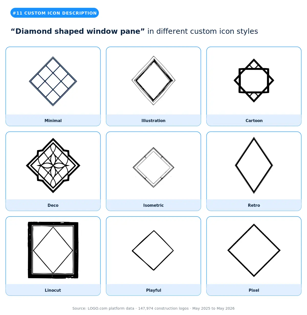
Diamond shaped window pane appears with variants like "Abstract window pane" and "Sparkling window pane" that share the same geometric vocabulary. It's a window installer and exterior remodeler symbol that gives the brand a distinctive geometric quality without going fully abstract. The deco and retro styles work best, because the diamond shape benefits from era specific framing. The smarter pick over a plain house for window and exterior contractors who want to look more specialized than generalist.
12. "Construction worker hard at work"
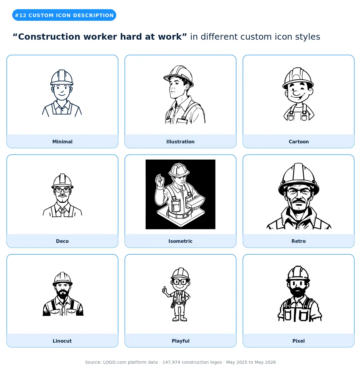
Construction worker hard at work rounds out the top twelve with close variants like "construction worker hard hat" and "worker with helmet and hammer." It's the labor forward symbol that signals workforce, reliability, and hands on capability. The illustration and isometric styles preserve the figure's character best. Skip the minimal style, because the worker silhouette needs detail to feel real rather than generic. The smarter pick for solo contractors or owner operators is to combine the worker with a tool from the stock library.
Part two: the most popular construction logo icons
The other half of the construction logo ideas on the platform come from the stock icon library, which is the path most construction founders take. They want speed, they want a mark a prospect recognizes instantly, and they want a graphic that's already proven on hundreds of other construction logos. The library carries thousands of options. Twelve of them account for the most picked construction logo icons.
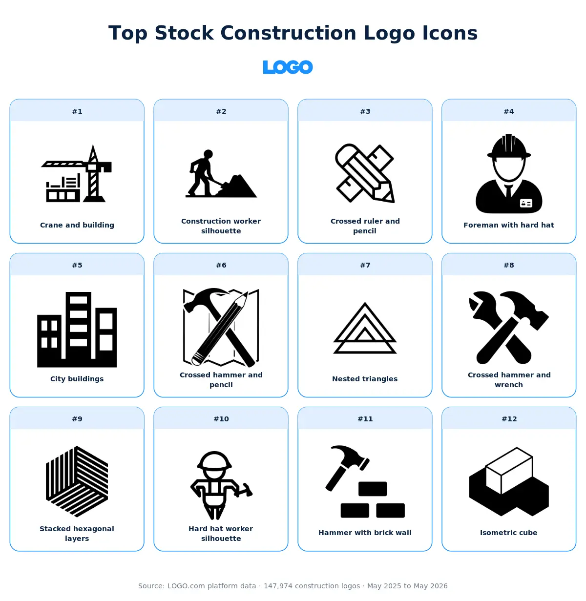
Here's our take on each of those twelve. When choosing construction logo icons for your business card, ensure the lines are thick enough to remain legible at small sizes. The visual gives you the short version. The paragraph underneath unpacks the why and offers guidance on which kinds of construction logos each icon actually fits.
1. Crane and building icon
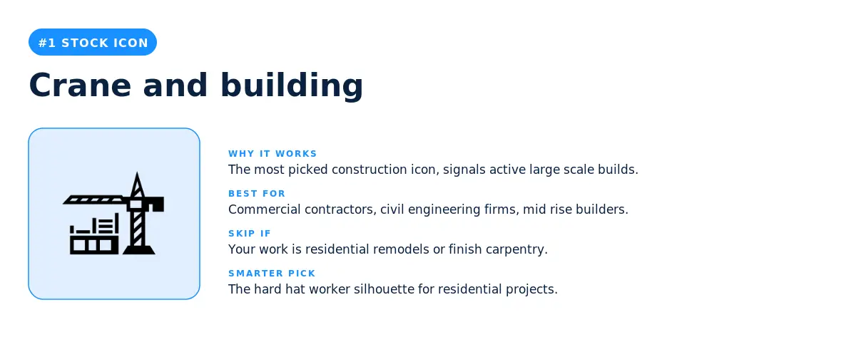
The crane and building icon is the single most picked construction stock icon on the platform. It does double work: the tower crane signals active construction, and the building underneath signals scale. Our data shows this is the default pick for commercial contractors, civil engineering firms, and any builder whose average project is large enough to require a crane on site. Skip this icon for residential remodelers and finish carpentry, because the scale it signals sets a price expectation residential prospects aren't shopping for. The smarter pick for residential is the hard hat worker silhouette covered below.
2. Construction worker silhouette icon
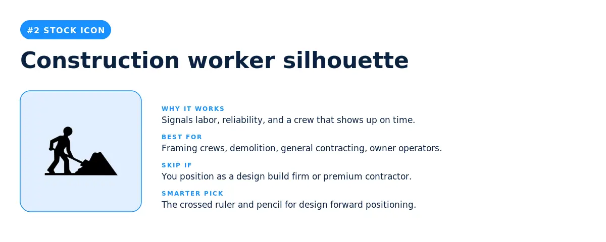
The construction worker silhouette is the second most picked stock icon. It signals labor, reliability, and the kind of crew that shows up on time. Our data shows this is a strong pick for framing, demolition, and general contracting brands that want the workforce to be the value proposition. Skip the worker silhouette if you position as a design build firm or premium contractor, because the labor framing can undercut the premium positioning. The smarter pick for premium is the crossed ruler and pencil at number three.
3. Crossed ruler and pencil icon
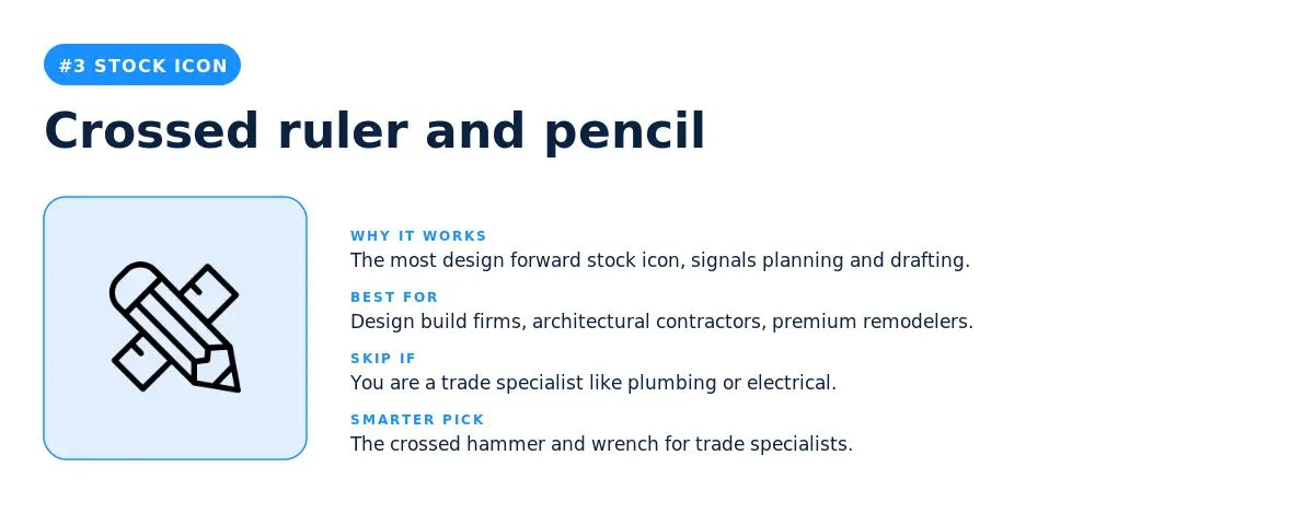
The crossed ruler and pencil icon is the most design forward stock icon in the top twelve. It signals planning, drafting, and architectural rigour. This is the right pick for design build firms, architectural contractors, and remodelers positioning upmarket. Skip it for trade specific brands like plumbing or electrical, because the architectural framing sets the wrong expectations.
4. Foreman with hard hat icon
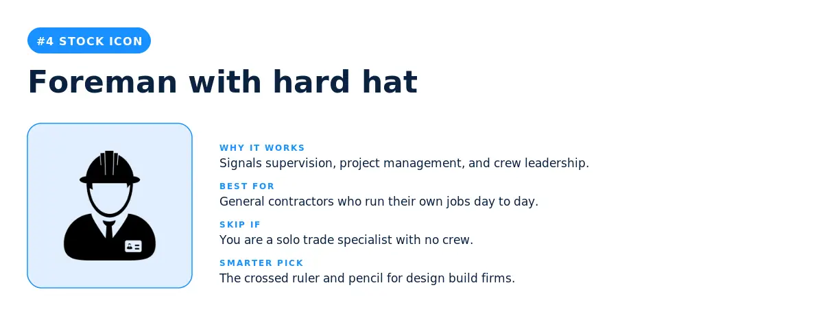
The foreman with hard hat icon (the worker bust with a clipboard or badge) signals supervision, project management, and crew leadership. This is the smarter pick for general contractors who want to communicate that there's an owner on every job, rather than a hands off scheduler. Skip it for solo trade specialists, because the foreman framing implies a crew you may not have.
5. City buildings icon
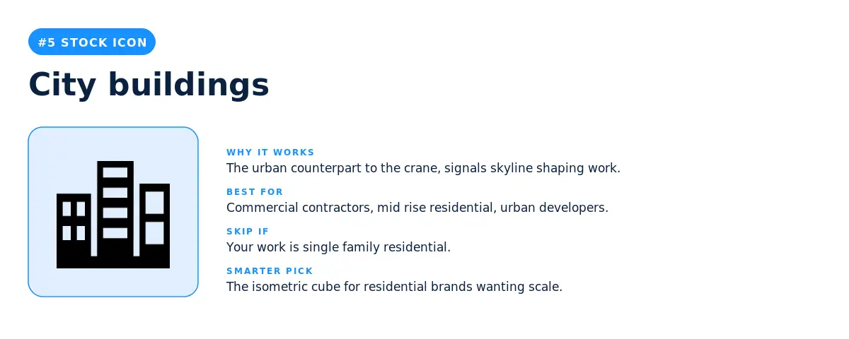
The city buildings icon (a cluster of mid rise structures) is the urban counterpart to the crane and building above. It's the right pick for commercial contractors, mid rise residential builders, and any firm whose work shapes a skyline. Skip it for single family residential, because the urban framing positions you for jobs your prospects aren't hiring for. The smarter pick for residential focused brands is the isometric cube at number twelve, which keeps the structural signal without the urban scale.
6. Crossed hammer and pencil icon
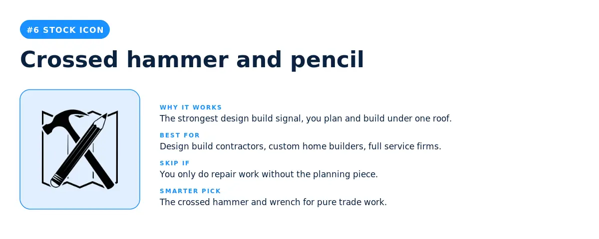
The crossed hammer and pencil icon is the strongest design build signal in the top twelve. It's the mark of contractors who plan and build under one roof. Skip this icon for repair only brands, because the planning element sets expectations of full project management. The smarter pick for a pure trade brand is the crossed hammer and wrench at number eight.
7. Nested triangles icon
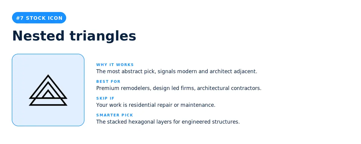
The nested triangles icon (three concentric triangles forming an abstract pyramid) is the most abstract pick in the top twelve. It's the strongest signal that a contractor is positioning as modern, design led, and architect adjacent rather than tradesman adjacent. Our data shows abstract geometric icons grew their share of the construction picks year over year while literal tool icons stayed flat. Skip this icon if your work is residential repair or maintenance, because the abstract framing reads as premium and may price you out of those prospects.
8. Crossed hammer and wrench icon
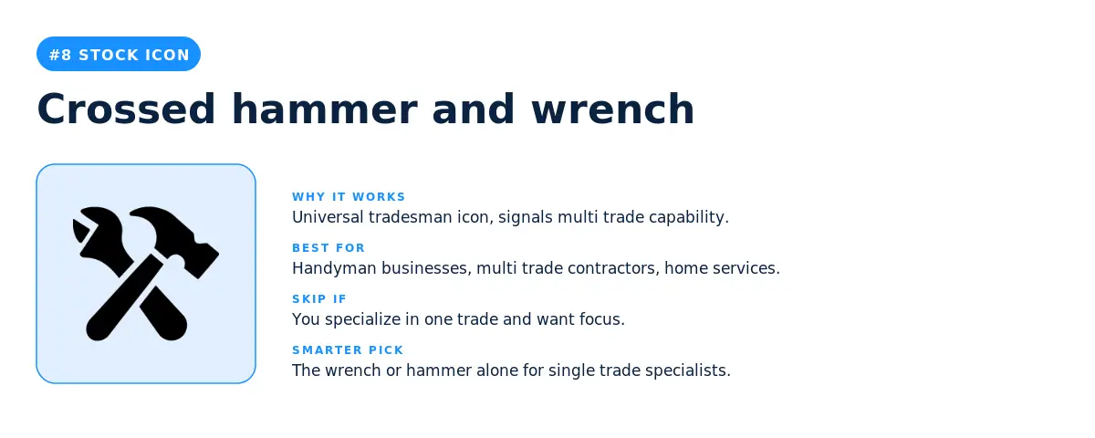
The crossed hammer and wrench icon is the most universal tradesman icon in the top twelve. It signals multi trade capability without committing to a single specialty. This is the right pick for handyman businesses, multi trade contractors, and home services brands where range is the value proposition. Skip the crossed tools if you specialize in one trade, because the multi tool framing dilutes the focus that makes specialists hireable.
9. Stacked hexagonal layers icon
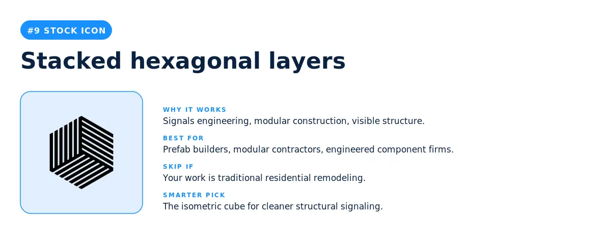
The stacked hexagonal layers icon is the second most abstract icon in the top twelve. It signals engineering, modular construction, and the kind of contractor whose work has visible structure. This is a strong pick for prefab builders, modular contractors, and any firm whose service involves engineered components. Skip this icon for traditional residential work, because the engineered framing reads as commercial.
10. Hard hat worker silhouette icon
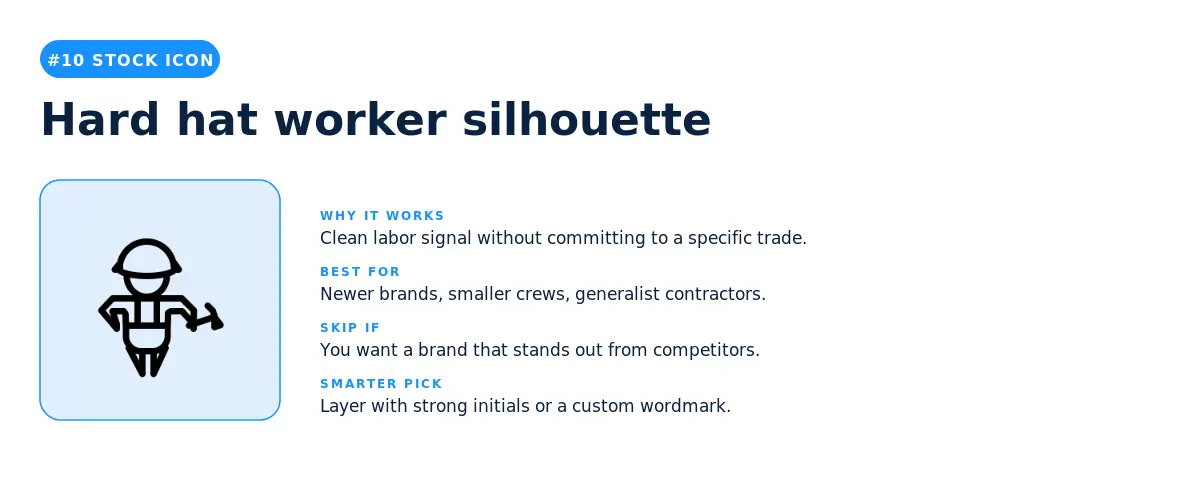
The hard hat worker silhouette (different from the foreman at number four, this one is a simpler standing figure) is the most generic worker signal in the top twelve. It's the right pick for newer brands, smaller crews, and contractors who want a clean labor signal without committing to a specific trade. The smarter pick if you want to stand out is to layer this icon with your initials or a wordmark that's stronger than the icon itself.
11. Hammer with brick wall icon
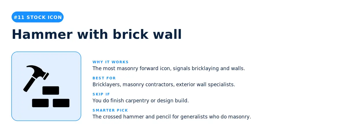
The hammer with brick wall icon is the most masonry forward icon in the top twelve. It's the natural pick for bricklayers, masonry contractors, and exterior wall specialists. Skip it for finish carpentry or design build firms, because the brick framing narrows your perceived service range. The smarter pick for general contractors who also do masonry is the crossed hammer and pencil at number six.
12. Isometric cube icon
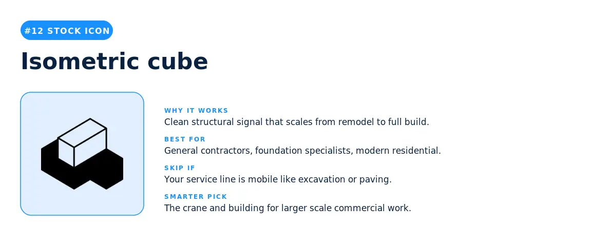
The isometric cube icon closes out the top twelve and is the cleanest structural signal on the list. It reads as building, foundation, and engineered structure without specifying scale. This is a strong pick for general contractors, foundation specialists, and modern residential brands that want a structural signal that scales from a kitchen remodel to a full build. Skip the cube only if your service line is mobile (excavation, paving, hauling), because the cube anchors the brand to a fixed structure that may not match.
Part three: the most popular construction logo colors
The symbol on your construction logo gets the most attention from your prospects, but the color palette underneath does almost as much work. We analyzed the color palettes on the 147,974 construction logos in our dataset and the patterns are surprisingly tight. Construction logo ideas are not running wild with color. They are converging on a small set of palettes that signal trust, capability, and seriousness.
The most popular individual colors in construction logos
White appears in 68.8% of construction logos, making it the single most used color in the category. Black appears in 42.4%, Blue in 34.4%, Green in 30.4%, and Grey in 24.6%. Together these five colors account for the overwhelming majority of every palette construction founders build. Yellow (17.6%), Orange (14.2%), and Red (10.8%) are the warm accent colors that appear most often as the third color in a two color construction logo palette. Violet and Brown both sit under 10%, which makes either an instant differentiation move if your construction logo wants to look different from every other contractor in your zip code.
The most popular color palettes in construction logos
When you collapse color order so the same combination counts once, three palettes dominate construction logos on the platform. Black and White is the single most picked palette at 15.9% of construction logos, which makes it the safe, professional, contractor default. Blue and White comes in second at 9.3% and signals trust, water adjacency, and a softer professionalism that residential prospects respond to. Grey and White is third at 3.9% and gives a modern, architect adjacent feel without the warmth of blue or the starkness of black. After those three, the palette mix opens up into three color combinations: Black plus Blue plus White (2.8%), Green plus White (2.8%), Black plus Green plus Yellow (2.7%), Blue plus Green plus White (2.6%), and Blue plus Grey plus White (2.1%). The construction logo ideas that want to stand out without taking a real risk lean into one of those three color combinations, which signal more brand intent than the two color defaults without going overboard.
How many colors construction founders actually use
53% of construction logos use exactly two colors. 30.6% use three colors. 7.6% use four colors, and only 4.6% use one color alone. The takeaway is simple: the average construction logo on LOGO.com is built on a two or three color palette, not a single color mark and not a five color rainbow. If you want your construction logo to fit the category, stay in that range. If you want to stand out, go monochrome (the 4.6% single color play) and let the symbol carry every ounce of the brand.
Three takeaways before you pick your construction logo symbol or icon
1. The house is not the answer for construction logo ideas. Workers, tools, and abstract structures are. A literal house icon does not appear in the most picked construction logo icons, and house ranks only fourth among custom symbol descriptions. The reason is that construction founders are signaling capability, not output. The crane shows you can build at scale. The crossed pencil and ruler shows you can plan. The hammer shows you can deliver. Pick a construction logo symbol that signals what you do, not what you make.
2. The path you pick (stock or custom) is itself a positioning signal for your construction logo. A stock icon tells the market your construction logo is efficient, reliable, and ready to start tomorrow. A custom symbol tells the market you care about how your brand looks and you're willing to invest in it. Premium remodelers, design build firms, and commercial contractors get more mileage from custom symbols. Local generalists and trade specialists do fine with stock icons.
3. The fastest growing construction logo ideas are not literal at all. Year over year, the construction founders building the most distinctive brands are typing geometric, abstract, and narrative descriptions (geometric chevron, fortitude building structure with waves, phoenix protecting a house) rather than literal tools or houses. The market is converging on a simple truth: in a category where every competitor looks the same, the construction logo that looks intentionally different gets remembered.
For founders launching in 2026, here is the simplest way to think about your construction logo. A stock icon is the right call when speed and recognition matter more than standing out. A custom symbol is the right call when you want a mark no other contractor in your market can use. The data above shows you which side of that line your business is sitting on, before you even open the editor.
Source: LOGO.com platform data, May 2025 to May 2026. n = 147,974 construction logos. Symbol and icon rankings reflect the most picked stock construction logo icons and the most typed custom construction logo symbol descriptions among users who selected "construction" as their industry. Color palette percentages reflect the share of construction logos that include each color across all saved palettes in the period.
Recent posts
Oct 19, 2026 by: Sean Baker

Oct 14, 2026 by: Vanessa Lam
Oct 12, 2026 by: Sean Baker
Oct 5, 2026 by: Sean Baker