

Logo Design Considerations for a Roofing Business
According to LOGO.com data, the five most popular colors in roofing logos created on LOGO.com over the past 12 months were white at 33%, black at 28%, blue at 10%, brown at 7%, and grey at 7%. White and black create the crisp contrast people expect from dependable roof lines and strong construction marks, while blue, brown, and grey add signals of trust, material, and lasting protection. For a roofing logo that works on trucks, uniforms, signs, and social profiles, start with a clear white or black base and use one grounded accent color to make the mark easy to recognize.
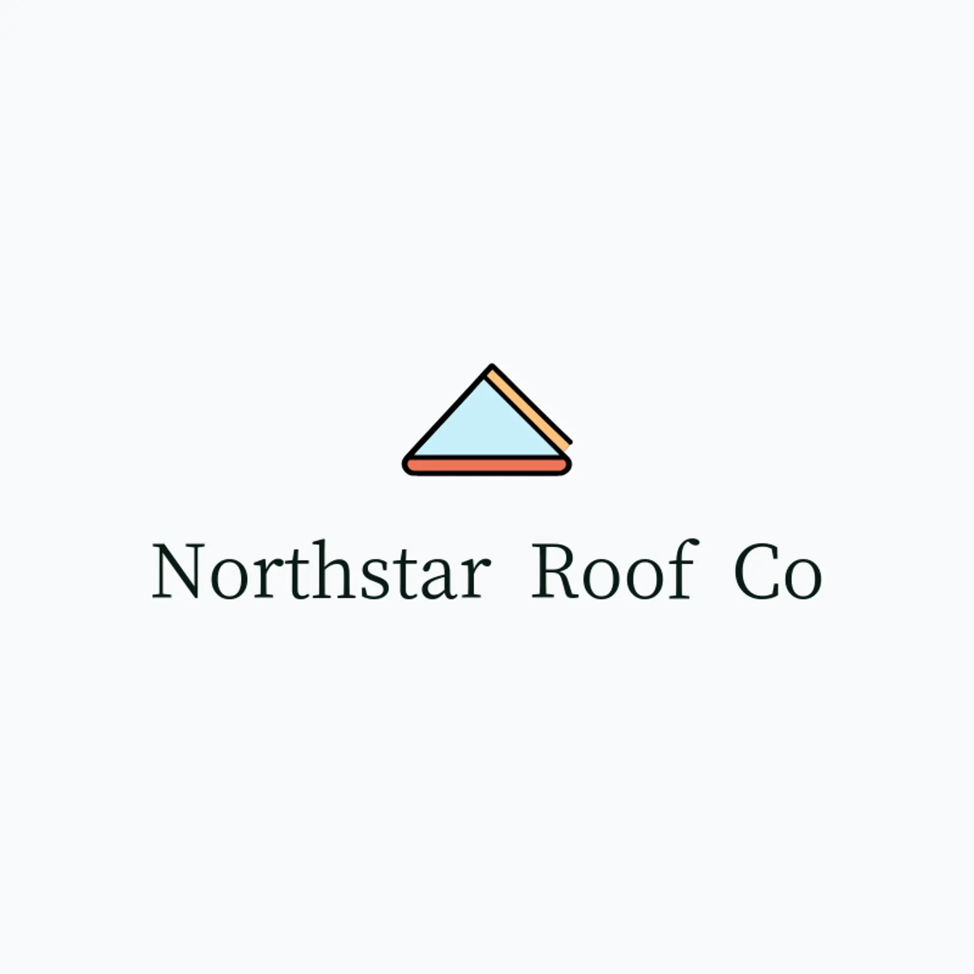
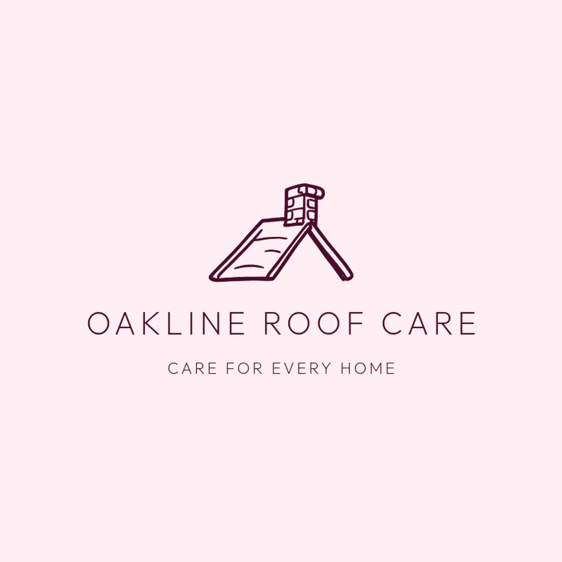
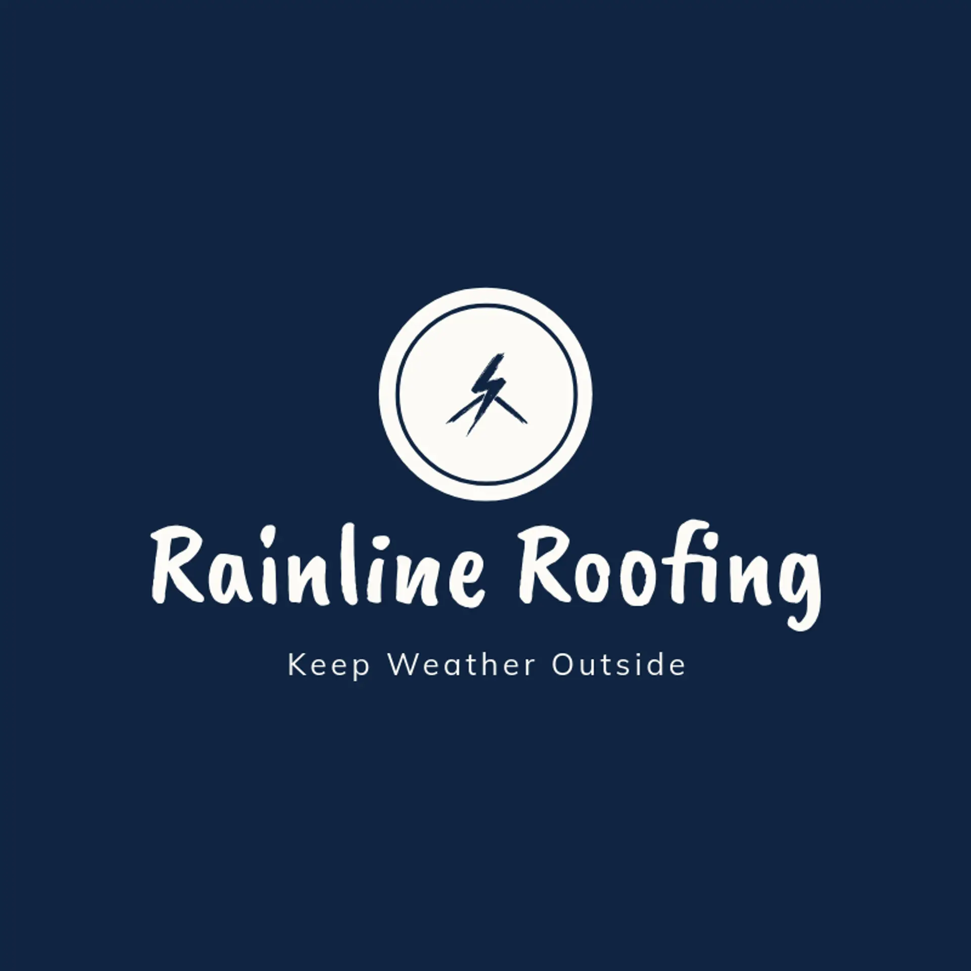
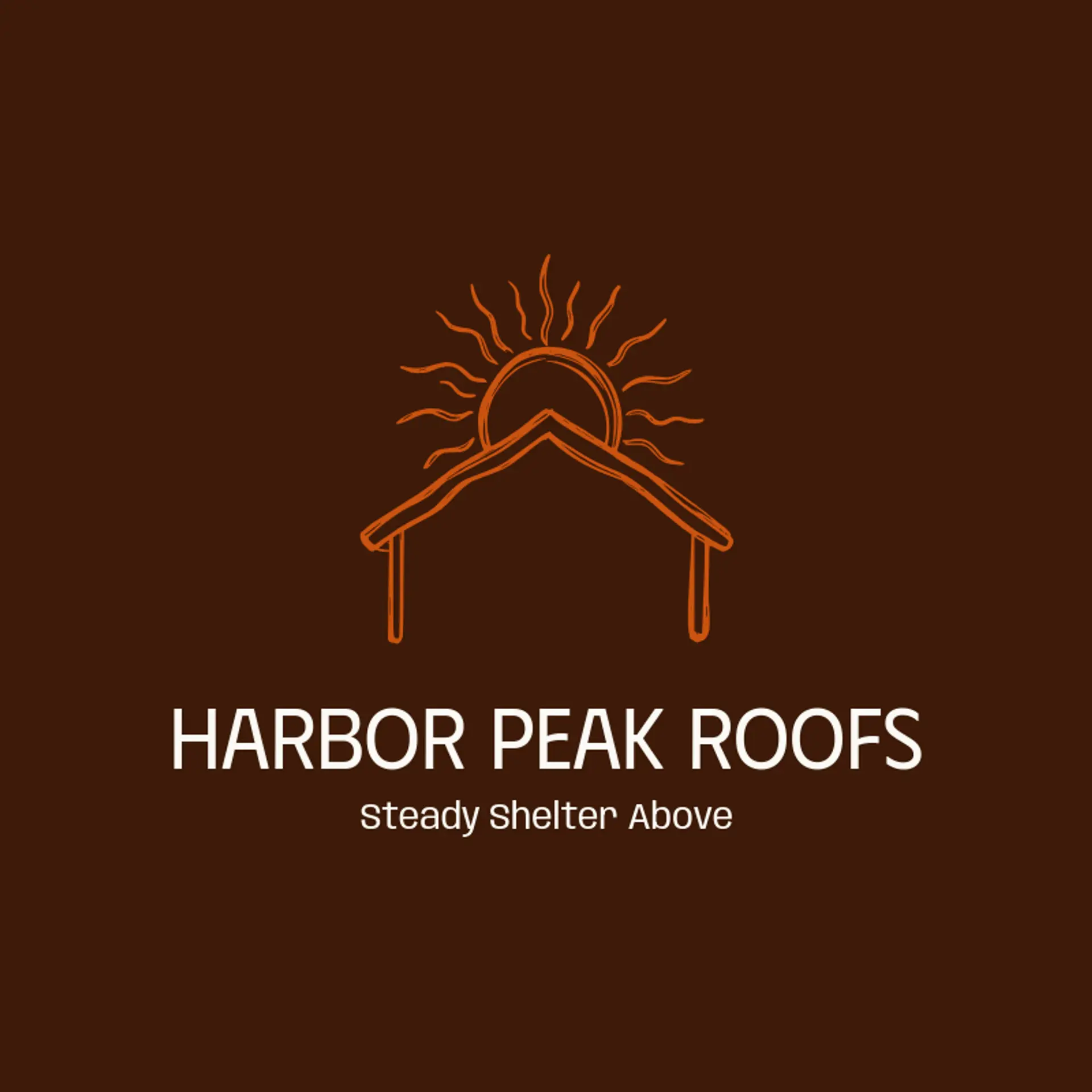
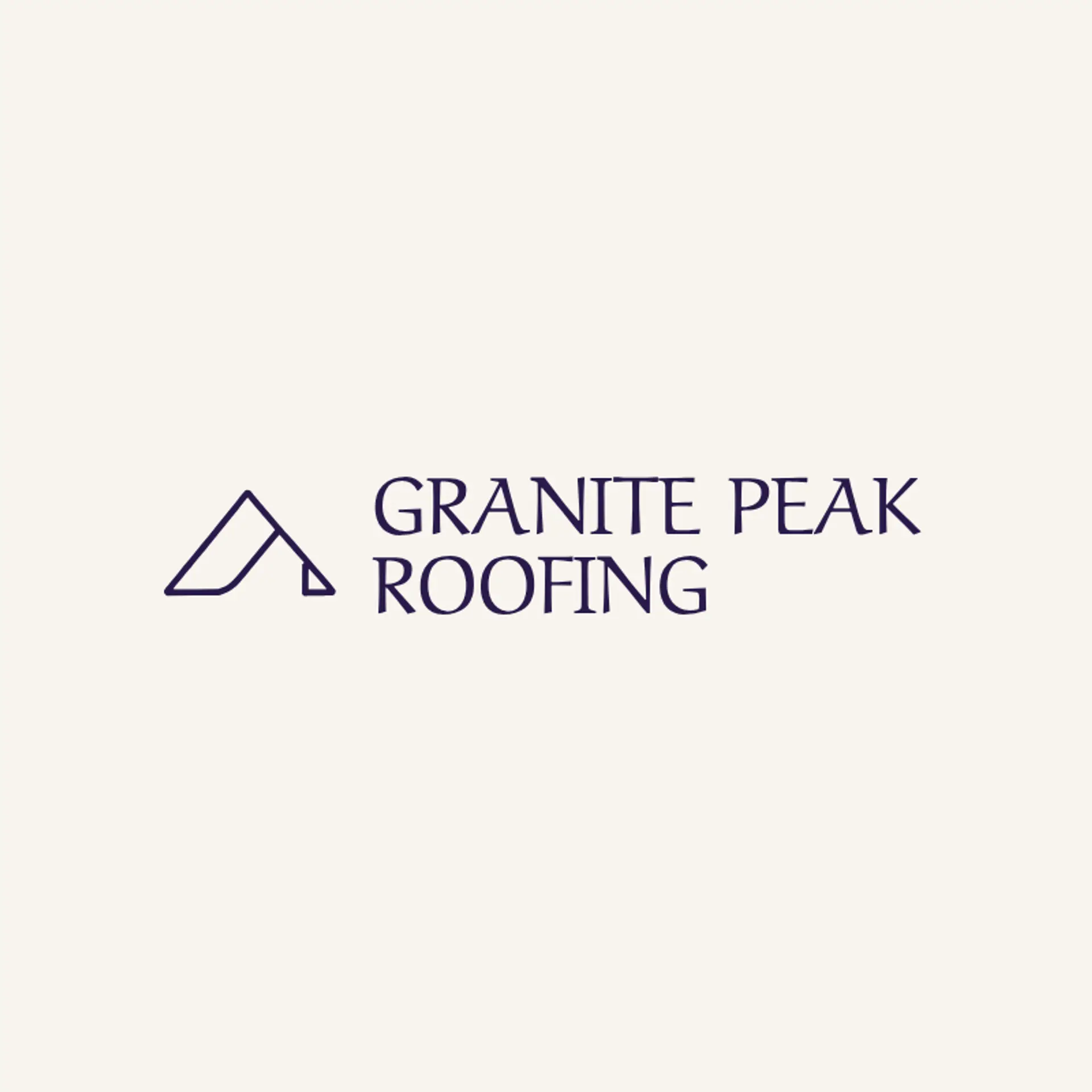
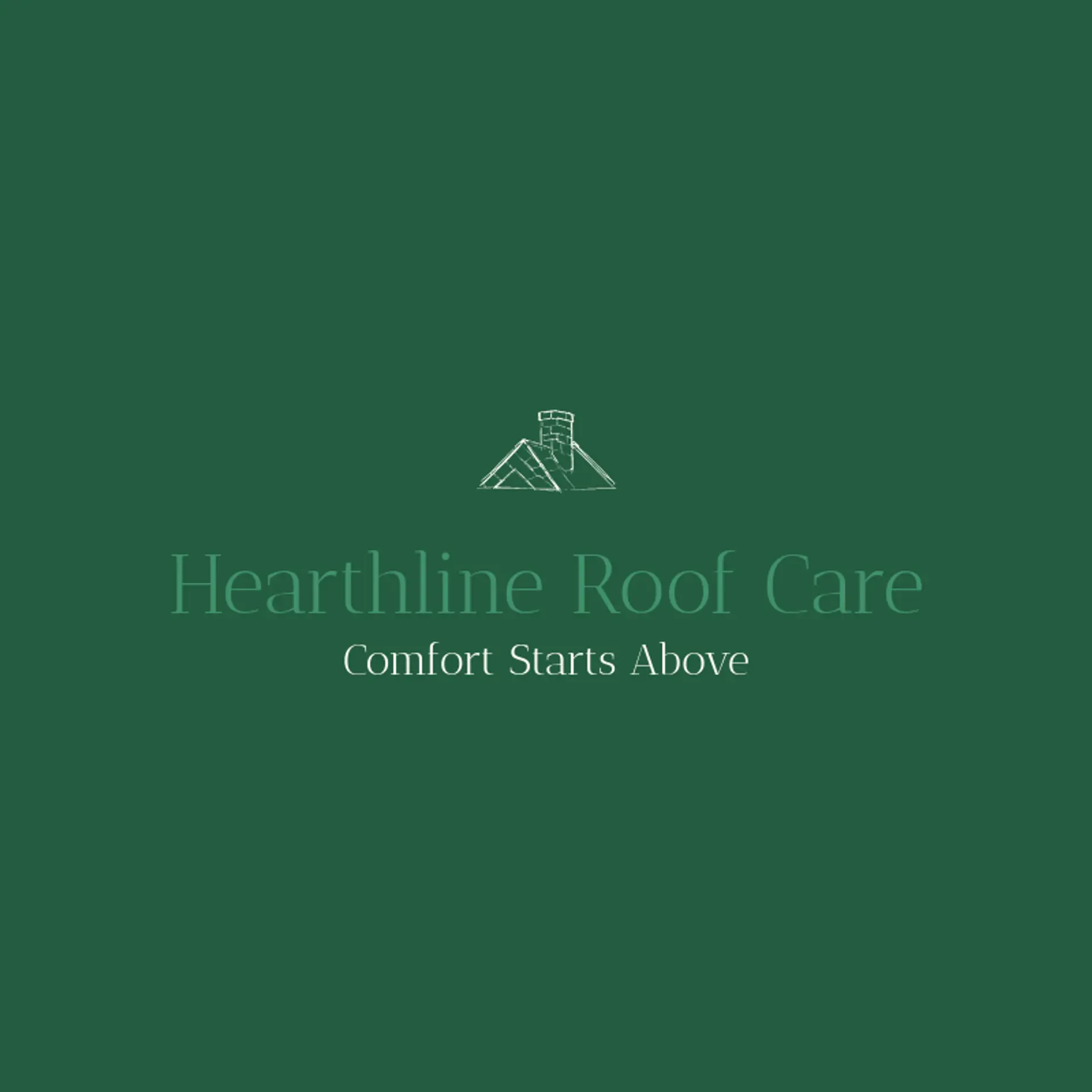
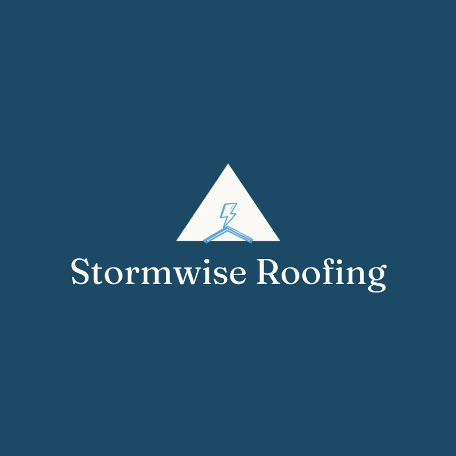
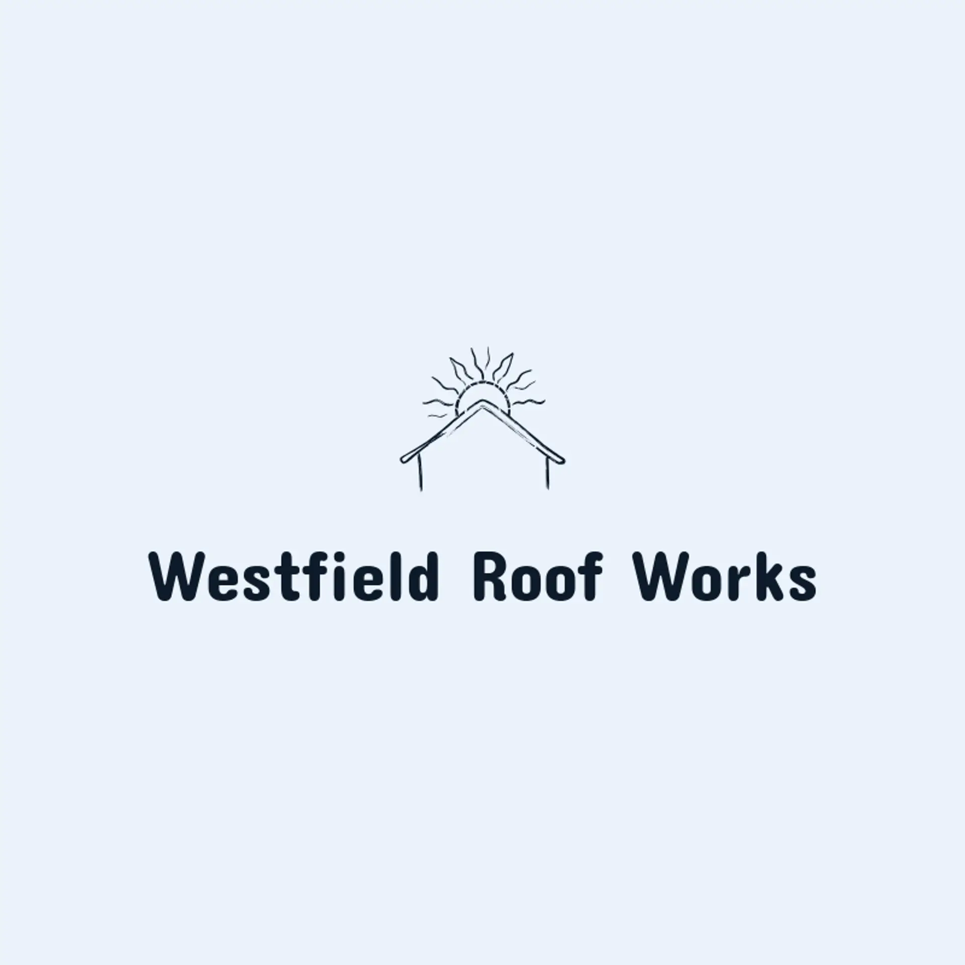
When it comes to the icon, a simple roof line or peaked roof is an immediate starting point, and its strong angles stay recognizable when reduced for a truck or website avatar. A shingle row, roof ridge, or chimney can add a more specific sense of craft without making the silhouette busy. Consider a rain drop beside a roof, a sun rising behind a roof line, or a hammer beside a shingle to connect protection with skilled work. For a broader contractor brand, try a sturdy house silhouette with a roof accent, a shield beside the roof, or a mountain peak that echoes the shape of a finished roof. Before settling, think about the company story: a coastal roofer might pair the roof with a wave, while a storm repair team could use a clear roof line with a small lightning bolt beside it.
Icons To Make Your Roofing Logo Stand Out
That same focus on clarity should guide the lettering. A sturdy sans serif can give a roofing company a direct and dependable voice, while a compact serif can suggest craftsmanship and years of experience. Look for open letter shapes, confident weight, and spacing that stays readable on a truck door or a small social image. Pair restrained lettering with the strongest contrast from the first paragraph so the company name remains clear beside a roof line, shingle pattern, or protective shield.
Roofing Logo Ideas FAQs
Browse Related Logo Ideas
Build logosCommercial construction logosConcrete construction logosConstruction 3D logosConstruction and landscaping logosConstruction business logosConstruction company logosConstruction designer logosConstruction drywall logosConstruction house logosConstruction logosConstruction painting logosDrywall logosElectric logosElectrical logosElectrician logosGeneral construction logosHome construction logosHouse construction logosPlumbing and heating logosPlumbing logosRoofing logosSurveying logosWelding logosWoodworking logosGear logosMetal logosSafety logosTools logosAir conditioning logosCarpenter logosCrane logosExcavator logosFactory logosFence logosFlooring logosGeneral contractor logosHard hat logosInfrastructure logosManufacturing logosHammer logosContractor logosEngineer logosPaint logosBlacksmith logosElectricity logosElevator logosGlass logosHome builder logosIndustry logos