







Logo Design Considerations for a Lemonade Business
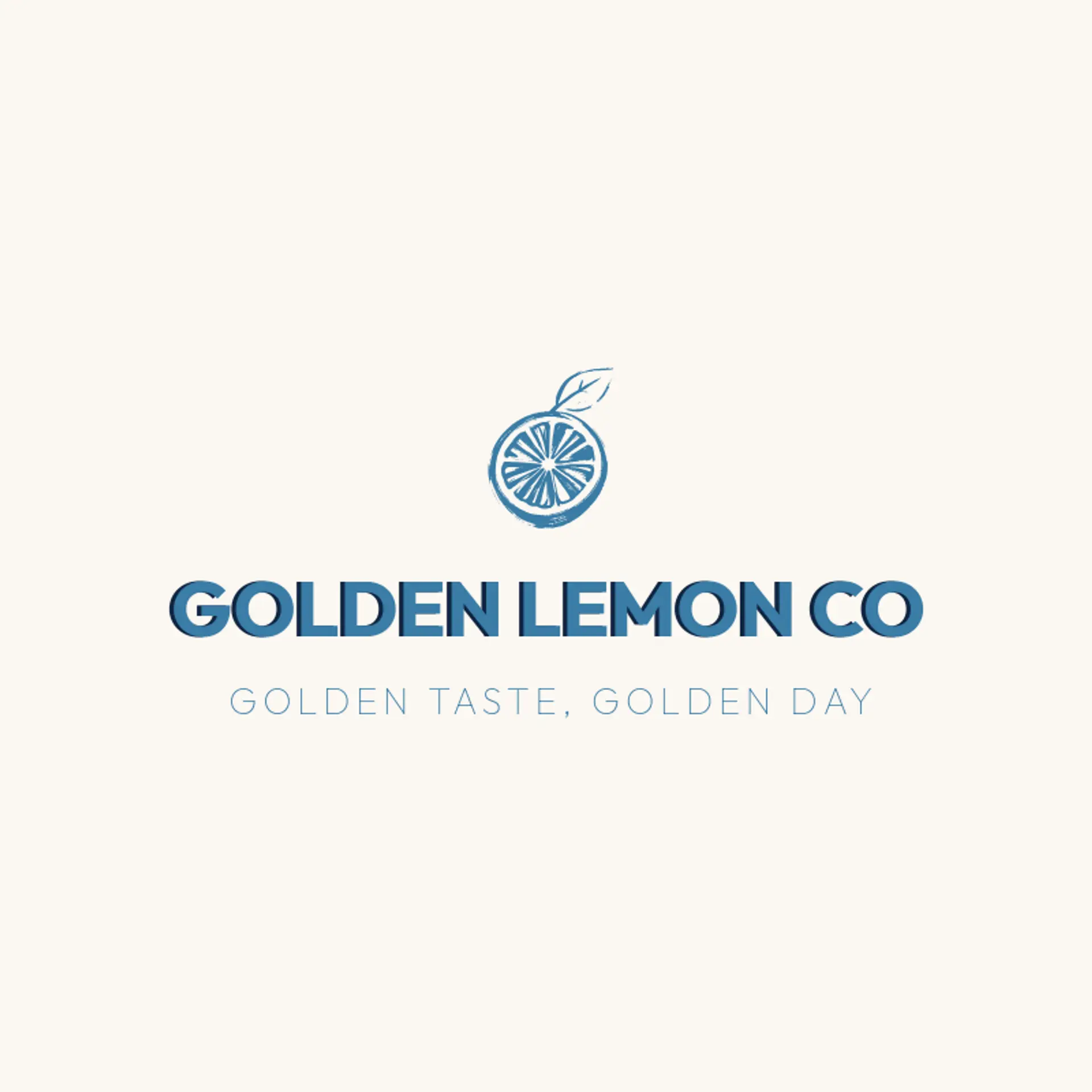
According to LOGO.com data, the five most popular colors in lemonade logos created on LOGO.com over the past 12 months were yellow at 21%, white at 19%, black at 16%, green at 13%, and blue at 11%. Yellow and white together made up two fifths of all color choices, a natural echo of bright citrus and a frosty glass, while black, green, and blue add the freshness and contrast that stands out on cups, stands, and social profiles. If you want a lemonade logo that feels at home on a stand banner, a cup sleeve, or a small social avatar, start from a sunny yellow or clean white base and let one of these accent colors carry the energy.
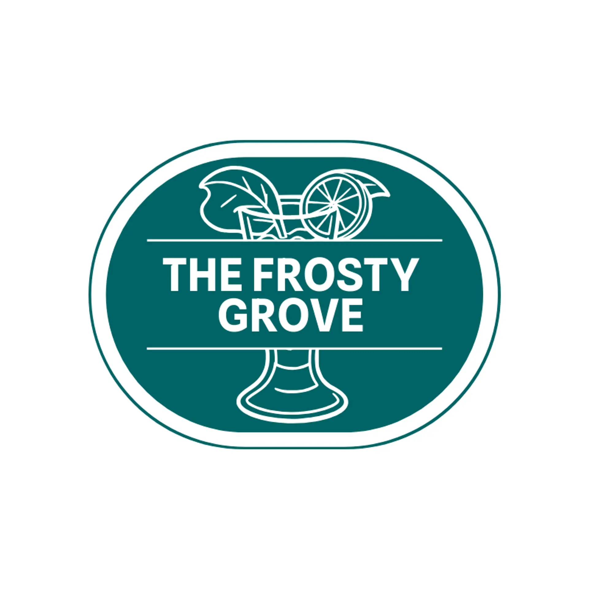
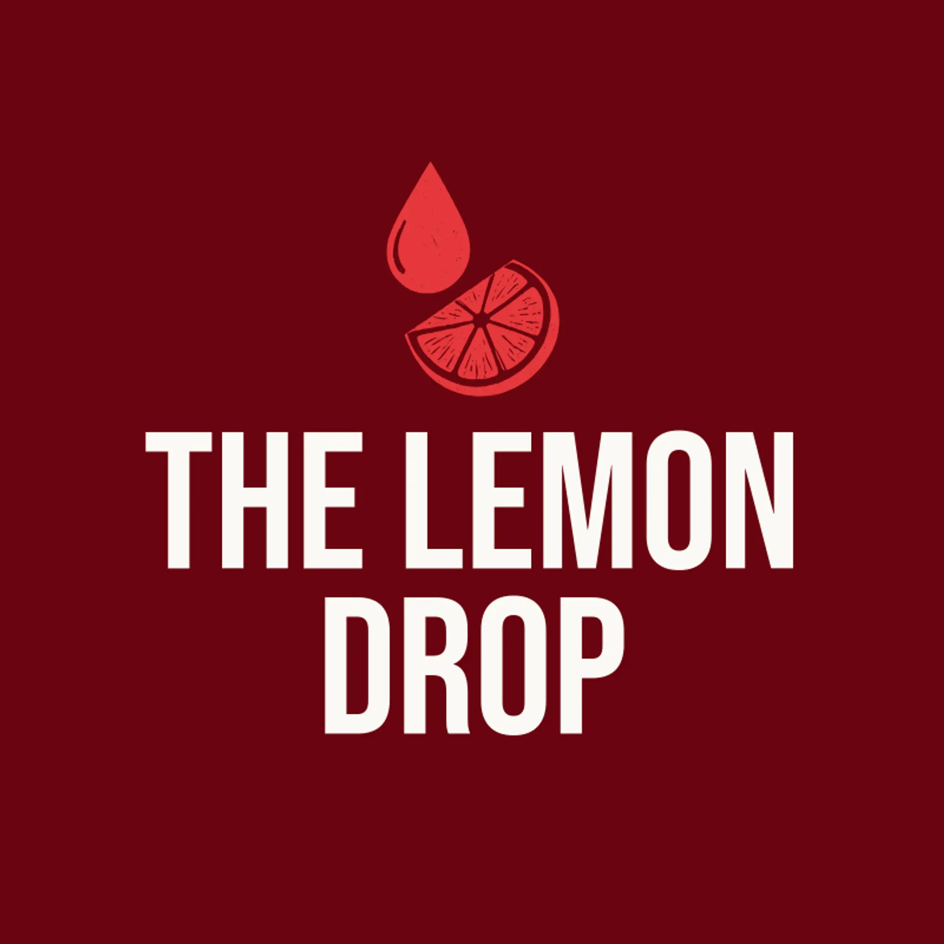
When it comes to the icon, the lemon is the obvious starting point, and it earns its popularity: that bright citrus silhouette reads instantly even cropped, flattened, or reduced to a few simple lines, which makes it perfect raw material for negative space tricks like tucking a slice into a letter or turning a whole lemon into a rising sun for a sunny stand. The glass is the most underused symbol in the trade, since a frosty cup with a straw and a lemon wheel can sit beside a wordmark, frame a monogram, or dissolve into simple shapes for a modern feel. Action and freshness bring energy that a lone fruit cannot, so sketch a lemon being squeezed with juice arcing out, a straw piercing a slice, or ice cubes tumbling into a glass, each one reading clearly at a distance. For family and neighborhood stands, pair the lemon with a mascot or an emblem shape like a badge or a sunburst, and for premium or organic brands lean on leaves, water droplets, and clean line work. Before you settle, brainstorm around your own story: a roadside stand can anchor the glass, a summer camp can perch a lemon on a picnic table, and a city shop can bounce a slice off the skyline.
Icons To Make Your Lemonade Logo Stand Out
The same instinct for bright, clean contrast carries into the lettering. According to LOGO.com data, sans serif typefaces made up 64% of the font choices in those same lemonade logos over the past 12 months, with serif at 17% and display styles at 16%. The favorites read like one sunny menu: Geologica at 23%, Afacad at 6%, and Aboreto, Antic Didone, and Open Sans at 5% apiece, a mix of friendly sans serifs and a touch of character. Set in bold, simple letterforms against that yellow or white base with a single vivid accent, a lemonade logo stays bright and legible whether it lands on a stand banner, a cup, or a tiny social avatar.
Lemonade Logo Ideas FAQs
Browse Related Logo Ideas
Alcohol logosCafe logosCat cafe logosCoffee logosCreative cafe logosCute cafe logosCyber cafe logosDairy logosFood cafe logosFrench cafe logosInternet cafe logosLemonade logosMilk logosMilk tea logosSoda logosTea logosTea shop logosUnique cafe logosWater bottle logosWater refilling station logosCoffee bean logosCoffee cup logosDrink logosEnergy drink logosMatcha logosBartender logosBourbon logosChai logosTequila logosWhiskey logosWine glass logosSpeakeasy logosCheers logos