



























Logo Design Considerations for a African Business
According to LOGO.com data, the five most popular colors among logos with african in their names over the past 12 months were white at 23%, yellow at 14%, grey at 13%, green at 13%, and black at 12%. White and yellow lead with a bright, high contrast look, while grey, green, and black offer grounded accents for a clear wordmark. For a polished result, begin with a white base and use yellow as a focused accent, then add green or black to keep the mark readable across packaging, signage, and social profiles.
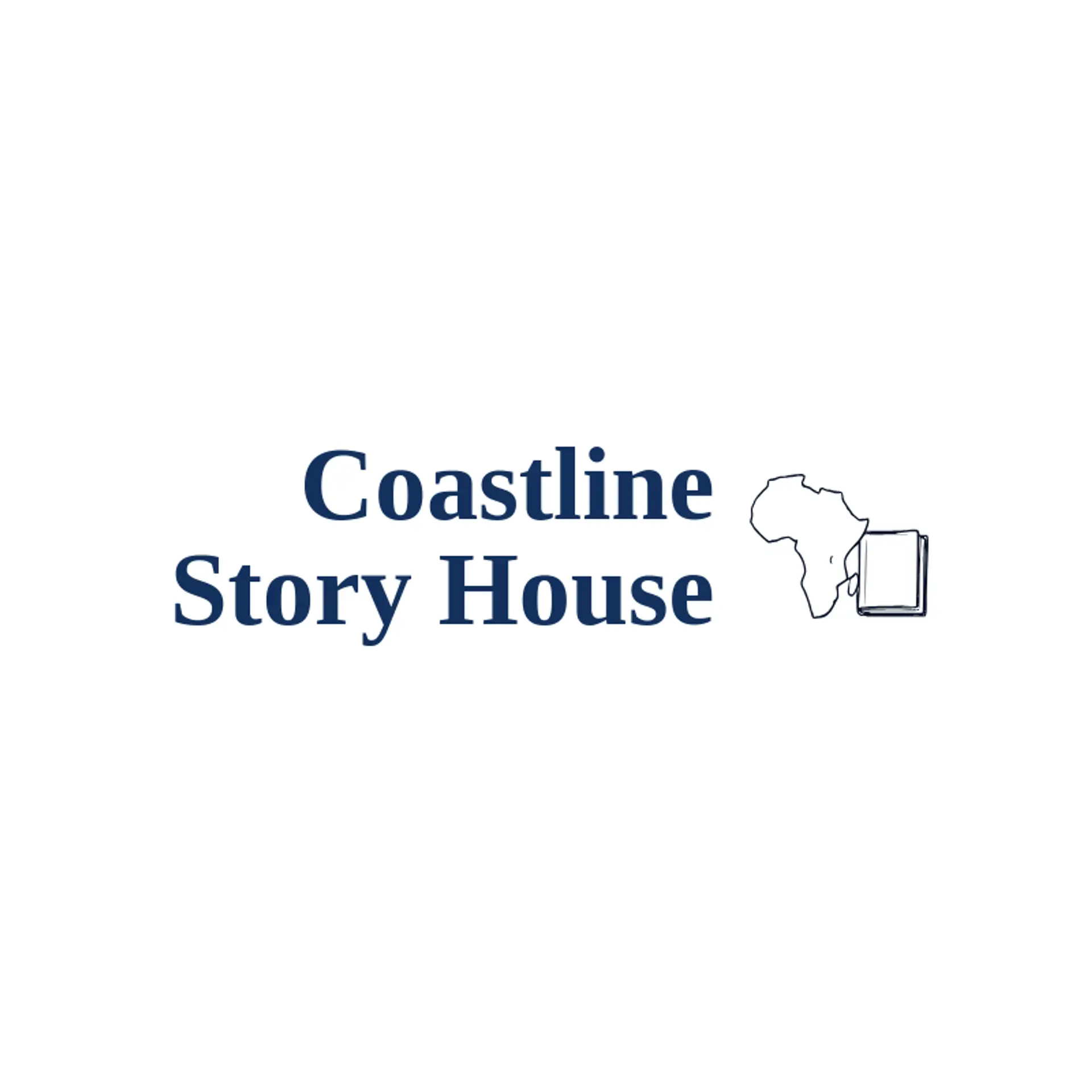
An outline of the African continent is a clear starting point; a carefully simplified coastline can hold its shape at small sizes, while a sun or star beside it adds a bright accent without crowding the map. Baobab silhouettes offer a memorable natural mark, and a single spreading canopy can work for a community organization, food brand, or travel company. Textile inspired geometry can bring rhythm through repeated diamonds or woven lines, but choose references from a specific region or tradition when the brand has a real connection to it rather than treating all African design as one style. For a more contemporary mark, pair the continent with a forward path, a leaf, or a rising sun beside it, or use the map's outer shape as a monogram anchor. Before choosing, connect the symbol to the business's place, language, craft, or audience so the final identity feels specific to its story.
Icons To Make Your African Logo Stand Out
That bright palette gives the lettering room to feel both clear and expressive. According to LOGO.com data, among logos with african in their names, sans serif typefaces accounted for 64% of category choices over the past 12 months, with display at 15%, serif at 14%, and handwriting at 5%. The leading individual fonts were Open Sans at 16%, Geologica at 14%, Schibsted Grotesk at 5%, Afacad at 4%, and Afacad Flux at 3%. Pair a readable sans serif with the white and yellow palette, using green or black for contrast, so an African logo stays legible from a storefront sign to a small social profile image.
African Logo Ideas FAQs
Browse Related Logo Ideas
Angel logosArabic logosBengali logosDesi logosHindi logosHindu logosIndian logosIslam logosIslamic logosJainism logosJapanese logosJesus logosJewish logosKrishna logosMahadev logosMuslim logosSpanish logosTamil logosTrishul logosUrdu logosBuddhism logosChristian logosSoul logosCulture logosFrench logosGerman logosGreek logosHeritage logosMinistry logosIrish logosTranslation logosCult logosNative american logosAfrican logosFaith logosSpiritual logosEvil eye logosFuneral home logosLanguage logosTribal logosWorship logosAura logosAztec logosMaya logos