The FedEx Logo: The History Of The Award-Winning Logo Design
Jun 29, 2023
By:Emily Harper
Jun 29, 2023
By:Emily Harper
Clever, cheeky, and subliminal—one would expect these attributes from the logo of a fast food chain or a cola brand. But the FedEx logo has become such an iconic symbol that it stands out as one of the best exemplars of branding in logistics. Apart from being one of the world's most famous logos, it is also trendy and cool.
We will explore what makes this logo so versatile and still manage to put up a serious business face whenever required.
Here’s the story and science behind the magic of the endearing FedEx logo.
From the Fedex abbreviation to an optical illusion, the FedEx logo has come a long way to establish its indomitable mark in the history of branding. The logo's story has interesting, lesser-known facts you may have never known.
It began with forming the company as a package delivery outfit in 1971. The brand got its first logo designed in 1973, and there have been only three logo redesigns in its 50-year history.
Let’s follow this exciting journey from its origin to the present day:

Only a few know that FedEx used to be known by its full business name, Federal Express, to show the link between the civilian population and the US government. Another interesting reason why the founder, Fred Smith, picked the word “Federal” in the name is to bag the Federal Reserve Bank as a customer.
The 1973 logo was designed with this brand name in mind, bearing a heavy wordmark to accommodate both. The company's business proposition was “speed of delivery,” which is why the logo needed to convey it creatively.
The designers cleverly placed both words of the logo on an upward incline, with the text written in contrasting brand colors. “Federal” was written in white and set against a field of blue, while “Express” was inscribed in red lettering against a field of white that merged neatly with the font of the first word.
Like it is today, the Fedex logo image was completely rectangular.

As brands started to embrace more minimalist logo designs in the last decade of the century, the FedEx logo donned a new avatar. The current logo seems to have drawn some inspiration from the “transition” logo, which represented the brand from 1991 to 1994.
The most significant contribution of this rebranding was the shortening of the name, as it went from Federal Express to FedEx.
The logo typeface was in all caps and thick, with rounded edges. On a second look, one will notice the similarity of the font with the first logo. The 1991 logo was the first to introduce the purple and orange font colors, which have been incorporated in the new logo, albeit with different hues.

The current FedEx logo is nearly three decades old. The sheer cleverness with which it was designed is reason enough for its immortality. It is more professional, has its own secret cues within the design, and also lends itself well to today's digital applications.
Most brand logo designs created in the 1990s have had to rebrand to accommodate dynamic social media platforms. One must give due credit to the designers of the FedEx logo for creating a visual element that has stood the test of time.
Lindon Leader is responsible for the phenomenal logo, introducing exclusive touches to the wordmark. He has been famed for his work with brands such as Motorola, Addison, Hawaiian Airlines, and Disney.
The logo dropped the blue and red for purple and orange. A unique touch to the logo is the attachment of the “d” to the “E” character, with the color difference being starkly represented.
Both iconic and ingenious, the FedEx logo is instantly recognizable around the globe.
If you were to ask someone to name a logo with a hidden meaning, chances are they would mention the arrow in the FedEx logo (or the smiley face in the Amazon logo). But could the famous design be reimagined?
Need a FedEx logo maker? No need. Design similar versions of the FedEx logo below and take them home for free!


Thanks to a few subtle tweaks, we now have not one but two FedEx logo images to take inspiration from. You don't need a FedEx logo maker; just rely on LOGO.com, and you're set.

The FedEx logo has earned over forty design awards from across the globe. It is also among the first few logo references one can give while demonstrating the importance of creativity in the arts. The logo represents service, speed, precision, and reliability—characteristics built over years of trust and belief in a brand.
Lindon Leader spent nine months of research and testing to finally arrive at the logo. He attributes his creative freedom to Frederick Smith, the former CEO and present Chairman of FedEx. Leader picked the famous color combination after testing several palettes.
The typeface is simple and easy to read, even if you spot it on a speeding delivery van. The logo combines two fonts: Univers 67 and Futura Bold.
The attention to the finer details in the logo is the reason why it has positively impacted customers and the brand to such a great extent.
The logo's white or negative space between the last two characters represents an arrow on FedEx that faces right to indicate forward movement. It is among the most cited frequently examples when one discusses the creative use of white spaces in typography. The white space could be shaped innovatively by tweaking the fonts and combining two styles.
One can notice the cleverness in the design by observing the negative space between the “E” and “x” characters, which showcases a forward arrow on FedEx.

Leader picked the current FedEx logo from among 200 logos. The designers needed to create these options to integrate the arrow on FedEx as naturally as possible.
A trained eye may observe how excessive the white space appears to be. The designers deliberately left more vacant areas because not everyone can pick up on cues hidden in white spaces. This argument has been accepted and appreciated by the brand.
FedEx, or Federal Express (as it was formerly known), was established by Frederick Smith in 1971. Although it competes directly with UPS as a transportation, delivery, e-commerce, and business services company, it doesn’t have the latter’s old parentage. The company is headquartered in Memphis, Tennessee.

The company commenced operations in April 1973 with just 389 employees. The company had 14 small planes that delivered packages across 25 cities in the United States. It took two years for FedEx to turn a profit.
The company was instrumental in deregulating air cargo, which allowed courier companies to use larger aircraft and helped change the world of logistics and delivery services.

In 1983, a decade after the company was established, the revenues finally touched the $1 billion mark. FedEx is the first American company to have achieved this milestone in 10 years without acquisitions or mergers.
By 1984, the company began intercontinental shipping. A significant milestone for the company was the 1994 acquisition of Evergreen International Airlines, after which it began operations in China.
This development catapulted the company’s success, as it was the only United States-based cargo company to import and export goods from and to China.
Sooner or later, it didn’t take FedEx long to reach the whole world.
What are some commonly asked questions about the FedEx? Get your questions answered with these three FAQs.
The optical illusion in the FedEx logo is one of its most recognizable features. There is an arrow in white between the letters E and X. It represents quickness, precision, the pursuit of excellence, and tenacity in the face of adversity.
In 1971, the company introduced its first logo, which featured a rectangle with the brand name "Federal Express" written across its diagonal. Federal was written in white and set against a blue background, while Express was given a red background and placed in the bottom half of the rectangle.
After expanding beyond the express business into trucking-only offerings in the late 1990s, FedEx began using secondary colors other than orange. When it comes to domestic parcel delivery, FedEx Ground's logo is purple and green, while FedEx Freight's is purple and red.
The inspirational story of FedEx as a business that not only conducted itself in the best way possible but also redefined B2B branding is notable.
The logo may just be a symbol of the brand, but it is representative of the brand’s personality. It portrays how the business is empathetic, clever, driven, and modern.
These are the attributes every paying customer would look for when they entrust their most precious goods to be delivered from any corner of the Earth.
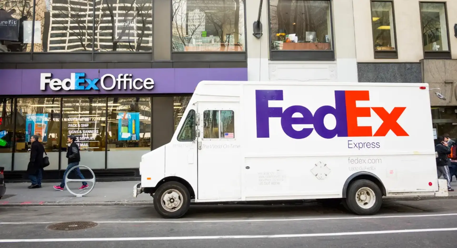
Today, 600 aircraft and over 425,000 employees proudly don the FedEx logo. It has become a recognizable symbol in the sky and on the streets.

Jan 12, 2027 by: Emily Harper

Nov 25, 2025 by: Emily Harper

Oct 28, 2025 by: Emily Harper

Oct 14, 2025 by: Emily Harper